weekly Posiview's 2012 ....week 52 Busy added...finished!

I really like that 1st one Andy, the negative space is spot on and great lighting. Number 2, nice technique but doesn't quite work for me in this instance.

Thank's, Michael. I could really get into OCF...now, where's that catalogue :D

Hi Andy. I really like both of those, and Isabelle's done a great job posing (a smile would have ruined them!).

I prefer the second one on a quick glance or from further back, but if you start to look too closely you can see the light spiral has been added in PP.

Never-the-less, how the heck is that done?

Thanks, a smile would have removed some mystery.

I suspect I could have worked it a bit more in PS, but I was glad to get this far.

It's a technique fro December's Practical Photogshop. If you want the article emailing or PMing, let me know.

Regards.
 
It's a technique fro December's Practical Photogshop. If you want the article emailing or PMing, let me know.

Yes pleas Andy :)
 
I'm afraid #1 does nothing for me and the head shots feel a bit detached if you know what I mean. However I do like those pencil shots. When I first saw them I couldn't decide between the two but looking again the warm orange and glow from it really adds to the shot. Nice one.
 
Video emailed to your ********@procoolindustrial.**** email address.

Let me know whether it arrives (y)

Got it, thanks for that :) I'll study it later, and yes, expect to see it used next year (as long as it either works in Pixelmator, or I get PS for Christmas!).
 
Andy, the weirdest thing; it arrived and I started watching it. Left mail on my iPad, and your email has gone! It's not gone to trash either, so I haven't deleted it, it's as if it were never there!

Would you mind sending it again p,ease mate?
 
Hi Andy
Glow - Far improved by the edit and definately on theme.
Round - Love the effects of wire wool spinning however your leaf shot is brilliant. The colours and clarity plus the thought provoking idea works for me.
Negative - All good examples. B/W pencil is my winner although the horizontal lines on left are a bit off-putting. Plenty of negative space on head shots but find this too surreal. Perhaps I'm more used to seeing the neck/body fading away on these kind of portraits.
 
Southdowns said:
Andy, the weirdest thing; it arrived and I started watching it. Left mail on my iPad, and your email has gone! It's not gone to trash either, so I haven't deleted it, it's as if it were never there!

Would you mind sending it again p,ease mate?

I'll do it tonight.

Cheers.
 
fazer said:
Hi Andy
Glow - Far improved by the edit and definately on theme.
Round - Love the effects of wire wool spinning however your leaf shot is brilliant. The colours and clarity plus the thought provoking idea works for me.
Negative - All good examples. B/W pencil is my winner although the horizontal lines on left are a bit off-putting. Plenty of negative space on head shots but find this too surreal. Perhaps I'm more used to seeing the neck/body fading away on these kind of portraits.

Thanks for the comments, it's what I really enjoy about this project, such differing opinions. I did have one with more detail on Isabelle but in rather like the one I posted.

Horizontal lines, yeah the black card I usually use got damaged so this is the kitchen table !!

Cheers.
 
fazer said:
Hi Andy
Glow - Far improved by the edit and definately on theme.
Round - Love the effects of wire wool spinning however your leaf shot is brilliant. The colours and clarity plus the thought provoking idea works for me.
Negative - All good examples. B/W pencil is my winner although the horizontal lines on left are a bit off-putting. Plenty of negative space on head shots but find this too surreal. Perhaps I'm more used to seeing the neck/body fading away on these kind of portraits.

Thanks for the comments. All taken on board. I did have one with more detail in Isabelle but rather liked this one.

The horizontal lines are on the table,...I damaged my black BG card :)

Cheers.
 
Don't worry Andy, I've found it; it was a weird timing coincidence :). Your email arrived on my iPad and I looked at it. Seconds later it arrived on my Mac, and Mail marked it as junk, moving it to the junk folder. Then my iPad synced again, and of course it disappeared! Normally my iPad wouldn't get a chance to retrieve it before it got moved by the Mac; I guess it was because the attachment was so big.

Thanks for sending it over :)
 
have to go for the colour pencil the dismembered head does nothing for me it needs some light somewhere so it doesn't look like a cut out. If that makes any sense at all
 
have to go for the colour pencil the dismembered head does nothing for me it needs some light somewhere so it doesn't look like a cut out. If that makes any sense at all

Cheers, makes perfect sense and I appreciate the critique. I did have some with more detail on Isabelle, but I rather liked the dismembered look :D

Cheers.
 
Hi Andy

Negative - #1 shot of your daughter's head is very well handled in terms of light, comp and b/g but does not hit the theme well for me even tho there is neg space in the shot. Can't reconcile such a lovely calm face with the theme.

Pencil shot #1 is spot on and good interpretation
#2 is equally as good with that vivid orange colour, but prob not as much on theme.

Strange thing for me is again how i first interpreted the shot of the pencil. As i scrolled down, the first image came into view, but not the orange one. My immediate thought was what a cracking shot of a shaft of light thro a slightly open door. The image I saw was of a corridor going r to l with a door slightly ajar, held open by some sort of metal device that looks like 2 stacked baked bean tins. The vertical part of the pencil is the upright of the door frame whilst the shaved point is the top of the door frame on the angle of the perspective. You prob won't be able to see this (maybe by leaning back and screwwing up your eyes) but this was my genuine first thought.:wacky:

May be this Challenge has affected me more than i know.

Should have gone to specsavers:)
 
:LOL: I too at first thought your pencil shot was of a doorway too.
I do prefer the B&W pencil shot, maybe because it is negative like in its tones IYSWIM.
Care to share how you lit this Andy? You've managed to control the light with no spill on the back of the pencil, its very effective.
Your second images for negative work equally well. My vote would go to #1 image of Isabelle, I feel it is a strong enough image without the swirl of light in #2.
Good work rate again Andy, this 52 of yours must be around a 104 by now ;)
 
Bloomin 'eck...I'm not around for most of the week & you've managed to take & post up 4 shots....I need a job like yours :LOL:

Pencil in B&W for me , though I do kinda like the glow from the color one....care to share the "How" on this one please ? Really nifty lighting that has me intrigued :thinking:

Quite like the 1st shot of Isabelle , lovely black BG & expression , the light ring makes her head look " pasted on " to me , but definately a neat bit of pp (y)
& congrats on 6thou posts......:clap:
 
Hi Andy

Negative - #1 shot of your daughter's head is very well handled in terms of light, comp and b/g but does not hit the theme well for me even tho there is neg space in the shot. Can't reconcile such a lovely calm face with the theme.

Pencil shot #1 is spot on and good interpretation
#2 is equally as good with that vivid orange colour, but prob not as much on theme.

Strange thing for me is again how i first interpreted the shot of the pencil. As i scrolled down, the first image came into view, but not the orange one. My immediate thought was what a cracking shot of a shaft of light thro a slightly open door. The image I saw was of a corridor going r to l with a door slightly ajar, held open by some sort of metal device that looks like 2 stacked baked bean tins. The vertical part of the pencil is the upright of the door frame whilst the shaved point is the top of the door frame on the angle of the perspective. You prob won't be able to see this (maybe by leaning back and screwwing up your eyes) but this was my genuine first thought.:wacky:

May be this Challenge has affected me more than i know.

Should have gone to specsavers:)

:LOL: I too at first thought your pencil shot was of a doorway too.
I do prefer the B&W pencil shot, maybe because it is negative like in its tones IYSWIM.
Care to share how you lit this Andy? You've managed to control the light with no spill on the back of the pencil, its very effective.
Your second images for negative work equally well. My vote would go to #1 image of Isabelle, I feel it is a strong enough image without the swirl of light in #2.
Good work rate again Andy, this 52 of yours must be around a 104 by now ;)

Bloomin 'eck...I'm not around for most of the week & you've managed to take & post up 4 shots....I need a job like yours :LOL:

Pencil in B&W for me , though I do kinda like the glow from the color one....care to share the "How" on this one please ? Really nifty lighting that has me intrigued :thinking:

Quite like the 1st shot of Isabelle , lovely black BG & expression , the light ring makes her head look " pasted on " to me , but definately a neat bit of pp (y)
& congrats on 6thou posts......:clap:

Thanks, all, sometime a theme catches my imagination and there's no stopping me :D

The lighting was quite difficult, mainly to avoid spilling light behind the pencil. Essentially, I had to spend quite a lot of time experomenting with the flash power, DOF and distance from flash head to pencil There was a small ammount of PP just to tidy up the edges.

Well, almost there!

Thanks again for everyone's support (y) :clap:
 
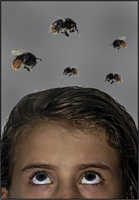
Well, as soon as I saw the theme I knew what I had to do. Brought out Beatrice, who I've used before and had stashed away. It did start to fall apart mid shoot though, much to Isabelle's :exit: :exit: :exit:

I'd like to say this is my last submission for TP52, but............:D :D :D


Week 52 3 by andysheader (Posiview), on Flickr
 
Last edited:
Liking the idea there Andy, though it looks a little rough around the hair line.

Thanks, Michael, doesn't often happen, but I saw the issues with the RH hairline and posted it anyway...bit lazy of me :bonk:

It wasn't easy not burning out the hairline with the flash.

Edit posted.

Cheers (y)
 
Last edited:
Thats a nice pic (y) maybe a different colour background would help, not that I use PS I wouldn't know where to start, Glad to see you let your daughter out of the suitcase.
Have a good Christmas :)
 
Hi Andy, great idea and execution for busy. My only crit you've already had; the hairline. I think it still looks a little "pasted" even in the edit.

Great bit of lateral thinking.

See you on the other side of New Year :)
 
Yep, that seems better, tricky pp work there.

Cheers, Michael.

Thats a nice pic (y) maybe a different colour background would help, not that I use PS I wouldn't know where to start, Glad to see you let your daughter out of the suitcase.
Have a good Christmas :)

Thank a lot for your comments thought (y)

Didn't think about a different colour BG :bonk:

Hi Andy, great idea and execution for busy. My only crit you've already had; the hairline. I think it still looks a little "pasted" even in the edit.

Great bit of lateral thinking.

See you on the other side of New Year :)

Cheers, mate, yeah, it does have a pasted feel, ah, we'll, it's a learning curve.

Well done Andy.

Pencils!

Like the lighting on the pencil Andy, not an angle I'd thought of yet, I'll be sure to credit you if I use it!

Cheers and I'll be keeping an eye on your Pencils project.
 
I'm afraid have to agree about the hairline and the background colour. I suppose it wouldn't bee the same without a shot of Isabelle :exit:

Congratulations on completing your 52.
 
Hi ya matey

Congrats on completing & surviving another year in the 52's madhouse (y)

Not 100% on the Busy shot though...think it's maybe the BG that puts me in a dither...bit too clinically white , though your editing skill is way above anything I could do :)

See you on the other side of the new year in 2013's 52 ...& roll on the end of january (y)
 
I'm afraid have to agree about the hairline and the background colour. I suppose it wouldn't bee the same without a shot of Isabelle :exit:

Congratulations on completing your 52.

Hi ya matey

Congrats on completing & surviving another year in the 52's madhouse (y)

Not 100% on the Busy shot though...think it's maybe the BG that puts me in a dither...bit too clinically white , though your editing skill is way above anything I could do :)

See you on the other side of the new year in 2013's 52 ...& roll on the end of january (y)

Can't leave on a negative and although I did say I'd finished, I had a quick edit on Snapseed to see what a darker BG would look like. Bit annoyed I didn't end on a better one. Even now, it's still a bit patchy, but Isabelle does have a bit of rim lighting :D

As they say, hey ho, and I am very happy to have finished another 52; despite saying I hadn't learned much by doing this project, I was wrong, I've learned loads :D

Cheers and no comments necessary - this one as for me (y)


Edited Busy - Snapseed edit for me. by andysheader (Posiview), on Flickr
 
Hi Andy :)

Catch up time, sorry but it will be brief as I want to get comments up to date :)

Colour - That's very effective, Like how you have done that (y)

Shadow - Again a clever idea, not sure on the crop maybe a bit too close to the handle, but I like how you have set it up and the PP is very effective

<EDIT> just see edit - much better :)

Glow - The first one for me too, the second is a bit too artificial for me, a great colour/glow to the first :)

Round - I love these shots, both are very effective :clap:

With the leaf I prefer the black background, makes the green much more vibrant to me

Negative - I like the first one, very original effect to me :) As for the pencil image the B&W pips it for me, Just, again clever idea

Busy - Great finishing shot, again like the idea and the way you have done it, the eyes lead into the picture well :)

A great 52 I have followed, well done for finishing, I look forward to seeing your thoughts executed in 2013 :clap:
 
Well done on your finish Andy

Thanks for your comments throughout the year on my shots

Hi Andy :)

Catch up time, sorry but it will be brief as I want to get comments up to date :)

Colour - That's very effective, Like how you have done that (y)

Shadow - Again a clever idea, not sure on the crop maybe a bit too close to the handle, but I like how you have set it up and the PP is very effective

<EDIT> just see edit - much better :)

Glow - The first one for me too, the second is a bit too artificial for me, a great colour/glow to the first :)

Round - I love these shots, both are very effective :clap:

With the leaf I prefer the black background, makes the green much more vibrant to me

Negative - I like the first one, very original effect to me :) As for the pencil image the B&W pips it for me, Just, again clever idea

Busy - Great finishing shot, again like the idea and the way you have done it, the eyes lead into the picture well :)

A great 52 I have followed, well done for finishing, I look forward to seeing your thoughts executed in 2013 :clap:

Thanks, both. Seems a loooonnggg time ago since I started.
 
Hi Andy
Congratulations on finishing.
Busy - Great idea to finish on. Yes could be critical, but won't. Thanks for popping in during the year, and appreciate your views and help.
Good luck with your 2013_52 and will visit occasionally.
All the best
 
OMG how did I get so far behind on your thread:bonk: :coat:

Pop art is some great pp work, love all the colours (y) Maybe this should be printed large in your daughters bedroom?

Colour is very clever, it makes for a rather unusual take on a tried and tested technique. PP is as ever excellent :clap:

Natural reshoot, you clearly have too much time on your hands to be doing stuff like that! But hey, keep doing it, lovely lighting and a yet again another unique take on the theme!

Shadow, it took me a while to figure out what it was:bonk: I like the graininess to it! I can't decide between the original and the edit? I think I prefer that little extra space on the RHS!

Glow, one for me. I know it's dark around the edges but the detail in the shell is better.

Round, wow, love the first one! I like that you can see the guy spinning. It's all white mans magic to me though! Those orbs look like eggs, very surreal! I like the red at the back of the tunnel too. Beads and the leaf thing is odd, they definitely look like real rounds though!

Negative, I think the blank negative looks amazing, just a tad on the dull side! The B&W pencil shot is amazing, love the lighting! I thought it was a door open slightly when I first looked at it:bonk: The shot of your favourite model is very well lit, but her head looks like it's floating a bit! Not sure on that wiggly line thing, could be straight out of Dr Who!!!!

Busy, the hair line looks a little rough to me? But a zany idea to finish on and her eyes really draw you up through the shot.

Well done for finishing your second 52 :clap:
 
fazer said:
Hi Andy
Congratulations on finishing.
Busy - Great idea to finish on. Yes could be critical, but won't. Thanks for popping in during the year, and appreciate your views and help.
Good luck with your 2013_52 and will visit occasionally.
All the best

Cheers, I missed a few of times this year. Not sure if you're doing 2013, if you are I won't miss any.

The goblin said:
OMG how did I get so far behind on your thread:bonk: :coat:

Pop art is some great pp work, love all the colours (y) Maybe this should be printed large in your daughters bedroom?

Colour is very clever, it makes for a rather unusual take on a tried and tested technique. PP is as ever excellent :clap:

Natural reshoot, you clearly have too much time on your hands to be doing stuff like that! But hey, keep doing it, lovely lighting and a yet again another unique take on the theme!

Shadow, it took me a while to figure out what it was:bonk: I like the graininess to it! I can't decide between the original and the edit? I think I prefer that little extra space on the RHS!

Glow, one for me. I know it's dark around the edges but the detail in the shell is better.

Round, wow, love the first one! I like that you can see the guy spinning. It's all white mans magic to me though! Those orbs look like eggs, very surreal! I like the red at the back of the tunnel too. Beads and the leaf thing is odd, they definitely look like real rounds though!

Negative, I think the blank negative looks amazing, just a tad on the dull side! The B&W pencil shot is amazing, love the lighting! I thought it was a door open slightly when I first looked at it:bonk: The shot of your favourite model is very well lit, but her head looks like it's floating a bit! Not sure on that wiggly line thing, could be straight out of Dr Who!!!!

Busy, the hair line looks a little rough to me? But a zany idea to finish on and her eyes really draw you up through the shot.

Well done for finishing your second 52 :clap:

Wow, appreciate the feedback. This is what I like about this project, very differing ideas and opinions.

Cheers and see ya in 2013!!!
 
Back
Top