weekly Rich's 52 of 2015 - Wk 14 'Alphabet' Added, back tracked to WK 11 and 12

Messages
211
Edit My Images
Yes
Hi All,

Slightly behind, but did not want to miss the first one, even though it was a practice week, I wanted to give it a shot.

I've signed up to the 52 weeker because I have been struggling with a lack of inspiration, so hopefully this will help.

I'm pretty much a complete beginner so am happy for constructive feedback.

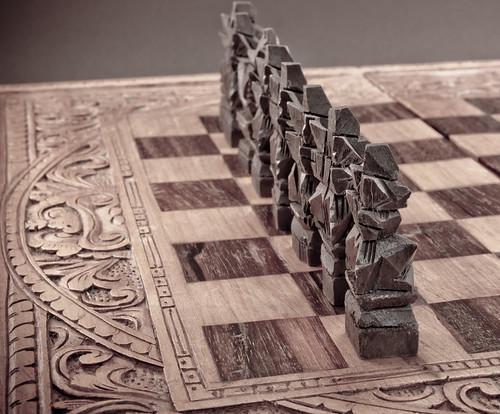
Here is my WK 0 'Patterns' photo.

I may have overdone it here with the patterns but in my mind I was looking for a pattern of the chess board(hand crafted) and also a pattern in terms of the pieces lined up.
16196781085_737fa68712.jpg
 
Last edited:
Hi

Good idea for patterns! I think it would have been emphasised more in the shot if you had used a lower and to the left viewpoint… more emphasis on the checks and the pieces… the decorative boarder is too distracting I think otherwise.

Mark
 
Really like this image, great start to the challenge, hopefully this 52 will help you get your mojo back.
 
Thanks for all the feedback so far, i will take it onboard
 
Super starting image good luck with your 52 this year
 
Welcome to the 52 :)

Good idea to start with the practice shot, trying to get the 53 shots, well possibly 57 if you do the re-shoots too, anyway i digress...

Patterns - I like how you have aligned the LH edge, although I'd like to see a bit more at the top (one piece clipped) but you have got good lighting and some really good detail, great start, and good luck with the rest of your challenge (y)
 
Last edited:
I really like the tones in that, give a nice austere feel to the shot. I too would like to see a lower angle though.
 
Here is my attempt at Week 1 - 'Bliss'.

Bliss for me is my little boy, Bliss for my little boy is his mickey.

I struggled here for a good while, I had an idea in my head and I really like the photo personally, it may not be perfect but it was the image I was trying to portray. I did find it difficult to keep my little boy still for any amount of time mind you lol.

I also had trouble with noise, but that was due to me having to take these at times when it was already dark; given enough time perhaps I could have improved on it.

Any constructive feedback as usual is appreciated thank you.


Bliss
by ThyJones, on Flickr
 
Thanks for the feedback guys, really enjoying these weekly photos!
 
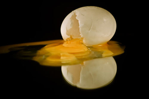
This is the photo I have taken for the Week 2 Subject of 'Fragile'. A duck egg.

This was actually a bit of a pain to get what I had in my head out. I did try with other backgrounds but it just didn't work. Keeping the egg still, on the mirror and trying to get the shot was a bit of a pain, but i cheated an used a bit of bluetack in the end.

Fragile by ThyJones


I did also do a bit of PP on it too in lightroom, and whilst it does take away the orange colour of the yolk, I kind of like the grungyness, but am still preferring the basic version above:

Fragile 2 by ThyJones


As usual, feedback welcomed.
 
I like that also, but I'd agree with Michael,
I would have liked to have seen all the egg spilling out,
and the first is the best IMO.
 
Hiya, I like your fragile shot too. The blutack was a great idea. I much prefer the first shot though - it's maybe because my screen isn't calibrated but the yolk doesn't look orange to me, just a nice deep yellow. The second shot looks very pink....maybe it is my screen? :confused:
 
I had to do 2 trips for my scenic photo because I just wasn't happy with them, these ones are better but still not perfect for what I was looking for, but at least i'm using my camera each week, so i'm getting better in terms of using the camera etc and learning which is the main thing.

I like number one in terms of the grungyness to it to some extent, almost a bit old/dead wood scenic type (not got a word for it yet lol).

Scenic (1) by ThyJones


and number 2, a little dark and I cannot say i'm completely happy with it:

Scenic (2) by ThyJones, on Flickr
 
Love the tones and composition in the first one.
 
Fragile - The first of the fragile shots works better for me. One criticism would be the double reflection which would have to be fixed by using a different reflective surface. Have a google for avoiding double reflections for some options.

Scenic - I prefer #2 out of these. The lighting is so much stronger and maybe has a better sky

Thanks for this, I wasnt sure how to get around the double reflection so appreciate the tip etc!
 
Scenic

#1 I like the shot, it does feel grungy and old.
Not sure if its me, but it looks to be leaning to the right slightly.

#2 I do prefer this image, the sun just rising, nice reflections on the pond/lake.

Yeah, now I look at it again, I agree, it is leaning to the right a bit, cheers for looking and giving feedback
 
Week 4 'Companions' Added:

A little behind again this week, but this is my entry for companions.

Companions by ThyJones
 
Seems there are more swans than one can shake a stick at in this week's theme, however this one I feel is the best of the bunch. Even though I'm not usually a fan of a lot of PPing, it seems to have worked in this case. Good shot.
 
As Martin /\ said, there are a lot of Swans about this week, on one hand, I do quite like the processing.
But its a shame you lopped off the feet.
 
As Martin /\ said, there are a lot of Swans about this week, on one hand, I do quite like the processing.
But its a shame you lopped off the feet.
Thats a very good point,whilst no excuse as such, i didnt intend on this shot and was just testing a few thinga but in the end quite liked it, i will keep that in mind though for the future, thanks all for commenting
 
Granted there are a lot of Swans this week, however this one is under the topic "Companions" where as all the others are for "Elegant".

I like the processing and as for the feet, because of how dark it is, I hadn't noticed until Chris pointed it out.
 
Back
Top