weekly Seaodyssey's 52ers for 2018 Week51 Party

Like this very much, well thought out, and it made my head go back when I first seen it on screen like wow.

Walter
Thanks Walter

I surprised myself when I first saw the result and the amount of detail in the full size image. I only upload images with a max 1024 size to flicker.

Pete
 
I like the added story with ten-a-penny and the stacking looks good.


Thanks Chris

I do struggle with these "Word" Themes and I try not to shot the first thing that comes into my head (apart from my Thick End of the Wedge)

Pete
 
Always good to try something new Pete :) I like all the little screws, the lighting has given them a lovely warm colour and theres a nice reflection but I'm not sure the coins add anything to the image
 
I like the ten a penny idea, but for me, the coins actually detract, as they make the shot feel lop sided. The screws alone were perfect for the theme.
 
Nice abundance of bolts etc I don’t think it needs the coins they look a little out of place I think it would have worked just as well without
 
Abundance of nuts & bolts, or whatever you've got there. Nice prop, a potful and more. Good lighting but personally, I'm not keen on these mirrored surfaces, when it works it works a treat but that's rare, imo.
 
Week 10 Heavy. I have only 2 photos taken this week that fit the theme - HEAVY.

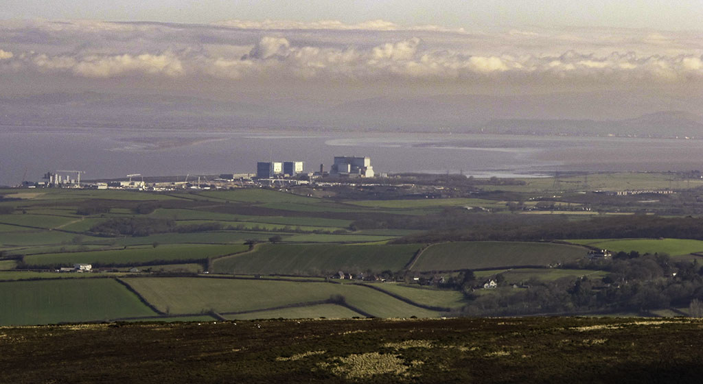
[url=https://flic.kr/p/23NPm1X]D20-Heavy Water Hinkley Point by Peter, on Flickr[/URL]

This is a double heavy, Heavy Construction and also D20 (Heavy Water) which is used to control the nuclear reaction in the reactors at Hinkley Point Power Station in Somerset. The photo is taken from just over 6 miles (10KM) away from the top of the Quantock Hills.

The next one is Heavy Lifting, It's a S&P Steam Crane located on the riverside in Bath.

[url=https://flic.kr/p/25aUzyk]S&P Steam Crane 1904 Bath Riverside. by Peter, on Flickr[/URL]

They are the best I can do this week, being away from home.

Pete
 
I like the HInkley Point picture. Nice cloud formations in the distance and the brown land at the bottom lends scale to the photograph.

Second one is a picture of a crane with a massive shadow in the bottom left so, unlike the first, this one is not for me.
 
I can see what Martin means about the shadow in #2, but the fact that the subject is so much clearer in #2 means it is the winner for me.
#1 is too washed out for my tastes (that's just me), though I think you could pp it significantly from the raw to give it more punch. I had a play with the jpg and a combination of de-haze, saturation, sharpening and selective noise reduction gave me something with more punch, but in deference to your 'Edit my images' choice, I shan't be posting it (it was purely to see what could be done, and the raw would likely be a far better starting place).
#2 is sharp, noiseless and colourful, hence the winner for me.
 
Abundance - Plenty of little screws there lots of details my only slight issue is the highlights are a little bright

Heavy - Love the cloud formation in the first some lovely colours, No 2 just edges it for me nice an sharp and some lovely details and contrast in there.
 
I like the HInkley Point picture. Nice cloud formations in the distance and the brown land at the bottom lends scale to the photograph.

Second one is a picture of a crane with a massive shadow in the bottom left so, unlike the first, this one is not for me.
There was not much i could do with that big shadow, if i had taken the photo from any other side I would have had a large block of new flats as background. I could not get any further back and was at the widest on the lens on my Canon g11. Thats why the back of the crane is cropped out a bit. Thats why i agree with you about which picture to use.

I can see what Martin means about the shadow in #2, but the fact that the subject is so much clearer in #2 means it is the winner for me.
#1 is too washed out for my tastes (that's just me), though I think you could pp it significantly from the raw to give it more punch. I had a play with the jpg and a combination of de-haze, saturation, sharpening and selective noise reduction gave me something with more punch, but in deference to your 'Edit my images' choice, I shan't be posting it (it was purely to see what could be done, and the raw would likely be a far better starting place).
#2 is sharp, noiseless and colourful, hence the winner for me.

I had already given it a whole load of antihaze and some saturation, but the screen on my laptop is rather poor and it was already suffering. I will check next week when i get home on a better monitor. Don't forget I was over 6 miles away.

Abundance - Plenty of little screws there lots of details my only slight issue is the highlights are a little bright

Heavy - Love the cloud formation in the first some lovely colours, No 2 just edges it for me nice an sharp and some lovely details and contrast in there.

You may need to decrease your monitor brightness as the highlights look ok on mine. There is a set of greyscale blocks available on the internet which you shold be able to see as seperate blocks when displayed on your monitor. I had to turn my brightness down a large amount to see a difference on mine.
Pete
 
Ok, quick off the mark for Week 11.
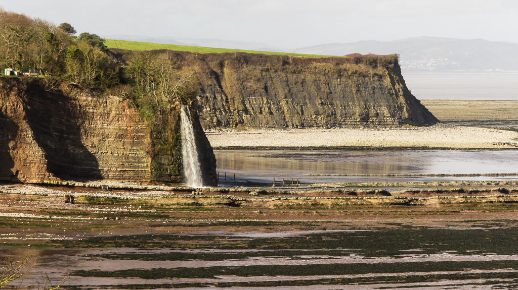
It's been very wet here in northern Somerset where I'm at the moment, So here is a photo of a beach waterfall at St Audries Bay which is flowing very fast. I have left the background as light as it is to show the distance.

Wk10 Wet by Peter, on Flickr

Hope you all enjoy. Ps I have noticed my mistake in the title of my Flickr post.

Pete
 
Last edited:
I like the clouds in the first heavy shot but I think it needs a little more oomph. The crane is lovely bright and sharp but the shadow is very dark but on the whole I prefer this one.

Thats quite a drop Pete, judging by the buildings on the top! I might have cropped a little off the bottom just to bring the focus a bit closer to the waterfall. Lovely colours in al the layers of rock :D
 
Guard - I like the fire guard best love the colour
Thick - the first of the amended shots is the best for me.
Abundance - I like that and the reflections work well.
Heavy - I like the first one more
Wet - great view and a waterfall is definitely wet
 
Wet makes for an interesting photo, certainly on theme and not often in this country that you get a big waterfall like that on the coast.
 
A good wet quick off the mark shot Pete, my only nit pic is you have left some twigs in the bottom left of view still a good shot though.
Thanks for your comments Dave, to be honest I did not see those Twigs when I posted, but I do now.
 
I like the clouds in the first heavy shot but I think it needs a little more oomph. The crane is lovely bright and sharp but the shadow is very dark but on the whole I prefer this one.

Thats quite a drop Pete, judging by the buildings on the top! I might have cropped a little off the bottom just to bring the focus a bit closer to the waterfall. Lovely colours in al the layers of rock :D
Hi Georgina

Thanks for your comments, I should have cropped a bit from the bottom, as Dave70D spotted some twigs which I did not. Some of those buildings are very close to the edge, they are static caravans and the drop would spoil your nights sleep that for sure.

Pete
 
Wet makes for an interesting photo, certainly on theme and not often in this country that you get a big waterfall like that on the coast.
Thanks for your comments Chris, The Wet weather helps, but that waterfall is always flowing. Earlier this year some of the water had frozen according to a local.

Pete
 
Guard - I like the fire guard best love the colour
Thick - the first of the amended shots is the best for me.
Abundance - I like that and the reflections work well.
Heavy - I like the first one more
Wet - great view and a waterfall is definitely wet


Thanks Minx for your comments.

Pete
 
Wet is interesting composition-wise but could be better focussed on the waterfall, however there is lots of other water around. :)
 
I agree with the above the waterfall is a little lost maybe but plenty of wet stuff about
 
Wet is interesting composition-wise but could be better focussed on the waterfall, however there is lots of other water around. :)

I agree with the above the waterfall is a little lost maybe but plenty of wet stuff about

Unfortunatly I could not get any closer to the waterfall and the lens was zoomed at it's max. Thanks for your Comments

Pete
 
I like wet, but think you could of been tighter with the crop on the left hand top side and took out the man made stuff on top of the cliff.
 
Hi Pete, although the blue sky is great in your second image for Heavy I prefer the first one as it's a lovely scene and the main buildings stand out well under a striking sky.
Wet is another interesting scene and you can see the size of the waterfall by comparing with the buildings to the left. As others have suggested, a little crop at the bottom would help to remove any distractions, but I do like the layers of colours, not just in the surface of the beach but also the different outcrops of land (y)
 
This week, like a lot of other people, I found hard, Juxaposition, I had a few idea's, black and White, short and tall and quite a lot of others as well.
But when it came to finding anything to fit the bill, not a lot came forward.
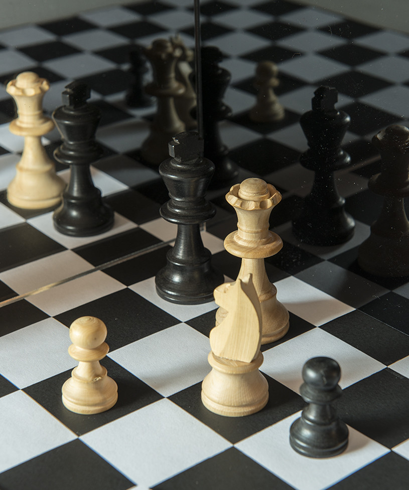
On Tuesday, I was thinking black and white, chess set, found some pieces, but not any board. So I printed out some squares onto paper, but I wasn't convinced it would work.
Came Wednesday and I set something up, found the printed squares was not enough, got some more, layed them on the table, got a mirror square and black gloss perspex and set them up so the squares where reflected into the distance, and set up some of the chess bits, now that was hard, getting them reflected but nothing else around the house.

Here it is
[url=https://flic.kr/p/24wq9vq]TP Wk12 Juxaposition2 by Peter, on Flickr[/URL]

Woke up this morning and opened the blinds, with the sun shinning onto the wall, took a couple of photos of that, this is the best. While not black and white, it is light and shade.

[url=https://flic.kr/p/FWYH8F]TP Wk12 Juxaposition1 by Peter, on Flickr[/URL]
http://[url=https://flic.kr/p/FWYH8...m/photos/94017719@N05/]Peter[/url], on Flickr
I'm going with the chess set up as the contrast is so much better.

Pete
 
The chess set works well, did think it looked a little strange at first till I read about the reflection and the perspex, it does work better than the morning sun which hurts my eyes in a strange way
 
I had to look at the chess pieces a couple of times before I saw the mirror work; I'm still not sure how you've done it Pete, but it woks for me and the theme. onwards and upwards.:)
 
Ooh, a lot of work went into the chess shot. Clever and it works well.
I thought it odd that the board folded in the middle of squares, rather than on the line (and now I think of it, it's larger than 8x8). I like it.
 
For this weeks theme I was trying hard to stay away from eggs, I had thought of painting faces onto some and using that and maybe getting some cadburys mini eggs and making it a family, but thinking about it, it would have been hard to get a decent background.
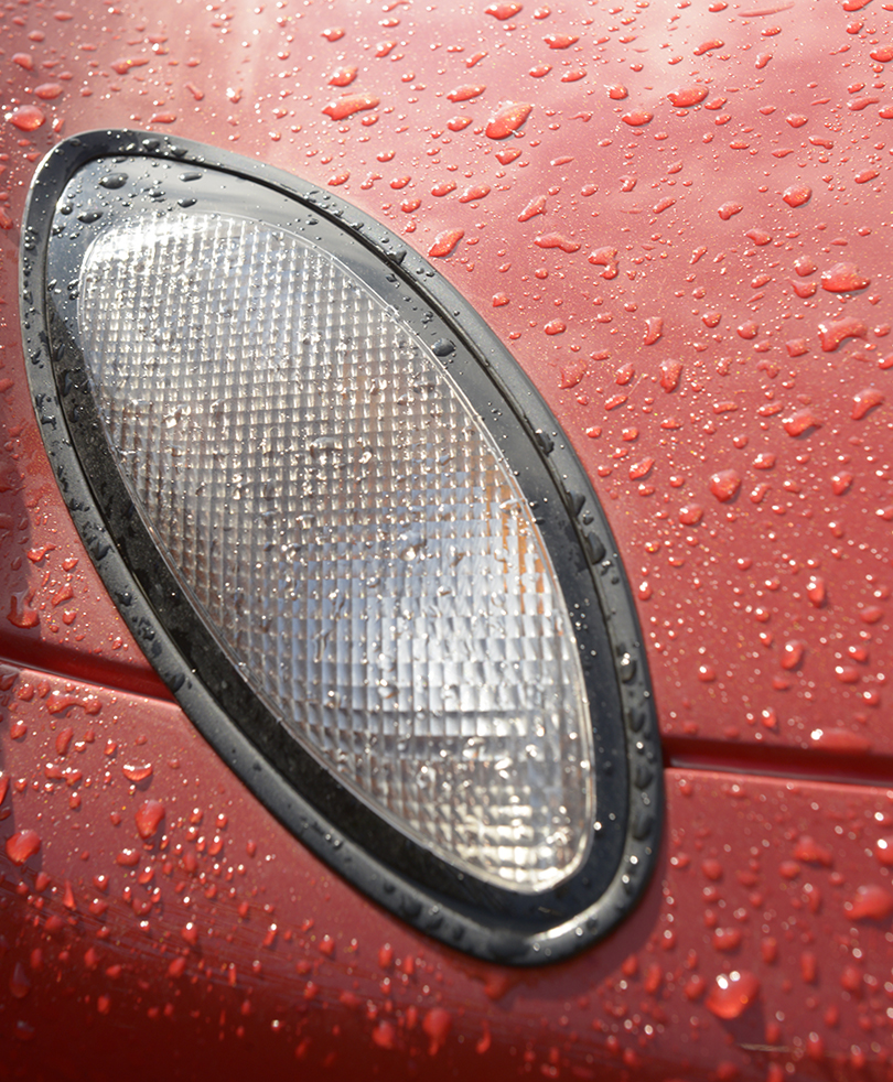
Today I went out to clean our cars after being down in Somerset with all the snow. I saw the indicator on my P&J and that was oval. It was hard to get only the indicator in as it's close to the headlight.

[url=https://flic.kr/p/24j5NBD]Wk13 Oval by Peter, on Flickr[/URL]

and as the headlight is also oval

[url=https://flic.kr/p/24AjGz3]Wk13 Oval 2 by Peter, on Flickr[/URL]

Pete
 
The temptation to do eggs is quite great for this theme, given it's Easter too. Fair play going automotive related.
The indicator pips it I believe, as there are no distractions, whereas you have the reflection of the wheel and some background in the alternative shot.
 
Nice shots for the theme Pete, I like oval 2 more
 
The chess set works well, did think it looked a little strange at first till I read about the reflection and the perspex, it does work better than the morning sun which hurts my eyes in a strange way

The second shot of the shadows were diffused because there was a lot of clould about, but the sky was bright.

I had to look at the chess pieces a couple of times before I saw the mirror work; I'm still not sure how you've done it Pete, but it woks for me and the theme. onwards and upwards.:)

Thanks John for the comment.

A nice shot for juxta, but when using perspex always make sure the dust is off it. Very good effort too.

Dust is a nightmare as you must know. I did not want to try and rub it off as the static would attact more.

Yep.
Perspex is devil to keep spotless miind.

It is.

I like the chess shots mate. I love a good reflection I do.

Thanks for you comment Ross.

Ooh, a lot of work went into the chess shot. Clever and it works well.
I thought it odd that the board folded in the middle of squares, rather than on the line (and now I think of it, it's larger than 8x8). I like it.

Thanks Tim, I was after effect rather than keeping it real.

Pete
 
Back
Top