I forgot to say, it's supposed to be an alligator - does look more like a dragon though!'ello, Letter, like it. Nice fall off, composition and detail. Nice dragon as wellWB looks a tad warm.
Electric, nice abstract photograph. Overall, well exposed and good detail.
Cheers.

You are using an out of date browser. It may not display this or other websites correctly.
You should upgrade or use an alternative browser.
You should upgrade or use an alternative browser.
weekly SixToes 2013 52 - Week 12, 13 and 14 added
- Thread starter SixToes
- Start date
- Messages
- 13,393
- Edit My Images
- Yes
Tiny catch up as way behind, sorry, your last couple of shots...
Letter - works really well, some great characters there, good focus on the 'a'
Electric - The square crop works very well and although the central bright part is not central I didn't notice at first, really like the effect you have caught and good detail of the filament coming out
Letter - works really well, some great characters there, good focus on the 'a'
Electric - The square crop works very well and although the central bright part is not central I didn't notice at first, really like the effect you have caught and good detail of the filament coming out
- Messages
- 8,398
- Name
- Lynne
- Edit My Images
- Yes
Hi Ian
Letter....great use of DOF , good colors & nicely focused on the A")
Electric....well exposed & very abstract..whioch I kinda like Only niggle for me is my OCD kicking about the outer circle not being even all the way round...closer to the light on the rhs...but that fairly minor
Letter....great use of DOF , good colors & nicely focused on the A
Electric....well exposed & very abstract..whioch I kinda like
Only niggle for me is my OCD kicking about the outer circle not being even all the way round...closer to the light on the rhs...but that fairly minorThanks DK!Tiny catch up as way behind, sorry, your last couple of shots...
Letter - works really well, some great characters there, good focus on the 'a'
Electric - The square crop works very well and although the central bright part is not central I didn't notice at first, really like the effect you have caught and good detail of the filament coming out
Thank you!Hi Ian
Letter....great use of DOF , good colors & nicely focused on the A
Electric....well exposed & very abstract..whioch I kinda like

- Messages
- 19,304
- Name
- Andy
- Edit My Images
- Yes
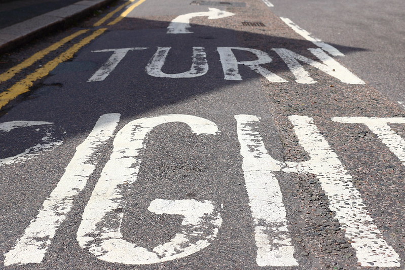
'ello, Direction, on theme, I like the low angle and really like the crop. It isn't a wow photograph but definitely on theme 
Tacky, this I like. Great detail and the metalic colour is bang on. I think I'd prefer it without the text.
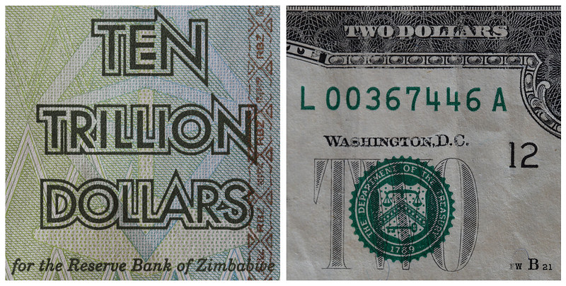
Value, $10,000,000,000 vs $2 and I suspect the latter is worth more Good detail and focus.
Cheers.
Tacky, this I like. Great detail and the metalic colour is bang on. I think I'd prefer it without the text.
Value, $10,000,000,000 vs $2 and I suspect the latter is worth more
Good detail and focus.Cheers.
Thanks for the feedback Andy. I think you hit the nail on the head with all of that. I might reshoot Tacky, I didn't have as many tacks as I thought, and like you I'm not sure about the background.'ello, Direction, on theme, I like the low angle and really like the crop. It isn't a wow photograph but definitely on theme
Tacky, this I like. Great detail and the metalic colour is bang on. I think I'd prefer it without the text.
Value, $10,000,000,000 vs $2 and I suspect the latter is worth more
Cheers.
You actually missed out three zeros from the value of the Zim note, and I'm pretty sure you're still right about the relative value!
- Messages
- 4,088
- Name
- Graham
- Edit My Images
- Yes
liking your direction shot - perfect POV and has a real "danger shot" feel to it with you being stood in the road!!
those tacks are a great subject - plenty of detail caught and I like the added interest of the yellow and blue background..
and I do rather like the juxtaposition (see - I have learnt something) of the two dollar bills you have side by side... Ten trillion dollars - sounds very close to a line from one of the Austin Powers films..
- Messages
- 8,398
- Name
- Lynne
- Edit My Images
- Yes
Hi Ian
great shot for tacky , like the contrast with the bg yellow, writing seems a tad soft though , nicely lit & plenty of detail in the tacks themselves
Direction....another 52 nutter..standing in the road for a shot
Value...good focus , nice n sharp & yup , on theme for sure
great shot for tacky , like the contrast with the bg yellow, writing seems a tad soft though , nicely lit & plenty of detail in the tacks themselves
Direction....another 52 nutter..standing in the road for a shot
Value...good focus , nice n sharp & yup , on theme for sure