You are using an out of date browser. It may not display this or other websites correctly.
You should upgrade or use an alternative browser.
You should upgrade or use an alternative browser.
weekly SixToes 2013 52 - Week 12, 13 and 14 added
- Thread starter SixToes
- Start date
Last edited:
- Messages
- 13,760
- Edit My Images
- Yes
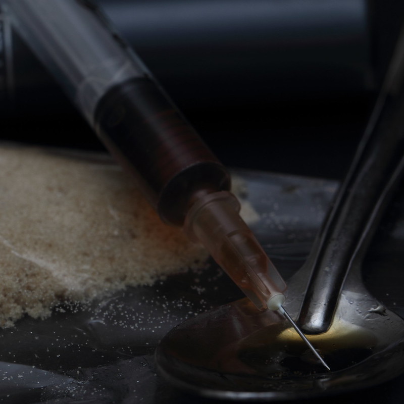
Ooo that's a great start, liking the lighting, agree with Andy about the spoon, effective dof too - Nice One 
Thanks for the feedback!ooooo - that all works for me, conveys the theme perfectly, darkness suits the theme, very nice...
Thanks, I'll have a go at making another version with the entire bowl of the spoon if time allows, and maybe use a bit more ISO to get some grain. I did have some earlier test shots that were grainy but in the end I went for the clean, dark, lowered saturation look instead.Very gritty image and well composed. I'd like to see a tad more on the right (of the spoon), but nice lighting on the needle.
Wonder what adding a bit of grain would look like.
Good start, cheers.
Thanks!Ooo that's a great start, liking the lighting, agree with Andy about the spoon, effective dof too - Nice One
- Messages
- 532
- Name
- Ray
- Edit My Images
- Yes
I dunno, the lengths some people will g to to save money on printer ink refils... 
Really like that though, completely hit the theme spot on, very effective.
Really like that though, completely hit the theme spot on, very effective.
- Messages
- 8,398
- Name
- Lynne
- Edit My Images
- Yes
Oh ,
love that image...bang on theme , dark & moody , great focus...no crit from me just a mahooosive
ps....I really can't spend the next 52 weeks calling you...SixToes
love that image...bang on theme , dark & moody , great focus...no crit from me just a mahooosive

ps....I really can't spend the next 52 weeks calling you...SixToes

Yeah, pretty sure printer ink is more expensive gram for gram! Thanks for the comment.I dunno, the lengths some people will g to to save money on printer ink refils...
Really like that though, completely hit the theme spot on, very effective.
Thanks for your comment. I do have a lighter version but I much prefer this dark one, it somehow suits the subject matter better I think.don't think the image needs anything but to be a bit lighter everything's in the picture you need
Wow... thanks a lot!Wouldn't touch it suits the theme perfect, best one I've seen, well done
Thanks!I agree i wouldnt touch it in my opinion! Looked at this and it initially gave me a shiver! Suits the theme perfectly! Well done!
Thanks for the comment - it's deliberately dark and tight - slightly claustrophobic - I have less tight and also lighter versions but for me this version worked the best.I love the interpretation of the theme and do think it needs a little more light on the spoon as you do struggle to see it slightly, personally though I think it's too tightly cropped, but I do like the shot overall. Well done
Thanks!Oh ,
love that image...bang on theme , dark & moody , great focus...no crit from me just a mahooosive
ps....I really can't spend the next 52 weeks calling you...SixToes
You could call me Mr Toes?
Thanks!dark and gritty.. suits the theme very well.. great start
Right... time to leave some feedback for other people!
So.. frustrating week. I wanted to avoid the studio shot and shoot something more found, but couldn't quite get the shot I wanted. Still, got pretty close with a couple.
I've got three options - two planned, one snapped.
The one I'm going with. I needed the snow to stop falling... but it didn't.

Week 2 - Season by 6Toes, on Flickr
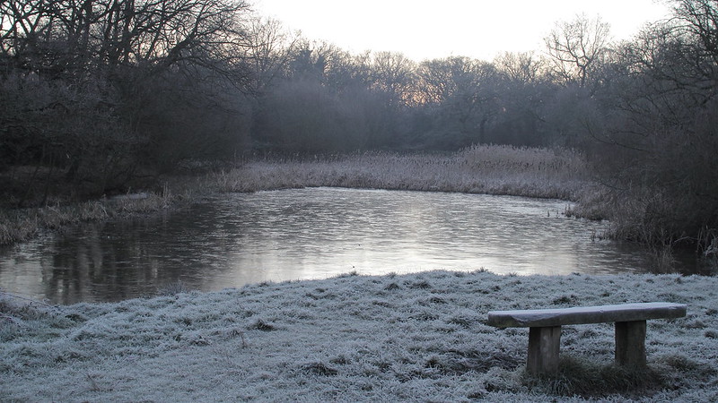
The landscape. The light got much better a few minutes later, but there is a road you can't see in the background that suddenly had a traffic jam, so this was the best of the bunch.
Week 2 - Season by 6Toes, on Flickr
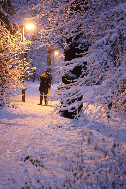
The snap. Not perfect but not bad. Annoying mixed light problems make white balance impossible, this is the best I can do without extensive editing.
Week 2 - Season by 6Toes, on Flickr
Hopefully Gravity will run a little smoother. I might move back indoors, it's easier whan you completely control the scene!
I've got three options - two planned, one snapped.
The one I'm going with. I needed the snow to stop falling... but it didn't.

Week 2 - Season by 6Toes, on Flickr
The landscape. The light got much better a few minutes later, but there is a road you can't see in the background that suddenly had a traffic jam, so this was the best of the bunch.

Week 2 - Season by 6Toes, on Flickr
The snap. Not perfect but not bad. Annoying mixed light problems make white balance impossible, this is the best I can do without extensive editing.

Week 2 - Season by 6Toes, on Flickr
Hopefully Gravity will run a little smoother. I might move back indoors, it's easier whan you completely control the scene!
- Messages
- 1,353
- Name
- Chris
- Edit My Images
- Yes
SixToes said:So.. frustrating week. I wanted to avoid the studio shot and shoot something more found, but couldn't quite get the shot I wanted. Still, got pretty close with a couple.
I've got three options - two planned, one snapped.
The one I'm going with. I needed the snow to stop falling... but it didn't.
http://www.flickr.com/photos/6toes/8400492812/
Week 2 - Season by 6Toes, on Flickr
The landscape. The light got much better a few minutes later, but there is a road you can't see in the background that suddenly had a traffic jam, so this was the best of the bunch.
http://www.flickr.com/photos/6toes/8399396801/
Week 2 - Season by 6Toes, on Flickr
The snap. Not perfect but not bad. Annoying mixed light problems make white balance impossible, this is the best I can do without extensive editing.
http://www.flickr.com/photos/6toes/8400499512/
Week 2 - Season by 6Toes, on Flickr
Hopefully Gravity will run a little smoother. I might move back indoors, it's easier whan you completely control the scene!
Out of the three I prefer the post box but it looks like it could do with straightening up a bit
The last one I reckon would have worked better without that tree in the foreground, maybe a step or two to e left would have done the trick?
Looking forward to seeing your gravity shots
Thanks!Very bold shot which has worked really well in my opinion.
Out of the three I prefer the post box but it looks like it could do with straightening up a bit
The last one I reckon would have worked better without that tree in the foreground, maybe a step or two to e left would have done the trick?
Looking forward to seeing your gravity shots
Thanks for the feedback.
It's tricky to straighten, everything in the shot is wonky! Its aligned to the horizontal rows of bricks near the top, maybe I should have used the postbox instead. I'll try it and see what it looks like, I think you're probably right that it could be improved.
Totally agree about the last one, the foreground spoils it. That wasn't the shot I was trying for, then I saw the guy with the sledge in the background stop under the light. By the time I moved he'd moved. Too slow!
Thanks for the feedback. I can see the blue tinge on my laptop, I'll check on the machine I edit on tomorrow. Pretty sure it's not blown, but again I'll check!I'm going for the post box too.. as mentioned slightly tilted.. think the snow falling adds to it.. like the textures and tones of the brick wall.. the snow on the ground has a blue tinge and is a bit blown but I quite like it on this

- Messages
- 532
- Name
- Ray
- Edit My Images
- Yes
Three good pics there, but I think I prefer the landscape. I think the bench just about makes it work.
- Messages
- 19,461
- Name
- Andy
- Edit My Images
- Yes
#1 for me, followed by #2.
Nice colours in #1. Personally I'd have gone for more snow and used flash to light it up. It's a bit wonky.
#2 is on theme as well. Very desolate. The bench is a tad close to th corner for me and I think a nice b&w conversion would suit it.
Cheers.
Nice colours in #1. Personally I'd have gone for more snow and used flash to light it up. It's a bit wonky.
#2 is on theme as well. Very desolate. The bench is a tad close to th corner for me and I think a nice b&w conversion would suit it.
Cheers.
- Messages
- 13,760
- Edit My Images
- Yes
Hi 
Another vote for the postbox shot, really like the composition, and with the minimal crit corrected would be a cracker
Also liking the 3rd shot, if the WB was done again it would be a great improvement
Another vote for the postbox shot, really like the composition, and with the minimal crit corrected would be a cracker
Also liking the 3rd shot, if the WB was done again it would be a great improvement
Yeah you were right... really blue... now corrected in this version. I really should have seen this but wasn't too happy with the original shot so did it really quickly - a lesson for me there I think!I'm going for the post box too.. as mentioned slightly tilted.. think the snow falling adds to it.. like the textures and tones of the brick wall.. the snow on the ground has a blue tinge and is a bit blown but I quite like it on this

Week 2 - Season v2 by 6Toes, on Flickr
It's also straightened aligned with the postbox. Funny thing is I'm pretty sure the phone box is actually wonky - look at the vertical lines in the cement. Personally I prefer it aligned with the wall, this one looks a little weird to me. :shrug:
ThanksThree good pics there, but I think I prefer the landscape. I think the bench just about makes it work.
Thanks, the bricks are what made it for me tooThree, great on theme shots!
The post box is the best though, love the colouring of the bricks
You mean more snow in the foreground?#1 for me, followed by #2.
Nice colours in #1. Personally I'd have gone for more snow and used flash to light it up. It's a bit wonky.
#2 is on theme as well. Very desolate. The bench is a tad close to th corner for me and I think a nice b&w conversion would suit it.
Cheers.
I think the post box is wonky, but I've put a new version up straightened as you suggest.
I'm not sure the second one has enough contrast for a decent b&w conversion, but I'll give it a go. Thanks for the feedback.
Thanks!I like the last season one with the man and sledge adding interest. I also like the light cast from the street light.
I think the phonebox is actually wonky... anyway I've put a new version upQuite like the letter box, better if it wasn't leaning to one side. Like the falling now
Thanks! I've updated the postbox...Hi
Another vote for the postbox shot, really like the composition, and with the minimal crit corrected would be a cracker
Also liking the 3rd shot, if the WB was done again it would be a great improvement
Not sure the third shot is correctable as it's low level natural light with great big blobs of sodium lights...
Sorry, meant to ask but forgot... why would you use a flash for #1?#1 for me, followed by #2.
Nice colours in #1. Personally I'd have gone for more snow and used flash to light it up. It's a bit wonky.
#2 is on theme as well. Very desolate. The bench is a tad close to th corner for me and I think a nice b&w conversion would suit it.
Cheers.
Nice 'gravity' by the way
- Messages
- 1,353
- Name
- Chris
- Edit My Images
- Yes
I reckon most likely the wall is not at 90 degrees to where you stood
Probably a little perspective tweak in photoshop would sort it
...but in terms of rotation only I would go with the bottom row of bricks being straight as its most obvious with the mortar there I think
Probably a little perspective tweak in photoshop would sort it
...but in terms of rotation only I would go with the bottom row of bricks being straight as its most obvious with the mortar there I think
I made a B&W version, I kind of like it but the increased contrast lessens the wintriness of it, and you lose the slight colouration in the sky.#2 is on theme as well. Very desolate. The bench is a tad close to th corner for me and I think a nice b&w conversion would suit it.

Week 2 - Season BW conversion by 6Toes, on Flickr
Yeah could be. DPP doesn't have that option for the lens I used for this - think the latest version does, I'll update and see if I can adjust it.I reckon most likely the wall is not at 90 degrees to where you stood
Probably a little perspective tweak in photoshop would sort it
...but in terms of rotation only I would go with the bottom row of bricks being straight as its most obvious with the mortar there I think
So... gravity. Most of my ideas so far are pretty lame - more thought needed!
Last edited:
- Messages
- 4,088
- Name
- Graham
- Edit My Images
- Yes
Love the post box - the bright red works really well against the snow and the colour of the bricks.
The first one definately looks tilted to me, but the second doesn't look right either. But neither of them is off by a huge amount - so I say split the difference and have it half way between the two
The first one definately looks tilted to me, but the second doesn't look right either. But neither of them is off by a huge amount - so I say split the difference and have it half way between the two

- Messages
- 8,398
- Name
- Lynne
- Edit My Images
- Yes
Hi ya
that letter box shot is fab....straightened version is even better...simple , great colors....love it
I'm also liking the 2nd image...has a superb wintery feel to it...deep frost with a hint of color in the sky...
that letter box shot is fab....straightened version is even better...simple , great colors....love it

I'm also liking the 2nd image...has a superb wintery feel to it...deep frost with a hint of color in the sky...
Heh - that's probably the way to go!Love the post box - the bright red works really well against the snow and the colour of the bricks.
The first one definately looks tilted to me, but the second doesn't look right either. But neither of them is off by a huge amount - so I say split the difference and have it half way between the two
Thanks LynneHi ya
that letter box shot is fab....straightened version is even better...simple , great colors....love it
I'm also liking the 2nd image...has a superb wintery feel to it...deep frost with a hint of color in the sky...
Week 3 - Gravity
Week 3 - Gravity by 6Toes, on Flickr
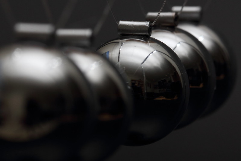
I struggled to make my ideas work this week. I should have been able to work this out in advance, but it turns out it's hard to make decent pictures of highly reflective spherical objects! You need a big black room and a long lens to keep reflections under control :bang:
So.. onto Wild!
- Messages
- 7,245
- Name
- Christine
- Edit My Images
- Yes
Still trying to catch up with all the commenting, sorry have missed you so far.
Sin - very gritty image and like the darkness of it.
Season - cannot make up my mind between postbox (prefer original with tilted box rather than second with angled wall) or the one of the guy in the snow. The tilt in this one bothers me, the streetlamp looks upright but the man and tree both look tilted - wonder if the same person installed both box and lamp. I really liked the lighting in the latter - the mix suits it.
Gravity. Sounds like you worked hard on this but I am not keen, the large out of focus area to the left and not being able to see clearly what it is don't work for me. As I have a good idea what it is I wonder if you could have done a shot of it moving? Then with the frame in focus and the other parts on the move you would not have had to worry so much about the reflections maybe
- Messages
- 532
- Name
- Ray
- Edit My Images
- Yes
Quite like the gravity one too. I think I'd agree to perhaps crop some of the foreground to the left out. Bang on theme though, and even named after Mr Gravity himself.
- Messages
- 8,398
- Name
- Lynne
- Edit My Images
- Yes
Hi Ian 
Gravity....wish I still had one of those...used to watch them for hours...almost like water torture but more calming
Anything thats shiny can be a mare ,maybe a light tent is the answer ? agree about losing the oof balls to emphasize the in focus one...& some motion would have been the icing on the cake

Gravity....wish I still had one of those...used to watch them for hours...almost like water torture but more calming

Anything thats shiny can be a mare ,maybe a light tent is the answer ? agree about losing the oof balls to emphasize the in focus one...& some motion would have been the icing on the cake
Sorry about the slow replies, I've been ill the last few days but all better now.
I really finding I'm struggling for time on this, but just about managing to keep up with the themes! I'm hoping it will get a bit easier when the days get longer. Also my commenting on others has been poor so far, I'll try to get better at that as well. :shake:
Sin - Thanks!
Season - I still prefer the alignment of the first postbox too, and it's nice to find someone who likes the third shot! I like the colour in it as well. I think maybe everything around this edge of Epping forest is a bit wonky.
Gravity - I feel like I worked hard but not smart, although I'm reasonably happy with the result. It's cropped pretty tight because the cradle has a really ugly frame I wanted to keep out of picture. It's in motion which is why you can see so much of the third ball, the first and second are on their way in to hit it. I have another one like this but with a lot more of the third balls face showing but I really dislike the reflections, so went with this one. It was shot with flash which removes the motion - I'd have to reshoot in decent ambient, I agree it might make it more interesting.


I really finding I'm struggling for time on this, but just about managing to keep up with the themes! I'm hoping it will get a bit easier when the days get longer. Also my commenting on others has been poor so far, I'll try to get better at that as well. :shake:
Thanks for the feedback. No worries about feedback, you're WAYYY ahead of me on that!Still trying to catch up with all the commenting, sorry have missed you so far.
Sin - very gritty image and like the darkness of it.
Season - cannot make up my mind between postbox (prefer original with tilted box rather than second with angled wall) or the one of the guy in the snow. The tilt in this one bothers me, the streetlamp looks upright but the man and tree both look tilted - wonder if the same person installed both box and lamp. I really liked the lighting in the latter - the mix suits it.
Gravity. Sounds like you worked hard on this but I am not keen, the large out of focus area to the left and not being able to see clearly what it is don't work for me. As I have a good idea what it is I wonder if you could have done a shot of it moving? Then with the frame in focus and the other parts on the move you would not have had to worry so much about the reflections maybe
Sin - Thanks!
Season - I still prefer the alignment of the first postbox too, and it's nice to find someone who likes the third shot! I like the colour in it as well. I think maybe everything around this edge of Epping forest is a bit wonky.
Gravity - I feel like I worked hard but not smart, although I'm reasonably happy with the result. It's cropped pretty tight because the cradle has a really ugly frame I wanted to keep out of picture. It's in motion which is why you can see so much of the third ball, the first and second are on their way in to hit it. I have another one like this but with a lot more of the third balls face showing but I really dislike the reflections, so went with this one. It was shot with flash which removes the motion - I'd have to reshoot in decent ambient, I agree it might make it more interesting.
Thanks, I might reshoot to try for more motion, I agree that it would probably help to have a little more obvious motion on the first and second ball. I tried a square crop keeping the right hand side but didn't like it.I rather like Gravity. I also don't mind the reflections.
I had a quick crop and removed a chunk of the OOF FG balls and preferred it.
Some motion would add interest.
Cheers.
Thanks!Quite like the gravity one too. I think I'd agree to perhaps crop some of the foreground to the left out. Bang on theme though, and even named after Mr Gravity himself.
Thanks!Gravity. Love it.
Hi! I bought it just for this, for the princely sum of £4.99 from Argos. Yeah I think a tent could be the way to go. And more sense of motion would probably improve it!Hi Ian
Gravity....wish I still had one of those...used to watch them for hours...almost like water torture but more calming
Anything thats shiny can be a mare ,maybe a light tent is the answer ? agree about losing the oof balls to emphasize the in focus one...& some motion would have been the icing on the cake
Thanks!Great idea with gravity, I always wanted one of those as a kid and wondered if they would just go on forever and ever
Shiny things can be really fiddly so I think you've done well


