weekly SixToes 2013 52 - Week 12, 13 and 14 added

Week 4 - Wild

Week 4 - Wild by 6Toes, on Flickr

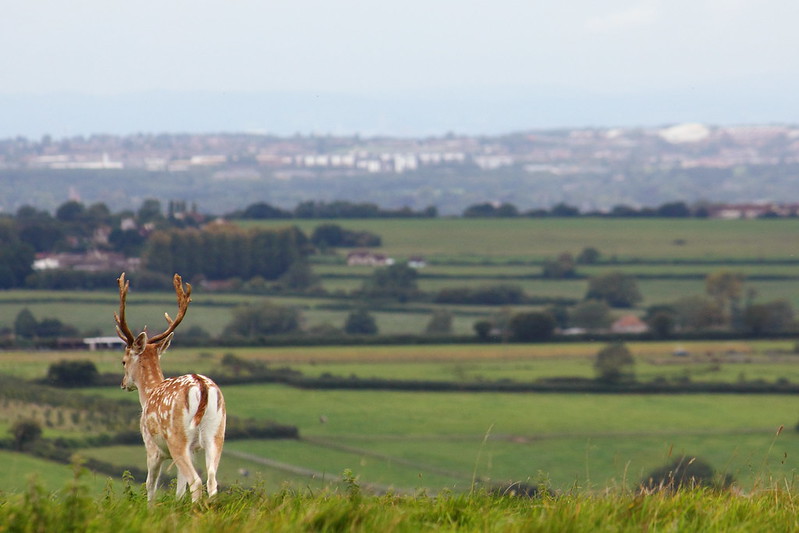
No time to make a new photo that I'd be happy with, so this is from 2011. It's the first time I've processed it. I liked the juxtaposition of the wild animal against the town in the distance.
 
Stands out very nicely, would have preferred a front View so it was walking into the frame rather than out :)
I figured it looks like he's contemplating the town in the distance. But yeah, would have been nice to have been able to tell him where to stand! :)
 
Week 5 - Space


Week 5 - Space by 6Toes, on Flickr

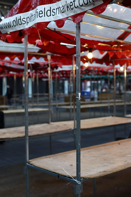
This shows the empty space in Spitalfields market before the days trading begins.

There is an alternative to this in my Flickr photostream but I think this is the better one.
 
Love it. There's a real vacuum there waiting to be filled.

Technically very good too. (y)
 
Hi Ian


Wild.....like it...the deer is wonderfully sharp, the DOF just right :) Love that a wild creature is surveying the sprawling town/city in the distance (y)

Space.....spot on...just waiting to be filled up , lovely n sharp , good use of DOF (y)
 
Yeah really like your space photo, as other have said DoF is spot on, just to get the stall in front nicely in focus, as its moving away and back to the right at an angle I think you'd did we'll with it, I like the lit bulb adding a bit of interest too
 
Really nice wild shot.

I really like the space shot too, spot on theme and shows how todays markets generally are.
 
Thanks everyone, really appreciate the feedback. I've replied in turn below.

Running low on mojo this week but at least I know what I'm doing for Work now. Just need to shoot and edit it.

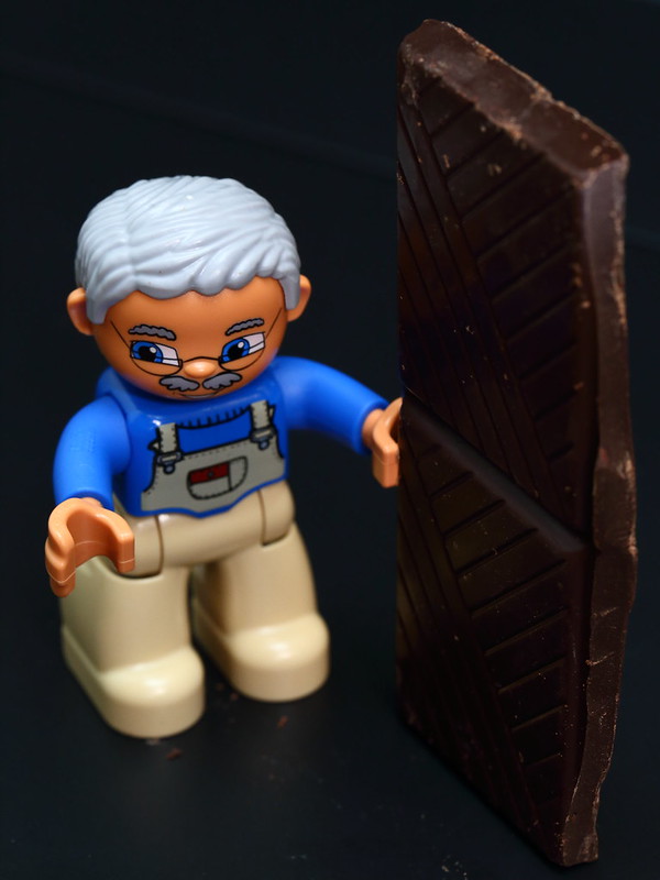
Not too keen on Gluttony as a theme as I think it's kind of difficult to come up with an interesting interpretation - I do have the beginning of an idea but I reckon it needs about 150kg of chocolate! It needs thought. :thinking:


Hi, you made the right choose (y)

Great detail, depth and on theme. The red at the top really works do me.

No crit.

Cheers.
Thanks Andy! (y)

Nice shot, love the depth of field.

You made the right choice out the two shots.
Cheers!

Love it. There's a real vacuum there waiting to be filled.

Technically very good too. (y)
Thank you! (y)

Hi Ian


Wild.....like it...the deer is wonderfully sharp, the DOF just right :) Love that a wild creature is surveying the sprawling town/city in the distance (y)

Space.....spot on...just waiting to be filled up , lovely n sharp , good use of DOF (y)
Thanks! I really like that deer shot. Sometimes you get lucky. ;)

Yeah really like your space photo, as other have said DoF is spot on, just to get the stall in front nicely in focus, as its moving away and back to the right at an angle I think you'd did we'll with it, I like the lit bulb adding a bit of interest too
Cheers. Some of the bulbs were unlit but like you say this worked better.

I like that, very minor crit for me that the web address is clipped at the top - but love the DoF and the vast emptiness captured/portrayed (y)
Thanks :) I wondered if anyone would mention that. I really wish the URL wasn't there at all, but couldn't crop it out without screwing the top of the image up. Every single stall there has that banner on it!

Really nice wild shot.

I really like the space shot too, spot on theme and shows how todays markets generally are.
Thanks :)
 
Damn, I'm two weeks behind and there's no way I'm going to get anything posted before next Tuesday. I'll catch up though - don't go marking me as AWOL!
 
Work - Good idea and well lit but it's unfortunate that the end of the key is slightly cropped.

Gluttony - Love it, very original.

Time - not too sure about the crop on this one either.
 
Work - Good idea and well lit but it's unfortunate that the end of the key is slightly cropped.

Gluttony - Love it, very original.

Time - not too sure about the crop on this one either.

mmm think Jim has the C&C spot on I like them all good work

Craig

Thanks guys.

'Work' - the end of the key isn't cut off but it is very close to the edge of the frame. I'll have a look at giving it more breathing room.

'Gluttony' - Thanks!

'Time' - I don't mind the crop, but overall I'm not that keen on this shot. A picture of a watch is a bit obvious and I couldn't really get into it. I think my disinterest shows in the finished image. Think I'll try an alternative to this in the next few days.
 
Hi Ian

Time...like the tones in this shot & the focus on the hand...needs a slight ccw rotation to get the 12 dead top ,crop's already been mentioned....we all have weeks that just don't inspire but you got a shot in so onwards & upwards to .....Juxtaposition ...ye gods :eek:

Work...cracking detail in the cogs & nicely lit..like it :)

Gluttony...I struggle with lego shots but it is original...though criminal to use dark chocolate ( least that's what it looks like) on a toy :LOL:

Thanks Lynne. On 'time' I quite like the slight wonkiness of the watch face, I'm weird like that I guess! I like the theme, it's just what I did with it I'm disappointed with. But time was short,and like you say at least I got a shot in! ;)

Work - thanks! This should have been easier than it was, my flash gear was playing up. One flash was completely dead and I had no spare batteries, and the trigger unit was low on power too so my remaining flash was only firing about 50% of the time. Pretty happy with how it turned out though.

It was dark, but don't worry no chocolate was wasted in the making of Gluttony! It was happily consumed by yours truly immediately after I made the shot. (y)
 
Work - Original idea, and great capture on the clockwork. The vertical line in the background to the left is a little distracting, but not a big deal, it still really works for me.

Gluttony - another great idea. The guy's sneaky expression adds to it well. :)

Time - Great capture. I'm not 100% on the crop, but the rest looks fantastic.
Work - Thank you. It's actually a toy turned upside down to better expose the mechanism. The line is one of it's legs. I'm not much cop at PP but I should bite the bullet and have a go at cloning it out - I like the toy too much to cut one of its legs off!

Gluttony - I'm glad you noticed the sneaky look he has! He normally looks quite benevolent but from that angle his smile is hidden and he looks a bit shifty. I think I could maybe have put his right arm in a better position but I'm happy with how it turned out.

Time - Thanks! I'm going to have to reshoot this at some point, I'm not that happy with it. Something other than a watch ideally!
 
Did some testing this evening, think I know what I'm doing for Juxtaposition now. Hopefully I can shoot it over the weekend!
 
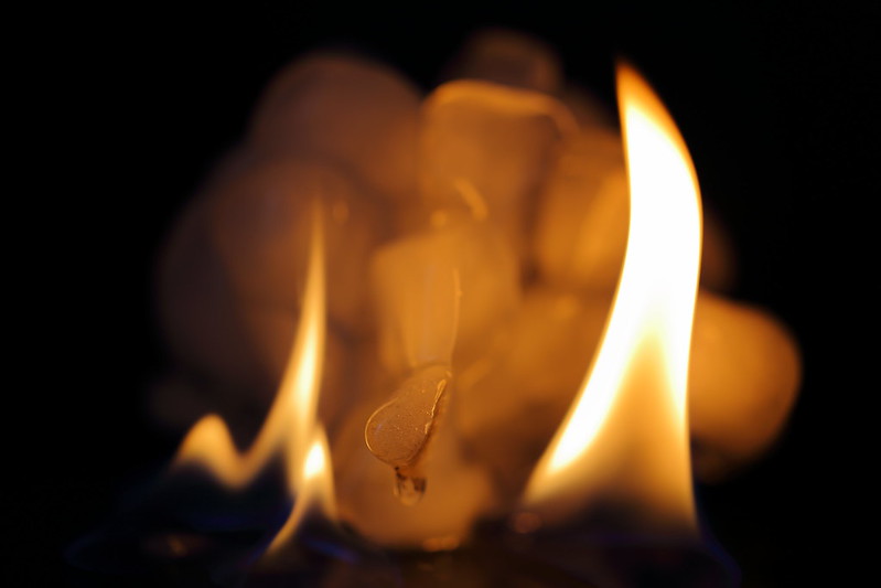
Shot #1 for me, shows the full flame. I know how hard this is to do, I had many shots where the flame extended out of frame, not something easily controlled in the time you have to take the shot.
Also liking the blue in the flame on the first pic. Well done from me.
 
#1 for me too, would have gone for #2 as the flames are much better - but the fact you don't have their tops lets it down.

Great work keeping the black BG nice and black too.

Guess a good example of where shooting wide and cropping a bit if necessary would have helped. Although not knowing how far the flames would go can't have made this easy!

Nice one (y)
 
Hi again,

Think next time I would do all shots in portrait, just to allow for capturing the whole flame.

I would also think more about the composition of the overall shot next time, and do a bit of cropping to balance the shot.

I forgot to say that I too had trouble keeping the flame alight for long when the ice was in the same shot. I stunk the room out with all the lighter fluid I used :D

(y) well done in capturing the blue's in the flame too.
 
#1 for me too, would have gone for #2 as the flames are much better - but the fact you don't have their tops lets it down.

Great work keeping the black BG nice and black too.

Guess a good example of where shooting wide and cropping a bit if necessary would have helped. Although not knowing how far the flames would go can't have made this easy!

Nice one (y)

Hi again,

Think next time I would do all shots in portrait, just to allow for capturing the whole flame.

I would also think more about the composition of the overall shot next time, and do a bit of cropping to balance the shot.

I forgot to say that I too had trouble keeping the flame alight for long when the ice was in the same shot. I stunk the room out with all the lighter fluid I used :D

(y) well done in capturing the blue's in the flame too.

Thanks to you both for commenting :)

I agree that leaving space to crop would be a good idea.

Allie, please could you enlarge on "...think more about the composition of the overall shot next time, and do a bit of cropping to balance the shot"? Do you mean to centre it more, or to shoot it so that the blue flame is more symmetrical or maybe something else? It's great to get some detailed feedback! (y)


Having has some time to reflect...

The more I look at these the less I like the first one. It has the best colour (the nice blue bit) but apart from that it seems a bit dull. The ice looks boring for some reason (probably too fresh) and flame seems a bit disconnected from it despite the blue base.

I prefer the more dynamic feel of the second one. I'm not that bothered about the missing flame top, I actually quite like the squared off top mimicking the similar shape in the bottom of the picture. The ice has softened a bit at this stage so it starts to look more interesting.

But my favourite is probably the third. I like the round shaft of melting ice projecting out of the mound with flame either side of it and the drip that is appearing. I also like the ice taking on the colour of the flame. I wish I'd given it more depth of field though, too much of it is out of focus.
 
Done this and not easy to get detail/colours so well done. I do like the dynamic nature of #2 but I'd like to see all the flame. Now I know it's not easy, but I rather the ice cubes weren't as melted.

Cheers.
 
Done this and not easy to get detail/colours so well done. I do like the dynamic nature of #2 but I'd like to see all the flame. Now I know it's not easy, but I rather the ice cubes weren't as melted.

Cheers.
Thanks Andy. Interesting to get feedback on the cubes shape, originally I wanted a clean tower of very square cubes but I couldn't get them to stack, and in the end gave up and chucked them into some tinfoil and back in the freezer resulting in the jumbled up structure you see here. If I was doing it again I'd go for much better defined cubes like you suggest or a much more random shape like you see in the third one.
 
Hi ya


yup , had a go at this for a theme last year so I know it really ain't easy...#1 for me...all in frame , good blue color in the flame , lovely black bg & I like the way the liquid appears to be pooling at the bottom....:clap:

Ps...I used brandy for my shots(really cheap stuff)...lethal it was...might try again with lighter fluid (y)
 
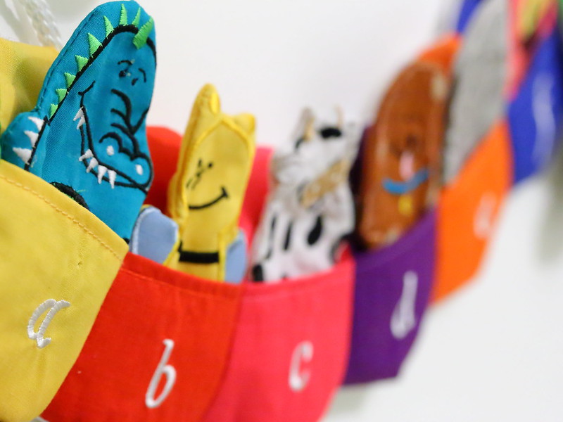
'ello, Letter, like it. Nice fall off, composition and detail. Nice dragon as well :D WB looks a tad warm.

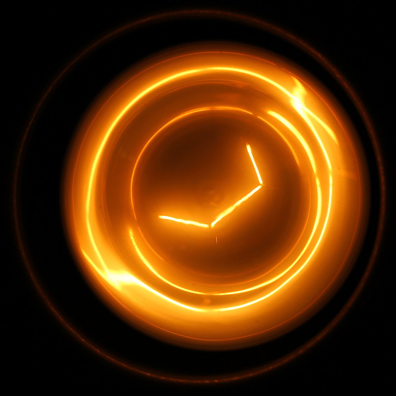
Electric, nice abstract photograph. Overall, well exposed and good detail.

Cheers.
 
'ello, Letter, like it. Nice fall off, composition and detail. Nice dragon as well :D WB looks a tad warm.

Electric, nice abstract photograph. Overall, well exposed and good detail.

Cheers.

Thanks Andy... Letter was more than a tad warm, I've updated it now! :)
Mustn't... rush... processing... :bang:


(Updating the image seems to have knackered Flickr's image caching.. hopefully it'll sort itself out in the next few minutes.)
 
Last edited:
Back
Top