You are using an out of date browser. It may not display this or other websites correctly.
You should upgrade or use an alternative browser.
You should upgrade or use an alternative browser.
weekly StuartPearson 52 for 2021 - Week 52 - Showcase
- Thread starter StuartPearson
- Start date
- Messages
- 1,293
- Name
- Stuart
- Edit My Images
- Yes
- Messages
- 1,293
- Name
- Stuart
- Edit My Images
- Yes
Numbers: lovely image, great use of DoF and plenty of detail in the close up.
Toys: sorry, I don't get it (but it is nicely colourful)
Thanks, I'm not sure anyone will get the Toys image!!
- Messages
- 4,331
- Name
- Martin
- Edit My Images
- Yes
You've certainly set us a puzzle with toys. Out of focus coloured pencils? Rolls of electrical tape (probably not much of a toy)? Sticks of rock?
- Messages
- 8,301
- Name
- Ian
- Edit My Images
- No
This is the best guess IMO.Out of focus coloured pencils?
I have no clue.
- Messages
- 1,293
- Name
- Stuart
- Edit My Images
- Yes
It’s probably going to be too obscure to work out, as you can see there are five objects that would have the same description with different colours. The camera is stationary, they are not.
- Messages
- 1,293
- Name
- Stuart
- Edit My Images
- Yes
- Messages
- 795
- Edit My Images
- No
I must say I like the both of the toy shots. The 1st is really good it’s just that like the other comments I can’t work out what it is but it’s a cracking abstract ICM shot. The second version of toys is really cool as well, I love the effect you’ve used to create the coloured ring 
- Messages
- 1,293
- Name
- Stuart
- Edit My Images
- Yes
- Messages
- 1,293
- Name
- Stuart
- Edit My Images
- Yes
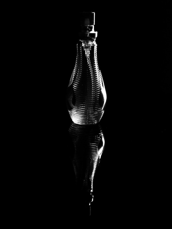
Perfume bottle, "artificial" scentNice mono for the theme. Worrisit?
I also considered this image with three bottles, but initially disregarded it in colour as the third bottle has a red colouring to the glass. Once converted to mono it looks better and is potentially better than the single one, what do others think?

Last edited:
- Messages
- 1,293
- Name
- Stuart
- Edit My Images
- Yes
I appreciate your comments, it's probably reflection used for the "sake of it" and might be too much. I'm regularly guilty of over complicating an image when something simpler works. We follow the themes in the camera club I'm a member of, we have a recurring use of the IKEA tile producing the reflections in our images so that's my excuse!!Not sure of the composition to be honest seems very unbalanced for some reason not sure it needs all of the reflection, that was very helpful wasn’t it.
- Messages
- 5,919
- Name
- Dominic
- Edit My Images
- Yes
Artificial
I think you've picked the right shot, I like the simple composition. The bright area on the bottom left, is a little distracting, I guess it's the light shining through. The reflection is good, the light on the right hand side is about right. So all in all, a good job.
I think you've picked the right shot, I like the simple composition. The bright area on the bottom left, is a little distracting, I guess it's the light shining through. The reflection is good, the light on the right hand side is about right. So all in all, a good job.
- Messages
- 8,301
- Name
- Ian
- Edit My Images
- No
I think the second one is my preferred shot. It's nicely balanced and I'd be tempted to add a bit of black round the outside to give it a bit more space, with a thin white border to set it off. The first shot feels less balanced - almost as if the "middle" of the image is above the middle. Again, perhaps a canvas extension to the top might help balance it? Dunno.
Nice clean contrasty images that still hold a lot of tone. I think that's why I prefer the 2nd one too, as it has more tones in it. Obviously if high contrast was your aim, then the 1st suits that better.
Nice clean contrasty images that still hold a lot of tone. I think that's why I prefer the 2nd one too, as it has more tones in it. Obviously if high contrast was your aim, then the 1st suits that better.
- Messages
- 1,293
- Name
- Stuart
- Edit My Images
- Yes
I’d just like more black space around it to throw it back a bit, it looks a bit too tight at the moment to me.
Thanks, leaving space is something I forget about, thinking it's all about the main subject without considering the background. I did try artificially adding more black space around the edge and it did look better, there was definitely a better balance.
Last edited:
Scots_quine
In memoriam
- Messages
- 1,753
- Name
- Joan
- Edit My Images
- Yes
Much prefer the first shot. The second might work with the same lighting as the first though. I may have been tempted to 'delete' the metal top from the bottle!
- Messages
- 1,293
- Name
- Stuart
- Edit My Images
- Yes
Week 21- Pattern(s)
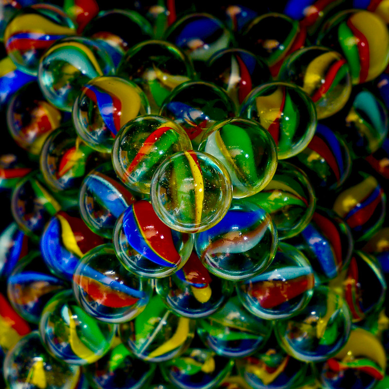
Pyramid of colour by Stuart Pearson, on Flickr
I also considered other options with the marbles, using the on-board flash.

I did try getting all the same colours in a row, but when I was trying to align them I was getting a "magnetic" effect where as one marble was lowered into the row a different one would physical move a couple of inches up and to the right before rejoining the rest, it was very strange and happened repeatedly. I also realised that I didn't have as much variety in the marbles as I thought once they were rotated.

Pyramid of colour by Stuart Pearson, on Flickr
I also considered other options with the marbles, using the on-board flash.

I did try getting all the same colours in a row, but when I was trying to align them I was getting a "magnetic" effect where as one marble was lowered into the row a different one would physical move a couple of inches up and to the right before rejoining the rest, it was very strange and happened repeatedly. I also realised that I didn't have as much variety in the marbles as I thought once they were rotated.
Last edited:
- Messages
- 4,331
- Name
- Martin
- Edit My Images
- Yes
First shot the best for me, you are patient person to spend time stacking them like that. Didn't know they still made marbles.
- Messages
- 1,293
- Name
- Stuart
- Edit My Images
- Yes
I created a cut out template which retained the marbles within the square for the base layer, the other layers were just added one marble at a time, with 6 ascending layers there is 91 in total (36 + 25 + 16 + 9 + 4 +1). I do tend to have a lot of patience and don't get easily annoyed which helps.didn't notice they were stacked into pyramid. That must have taken some doing.

- Messages
- 2,156
- Name
- Nick
- Edit My Images
- Yes
Ah, c'mon, there's got to be glue involved!
The pyramid is great. I was always fascinated by the patterns inside marbles as a kid. There's a vintage look to the colours, and I'm guessing that's because they use the same colouring now as they did back then.
The pyramid is great. I was always fascinated by the patterns inside marbles as a kid. There's a vintage look to the colours, and I'm guessing that's because they use the same colouring now as they did back then.
- Messages
- 3,384
- Name
- Kell
- Edit My Images
- Yes
Love that first pattern shot. And not just because I love marbles.
I love the multiple patterns you've captured - from the pyramid, the the big X, to the patterns within the marbles themselves.
I also watched a 'How it's made' recently that showed how they make marbles. Who'd have thought they'd go to that much bother?
I love the multiple patterns you've captured - from the pyramid, the the big X, to the patterns within the marbles themselves.
I also watched a 'How it's made' recently that showed how they make marbles. Who'd have thought they'd go to that much bother?
- Messages
- 1,293
- Name
- Stuart
- Edit My Images
- Yes
I’ve certainly binge watched “how it’s made/how do they do that” type series. It’s fascinating when you see what’s involved, I’m sure I’ve seen the marbles one too and it did appear a complex process producing the end result.I also watched a 'How it's made' recently that showed how they make marbles. Who'd have thought they'd go to that much bother?
- Messages
- 3,384
- Name
- Kell
- Edit My Images
- Yes
- Messages
- 1,293
- Name
- Stuart
- Edit My Images
- Yes
- Messages
- 4,331
- Name
- Martin
- Edit My Images
- Yes
Ducks always look like their beaks are doing one thing while their eyes are doing another.
- Messages
- 4,637
- Name
- Pete
- Edit My Images
- Yes
Nice close up of the Duck Stuart, love the detail in the feathers and the sharpness. Water looks good too.
Pete
Pete


