OP
- Messages
- 242
- Name
- Vicky
- Edit My Images
- No

Handmade - Nice shot, good colours and angles of the pencils
Abstract -very interesting! Like the reflection in the glass. Nice background.
Soft - love puddy cat! They are very soft. Lovely colours and markings, and the angle again is great.
Shiny - could have been one for abstract. Definitely shiny, nice clean image.
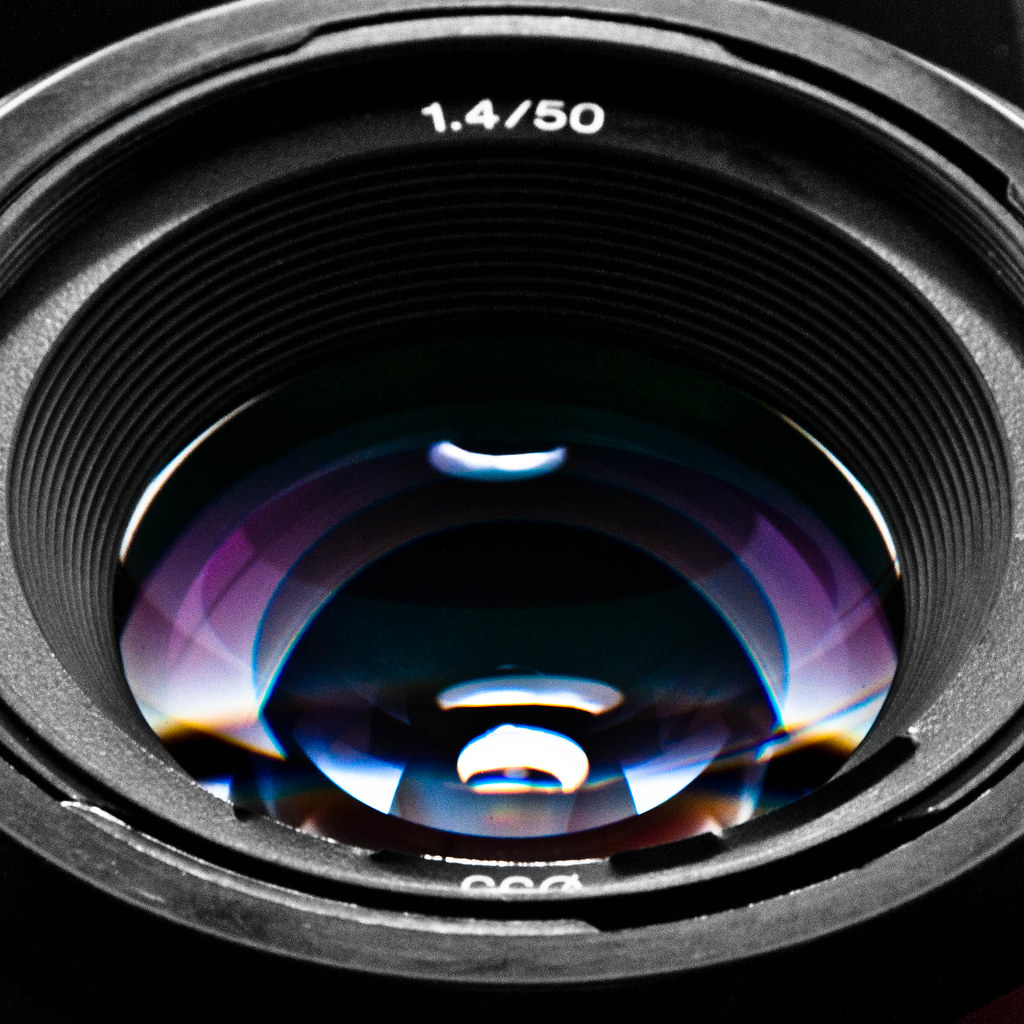
Symmetry - good lens shot. Simple and well executed.
Strong composition in all pictures!
") I'm not quite sure how I feel about shiny - like the first version of abstract, something's not quite right, but I can't put my finger on it.
I'm not quite sure how I feel about shiny - like the first version of abstract, something's not quite right, but I can't put my finger on it.
 So disappointed.
 It is like one of those old sepia shots where they applied a colour wash to certain parts afterwards. Pity that there was 2 lines of trucks as one would have been better because the engine is obscured/ cut off, but that is what you had to work with.
 but, without flogging the technique, it might lend itself to the treatment in Industry.
Shiny - certainly shiny and good colour. But I am not sure whether there is a focus and there is no context to what is the object so it leaves me a bit underwhelmed.
Symmetry - good idea, well executed. Light reflections are particularly good with nice exposure
Industry - i really like the sepia/washed out treatment - suits the subject.
I love the treatment too - I have a full colour version on Flickr, but it looks too modern. The engine is displayed separately from both rows of trucks, so no possibility of getting a shot with them all together, unless we moved everything around... and considering I made my husband haul a heavy bin out of the shot already I think I'd exhausted my good will there! The main reason why I framed it like that was because it got in all three things together: Trefor (the big red bit in the background - one of the mine shafts), the coal carts, and the valleys in the background. The triumvirate of Welsh mining, as it were.Leave - another good idea but in mono i find the subject a bit hard to work out. Colour would probably be too busy
 I've noticed already that when taking shots I'm bearing so many past comments in mind and they're making my shots that little bit better (see bin comment above...!).
Hi Vicky, really like your industry shot, what processing did you do on this? It works really well. Leave, I like the take on the theme and a little difficult to choose between the 2, I keep going to the b+w version though, the effect on the cutlery is pretty cool, 2 version is nice, but the b+w takes top spot for me.
Thanks for the comments, interesting divide in opinion on Leave... Having just spend, over 2 days, about 12 hours filtering and editing my TP meet photographs I'm frazzled so can only manage to comment of a few...Hi, Vicky, your doing a cracking job of catching up
Abstract edit is a cracker: vivid colours, flair on the glass and I actually like the reflection of the hut.
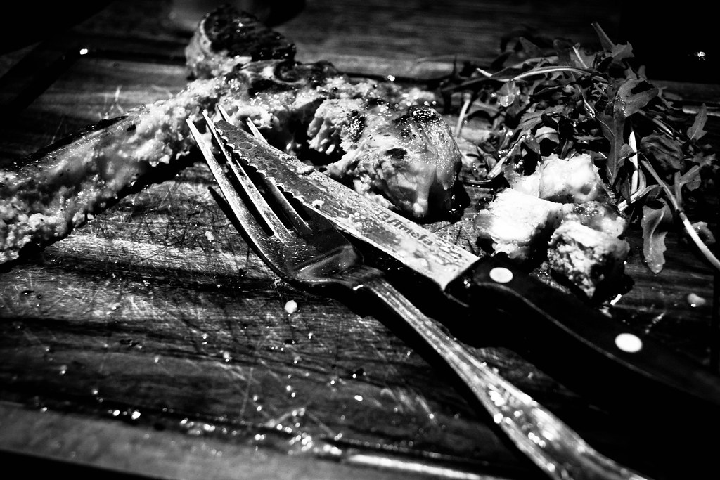
Leave (B&W), really like this one. It looks very grim, almost like Hannibal Lecter's plate
Industry, well processed. Think I's like to see it from looking more towards the writing on the cart, if you know what I mean
Cheers.
Unfortunately my catching up is about to slow right down - came home from work yesterday to take a couple of shots and some part of my camera is covered in dust. Definitely the camera and not the lens No idea how it's happened but today's lunch hour is given over to shopping for cleaning supplies and this evening will be much crossing fingers!Handmade Im afraid I dont get the connection with the theme but I do like the photo. Nice angle & DoF
Abstract I like the inverted refraction through the glass and the edit is far brighter and gets my vote of the two
Soft Definitely soft and an aaahhh picture
Shiny I cant decide what this is water on foil?
Symmetry Nice and symmetrical and I quite like the tones in the shot
Industry Youve caught a real example of past industry there and the toned down pping works well
Ooh I hadn't noticed that - thanks, I'll remove it.Leave On theme with my preference being the colour version. The only niggle is the blue line on the fork
Hope your camera recovers soon. You were doing a good job at starting to catch up
After a good clean last night it's almost back to normal - just one or two tiny spots which I can work around. I'm going to keep going with cleaning it until it's back to normal. In the meantime I've taken this as a sign that I should order the new camera I've been eyeing up, so that's now on its way to me - hopefully it'll arrive ready for the weekend. It might even be my joy picture...!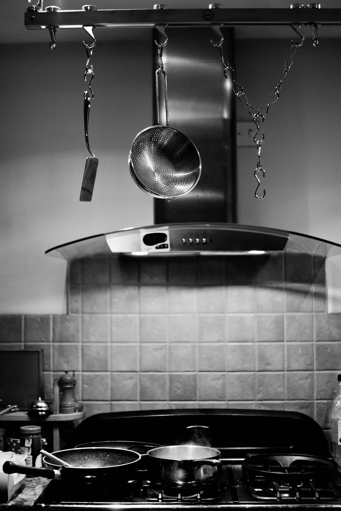

 Perhaps bottom of stand should not be cropped so tight
...and one more, because my wonderful husband decided to play along:
Secure
...I feel compelled to mention that the handcuffs were bought specifically for this shot (and I have the eBay receipts to prove it!).
Hi Vicky
Joy - good idea. Perhaps not centred and the 'j' seems to have swung round slightly. Difficult lighting but the 'joy' stands out well. I like the way that the shiny reflective surfaces at the top have been handled but the tiles lack detail. Really original idea
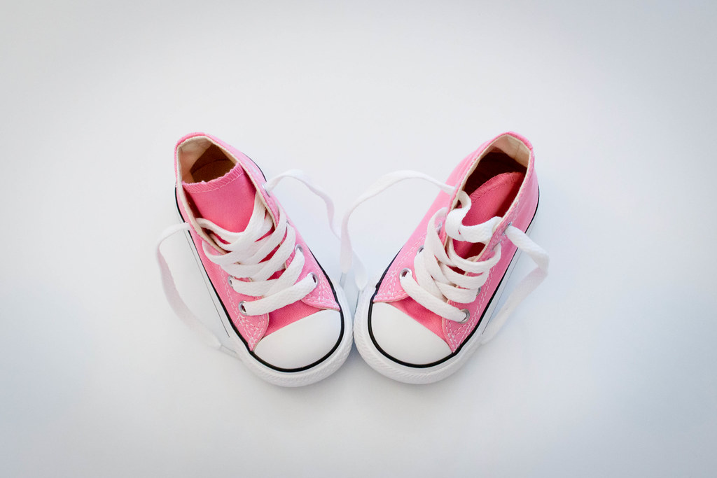
Sweet - like the different colours and a good black background. Well handled lighting and I like the composition woth the top one breaking up and the bite out of the bottom one .
Secure - Spot on theme. Good spare treatment - maybe a little too much space to left. like the focus and the mono adds to the pic.
Some very nice shots in your thread!
I particularly like the abstract reshoot.
I think your joy offering is a really good idea.
Maybe people who don't know the themes etc wouldn't actually spot the word at first
so perhaps there's a kind of a hidden message aspect to it?
really like what you did with sweet
hi Vicky, took me ages to see the Joy in your joy shot because my attention was on the oven, I think a tighter crop would improve this. Sweet is lovely, I always like colour, and it's even better when the rest of the shot is neutral. Only niggle is that the biscuits seem a little oof to me. secure, good shot
 My main concern is the bright BG above the hob.
 but I like it. It have a very photo-documentary feel to it and B&W was the only choice. Hands look a tad bright in place.
Hi, Vicky, you're catching up fast
Joy in B&W works really well. The top half looks really sharp and contrasty....wonder what a wider DOF would look like. Nice steam and I like the idea....not my idea of joy though...cooking...
Sweet, great, vibrant colours, crisp whites and uber dark blacks....I'd prefer it without the lower base.
Secure...my first reaction was
Good set...keep up with the catch up...
Part of the joy was that my husband was cooking dinner for me, which is pretty rare because I do love to cook I agree the hands have a couple of blown highlights, I did try fiddling but with no good outcome - I may well have another look later on and try something else. That is once I'm done going through the 200 macro shots I just took for small Cant see Secure and Joy
Sweet - yum! They look nice! Good colours but could do to be a tad brighter. And I would have avoided clipping the plate edges.
Nice clean background though and that helps the macaroons stand out.
It looks like when I update the pics on Flickr the links change slightly - how annoying is that! I've updated them so they should be there now.
If I make them any brighter / more saturated on my screen, it looks wrong - like I've coloured them in. Especially the dark pink one in the foreground. Is your monitor calibrated?
Monitor is fine, just know how colourful they can be so hence the comment. I was only talking about a tab brighter anyway. Nothing to major.
I'm having a bit of a hectic week so far (and it's only Monday - argh!) so I wanted to get Small done before I lost the energy to do it right. Plus I'm waaaaaaay behind on commenting on other people's shots - bad Vicky.Hope you had a good break?? I had a week in Wales a couple of years ago - I too had 6 days rain in the 7 day holiday, no wonder the Welsh are so miserable all the time
 I'm quite proud of this one: after some playing with spoons the other day I spent a lot longer than usual checking and re-checking for this shot, and a lot longer tweaking the PP too, and I think the effort shows. Now to keep doing it until it's second nature...!
You've really nailed the lighting on this one Vicky, good work there
I like the composition too, but just wonder if a tighter crop maybe square would help it along as I feel there is too much empty space at the sides.
Potential with the subject to have different compositions too, maybe with them set up as if they are walking? Iain
