
You are using an out of date browser. It may not display this or other websites correctly.
You should upgrade or use an alternative browser.
You should upgrade or use an alternative browser.
weekly Cowboys 52 in 2013 Done and dusted
- Thread starter cowboy
- Start date
- Messages
- 13,760
- Edit My Images
- Yes
Welcome to the 52's Mark - Look forward to seeing your photo's ")
Batteries Charged ??
(your thread is now on the spreadsheet)
Batteries Charged ??
(your thread is now on the spreadsheet)
- Messages
- 8,398
- Name
- Lynne
- Edit My Images
- Yes
Hi ya Mark
welcome to the madhouse.....look forward to seeing your shots
welcome to the madhouse.....look forward to seeing your shots
- Messages
- 19,461
- Name
- Andy
- Edit My Images
- Yes
cowboy said:Camera, check
Lens, check
OK ready
Reality, check....
Welcome aboard.
OP
cowboy
Guy Fawkes
- Messages
- 3,143
- Name
- Mark
- Edit My Images
- No
Welcome to the 52's Mark - Look forward to seeing your photo's
Batteries Charged ??
(your thread is now on the spreadsheet)
Knew I'd forget something.
Thanks for the welcome everyone
- Messages
- 8,398
- Name
- Lynne
- Edit My Images
- Yes
Hi Mark
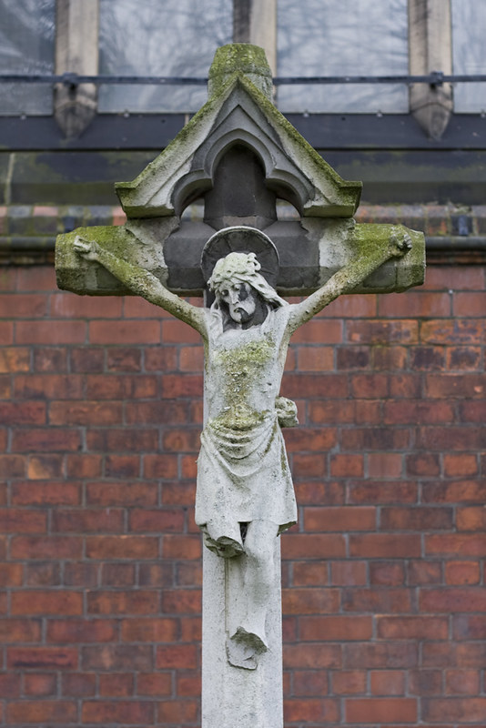
hmmmm.. on theme for sure...twice over if you take the fact that some little oik as broken his legs off
Like toe DOF & the sharpness ....just think that maybe there's more to be had from the tones n colors Normally not keen on central compositions but this seems to work fine Bg's can't always be helped...unless you had a step ladder handy
  for a more eye level shot where you may have been able to lose the bars on the windows ?
hmmmm.. on theme for sure...twice over if you take the fact that some little oik as broken his legs off
Like toe DOF & the sharpness ....just think that maybe there's more to be had from the tones n colors
Normally not keen on central compositions but this seems to work fine Bg's can't always be helped...unless you had a step ladder handy for a more eye level shot where you may have been able to lose the bars on the windows ?- Messages
- 13,760
- Edit My Images
- Yes
Yep generally agree with all of the above, I like the aged look with the moss, well spotted, a good start
OP
cowboy
Guy Fawkes
- Messages
- 3,143
- Name
- Mark
- Edit My Images
- No
Thanks.
I looked at it in B&W but prefered the moss to be showing as I felt it helped the image.
The other angles I could get made the statue seem out of balance, a good side shot would have put houses and trees in the photo as the church is on a busy main road.
I looked at it in B&W but prefered the moss to be showing as I felt it helped the image.
The other angles I could get made the statue seem out of balance, a good side shot would have put houses and trees in the photo as the church is on a busy main road.
Definitely on topic, and an original idea, also find the missing legs amusing/fitting, we've forgotten to respect the person who died to rid us of our sins, and Jesus is looking rather sorry about it!
I would have probably shifted a couple of inches to the left so that the cross lined up with the verticals of the windows, but it's no biggie.
I would have probably shifted a couple of inches to the left so that the cross lined up with the verticals of the windows, but it's no biggie.
Brian_of_Bozeat
Jeff
- Messages
- 3,235
- Name
- Brian (not Jeff)
- Edit My Images
- No
Good Subject, I would like to see a contrast boost to lift it off the background a bit more. - good start, 51 to go!
- Messages
- 2,820
- Name
- Mark
- Edit My Images
- Yes
Bang on theme, and nicely taken. I agree with Lynne that the tones could be brought out a little more. I also think an even shallower DoF would have helped a lot, but it might not have been possible.
Looks like Jesus was capable of sin too; he's clearly got himself legless in this photo!
Looks like Jesus was capable of sin too; he's clearly got himself legless in this photo!
- Messages
- 139
- Name
- Nick
- Edit My Images
- No
i agree with the b+w coment i think it would give a really dark feel to the picture, saying that i do like the original photo and the sharpness is excellent. nice work
- Messages
- 1,353
- Name
- Chris
- Edit My Images
- Yes
Agree with the brightness comments, but this is a really creative shot and well thought out in my opinion
M
Mad Hatter
Guest
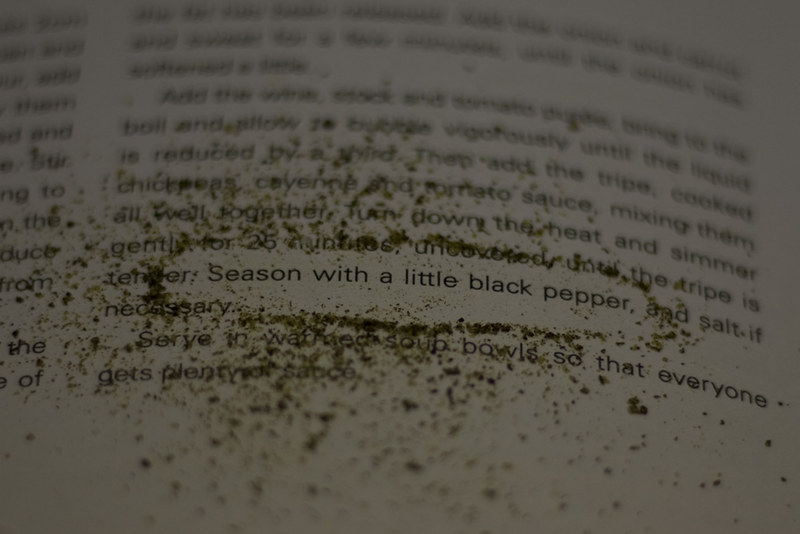
Clever shot Mark and well thought out with the pepper brushed around the text. Good job!
St Peters church south bank ?
- Messages
- 13,760
- Edit My Images
- Yes
Hi Mark
Season - I think the feedback has covered all points already, great idea
Season - I think the feedback has covered all points already, great idea
Brian_of_Bozeat
Jeff
- Messages
- 3,235
- Name
- Brian (not Jeff)
- Edit My Images
- No
Spot on theme 
a little dark? - I think that is personal choice rather than a valid critique though!
onward and upward!
a little dark? - I think that is personal choice rather than a valid critique though!
onward and upward!
OP
cowboy
Guy Fawkes
- Messages
- 3,143
- Name
- Mark
- Edit My Images
- No
St Peters church south bank ?
Yarm Road, Stockton.
Thanks for all the comments/crit.
I tried it brighter but personally prefered the slightly darker image, I'll put the lighter one in the thread later.