weekly 52 : 2014 | MrNicholas | Week 2: Play

Messages
81
Name
Nick
Edit My Images
No
This is my first 52, the aim is to use the themes to encourage creativity and give myself the opportunity to try different things.

All criticism is gratefully received, I have a thick skin so please don't feel the need to sugar coat it, I like honest opinions but also advice on how to improve.

I'll be doing to best to comment on others photo's to.

Week 0 : Odd [Bonus warm up week]
 
Last edited:
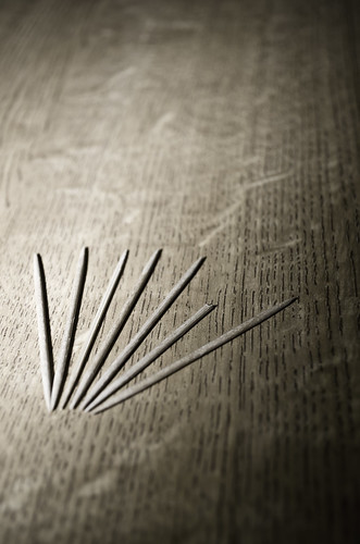
A good start. For me it keeps flipping from cocktail sticks to grooves in the wood, I like that it does this because it makes it more odd IYSWIM. I would have liked the points to be in focus but that doesn't spoil it. The processing goes well with the subject.

I've subscribed! :cow:
 
Like that. Has a real Blair Witch project feel to it. Great processing, well composed and good lighting.

Thank you, I like that interpretation. I was going for a bit of a weird (odd) feel to the image so a Blair Witch feel is a nice complement :)

Nice processing, good composition.

Good start (y)

Cheers mate :)

A good start. For me it keeps flipping from cocktail sticks to grooves in the wood, I like that it does this because it makes it more odd IYSWIM. I would have liked the points to be in focus but that doesn't spoil it. The processing goes well with the subject.

Thank you daddy-o, I did try a good range of apertures in order to increase the depth of field (it was quite easy to adjust the flash to suit) and I found that the points being in focus drew attention away from the shorter stick - which is why I opted for the smaller f stop. Now that you've said that though I'm going to re-visit some of the other shots I tried and see how I feel about them in retrospect. Maybe a greater depth of field would be better, I guess we'll have to look with fresh eye's and decide. Thank's for the feed back. :cow:

That works very well, looks much better viewed on flickr. Maybe evening out the lighting on the bottom right hand side might work too.

Thank you, I hadn't noticed the unevenness in the bottom right. I'm gonna see if there is anything I can do in PP to help that, do you have any suggestions? I might just be the way it was shot though, which would be a shame :p.

I also find that images look better on flickr, maybe it's the white of the forum that makes the images look less nice.

Good start nicely composed and a nice interpretation off the theme.

Thank you also for your feedback :)
 
Last edited:
Hi Nick, I like its minimalism, its quite subtle, nicely processed too (y)
 
Hi Nick...welcome aboard (y)


Odd....like it , the pp works really well , lowish POV...yeah ,ticks the boxes for me :)
 
Nice Nick! I like the the strong contrast, dirty tones and details in the grains of wood.
Despite the right side being quite dark, overall there is still a nice balance between dark and light which works well for me
 
Nice composition, clean and minimalistic - I like on the whole although not that keen on the vignette (y)
 
I like it. Only thing that is picking at me is one of the full length skewers looks different from the others.

Thanks for the critique, I can see where you are coming from, on reflection I should have swapped it for a matching stick!

Hi Nick, I like its minimalism, its quite subtle, nicely processed too (y)

Thank you :D

Hi Nick...welcome aboard (y)

Odd....like it , the pp works really well , lowish POV...yeah ,ticks the boxes for me :)

Thank you also :D

Nice Nick! I like the the strong contrast, dirty tones and details in the grains of wood.
Despite the right side being quite dark, overall there is still a nice balance between dark and light which works well for me

Thank you (y)

Stunner! Works really well against the grain of the wood. How did you do it?

Thank you, the image its self was quite a simple shoot. I used a single flash attached to the hot shoe of my camera and found the aperture and angle I liked. In PP I set the vibrance and Saturation High (so that it was over done but not loosing detail) and then applied a black to white gradient map at 75% opacity to add the contrast and texture to the image while toning down the colours to the deal brown (that is why they were set high in the first place, otherwise you loose the colours very easily). I'm glad you like the image, its quite a simple one but hopeful effective.

Nice composition, clean and minimalistic - I like on the whole although not that keen on the vignette (y)

Thank you too :)
 
Thank you everyone for your comments.

Week 1 - Linear / line
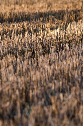
I went out this morning looking to get a shot of the field behind me house, the stalks of the harvested crop were creating great lines of colour across the field. I regrettably didn't take a tripod with me and struggles to get a sharp image hand held. I'm a bit gutted because the compositions were great, but the sharpness was not, so they ended up in the bin. As the sun was rising, however, it started to cast a great streak of light on the crops near to where I was standing and so I changed the focus of the shoot and went for a different image. I'm quite pleased with the results, I think its a good example of when the shot you come away with is not the shot you went to get. I hope you like it.

TLDR: Went to get landscape, forgot tripod, get this instead, enjoy.


Week 1 - Linear / Line
by Planet Mead, on Flickr
 
I like this shot - well spotted. I suspect it will stand out among the interpretations of this week's theme.

If Im being picky, I find the out of focus foreground a bit distracting. I think a square crop (losing the bottom) would work well, without this distraction.

Nice work so far. Looking forward to see your interpretation of future themes.
 
Well spotted and as said nice tone, and also once textures.

Looking at your settings, not much you could do to increase DOF. If anything, I'd prefer the focus to be 1/3 in as opposed to what looks like 1/3 from top.

Good start.

Cheers.
 
Thank you all for your comments, I tried a greater DOF and it had less impact. I don't mind going to ISO 3200 if it means I can get f/11 handheld but having the other bands in focus didn't have to pop this image has, but it was something I tried. unfortunately having the bright band ⅓ in and not ⅔ in wasn't an option in this spot, I had to make a slight crop in order to not show the end of the crops at the top of the image and give the feel of the crops being part of a larger field. I was acutely a tiny little patch at the edge of the field that I worked to get the big field feel that I think I achieved. Thank you none-the-less for the critique, I appreciate the feedback and it gives me thing to think about in the future. :D
 
Hi Nick
thats really nice really like the tones and textures, there is a bit of a debate about the focus point, I think its fine.
A really good start.

You weren't out looking for cows with the old man where you? ;)
 
I like this a lot, particularly the layers and the great light. Reminds me of a brush head! The OOF foreground is a bit distracting and I would have cropped it a bit, but it is well seen.
 
Different, and another one I could look at for a long time
 
Odd - Nice grain on the background, nicely lit and a well suited conversion
Linear/Line - Nice tones on this one. I think I agree with Posiview regarding having the focus on the bottom third.
 
I think it has been said but the OOF foreground is distracting given the theme the foreground in focus and a nice blur at the rear might have worked better.

Nevertheless a great interpretation of the theme.
 
Back
Top