weekly DK's 52 in 2014 - Wk's 52 'Support' Added - AND FINISHED :)

Nice to see a smoke shot taken outside and I certainly like this one. #1 for me - the colours and crop work better. You've done really well with the exposure given that you were shooting straight in to the sun.
 
Original idea for the theme (y) The sun really makes it, giving a nice silhouette and beautiful colour in the sky. Im determined to get a sun rise/set for the 52 at some point, been wanting to get one for a while.
 
No.1 is great DK, the sun on the horizon is stunning and has given you some lovely colours. I also like the silhouette of the silos and obviously the smoke just finishes it off.

Well done for being different, I really like this one (y)
Cool... Cheers Simon :)

#1 bubble as the bubbles are more in focus.

#1 also for Smoke absolute cracker.
Thanks Michael :)
 
Different! I'd never have thought of doing this sort of shot. Nicely composed and great colours in the sky making it stand out.
Thanks Simon :)
Love your idea for smoke and an outside shoot makes it even better. Like the colours.
Thanks too Sharon :)
 
Nice to see a smoke shot taken outside and I certainly like this one. #1 for me - the colours and crop work better. You've done really well with the exposure given that you were shooting straight in to the sun.
Cheers Peter :)

I had spots in my eyes for quite a while afterwards :bang:

Original idea for the theme (y) The sun really makes it, giving a nice silhouette and beautiful colour in the sky. Im determined to get a sun rise/set for the 52 at some point, been wanting to get one for a while.
Thanks Adam :)

I'm sure something will come up again shortly that we can all squeeze a sunset/sunrise into :)
 
Hi Dk

Smoke - so good to see an image from out of doors (y) I remember some of your industrial outside images from last year and really liked them.
Like the wide angle, the simple silhouette treatment and the colours
Thanks Alan :) It is nice getting out and about thats for sure !!!
 
Catch up time and shot 1 on both bubbles and especially smoke shot 1 is fantastic
 
Smoke:

Ahhh....Dk has pulled out a corker this week.

Really like the silhouette and rich golden tones and the way these contrast with the industrial scene....If pushed to crit then I woud perhaps clone out the trees (on horizon) picture left and the little isolated patch of tree on the horizon right side.

For me, your best 2014 submission this year (y)
 
Tried to do one myself like this and just couldn't get any nice lighting behind the smoke so I know how hard this is. Great shot, I agree with Jason above a squarer crop might be better.
 
Catch up time and shot 1 on both bubbles and especially smoke shot 1 is fantastic
Thanks Simon :)

Smoke:

Ahhh....Dk has pulled out a corker this week.

Really like the silhouette and rich golden tones and the way these contrast with the industrial scene....If pushed to crit then I woud perhaps clone out the trees (on horizon) picture left and the little isolated patch of tree on the horizon right side.

For me, your best 2014 submission this year (y)
Oooo cool... Thanks Jason :) :)

I may have a go at your suggestion... thanks again :)

Tried to do one myself like this and just couldn't get any nice lighting behind the smoke so I know how hard this is. Great shot, I agree with Jason above a squarer crop might be better.
Thanks Richard :)

Would like to see how you managed with yours, or not got any you can put up ??

Great set like them all but #1 the best (y)(y)
Cheers Judi :)
 
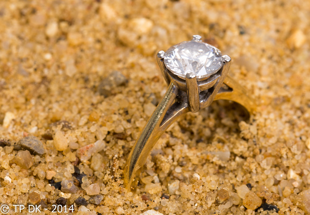
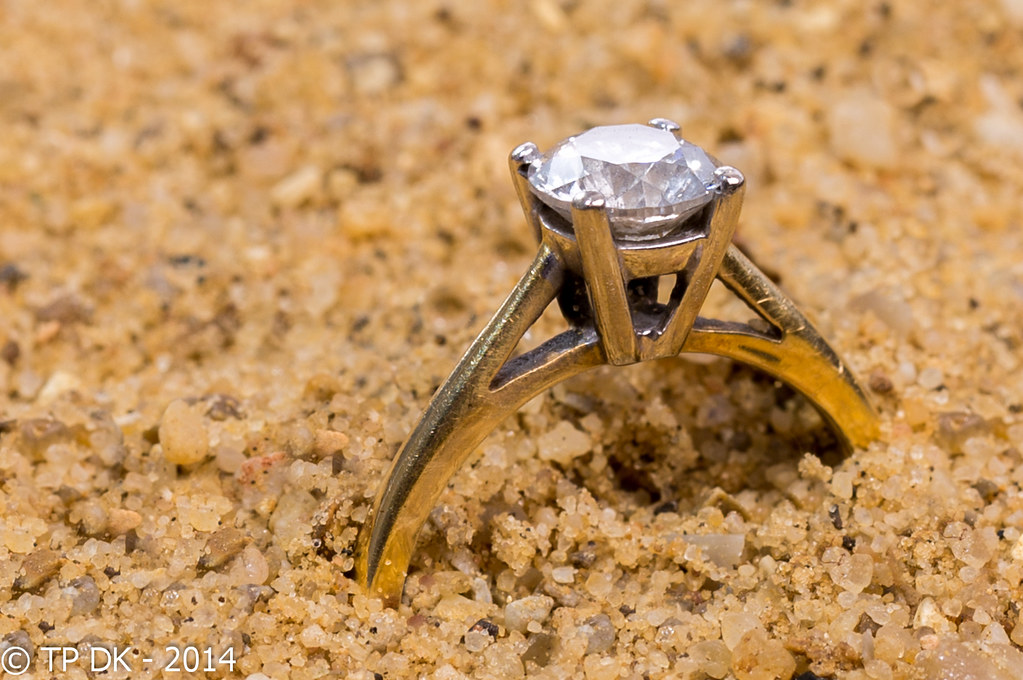
Here we go then... was a bit stuck with this, so have gone for something simple, and tried to put it in a different setting to add an interesting background rather than a hand or jewelry box...

I give you 'Diamond' my Wk 6 - 'Mineral'


Wk 6 - 'Mineral'
by TP DK, on Flickr


Wk 6 - 'Mineral' 2
by TP DK, on Flickr
 
Good shots and great idea that fits well with the theme, but I think I would have tried a different colour of sand to provide contrast against the gold ring.
 
Nice idea. Does your wife know that you've "borrowed" her ring? Both nicely composed but I prefer #1 as there seems to be more definition on the facets of the diamond
Hahaaa.... Hi Peter, yes she did notice me prise it off her finger, she wasn't sure what I was trying to do with it though with a pile of sand :D

Nice ring, did you find it on the beach :D

I prefer the angle and placement in the first one.
I'd be so lucky Mark, broken glass would be my luck - thanks for the comments mate :)

Good shots and great idea that fits well with the theme, but I think I would have tried a different colour of sand to provide contrast against the gold ring.
Thanks Elaine :)

I certainly know what you mean, I thought I had got away with it until I started editing in lightroom, in hindsight I should have gone out and got some kiln dried sand, rather than just using some from a Ton I have stored in the garden in a corner :bang:
 
#1 gets my vote too Dean (y)
I agree with the others re the colours, maybe a wee bit of desaturation would help?

Composition works well too with the ring being on the right hand side, a simple yet effective idea matey, good work (y)
 
Hi DK, No1 for me too nice detail in both the ring and the sand as Iain says above a little desaturation may help
 
Two great shots I prefer the composition of the first image, but I have to agree with maybe some different coloured sand.
Thanks Mandy :)

Sand... damn sand was sand colour, what was I thinking :D

Nice one Dk...I love the way everyone tries so hard to think of an original idea and this is a good one :) I like the first shot, the grains of sand stand out nicely showing the lovely colours and textures (reminder to self...must get my macro out and investigate sand :cool:)
Hahaaa Cheers Susie :)

You aint kidding about the sand under Macro, I cloned out a few larger lumps but BOY was there some interesting shapes and colours :)

:agree: good one though (y)
Thanks Judi :)
 
#1 gets my vote too Dean (y)
I agree with the others re the colours, maybe a wee bit of desaturation would help?
Ahhhh thanks Iain... I'll try that :)

Composition works well too with the ring being on the right hand side, a simple yet effective idea matey, good work (y)
Thanks again mate :)

Hi DK, No1 for me too nice detail in both the ring and the sand as Iain says above a little desaturation may help
Cool - Thanks too Allan :)

Mineral works for me. Good detail and I do like the low POV of #1. I'd like the colour of the sand pulling back a bit.
Thanks Andy.... now going to give it a go, LR is now firing up :)

How you didn't loose it :)

Cheers.
Well.... carried on a tray very carefully and then took the shot in a large seed tray as to limit my mishap chances :D
 
Hi DK - or should I call you Mr Frodo?
lol :D

I like #2 best because you can see the diamond more clearly. Original idea!
Thanks... nice to see a different choice, for a moment I thought it was a one carat race :)
 
Good thinking DK (y) Edit looks better, the ring certainly stands out more. Detail in sands good too, loads of minerals in there too :)
 
Ok, I replied to your thread last night, where'd it go :thinking::grumpy:

I'll say it again!

Smoke, love the colours in number one and the sun beams in number two, now go back and wait until you can combine the two :exit:

Mineral. I like the edited version best, the detail in the stone is better. I don't think you needed to use the sand though as the ring has a big enough mineral in it, I think the sand is a touch distracting!
 
colour of the sand is fine for me - great detail picking out every single grain, second of the two originals for the detail retained in the top facets of the ring.... and there was me thinking you went to the beach for this one!

At least if you lost it in a builders bag in the garden, it would be easier to find than somewhere on Great Yarmouth beach!!
 
Back
Top