Banging them in at the moment.. how far behind were you??

First of the castle with the flare, not completely sure it needs the lens flare, but I'm not against it / them.... seems to be a bit squashed vertically to me?
Second looking up the chains is more appealing, like that you've made a photograph of part of it, rather than just taking a shot of what's in front of you, second with the deeper DOF is an improvement too.
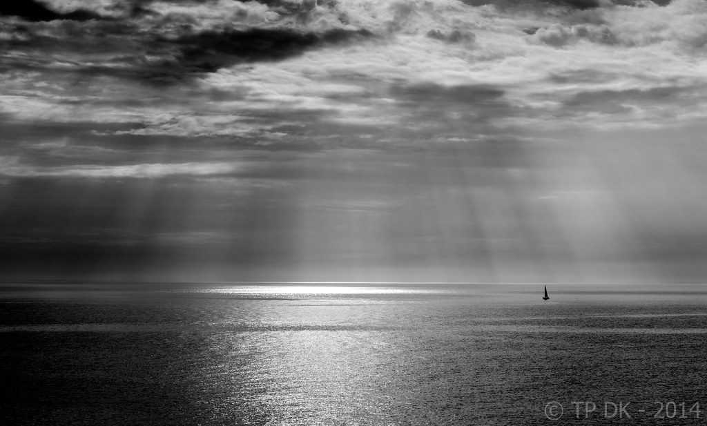
wild sky I think you;'ve got the beams just right, any more could have started to look tacky, or photshopped... Nice touch with the boat and I love the light being cast onto the middle of the ocean. You're going to have a wet patch on your desk when all that water runs out of the right side of the shot though...
And again, the flower with the lighthouse in the BG, brilliant, composition spot on, and the hazy transition between the sea and sky work really well, what did you clone out to the right of the flower though??
(Sorry, I know you're pushed for time, and burning the candle both ends a bit atm, but I can;t see things and not mention them).


 Alt - Deeper DoF
 Wk 23 - Wild
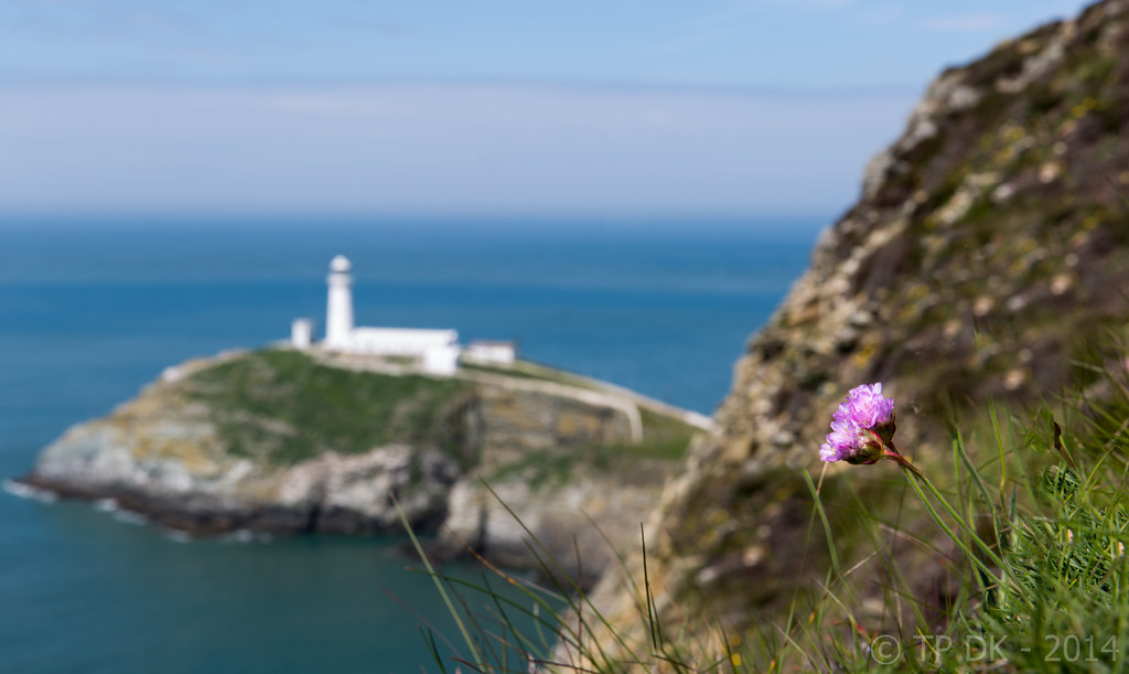 Wk 23 - Wild 2

