weekly pjm1's 52 in 2014 week 52 (Support) added... FINISHED!

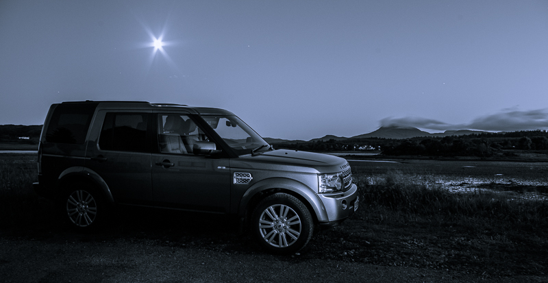
Thanks Graham - I agree completely with all your crit... what I should have done was switch to my telephoto and put together a panorama using the better quality/sharper lens. Instead, I stuck to my W.A. which was on the camera and isn't the sharpest by any stretch - yes, I cropped to make a "panorama aspect" shot. Sharpness is poor towards the edges as a result, I think. I might reshoot that "properly" for the album...

I upped the saturation by manually painting saturation over the houses individually. I actually lowered saturation in the sky and water. I may overdone it slightly, even though I was going for an "in theme" loud look ;)

Ok now for confession time... the reflection of the buildings is entirely painted on the sea by me :oops: :$. I felt like it should have been there, so I got the paintbrush out and added it manually! Now that you know it of course, you'll look again and realise it's fake but I'm quite pleased it wasn't blindingly obvious...

David - thanks and glad it's striking the right (loud) chord ;) I actually chopped the sea because I just felt it wasn't adding anything to the image. Maybe I just took too much away and left the proportions slightly wrong. Thanks - I'll review my crop a bit...
 
Another catch-up shot from me. Sorry for giving everyone who's critiquing more work! (But at least I'm not posting 5 a day... I'm trying to be restrained ;))

Week 17: Twisted. Plenty of options re: barbed wire and the like and being on an island, there is a propensity of rope from boats, lobster cages and the like. So boats it is for me...

EDIT: following Judi's comment (which was spot on), I've re-saturated the loch and also brightened the scene a touch. The original is at the bottom of this post but this is the edited version:

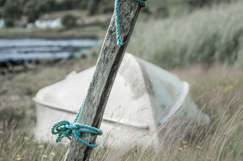
Twisted: Boat mooring (edit) by pjm1 (Paul), on Flickr


Again, this is a slight test for me - a fairly bold composition for the theme with the otherwise offputting diagonal mooring rather rudely grabbing your attention when you'd prefer to be looking at the boat. But the purpose here is to give the twisted rope some sort of context: why is it there and what would make the shot more interesting? Hopefully the boat and edge of the loch do that.

PP-wise, I've pushed the boat out (ha... see that there?) with some desaturation almost verging on selective colour. Hopefully not too far to the latter, though. A bit of extra negative clarity on the background also helps the rope and its mooring gain prominence. Twisted? Well, in two ways: the rope itself and the knots at the bottom.

C&C very very welcome as always - I'm trying new things (for me, that is) with each of these photos, so I really won't be offended if you tell me something/everything doesn't work!

Looking at the preview here, it looks reall oversharpened vs the Flickr version so probably best to look at that if you can & have time. Thanks in advance!

Original posted picture here:

Twisted: Boat mooring by pjm1 (Paul), on Flickr
 
Last edited:
Hey Paul :)

Fresh - Does what it says on the carton... works fine for me, nicely lit, good DoF, liking the placement, none of the major items clipped, the rustic chopping board looks good too - Crit... the only thing for me would be to remove the £1 label from the blueberries, the splash of red is competing with the bowl of strawbs for me - other than that, great image (y)

Loud - Blimey... viewed large on Flickr there are certainly some very loud colours there, set in the foreground of the green hills it works a treat - not much to crit really, maybe a tad to wide on the right the last building tapers away, I'd probably crop to the RH side of that lovely blue building to keep all large buildings in place, and clone a tree over the a would be now clipped building on the hills - again, a super image for the theme, not too over saturated for me (y)

Your're catching up nicely - keep them coming, looking forward to your take on the themes :)
:agree: 
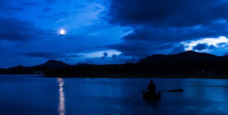
I am going to echo the wise man Mr Dark Knights comments. Keep up the good work can't wait to see what else you bring to the challenge.

Thanks Dean and Mandy - I appreciate the encouragement! I'll try to keep up the pace until I've caught up fully - although I'm finding it easier because it's such good fun! Sadly this thing called work keeps getting in the way, but hey ho.

I'm enjoying trying different photographic styles - they might all look very ordinary to you, but quite a few of these shots I'm really trying new stuff to me. Up until this challenge I tended just to take shots of landscapes and my kids. Not any more! Even shots which I might otherwise take (the Loud Tobermory one, the Shapes B&W mountain shot) I'm trying to compose differently. I guess the same with the Twisted shot above - althought I'm not sure if the diagonal post interferes too much with the shot though?

I do appreciate everyone taking the time to comment - you're all helping me loads!
 
I like that "loud" image very much (y)

but I agree ... I'd like a bit more sea in the foreground.

Hi Paul I agree with David :clap::clap:

Thanks Judi (and thanks again David because I've quoted your post, too)... does this edit work better? I've reverted back to a much more conventional 1/3 : 1/3 : 1/3 of the sea : land : sky and also cropped off some of the right (nearly what Dean suggested but not quite!) To be honest, it's probably closer to what I would have shot had I not been trying things out but I'd rather give things a whirl and decide which I prefer (and what the consensus prefers!) than just stick to doing it the "old" way...

Loud: Tobermory seafront (edit: more sea!) by pjm1 (Paul), on Flickr

Twisted... fits the theme, but not really liking it :( the loch is just a grey blur to me might be my screen but if you hadn't said i wouldn't have known what it was,

Yes, you make a good point - the tide was way out so the edge of the sea loch wasn't particularly well defined. Funnily enough, the more I look at the photo, the more I actually like it... I started off pretty undecided about the composition, but it's growing on me. I know that's not the point of doing this challenge, but I'm getting something out of it at least!

I've edited the photo in the original post above (and kept the original beneath for comparison)... you're right that the loch needed a bit of colour and I've also brightened the whole scene a bit... Thanks!
 
Last edited:
Ok - very excited now! I've managed to get the shot I wanted to take for a while for Mono. A clear night sky, a reasonably full moon and enough time to set it up.

I'm sure there's plenty I can improve on this but it's my first proper composite shot (albeit a simple one: just lightening by painting on a flash photo layer over a non-flash long exposure).

Did anyone say Mono had to be black and white? Well, I missed that memo so mine is black and blue ;)

nOZbOjC.jpg

(full res here: http://i.imgur.com/BkyqrSU.jpg - can't seem to get Flickr to work tonight??)

Crit very welcome as always because this is my first stab at this sort of photo so I'm keen to know what to do better next time - I like the style and want to perfect it!
 
Loud - I really like a beautiful place in Scotland and very well known as well. Some nice loud colours on the buildings fits the theme for me.

Mono - good composition, nice looking 4x4 as well good take on the theme, my crit for me is I'd like to see a little less blue in the sky. And maybe a more interesting angle off the 4x4 to help give the image more impact.
 
Yeah, does cover the theme. My first observation, well second after the Balamory houses, was the cropped LH house. It's a pleasing image and some FG interest would be nice but not sure if you had the opportunity

Cheers.
 
Works well Paul - both in idea and exuecution, 4 small things that jump out at me though.....

1, cottage in hills to rear of car
2, highlight above rear wheel
3, drivers sun visor down
4, coat(?) in passenger side rear window.

ALso, was there a caravan or something parked over your left shoulder, reflecting in the door?

All of these are a relatively easy PP fix with a bit of time, and don;t detract overall from the great sky, clouds, hills, moon and stars, not to mention the great lighting on the vehicle, and the excellent blending of the two exposures.


(See you also posted in the general forum, I think alot of people look, but don't comment there, unless you regularly post in a particular section. Whereas here, comenting is more likely, and I feel are worth more, as you 'know' the person more)
 
Loud - I really like a beautiful place in Scotland and very well known as well. Some nice loud colours on the buildings fits the theme for me.

Yeah, does cover the theme. My first observation, well second after the Balamory houses, was the cropped LH house. It's a pleasing image and some FG interest would be nice but not sure if you had the opportunity

Thanks Mandy & Andy (ha!) - comments on Loud much appreciated. It was a shot taken from the other side of bay and there was nothing between what you see and me, apart from empty water... more of the same, basically. So no real opportunity to create any foreground interest. Because of where boats moor, there is unlikely to be any on another day, either... It is what it is!

Mono - good composition, nice looking 4x4 as well good take on the theme, my crit for me is I'd like to see a little less blue in the sky. And maybe a more interesting angle off the 4x4 to help give the image more impact.

Well, I did convert Mono to a blue-tone, so that will be 100% my fault ;) Seriously though, it felt as if it was just a bit lacking in conventional B&W so I wanted a colour tint, which perhaps I overdid... Re: the car at an angle, that is exactly what I should have done! Thanks for the suggestion which would have strengthened the composition. I'm not sure how I'd have managed it without blocking the road, but at late o'clock there aren't exactly many cars around, so would probably have been fine...

Works well Paul - both in idea and exuecution, 4 small things that jump out at me though.....

1, cottage in hills to rear of car
2, highlight above rear wheel
3, drivers sun visor down
4, coat(?) in passenger side rear window.

ALso, was there a caravan or something parked over your left shoulder, reflecting in the door?

All of these are a relatively easy PP fix with a bit of time, and don;t detract overall from the great sky, clouds, hills, moon and stars, not to mention the great lighting on the vehicle, and the excellent blending of the two exposures.


(See you also posted in the general forum, I think alot of people look, but don't comment there, unless you regularly post in a particular section. Whereas here, comenting is more likely, and I feel are worth more, as you 'know' the person more)

Wow Graham, thank you very much for such a detailed critique on Mono. Hugely helpful for me - so thanks for taking the time to put e-pen to e-paper. As you say, I can fix (and should have fixed!) all of those points you list... I've also since tidied up a bit of lens spotting/dust. The coat is actually a sun visor (for our youngest whose car seat is on that side). Again, I should have removed that before the photo... will know next time!

Thanks for the back patting re: the blending - always nice to receive! I'll go for more flash exposures next time which will require a bit more work... To be honest though, it's dead easy to do using the "lighten" blending option in PS and a non-hard brush.

Re: cross-posting, I did wonder if what I was doing was deemed naughty, but I am keen to get tips from people who take a lot of car photos with multiple exposures/flashes as well as the assembled cognoscenti on this thread. Basically, I don't really have a clue what I'm doing but was quite pleased with the outcome in this instance and just want some pointers for what to do better/differently next time.

You and Mandy have both given me some great suggestions, so thanks! Right, back to work now :(...
 
Last edited:
Hi Paul .... I love your 'Balamory' shots, they almost made me burst into song ..... it's one of the grandchildrens favourites.
I really like the twisted blue rope, I was thinking the background was a bit 'too much' but after a longer look I like it.
I can't comment technically on the car one ....good points there from Graham by the way. But I do like the use of the blue and the location looks great.
 
Last edited:
Hi Paul, have a few to catch up on
Fresh, certainly fresh ingredients but I feel as a food shot the packaging is unnecessary, I know its there for the theme but rather spoils the look of the fruit. maybe present it in a dish like the strawberries.
Twisted a good idea for the theme though I am not sure the boat adds anything.
Loud, I like it, nothing to crit there liking the reflection of the house colours on the water
Mono, I think a little more light on the car, slight touch of light painting maybe.

All very well thought out pics (y)
 
Hello again Paul, lots from you again I will be well pleased when you have caught up and posting weekly :)

will aim to catch up on all of yours of the year but for Now

Loud - A wonderful looking place, a great mixture of colours in there lots going on in the picture but it works for me

Mono - looks good to me mate sky is clear the truck looks a tad dark at the rear but the rest fits the theme perfectly
 
Hi Paul .... I love your 'Balamory' shots, they almost made me burst into song ..... it's one of the grandchildrens favourites.
I really like the twisted blue rope, I was thinking the background was a bit 'too much' but after a longer look I like it.
I can't comment technically on the car one ....good points there from Graham by the way. But I do like the use of the blue and the location looks great.

Thanks Susie - Balamory was a fun place and certainly loud at times! I think you're in good company re: rope... I quite liked the background but might be in the minority!! :)

Hi Paul, have a few to catch up on
Fresh, certainly fresh ingredients but I feel as a food shot the packaging is unnecessary, I know its there for the theme but rather spoils the look of the fruit. maybe present it in a dish like the strawberries.
Twisted a good idea for the theme though I am not sure the boat adds anything.
Loud, I like it, nothing to crit there liking the reflection of the house colours on the water
Mono, I think a little more light on the car, slight touch of light painting maybe.

All very well thought out pics (y)

Thanks Allan - you're right the Fresh one didn't quite hit the mark so better luck next time!
Thanks re: twisted... again, something to work on next time I'm trying something similar.
Glad you like my painted-on reflections ;)
The car shot is still one I like (style-wise) although I deliberately darkened the back of the car... perhaps a mistake!

Hello again Paul, lots from you again I will be well pleased when you have caught up and posting weekly :)

will aim to catch up on all of yours of the year but for Now

Loud - A wonderful looking place, a great mixture of colours in there lots going on in the picture but it works for me

Mono - looks good to me mate sky is clear the truck looks a tad dark at the rear but the rest fits the theme perfectly

No worries Craig, and thanks for commenting where you have. I'm not helping by posting frequently, am I?? Thanks for the comments - glad you liked and others agree re: back of car so will reign myself in next time!
 
Ok... more experimentation, this time with a rather shallow DOF and a question from me whether it's too shallow?

Week 28 (Rich):


Rich: Cookie time!
by pjm1 (Paul), on Flickr

Mrs pjm1 obliged by making some yummy but rather rich choc chip cookies. I'm still excited by having some of that fantastic Normandy butter left over from our holiday (hence the choice of focus point)...

C&C welcome as always. Just need to squeeze in reshoot (of what?!) before the end of the week... Oh, and the surface isn't full of specks of white dirt... it's the pattern - "starfield" or something. Honest!
 
Hi, Rich well composed nice detail, looks a bit of light painting there. Although well composed it looks to be ordered to me I bet they tasted nice though.

Cheers.
 
Thanks Andy... yes maybe too "posed"? Maybe i should have taken a bite out of one! They were certainly yummy enough. Thanks for the comments - appreciated as always.

No light painting (I still haven't given that technique a go yet...) I held the flash off camera pointing at the ceiling above and shielded from the subject (could have done it on camera though). EV was metering at -3 without flash... to be honest, I'm still a bit clueless with my flash photography so tend to take a few different snaps with different setups without really knowing what I should be doing!!
 
Hi, DoF looks fine to me, as Andy has said looks a little too set up, i don't think the three packs of butter help with that,
nicely lit, so your messing around with the flash has worked, to be honest thats my method too.
 
Hi, DoF looks fine to me, as Andy has said looks a little too set up, i don't think the three packs of butter help with that,
nicely lit, so your messing around with the flash has worked, to be honest thats my method too.

Thanks Allan... I'll get there with flash eventually but it's going to take a lot of trial and error!

Only three packs of butter is quite restrained for me... I do like my food rather rich! ;)

And here is my reshoot for week 28: I retook numbers (which was previously of the mountain in cloud with a loch below making out a number 5). This one is definitely staged!


Reshoot - Numbers: Choo choo
by pjm1 (Paul), on Flickr
 
Thanks Mandy - I appreciate the comments. The cookies are quite tasty. The only negative is thinking about where that butter is going...

Sometimes simple is good... I can be guilty of overcomplicating things at times but I'm pretty confident I didn't do that with my numbers reshoot! :)
 
Vertical - Good lighting and I certainly agree that the edit improves the image

Reshoot - Looks like some lovely landscape up there. I wondering what a mono conversion would look like for this one especially with the landscape blending into the cloud cover

Yum - A nice portrait with great eye contact although I find the back of the chair a little distracting.

Shape - I certainly like this. With a good 2/3 being filled with foreground stones it works really well. Maybe a tad more contrast would just boost this even further. Nice one.

Fresh - Nice sharp image where it needs to be and I like the oof fruit in the background. The aged chopping board help to make it looks less stark

Loud - Definitely some loud colours and the letterbox crop works well with the scene. I'd probably say that it was a little over saturated especially on the red channel but given the theme I'm ok with it.

Twisted - I think I'm wanting to see a little more of the image on this one. I'm not sure if the wood chopping the boat in two is helping the composition

Mono - Another good photo and I'm happy with the blue tint which gives a nice cold feel to the image. Looks even better on the full-res version. A crit would be that I would have liked to have seen a more even lighting on the side of the vehicle. Is that your caravan & awning reflected in the front door. If so that's one heck of a view from a camp site. Where was it? I'd love to stay there.

Rich - I like the industrial feel to the surface and the reflection in the bowl. If I was critical I'd include the top of the milk bottle and whisk.

Reshoot - Hits the numbers theme. I do feel the blacks are a little too deep if you know what I mean. I feel some detail has been lost as a result. Putting the green engine on the third is a nice touch
 
Wow - thanks for the detailed review & crit... going all the way back! It's only fair after you've put in so much time that I respond individually - thank you.

Vertical - Good lighting and I certainly agree that the edit improves the image
Thanks, the lighting was quite flattering but dim... hence the 3200 ISO. Think I got away with it though because of the surface textures.

Reshoot - Looks like some lovely landscape up there. I wondering what a mono conversion would look like for this one especially with the landscape blending into the cloud cover
Good point/question - I'll have to investigate a mono version. It's amazing up in the hills... it has been scary at times, especially in winter when the gales start but it's usually worth the effort.

Yum - A nice portrait with great eye contact although I find the back of the chair a little distracting.
Thanks - there's a fair bit I'd like to improve on my portrait shots such as background clutter and lighting, so thanks for this (and others' comments).

Shape - I certainly like this. With a good 2/3 being filled with foreground stones it works really well. Maybe a tad more contrast would just boost this even further. Nice one.
This was a bit of an unexpected hit, it seems. I was going for something a bit unconventional and for once it seems to have worked. I really ramped up the contrast & clarity as it was but I'll look to see what going further does!

Fresh - Nice sharp image where it needs to be and I like the oof fruit in the background. The aged chopping board help to make it looks less stark
Thanks - you're being kind but I've gone off this one. It's just a bit dull, I think?

Loud - Definitely some loud colours and the letterbox crop works well with the scene. I'd probably say that it was a little over saturated especially on the red channel but given the theme I'm ok with it.
It's definitely oversaturated, but deliberately so. I was working remotely and only had my cruddy laptop screen to go by, but the saturation was more or less what I was aiming for - a bit over the top without being too painful on the eyes!

Twisted - I think I'm wanting to see a little more of the image on this one. I'm not sure if the wood chopping the boat in two is helping the composition
I'm not sure either, and it seems most people aren't convinced by it. Unlike Shape, I think this was a compositional experiment which didn't really work - other than to tell me that!

Mono - Another good photo and I'm happy with the blue tint which gives a nice cold feel to the image. Looks even better on the full-res version. A crit would be that I would have liked to have seen a more even lighting on the side of the vehicle. Is that your caravan & awning reflected in the front door. If so that's one heck of a view from a camp site. Where was it? I'd love to stay there.
I added the darkness to the side of the vehicle but the feedback is unanimous - take it away again! We were parked in front of our cottage for the week and it was our next door neighbour's caravan/motorhome which was semi abandoned. The owners have a few cottages along the shore - google Isle of Mull Cottages (no connection to me). It's a stunning location, just watch for midges in the summer (we were very lucky).

Rich - I like the industrial feel to the surface and the reflection in the bowl. If I was critical I'd include the top of the milk bottle and whisk.
Thanks - it's actually our kitchen floor... I discovered it as a "canvas" quite by accident but I rather like it. Not sure if I've done something wrong with the image uploading but I can see the top of the milk bottle and whisk??

Reshoot - Hits the numbers theme. I do feel the blacks are a little too deep if you know what I mean. I feel some detail has been lost as a result. Putting the green engine on the third is a nice touch
Yes, maybe a bit too obvious on the numbers theme. It was also shot on the same floor as Rich, but I dropped the exposure way down (-1.5) and then painted it back onto the track and train... sort of seeking a "floating" look but not a complete back cutout. Possibly overdone it, though? Part of the reason is the floor is very slightly glossy in the "wrong" light and I was trying to kill the reflections - I found dropping the exposure was a good way to achieve that!

Thanks again for the comments Peter - I now need to check I've caught up with your thread!
 
I added the darkness to the side of the vehicle but the feedback is unanimous - take it away again! We were parked in front of our cottage for the week and it was our next door neighbour's caravan/motorhome which was semi abandoned. The owners have a few cottages along the shore - google Isle of Mull Cottages (no connection to me). It's a stunning location, just watch for midges in the summer (we were very lucky).!
Some great looking cottages on that site. We're looking to go up to Scotland in October so thanks for the tip

Thanks - it's actually our kitchen floor... I discovered it as a "canvas" quite by accident but I rather like it. Not sure if I've done something wrong with the image uploading but I can see the top of the milk bottle and whisk??
I think it must have been me Paul because I can see all of it now. When it came to posting my comments I found my internet had dropped so it might have happened while the images where loading hence not seeing all of it.
 
Good stuff Peter. If you want any travel tips, there are a fair few TPers up this way (don't tell anyone, but I'm actually English!) and I know I'd be happy to offer suggestions. I'm a big fan of the islands, hills, lochs and the like so ask away nearer to the time...
 
Good stuff Peter. If you want any travel tips, there are a fair few TPers up this way (don't tell anyone, but I'm actually English!) and I know I'd be happy to offer suggestions. I'm a big fan of the islands, hills, lochs and the like so ask away nearer to the time...
Cheers Paul. I may well by back in touch
 
Hey Paul :)

Liking your edit on Loud, Seems to make the great colour reflections catch my eye even more, a great location that !!!

Mono - A super image, I wasn't sure on the darker back end top the 4x4 but once I saw larger now I think it works well, good PP, really like the starburst above it and the blue tone really suits it for me - nicely put together, yep liking that (y)

Yum - On my lappy the DoF looks deep, I'd prefer to see a bit more flour scattered about for a baking shot as it looks way too staged, also the metal surface seems a bit odd for baking, all the actual elements are lit beautifully, real nice black background that does actually blend/fade into the surface nicely and some real scrummy cookies :drool:

Your doing a great job back-catching up... keep it up, loving your images so far (y)

Thanks Dean - appreciate the comments as always. Loud has definitely been a hit - it took about 20 minutes to get the reflections just right so time well spent!

Mono - I've taken the crit on board and re-lightened the back (basically taking away the grad I applied). Only problem is now the reflections just look even more distracting! Secret is to get the shot right in camera, first...

Yum (which is actually Rich! ;)) clearly suffered from being staged a bit too quickly... I had a break in work and decided to set up and take the shot. The surface is our lino kitchen floor, which is a bit odd, but is one of the few places with a big enough area and consistent(ish) lighting which allows me to set up my flash shots more easily. Only problem is it's a strange-textured floor! Agree re: flour etc... basically just a bit of careful chaos to make it look less "placed". Glad the lighting worked - I've been struggling with flash for some time.

Cheers! Time to have a cookie for breakfast...
 
Ok, catch-up time again. (Groans all round...)

Week 15

Action. So what constitutes "action"? I would argue it would depend on what inaction is... what the baseline of "normal" is for the place, time, situation. If you're in a busy shopping street, "normal" is hustle and bustle. Action might be a fight, someone falling over, police arriving or something equally "big".

I've taken the opposite approach. Let's start with emptiness: somewhere - a place and a time - where there is, by default, no activity. Complete silence. What constitutes action now? Well, perhaps this:


Action: night time escapades on the loch
by pjm1 (Paul), on Flickr

As is usually the case, probably best viewed fullscreen on Flickr.

C&C most welcome - this might turn out to be a bit of a marmite shot (or just universally disliked!) I'm quite liking it, but then it's mine so I guess I would!
 
Last edited:
Numbers reshoot, cracking idea and a nice sense of humour, too.

Action, hmmm, now I like the photograph. Rarely have I seen such a blue blue hour :) You justification for the post made me smile. I wouldn't quite put it in the crowbar catagory but the link IMO is somwhat tenuous ;)

Cheers.
 
Numbers reshoot, cracking idea and a nice sense of humour, too.

Action, hmmm, now I like the photograph. Rarely have I seen such a blue blue hour :) You justification for the post made me smile. I wouldn't quite put it in the crowbar catagory but the link IMO is somwhat tenuous ;)

Cheers.

Thanks Andy! I wasn't sure whether Numbers reshoot would hit the mark... glad you liked it.

Re: action... well, it was a very long exposure - hence the strong blue cast. I genuinely didn't add any PP to the colours, apart from getting the exposure how I wanted and upping the contrast & clarity (especially in the sky). However, I did do a bit of pp elsewhere - a LOT of cloning of vegetation at the bottom of the frame which I didn't want (and couldn't easily avoid, tbh). Erm... and something else ;)

Oh, as for the crowbar... moi? <innocent look>

Well, maybe I was stretching things a tad, but I wanted to get this shot in. I actually have another shot very similar but with the boat and oarsman further down the frame with clear water between him and the mountains - I will post as a comparison in a tick.
 
Hi, numbers reshoot does look a little like its floating but the composition works very well and a great idea :clap:

Action I think passes with your explanation, lovely blueness to it the only thing that spoils it is the silhouette of the persons top half disappears into the mountain.

great catch up and a lesson to others who just throw something in to keep up, you obviously put some thought into them :clap:
 
Hi Paul

bit of catch up here.....

Twisted....I like that , the muted colors & DOF work really well , you've left enough in shot to give context...only minor comment is the boat seems a little too bright in comparison to the rest of the image ?

Loud....wow....they look brilliant...I love scene's like that , almost surreal but lovely . I've not looked at the original shot you posted so this may have been said before...there's just a little too much empty sea for me in the 2nd version

Mono....I really like this...a touch more light over the rear of the Rover would make it really look like advertising material :clap:

Rich...well lit , DOF looks fine to me , well laid out , no masty highlights on the shiny bowl :clap: The only thing I'll mention is the towel( or cloth) that the cookies are on......any reason for that rather than a plate ?

Numbers.....lovely shot , well lit , fab blacks & a splash of color in the green engine :clap:

Action......very calming & a great night long exposure......just needs some separation between the person & the mountain...waiting to see the other shot you mentioned :)
 
Hi Paul
Loud - very photogenic spot and the edit does it justice.
Mono- creative, like the sky, the hills and the general moodiness. Bit dark on the rear of the car for me. Like the lighting on the front tho.(y)
Rich - very much on theme but as others have said , maybe a bit too staged. i would lose the egg box - we know it is an egg, - move bottle to RHS and angle slightly,- maybe no need for 3 packs of butter with all the labels showing - we know it is butter - maybe open a pack slightly too. On the plus side, good foreground/ base, nice lighting on the bowl and whisk - thy are verrrry clean:)
Numbers reshoot - good idea , well handled and good comp. I like the 'in space' feel.
Action - idea works for me for the theme. Good sky, moon and reflection and a nice balance to the comp.(y) Bit dark and a bit blue and a shame that the boat and oarsman are not more distinct - and they are the point of action aren't they?
 
Hi Paul....I think I'm just about keeping up with your shots. I'm a big fan of black backgrounds so Rich and Numbers are a hit with me....Rich is very crisp and sharp, it does need the flour to be perfectly realistic...but I'm assuming it's in the lovely shiny stainless steel mixing bowl :) the reflection is great in there by the way.
Numbers I like a lot...so simple, the bright green train is perfect.
Action....it doesn't shout it out loud, but I like your explanation. As Lynne says it's a shame that the man blends into the mountain, but it's such a beautiful shot...it would have suited dreamy too :)
 
Hi, numbers reshoot does look a little like its floating but the composition works very well and a great idea :clap:
Action I think passes with your explanation, lovely blueness to it the only thing that spoils it is the silhouette of the persons top half disappears into the mountain.
great catch up and a lesson to others who just throw something in to keep up, you obviously put some thought into them :clap:

Thanks Allan - really pleased the shots are generally working... as you'll see below, I have an answer on Action! I've really enjoyed trying some new stuff and my PP is definitely getting better...

Hi Paul
bit of catch up here.....
Twisted....I like that , the muted colors & DOF work really well , you've left enough in shot to give context...only minor comment is the boat seems a little too bright in comparison to the rest of the image ?
Loud....wow....they look brilliant...I love scene's like that , almost surreal but lovely . I've not looked at the original shot you posted so this may have been said before...there's just a little too much empty sea for me in the 2nd version
Mono....I really like this...a touch more light over the rear of the Rover would make it really look like advertising material :clap:
Rich...well lit , DOF looks fine to me , well laid out , no masty highlights on the shiny bowl :clap: The only thing I'll mention is the towel( or cloth) that the cookies are on......any reason for that rather than a plate ?
Numbers.....lovely shot , well lit , fab blacks & a splash of color in the green engine :clap:
Action......very calming & a great night long exposure......just needs some separation between the person & the mountain...waiting to see the other shot you mentioned :)

Thanks Lynne... you're being very kind! Twisted seems to be a bit of a marmite shot but I agree with you re: the brightness of the boat - I actually reduced it but I think the composition wasn't right so I was rescuing in post! My original Loud has less sea but it was my edit which increased it - some prefer one, some prefer the other!

Hi Paul
Loud - very photogenic spot and the edit does it justice.
Mono- creative, like the sky, the hills and the general moodiness. Bit dark on the rear of the car for me. Like the lighting on the front tho.(y)
Rich - very much on theme but as others have said , maybe a bit too staged. i would lose the egg box - we know it is an egg, - move bottle to RHS and angle slightly,- maybe no need for 3 packs of butter with all the labels showing - we know it is butter - maybe open a pack slightly too. On the plus side, good foreground/ base, nice lighting on the bowl and whisk - thy are verrrry clean:)
Numbers reshoot - good idea , well handled and good comp. I like the 'in space' feel.
Action - idea works for me for the theme. Good sky, moon and reflection and a nice balance to the comp.(y) Bit dark and a bit blue and a shame that the boat and oarsman are not more distinct - and they are the point of action aren't they?

Thanks Alan - I've had a lot of fun with these shots. I did polish the metal on Rich for quite a while before taking the shot!! I can see you're right on all of your crit - which is why I love this 52 idea so much!

Hi Paul....I think I'm just about keeping up with your shots. I'm a big fan of black backgrounds so Rich and Numbers are a hit with me....Rich is very crisp and sharp, it does need the flour to be perfectly realistic...but I'm assuming it's in the lovely shiny stainless steel mixing bowl :) the reflection is great in there by the way.
Numbers I like a lot...so simple, the bright green train is perfect.
Action....it doesn't shout it out loud, but I like your explanation. As Lynne says it's a shame that the man blends into the mountain, but it's such a beautiful shot...it would have suited dreamy too :)

Thanks Susie... I'm trying my best to drown you all in photos ;) Rich also needed brown sugar but Mrs M had finished both off!

A big thank you to everyone for the crit so far - I can't tell you how much my own appreciation for photos has come on since starting this just a handful (or two) weeks ago - and it's all down to the feedback we give and receive. (y)

So, onto my edit for Action... unfortunately this will give away a big secret. A big PP secret...


Action (edited): night time escapades on the loch
by pjm1 (Paul), on Flickr
 
Back
Top