weekly pjm1's 52 in 2014 week 52 (Support) added... FINISHED!

Hi, Vertical not sure which version I like I am leaning towards the first.
strong, at first view i thought you had cloned out a support, it sits in the frame nicely but not sure if it is missing something, no idea what though:thinking:
maybe a slightly different view
 
Woo! I'm onto page 2 - thank you Allan for that :) And thank you more seriously for your comments. I'll be honest and say the Strong photo doesn't excite me - which as the photographer who took it, isn't a great sign! There are things about the composition I like but quite a bit I don't yet had no control over: the green thing in the middle of the water, the buildings in the background, the mud in the bottom right etc. Still, the purpose of this is for me to get better at recognising what I do and don't like in my images (and others') so it's all helping.

Thanks again everyone.
 
Hi paul, ive looked at both of your vertical shots a few times and its took a while to pick a winner but...........I think the first one just edges it. It made it more difficult to choose with them both being very good! I do like the off centre comp for something different and I thing it keeps you looking through the frame for longer. good work. (y)
 
Hi Paul, I did write a comment on your texture shot but I've just noticed it's not here ! I thought it was an excellent idea, but I agreed with Graham on the stem of the glass showing more as it looks a bit cluttered on the right to me. I like all the tiny shards of glass and the b&w effect.
Vertical, definitely the first one, the second one jars on that top line. I love the aspect for the shot and the choice of colour for the PP. An excellent choice for the theme.
 
Last edited:
Thanks Adam and Susie. The good news is that so far, I can see how I can improve every one of my shots in this 52 - which is the whole purpose I guess! Thanks to comments like yours and the others on this thread, I do feel as if I'm improving my own critique of my photos which - fingers crossed - will lead me to take better pictures next time.

I do enjoy the thought process before taking a photo as much as the technical bit (and the PP afterwards)... but ultimately we want to be happy with our end product. I think that by the end of this 52 I will be a lot happier with my photos than at the start - which will be a great outcome! So far, vertical and wild are definitely the ones I'm most pleased with - I look forward to taking some more which can slot in above them!

Lots of small incremental improvements will hopefully all add up... thanks again.
 
Hi,
Vertical: Yes, I am in agreement with the first of your Vertical shots being my preference. I think the highlights and shadows and overall texture have been captured brilliantly and I have no negative feedback for you.
Strong: Good Subject and well framed with the bridge on the diagonal. Nice texture in the skies too with those clouds and blue sky.
 
Hi Paul, a belated welcome to the TP52 from me :)

No real crit from me, but some good takes on the themes so far(y)

Wild brought a smile, although soft and cuddly, he does look a bit pee'd off .....making him look a bit wild :D Don't know if it was possible, but I'd have like a lower pov to see what hopefully was a bit of blue sky above the grass

The broken glass,as mentioned, could have done with a bit of repositioning, bigger bits more central at the end of the stem, smaller bits leading away :)

Undecided on your vertical as to which crop......possibly the first(y) prefer the centre not being central :confused: :D

Yes, the bridge shot is good, on theme, good composition (y) my other thought was, would it be possible to get the whole reflection in shot if the tide was in from a pov further back? :thinking:
 
:naughty: We'd have found out anyway ;)

It works for me. Well composed and nice detail. Although nice colours I wonder what a B&W would look like?

Cheers.
 
Vertical - great take for the theme, I love the detail in that spiral staircase great colours in there as well.

Strong - fits the theme nicely, composition is good and there's some interest in the sky with the clouds, nice work keep it up.
 
Wow - thank you Mandy, Andy, Phil and Simon for those really generous comments! I'm pleased that my first ever spiral shot has worked... I'd still like to improve it though! The bridge shot felt a bit of a limp effort compared to the other themes where I made much more of an attempt to play on words or such like... but I'm glad it's gone down reasonably well. I did brush a bit more clarity onto the clouds to make them pop a bit more and also decreased the luminosity of the blues to pump up the sky a touch - but nothing too crazy. Andy, I'll look at a B&W when I have a mo but that won't be now!! Phil - I'm not sure the tide ever really comes in enough to get the full reflection in sadly - the river is fairly narrow at that point. It's somewhere I pass a lot, so I'll look out!

For the spiral staircase, I spent very little time in PP, although I did whack up contrast and clarity a huge amount to really make it pop. My only other PP was a bucketload of noise reduction and sharpening to deal with the high ISO noise and converting it to a square crop. I deliberately overdid the NR as I wanted a very even, almost "plastic" look to the underside of the steps. Aside from that, I had exposure compensation set to -1 to make sure I captured a bit more highlight detail from the lights so I reversed that out in post and I set WB to shade ( I should have gone to -2/-2.5 really but I was worried about losing detail in the darker areas). Here is a SOOC shot which I've just corrected the exposure comp and white balance on - you can compare to see the significant impact of the contrast/clarity adjustment:
Vertical before editing (SOOC +1 EV) by pjm1, on Flickr

I apologise in advance that I won't be able to get much crit done on others' photos over the next few days... I'm working like a Trojan today/tomorrow (18+ hour day) and then I'm off to the mountains tomorrow afternoon for the whole weekend (with my camera though!) I will hope to check the theme tomorrow evening if I can get a data signal but after 8pm I'm going to be genuinely in the middle of nowhere (near the north coast of Scotland)... How frustrated will I be if I miss the theme and it turns out to be "High" or "Panorama" or something?!? :(

Back on Sunday after a 2 night camp and 6 mountains climbed (hopefully). That'll be nearly 3000m of vertical ascent so I'll be a touch weary...
 
Thanks Judi... it's funny because I deliberately cropped the nearest support out! To me, it make me think the materials must be stronger but conversely I can completely see your point which is that the structure itself looks weaker.

If we were all the same life would be so terribly dull!

Thanks for the feedback... I've more work to do still ;)

Edit... right, back from my trip up to the NW of Scotland to bag a bucket-load of munros. I've managed a catch-up picture from my next week (working backwards): week 20. The theme then was "Reshoot and Numbers" and I do believe I've got both of them in the one photo...

So, here is my catch-up week 20: Reshoot (strong) and number (5):


Strong + Number 5: from the Fisherfield Six
by pjm1, on Flickr

Best of all, the range of mountains I was shooting from is called the "Fisherfield 6" so I think it double-counts on the numbers theme :) I don't think anyone who's walked up them will doubt the strength inherent in the mountains (and the strength required to get up the big b&*^%rs!)

Just managed to grab the photo before the cloud descended completely!
 
Last edited:
Hi Paul, a belated welcome to the 52 from me (y)

Great start, I must say, the spiral staircase is very striking and is now on my list of places to visit the next time I am in Gods country visiting the folks.
It really draws the viewers eye into the frame, I like the graphic nature of it as opposed to the perhaps more familiar view of sweeping curves in spiral staircases.
Have you done a B&W conversion for comparison?
Having said that, I do like the warm colour tones of your version.
 
Thanks Iain! The spiral was fun as I've been wanting to capture one for a while and with the theme being vertical I decided straight-on would be interesting if I could get the processing right to look "graphical", as you say. I haven't done a B&W and I'll have a play when I have a spare moment...

Thanks again.
 
catchup strong and number..... not sure you;re actually allowed to put 2 into 1... I got some raised eyebrows when i tried this a few weeks back!!

Great shot though, technically well taken and processed, lovely light despite of the clouds, top composition getting the edge of the lake to nestle into the same shape of the rocks in the foreground. super sharp front to back and I love the refelection of the clouds and mist in the surface of teh lake. The receding inot the clouds works well, and I like teh panoramic crop, (and also the fact you 've left it big enough to view full screen). (y)
 
Wow... thanks for such positive comments, Graham!

I have to say, it's hugely encouraging having seen all of your (a collective "your") photos to receive the comments I have been (both positive and more critical) - I'll be honest and say I feel a bit of a fraud critiquing a lot of your photos since I'm only just starting out myself so probably don't really have "the right" to be critical of anyone else yet! So many of you have been doing this for years and are clearly miles ahead of me in skill level, but fortunately it gives me something to aim towards one day! (I also think you're all being kinder because I'm a newbie ;) )

Back to the photo - it was a bit of to-ing and fro-ing to get the right shot but I was pleased with it in the end. For once with my landscape shots, it was very very close to SOOC - I had -1EV comp set as standard because the cloud was coming and going and I was generally worried about highlights blowing on other shots... but aside from lifting that back to "normal" that there was very little processing - a touch of shadow detail and contrast.

I hardly ever go above f11 normally but with the depth of landscape I was forced up to 16 here and 22 on a couple of shots. Edge-to-edge sharpness doesn't seem to have suffered too much though. Thanks again!
 
Hi Paul, like the landscape and like how its disappearing into the clouds, bit of a shadow on the right foreground mountain from the cloud, but thats not your fault.

as to you offering critique, there are a few people on here who could take note from you as you say you haven't been at it long but at least you try to say something, and you have every right to.
some people just don't offer anything, just a line sometimes as to why you like/dislike something is enough.

Keep up the good work and hope you are enjoying it (y)
 
Thanks Allan for the kind words and encouragement. Don't worry, I'll keep commenting - you just can't shut me up, you see... ;)

The project is great fun - I'm really enjoying it. And with a bit of late evening sun, I snapped a cheeky week 26 "yum" shot after dinner:


Yum!
by pjm1, on Flickr

Comments and critique very welcome, as always...
 
Another catch-up from the mountains (sorry for being a bit repetitive but they are catch-ups and I will endeavour to do something quite different with them):

Week 19's "Shape" had lots of interesting possibilities - do I focus on a single shape as the subject (one idea was something like a pylon)? Instead I decided to show as many as possible, without any single one being the subject. To throw a little more focus onto the shape of everything in the shot, I decided a high contrast B&W conversion would be most appropriate. Taking the distraction of colour out of the picture I thought would concentrate the viewer on the edges of each shape.


Shapes: Everywhere you look
by pjm1, on Flickr

Compositionally, I really wanted to try something different and "less obvious". I opted for a huge amount of what would normally be negative space (in terms of subject matter / interest): the scree field. Because of the theme, though, this really becomes the main subject - millions of shapes. Conversely, the mountains (and their shapes) are demoted to a tertiary position in the image and are mostly obscured because of the POV. Finally, I processed the sky more heavily to bring out the shapes of the clouds and despite being obvious "background", try to sit them in the middle, in terms of compositional interest.

I'm not sure if it entirely works - as I said, I have probably broken a fair few rules of composition with this, but if I don't try things I'll never progress!

If anyone can work out where the horizon is then well done - the cloud base was going one way, the screen field the other and the mountains were at a different angle again!

Harsh critique very welcome on this one...
 
Lovely shot of the little girl, even with the catch bib on... love the curve of the hat and the glint in her eye, is it possible that the right eye (her left) has just fallen out of the DOF, left is lovely and bright and sharp. I try not to suggest maybe having used a different aperture (or shutter) if ISO or shutter were already at their limits, but you had a fair bit of shutter speed in reserve (and also ISO) to have closed down a touch. Minor point in an otherwise great shot. (y)

and the mountains, never going to knock someone for trying something different, and this works nicely for me, there is an awful lot of foreground there but theres shap[es and detail thoughout, the strong shapes of the mountains and the clouds holding up the top 1/3 nicely.
(Feeling it could go a touch ACW though maybe?)
 
Thanks Graham... super quick feedback!

You make a very good point on her left eye - I was checking DOF using the eyelashes and was reasonably happy both were in focus (just enough) but I guess because the eye itself is further back it just drops out. Annoyingly so! A touch smaller aperture next time - as you say, I had plenty of leeway with light. For once, leaving the bib on actually works better (IMO) for the theme! I took a couple without and it just looked like I had forgotten to clean her face ;)

I wasn't sure if cropping the top of her head would work - unfortunately her hands were moving around so much I did lose most of them... again, not sure if that detracts. I was lucky to have nice soft lighting from the evening sun (and we were in the shade) and as a complete bonus, her high chair table acted as a reflector to fill in under the eyes... result!

Onto the scree/mountains shot - I'm still not convinced... one minute I look at it and like the composition, the next viewing I don't. I think you're right re: horizon... ACW is probably a better fix for the background even if the foreground will slope more.

BTW, this was my first f/22 shot... I don't think diffraction has killed it? On the mountains I always use my cheap wide-angle kit zoom (because it is weatherproof and not expensive if the worst were to happen) and it's not the sharpest len by any stretch... but it has just about coped, I think.

Cheers!
 
Here's an edit with it bang on centre... ...
I quite like the edit... but think I prefer the original... Maybe :D

Strong - I like how that sweeps in from the top corner, and also like the view from below, but although the concrete/green bit in the water is part of the scene, I'd be tempted to clone it out :), the lack of support on the rh of the shot really helps show the implying of strength, like it :)

Numbers - Well... now now you can't choose it for two shots lol :bat: (to be fair I don't know if that's strictly true, but you won't get 2 image ticks on my spreadsheet :p)

It's a cracking view, I like the clouds encroaching into the top of the shot and the jutting out piece of rock in the foreground, would love to go up that high and try some shots :)

Yum - That's a lovely shot, great eye contact but feel there is a tad too much movement for a perfect shot, having said that like the composition and colours, perfect one for the theme with that look and certainly a great keeper for an album (y)

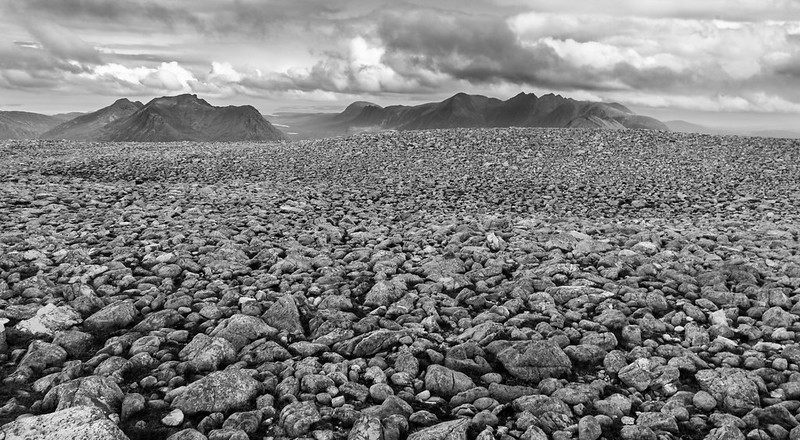
Shape - Now that I really like, a great description to your thoughts/reasoning behind this too, I think it works very well and love the B&W, the low point of view and the vast foreground works for me :clap: as for the horizon, I'm hardly in a position to spot it :D
 
It's a cracking view, I like the clouds encroaching into the top of the shot and the jutting out piece of rock in the foreground, would love to go up that high and try some shots :)

Yeah... I always start off thinking that, too. On this particular trip though, 14 hours in and 3,000m climbed vertically up and 3,000m climbed vertically down again... I was frankly less than impressed with my stupid decision to do it. :)

All joking aside though, I love being up in the mountains - whether walking, scrambling or skiing. It's just the getting up there in the first place that's a bit of a drag! That's why I have to take a lot of pictures when I'm there to make it worthwhile.

Thanks very much for your very helpful crit - all points very valid on strong and yum. Re: the latter, I think "family album shot" is probably the fairest description. But it ticks the box and helps me improve my portraiture. Glad you liked the two mountain shots. Funnily enough the shape shot I wasn't remotely happy with until I converted it to high contrast B&W (by creating a very sharp 'S' in the tone curve in LR) - it was one of those where I had the idea in my mind but I really didn't expect it to work until I tried it. Compositionally, the picture still leaves me a bit uncertain but your and Graham's positive comments are helping convince me... ;)

Thanks!
 
Hi Paul...a gorgeous little girl in your YUM shot, a very natural image that shows off those lovely blue eyes...super messy age isn't it :)

Mountains...a glorious view for strong, and I like the composition very much in shapes, quite a fascinating image that one, it's good to see something different. Excellent choice in the B&W.

Regarding comments...you will always find mine lacking technical info...as I don't know any :) my photography is all trial and error. However I always try to add something regarding the visual aspect and I'm really enjoying your thread.
 
Hi Paul'
Lke Susie I have very little technical knowledge, I comment on what I see and like and you are putting up some super pictures, which make it hard for me to comment on them, I love the image of your little girl she is beautiful I like the composition with her slightly to the left and the soft colours are lovely (y)
Your shot for strong is worh looking at on Flikr its a cracker:)
I like the b/w one for shape, the multi shaped stones in the foreground i like:)
 
Hi Paul

swift catch up from me ....

The staircase....I'm so envious of shots like this - 1st one is my preferred version....love the range colors & tones , the lines leading to the centre ,the placement in the frame & the crop...essentially just LOVE it :clap:

Shape...beautiful mono , sharp, enough interest throughout to keep me looking , maybe not a typical landscape but it works really well :clap:

Yum...not so keen I'm afraid...to much shadow on the face maybe ?

Strong....on theme again, like the bridge coming in top rh corner but not sure about the crop ( but then I always get crop's wrong !) I'd maybe have lost a bit from the bottom & the lhs ?
 
Susie, Judi & Lynne - thank you for the kind comments - it's nice to know people enjoy looking at my photos almost as much as I enjoy taking them! You all have more than enough knowledge to take some wonderful pictures, which is all you need ;) More technical knowledge can always be picked up over time, but instinctive talent and creativity can't - and you (and so many others here) are pretty blessed with that, so count yourselves lucky!

Lynne - thank you very much for the crit especially on Yum - I really just can't get that "studio" look to my photos, even when I'm comparing to pros who've shot just in natural light... so I need to keep practising. Please keep critting! Strong was one where I wasn't as happy with the photo as I was of the symbolism, so I completely agree it's not quite right. I just can't quite work out what to improve (apart from a bit of cloning).

Craig - don't worry at all and no need to apologise... it's my fault for starting late and forcing people to look through more photos more quickly now I'm catching up! I look forward to reading your comments on my later photos.

And speaking of catch ups... here's week 18, Fresh. Which I have subtly re-punctuated to "Fresh?" (Photo taken on 4th July just for the sake of clarity!)

Thoughts before taking: 1) I want to improve my still life / set up shots. I have no studio/lightbox facilities so I make do with a single off camera flash and natural window light. I actually find this helpful for me as I'm learning because there are fewer variables to play with - three angles/positions (window-subject, flash-subject and camera-subject) and then the balance between ambient and flash. 2) Food photography is something I've never played with, but as a very keen cook, I'm interested to learn more especially since I love practising patisserie... :jaffa: 
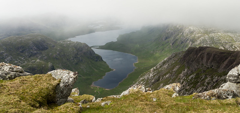
(I couldn't find a tart smilie!)

I quite like this shot but I can also see it's not up to the standards of many others' food/still shots. What can I do to take it up a level?

Week 18: Fresh?


Fresh? It's only a few days...
by pjm1 (Paul), on Flickr

Any and all comments welcome and in particular harsh criticism!
 
Last edited:
Hi Paul,
lovely shot, mirrors to aim light to a specific place and kitchen foil crumpled and glued to a piece of cardboard makes a very good reflector. i like your layout and it all looks very fresh minor crit the dark triangle bottom left (y)(y)
 
Thanks Judi. I'm a bit nervous about my likelihood of messing up with a metallic reflector but I might just try white A4 stuck to some cardboard next time... good thinking! Thanks for the comments - do you mean the shadow beneath the blueberry punnet? That bugged me too, but I guess a home-made reflector held by me could eradicate it next time.

Cheers!
 
Hi Paul

Fresh.....I like the chopping board for the base , the light looks reasonable & the quirky angle works , focus looks good on the punnet & no harsh brigh spots on the shiny knife ( which can be a mare ) :)
As Judi said , homemade reflectors are easy enough to make or blow a tenner on fleabay & get a circular one with 5 different covers to give differing tones whilst bouncing/directing light back in an image .You only have a slight shadow from the bowl which isn't a problem anyway...shadows are real .
You obviously had a reason for using 3 strawbs in the bowl & blueberries in the punnet ? Personnally I'd have gone for one fruit....maybe 2 , but put them in the bowl & had a few (artfully) arranged on the board ( as per Susie ) , maybe some of the strawbs cut in half or 1/4's to show the freshness of the flesh ?
Dunno if any of that helps ?
 
Thanks Susie and Lynne... replying on phone so apologies for any typos :)
Yes, my reason for the two fruit and question mark at the end of "Fresh?" Was intentional but not explained at all - my fault! The story was the strawberries were fine but the blueberries are out of date - hence Fresh? I wasn't trying to convey a sense of freshness (Susie's ideas is far better for that) but instead the dilemma of "shall I / shan't I?" The pause to decide also made the arrangement a bit more believable to me - caught umming and ahhing mid prep. It was also the reason the focus was directly on the date on the punnet..

Does that make more sense? Or was I trying to be too complicated for my own good?!? :)

It was all triggered by me being about to give the blueberries to my son only to realise they were out of date. (He did still get them and they were fine but he had to wait until after I'd set up the shot!!)
 
Last edited:
Or was I trying to be too complicated for my own good?!? :)

:) I think we all do that at times....I think the problem with your plan is that we have no idea of the date of the photo, maybe if there was a newspaper or something at the side showing a date in advance it would have been clearer....not sure if I understand myself now :confused:
 
Last edited:
Hi Paul lovely eye contact in yum. A little fill flash would've been great here to make it really pop.

Shape works really well the black-and-white suits the subject matter. I did wonder what do,e foreground interest would look like, a big rock for example, but I'm looking at it again I prefer it as it is.

Fresh, I think you could do much better by just using a knife to cut some of the strawberries, I don't really get the connection between the two fruits.

Cheers.
 
Thanks Susie and Andy... I think it's fair to say I can use Fresh as a bit of a learning experience - technically the photo was okish but story-wise it was really lacking. That's good as I can take a lot from that! Thanks also for the tip re: Yum - I'm doing a friend's Match.com photo in a week or so - that might just help!

Next week, next challenge. Loud. What a tricksy little number that one is!

I'm spending the week in Mull, so I simply had to include a picture of the seafront at Tobermory. Is it loud? Well, it's bright. And, during Scottish school holidays, "Balamory" certainly isn't quiet... (Having five kids in tow might not help, mind).

I'm on the laptop with a poor screen so this PP might not be close to what I'm seeing for the rest of you... barring that, I wanted to "loud it up" without ridiculously overcooking the saturation. Not sure if I've succeeded?


Loud: Tobermory seafront
by pjm1 (Paul), on Flickr

At the end of the day, if this shot is rubbish, I don't mind at all. I'm sitting here eating the most amazing scallops, langoustines and mussels all caught from within 20 miles. Photos or no photos, life doesn't get much better than this!
 
Last edited:
Yum - Great image and good take on theme...
Shape - Again bang on with the theme and enough interest in the image...
Fresh - Nice use of DOF in the image... maybe a few berries scattered round the box would have made it a tad more interesting with catch light etc...
Loud - haha great take on theme... this is what I enjoy about this. Everyone has their own idea... nice thinking outside the box...
 
Thanks Colin... much appreciated. Comments on my shots like Fresh are definitely helping me more - I want to use this to try to push me into areas I'm less comfortable (stills, low key etc.) I'll still need to throw a couple of "easy"/familiar shots to keep me happy that I can still take ok photos but I'll be honest and say I get less out of "great photo" than I do "rubbish execution and you should have done x, y and z to improve it". Ok, nobody's done the latter yet, but just to say I appreciate the comments regardless!

I have what I think is a good idea for my mono catch up, which is way out of my comfort zone - low key and composite of two shots. We'll see if it works and then I can garner crit on how to do it better next time!

Before that though I need to do twisted... so I'd better get my thinking cap on. It should really be an easy theme...

Cheers again!
 
loud - those houses certainly are, cracking sky and great reflected colour from the houses.

Couple of things, oversaturated, a little bit I think, but I see why you have, just needs tweaking down a tad, did you up vibrance or saturation here?
A little soft on the left side, particularly the co-op building?
And I'd like a bit more sea, to include some more of the reflections, especially the rainbow to the right. You've not mentioned a panorama, so Imagine you've cropped off the bottom (and / or top)?
 
I like that "loud" image very much (y)

but I agree ... I'd like a bit more sea in the foreground.
 
Back
Top