weekly Posiview's TP52 for 2014 Week 52 Support added and FINISHED :)

Hi Andy

Vertical is a nicely taken shot but on my screen (looking at flickr) it looks quite processed in terms of saturation etc. It definitely doesn't look flat to me - if anything, slightly too far the other way.

Nice idea and nicely taken shot though. Love the pop from the background. The only other point which could lead to flatness is that the subject is quite thin - which means it doesn't stand out as much as something fatter. But that's all!

Cheers. I must get my screen calibrated...or buy a new laptop :)

must admit, I'm in the "lacking something" camp on this one... the crop is an improvement for me, but somewhere along the way seems to have lost some of the colour... original possibly had a wee bit too much colour, but at least that made it stand out.

edit..... having looked at these on my tablet, the colour issue isn't there.... (both appear saturated). But looking deeper, the crop image has no colourspace associated with it, the "original" has Prophoto RGB.

This could explain the "flat" comments?

Thanks for the FB as above re my screen (y)

Hi Andy
Dream, having been there when you were shooting this car, I know the difficulties presented in composition by having other cars nearby. You've done a great job in cleaning up the scene.(y)
I am with Lynne on this one though, the grass appears just a little too surreal for my taste but again it is your creative choice so good work.

Vertical, i will go with the cropped version, it just seems to work better having the plant larger in the frame.
I am also in the "needing something else" camp though. It just seems a little stark against the black background, maybe thats what it is, the background. Perhaps if it had a more complimentary colour it would lift it a little.:thinking:

Yeah the grass does appear to be over saturated...see my first reply. Not that I'm blaking my tooks :)

Nice Mg that Andy, it looks really good, the grass has been mentioned. I like the image.
vertical, this one seemed to pop more when viewed on flickr. Lovely bg which the colours really stand out against. I prefer the one with the crop.

Thanks, Michael, mixed thoughts on the BG, but I'm with you in that I prefered a plain BG.

Liking the crop Andy... The green stands out nicely !!!

Cheers, Dean.

Dreamy - love it the green against the blue really give impact

Vertical - tighter crop is spot on back round is perfect nice detail :clap:

Thanks, I'm with you on the BG (y)

HI Andy

Vertical....cropped version all the way....can see more of the delicate detail , the black contrasts well with the green/yellow of the plant.....lovely & simple but effective :clap:

'ello, cropped for me too, I liked the initial idea of having plenty for it to fall into, but as said there is more detail with the crop.

Chests all.
 
Cheers. I must get my screen calibrated...or buy a new laptop :)

Even if you buy a new laptop, if your images don;t have a colour space / profile embedded, then they're not going to look the same on all screens, or even different browsers on the same screen, or even different hosts, within the same browser on the same screen.(?) Hence a few saying looks better on flickr!

Have a look here for a good start ref colour profiles... http://www.talkphotography.co.uk/threads/iphone-saturation-question.549123/#post-6346912

Not that I'm blaking my tooks :)

That'll be a northern expression then? ;)
 
Even if you buy a new laptop, if your images don;t have a colour space / profile embedded, then they're not going to look the same on all screens, or even different browsers on the same screen, or even different hosts, within the same browser on the same screen.(?) Hence a few saying looks better on flickr!

Have a look here for a good start ref colour profiles... http://www.talkphotography.co.uk/threads/iphone-saturation-question.549123/#post-6346912

You sound like my wife ;) I'll have a looksy at the link tonight. I've had a Macbook Pro in my vertual basket every day this week but haven't managed press the Buy button :(
That'll be a northern expression then? ;)

Stoopid fat fingers :)

Cheers.
 
Form an orderly queue. I am the chap on the right :) Slapylinky

Interesting week, but I won't bore you because I have a pie in the fridge.....yup I did photograph this one before I started to eat it. I apologise for any spelling mistakes...my gut is impeding my keyboard :muted: :muted:

We have two submissions. To paraphrase the Sage Homer Simpson, "Both of these are good, in theory!".

Anyway, I'm off to get drunkerer :)

Have a good weekend all. I'm up early for the TDF :clap:

Cheers.

Week 25 Yummy! by andysheader (Posiview), on Flickr

Week 25 Yummy 2! by andysheader (Posiview), on Flickr
 
Hi Andy, good work rate this week with a couple of submissions which couldn't be more diverse if you had tried.

If I had to decide between the two, #1 would get my vote, its bright vibrant colour is appealing and eye catching and its on theme but, (there's always a but ;))
I find it compositionally quite awkward. Its in the top half 'looking' down, I think i would prefer it facing upward. Not too sure about the jagged cut marks. I feel bite marks would be more suitable.

When i first looked at the cake on the black background, something immediately struck me as to how similar it looked to pac-man, I would be tempted to cut the cake so as to look like pac-mans mouth and maybe place something for example a strawberry in front of it still on the black background so as it looks like game play IYSWIM?

#2 is a creative idea but I find the building a little dark in contrast to the bright blue sky, maybe bringing the shadows up a little would reveal the building more?

Cheers, Iain. Great crit. These were very much lastminute.com submissions which is no excuse. With the first one, I did originally have bit marks but didn't like them so I cut more out. Compositionally, I like it as it is. If I were to bite a cake and out it down, I'd put it as it is here. Thanks for the suggestions, though (y)

#2 was with my phone camera and I photographed directly into the sun so the camera got very confused and metered for the sky. I brought the shadows up as much as I dare in post. The sky is a rather poorly Photoshop in as well.

Anyways, I have an idea for loud which I will do Sunday so I can spend a little more time :)

Cheers.
 
Cheers Andy, I was thinking out loud to be honest, these are your creative choices and they are very much respected.
I have yet to come up with any ideas for loud :thinking:
 
Cheers Andy, I was thinking out loud to be honest, these are your creative choices and they are very much respected.
I have yet to come up with any ideas for loud :thinking:

All crit is taken on board, Iain (y)

Loud does seem like a difficult one, but I I'd have an idea that may work :)

Chests.
 
Hi ya

not quite sure what to make of Yummy....1st off I thought it was part of a pumpkin ! It's sharp , brilliant color & a super black bg....but I'm really not sure about the placement .........are you left handed ? at the end of the day if it's how you want it that's all that matters (y)

Yummy 2..........really don't wanna as it's from a camera phone...cracking sky though :)
 
Last edited:
Vertical - I prefer the crop, although it is a nice image overall :)

Thanks (y)

Hi ya

not quite sure what to make of Yummy....1st off I thought it was part of a pumpkin ! It's sharp , brilliant color & a super black bg....but I'm really not sure about the placement .........are you left handed ? at the end of the day if it's how you want it that's all that matters (y)

Yummy 2..........really don't wanna as it's from a camera phone...cracking sky though :)

Right-handed :)

It was how I wanted it but late submissions are never easy.

Hope you got plenty of pics of the TDF M8...

Liking both your images for YUM... actually laughed when I seen the second image...

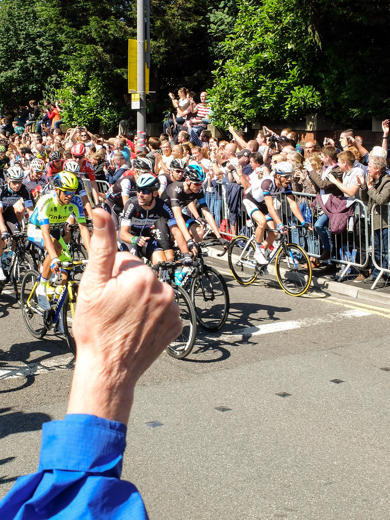
One from the TDF...Oh, I did laugh :(

Cheers.

Pass me the bat! by andysheader (Posiview), on Flickr
 
Hi Andy, a couple of good efforts there. No point in adding my critique as it's already been said. Thumbs up for the tour! ;)
 
Yummy 1: great fun image but well executed and great colours. I personally would have preferred a much lower POV rather than standing over it, but aside from that it's great. Nice blackground.

Yummy 2: very funny and made me smile. Despite looking at it on both my cruddy laptop and phone, I can't make out much detail in the blacks but that could be my problem rather than a general issue - my monitor is at home and I ain't!

It's nice to see everyone mix it up a bit, though...
 
Yummy 2 made me laugh too

food for thought

Cheers (y)

Hi Andy, a couple of good efforts there. No point in adding my critique as it's already been said. Thumbs up for the tour! ;)

Thanks and grrrr for the TDF.

Yummy 1: great fun image but well executed and great colours. I personally would have preferred a much lower POV rather than standing over it, but aside from that it's great. Nice blackground.

Yummy 2: very funny and made me smile. Despite looking at it on both my cruddy laptop and phone, I can't make out much detail in the blacks but that could be my problem rather than a general issue - my monitor is at home and I ain't!

It's nice to see everyone mix it up a bit, though...

Cheers, yeah the POV, I did think about a lower one but decided on this one

#2 was on my phone so not to good

Appreciate the FB.

Hi Andy,
Yum... I'm a bit like Lynne couldn't work out what it was, cake it is, was it yummy? stands out nicely on the black, the placement would work for me with a lower pov :)

This was yummy...as was the other two I are before I manage to get my camera out :

Cheers.
 
Hey Andy :)

Looks like you had fun doing these... and fun whilst posting them lol...

Yum - Two very different images, the second is a fun idea and made me laugh :D., The church is just sooooo dark compared to the wonderful sky and bright grass (On my un-calibrated) so possibly wrong, so my vote goes for the beautifully bright tart on the first shot, nice jagged teething marks, the detail is super with the little crumbs, a nice stark colour against a good black/reflective background, PoV... Like it as it is to be honest (y)

... Mmmmmm making me very hungry
 
Loud.... both musically, and in colour right?? :)

You bought that? And you're going to wear it when?? :LOL:

Compositionally it works, but the colours look to have been ramped up in saturation too much, (for obvoius reasons if they have), but at the expense of some texture in the lines?
 
Loud.... both musically, and in colour right?? :)

You bought that? And you're going to wear it when?? :LOL:

Compositionally it works, but the colours look to have been ramped up in saturation too much, (for obvoius reasons if they have), but at the expense of some texture in the lines?

Yup, I bought it for the theme...and won't be wearing it :)

I did up the saturation but there isn't much texture anyway. I'll revisit and reduce the saturation to see what it loks like.

Appreciate the FB.

Cheers.
 
Hey Andy :)

Loud - I'm liking that, although the top of the bin is lit lightly, there is enough so that you can still make out what it is, the colours look good on my tablet and I have to say that is a SPLENDID tie... it's a sure winner of any 'bad tie day' :D

Cheers bud.

Might wear the tie to our next meet :)
 
It certainly is loud!
It was a great purchase and I don't think it should be thrown away. I love the highly saturated colours and how it's been lit.
 
Hi Andy, now thats a tie, I am surprised the pic wasn't you naked with just the tie on ;)
Composition spot on and I like the very bright almost luminous colours
can't believe you wont be wearing it.
 
It certainly is loud!
It was a great purchase and I don't think it should be thrown away. I love the highly saturated colours and how it's been lit.

I suspect you'll be seeing it again at some point :)

Hi Andy, now thats a tie, I am surprised the pic wasn't you naked with just the tie on ;)
Composition spot on and I like the very bright almost luminous colours
can't believe you wont be wearing it.

Cheers, Allen, trust me I did consider a selfie with the tie strategically placed :runaway:

Cheers.
 
Yummy, got to be the pie (y) good colour and a nice touch of reflection.

The tie is nicely lit with enough emphasis on the colours to make it loud :)
 
HI Andy

Yum - first one is excellent colours are vibrant, nice little reflection and the backround suits it perfectly, 2nd image baffled me for ages not notice the chucks missing :)

Loud - quite like the effect but cant make my mind up on the saturation if its too much or adds to the loud theme :thinking:
 
Yummy, got to be the pie (y) good colour and a nice touch of reflection.

The tie is nicely lit with enough emphasis on the colours to make it loud :)

HI Andy

Yum - first one is excellent colours are vibrant, nice little reflection and the backround suits it perfectly, 2nd image baffled me for ages not notice the chucks missing :)

Loud - quite like the effect but cant make my mind up on the saturation if its too much or adds to the loud theme :thinking:

Cheers, appreciate the FB.
 
love the idea for this Andy, and couldn't agree more. The pose works for me and its nice to see a different approach to lighting. Crit wise id say possibly a little more light around the top of the head and it looks a little cool to me, could well be my monitor though :thinking:
 
You speak the truth Andy (y)
Couldn't possibly critique the image as the sentiment behind it is what is important.
Love the expression on isabelle's face as her Mum has her in a choke hold:D, the eye contact really makes it. Good work matey (y)
 
I like your thinking Andy I too am rich in this way with a fantastic husband and my very beautiful, funny, full of life daughter!!!

Have a great holiday.
 
Andy - two more good shots!

Loud: it certainly is. Good shot, nice lighting and well composed. Superbly on theme. (Horrible tie, mind)

Rich: wow. I'm going to focus my comments on this photo as for me it's virtually perfect. I really love the lighting - it draws you in. Yes, a touch more lighting on the tops of the heads might be "classically better" but then you'd lose some of the attention on the faces. Maybe a touch of brushing some shadow lightening would help, rather than changing the lighting? The models are brilliant, poses (if posed) great and wonderful eye contact (and non-eye contact with your wife which really works for me).

A genuinely super take on the theme - I love it. What was the lighting setup because I really like that look? Level with and right of camera? No fill? :clap:
 
love the idea for this Andy, and couldn't agree more. The pose works for me and its nice to see a different approach to lighting. Crit wise id say possibly a little more light around the top of the head and it looks a little cool to me, could well be my monitor though :thinking:

Thanks, yeah, liking again if loos a little cool. My cheap flash that I use for rim lighting is busted so I did without.

Cheers.

You speak the truth Andy (y)
Couldn't possibly critique the image as the sentiment behind it is what is important.
Love the expression on isabelle's face as her Mum has her in a choke hold:D, the eye contact really makes it. Good work matey (y)

Cheers, Iain. Never mind Jackie choking her....I was almost going to join in :)

I like your thinking Andy I too am rich in this way with a fantastic husband and my very beautiful, funny, full of life daughter!!!

Have a great holiday.

Thanks for the comments (y)
 
Back
Top