weekly Posiview's TP52 for 2014 Week 52 Support added and FINISHED :)

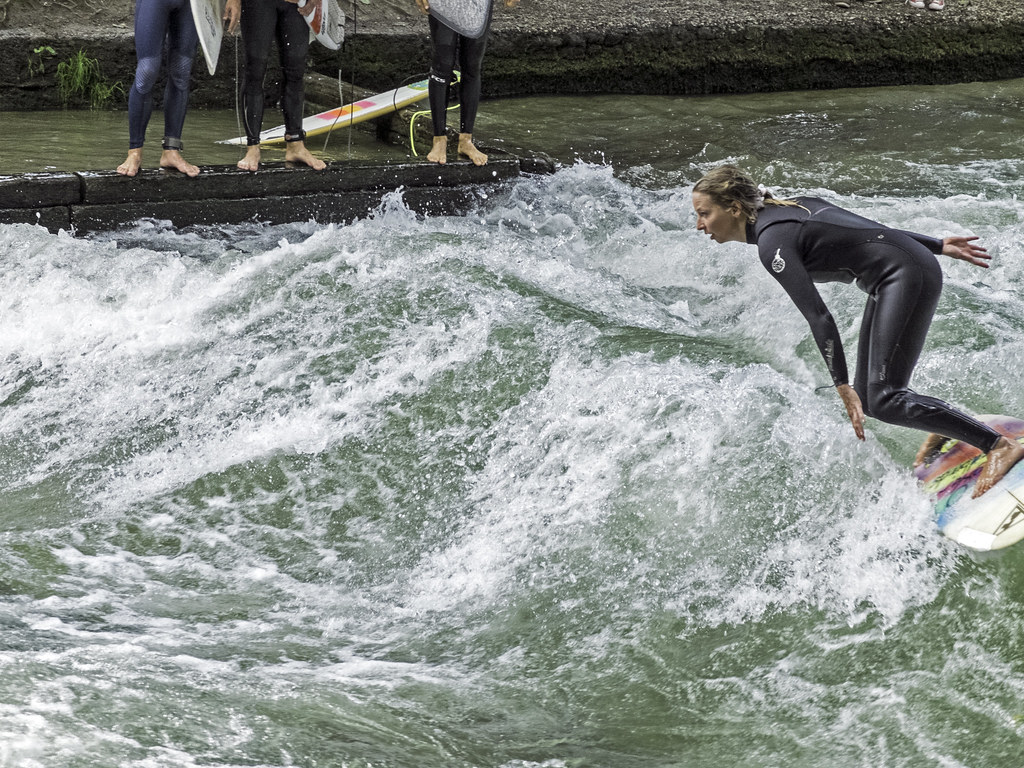
Evening all, well, while walking through Munich I happened upon some surfers in the town centre surfing in a river! I'd seen people with surf boards but had no idea what they were doing. First thing I through was of a line from Point Break, "It's 100% pure adrenaline!" If you haven't seen the film it won't really mean anything :)

First one was always going to be the one I used. I know the end of the board is clipped but that's why I like it. I like the angle she is at and the three guys in the upper section watching her and waiting more their turn. I know the water looks too green, but that's the actual colour.

Second one is a SOOC to show context.

Cheers, all.

Week 34 Pure by andysheader (Posiview), on Flickr

Week 34 SOOC by andysheader (Posiview), on Flickr
 
crikey....I have been a slack mare haven't I.....'pologies matey :oops: :$

In no particular order.....

Pure....... on 1st seeing this I thought " Pure water ? " " pure madness ? "...I have seen Point Break but but struggle to remember 5 minutes ago let alone the line from the film ;) I know you prefer the 1st shot but the 2nd one gives more context & connects easier to the line " 100% pure adrenalin" for me....

Architecture......cracking pov , mono works perfectly .......all you need to do is put a proper sky in & it's sorted :naughty:

Promise...........I trust no JD was wasted in the shooting of this :eek: cracking shot , perfect placement , no highlights & sharper than a sharp thing :clap: My only little niggle is the " something or other " under the top of the bottle...i suspect it's a small pool of JD but need a bit more light or maybe a color version to say for sure ?

Sharp...everyday's a school day on here.....#2nd one for me as well ( but then I'm a sucker for close up views) Perfectly focused , lovely lighting , a hint of blade & a splash of vibrant color :clap:

Right... think that's me up to date ....till next week anyway

Hope you had a fun time in Germany .........
 
Catch up time........

Skill - Nice idea although feels just a little cut out. Watch out for the direction of the lighting/shadows as this may give a strange feel to it

Half - I like the low PoV on this one. The TV is a bit distracting but you've done well given the lighting conditions

Architecture - Super idea and nicely fitting in with your US trip. Strange pixelation in some of the clouds but the conversion has been nicely done which for me the right amount of contrast.

Promise - I do like this. Great low key approach. The angle of the subject plus the reflection make this a thumbs up from me

Sharp - Another great shot. I must admit I can't decide between the two. The choice of red is inspired for this one.

Pure - I prefer the first one but a shame that her surfboard is just cropped off camera.
 
sharp, closer crop for me, must say I had to look awhile to see the sharp part, till I realised it was still sheathed(?). Lovely red and super detail.

Pure - close enough to the theme, (as in, we've had worse!), first would be the one if it was all there, the three sets of legs jar a bit too. But the angle and the movement and splash of the water work.

second one works well as an overview but as you say, lacks the drama of the first.
 
Hi Andy...

Pure - well, it's on theme enough for me (a toughie this week). A difficult scene to capture zoomed in and you've done well to nail focus (perhaps helped by a small aperture?)

I actually think a jaunty angle would work - a bit of CW rotation and Dutch (Bavarian?) tilt... partly because it would give you enough leeway then to crop out the legs! I don't mind the board being cropped but I'd honestly still prefer it slightly if it were all in frame. Hey ho. Good details on the dark wetsuit whilst not losing highlight detail. Contrast may have been squashed a bit as a result, but it works and it's a bloomin' tough shot given all the constraints mentioned. Well done!

Second is great contextual shot but has nowhere near the energy of #1 so it's only interesting as a scene setter. Great captures though, well done.
 
Hi Andy ....well there are plenty of surfers here where I live and I'm sure they would all agree with your comment...so an excellent choice for the theme. The location adds extra interest ...certainly not what you expect to go sailing past you on a river. Not easy to catch someone in mid flight like that so well done with that....I must admit I would prefer those feet not to be there though !
 
crikey....I have been a slack mare haven't I.....'pologies matey :oops: :$

In no particular order.....

Pure....... on 1st seeing this I thought " Pure water ? " " pure madness ? "...I have seen Point Break but but struggle to remember 5 minutes ago let alone the line from the film ;) I know you prefer the 1st shot but the 2nd one gives more context & connects easier to the line " 100% pure adrenalin" for me....

Architecture......cracking pov , mono works perfectly .......all you need to do is put a proper sky in & it's sorted :naughty:

Promise...........I trust no JD was wasted in the shooting of this :eek: cracking shot , perfect placement , no highlights & sharper than a sharp thing :clap: My only little niggle is the " something or other " under the top of the bottle...i suspect it's a small pool of JD but need a bit more light or maybe a color version to say for sure ?

Sharp...everyday's a school day on here.....#2nd one for me as well ( but then I'm a sucker for close up views) Perfectly focused , lovely lighting , a hint of blade & a splash of vibrant color :clap:

Right... think that's me up to date ....till next week anyway

Hope you had a fun time in Germany .........

You have indeed been a little slack ;)

Thanks for the FB. Promise, really struggled to get a decent reflection and the spillage fo JD (;)) wasn't working.

Cheers.
 
Catch up time........

Skill - Nice idea although feels just a little cut out. Watch out for the direction of the lighting/shadows as this may give a strange feel to it

Half - I like the low PoV on this one. The TV is a bit distracting but you've done well given the lighting conditions

Architecture - Super idea and nicely fitting in with your US trip. Strange pixelation in some of the clouds but the conversion has been nicely done which for me the right amount of contrast.

Promise - I do like this. Great low key approach. The angle of the subject plus the reflection make this a thumbs up from me

Sharp - Another great shot. I must admit I can't decide between the two. The choice of red is inspired for this one.

Pure - I prefer the first one but a shame that her surfboard is just cropped off camera.

Thanks for the FB Peter. The sky was added and I really should have taken more care with it.

Missing Florida alread :(

Cheers.
 
sharp, closer crop for me, must say I had to look awhile to see the sharp part, till I realised it was still sheathed(?). Lovely red and super detail.

Pure - close enough to the theme, (as in, we've had worse!), first would be the one if it was all there, the three sets of legs jar a bit too. But the angle and the movement and splash of the water work.

second one works well as an overview but as you say, lacks the drama of the first.

Cheers, the bank near the surfers was abslutely packed so I could not get a better posiiton....excuse...excuses.

Chers.
 
Just worked out how to do the multi quotes :oops: :$

Hi Andy...

Pure - well, it's on theme enough for me (a toughie this week). A difficult scene to capture zoomed in and you've done well to nail focus (perhaps helped by a small aperture?)

I actually think a jaunty angle would work - a bit of CW rotation and Dutch (Bavarian?) tilt... partly because it would give you enough leeway then to crop out the legs! I don't mind the board being cropped but I'd honestly still prefer it slightly if it were all in frame. Hey ho. Good details on the dark wetsuit whilst not losing highlight detail. Contrast may have been squashed a bit as a result, but it works and it's a bloomin' tough shot given all the constraints mentioned. Well done!

Second is great contextual shot but has nowhere near the energy of #1 so it's only interesting as a scene setter. Great captures though, well done.

As I recall i was on the lowest F on the Fuji.

Pure, never thought of a totation, thanks for the suggesiton.

Cheers.

Hi Andy ....well there are plenty of surfers here where I live and I'm sure they would all agree with your comment...so an excellent choice for the theme. The location adds extra interest ...certainly not what you expect to go sailing past you on a river. Not easy to catch someone in mid flight like that so well done with that....I must admit I would prefer those feet not to be there though !

The feet, strange, I purposly wanted them in for a little quirkyness.

Thanks for the FB (y)
 
Hi Andy, agree with above comments regarding the feet in 1, so number 2 as it gives the idea of what a strange place to surf
 
Hi Andy
Good city break i hope.
Pure - like both shots for different reasons, but first does have a bit more drama partic as one can see the concentration on the face. I too find the feet a distraction, but clipping of board is Ok

Yeah I like both of them too, great expression and angle from the lady, but for me I prefer the second shot, much more context with the wave, the line of the river and the watching crowds - how exciting is that !!!!

Hi Andy, agree with above comments regarding the feet in 1, so number 2 as it gives the idea of what a strange place to surf

Cheers, all, I'm still preferring the feet in.....:)
 
I had all manner of ideas for this and Jackie was kind enough to buy me a load of sparkler related accoutrements. All of which are sat in the kitchen. I drive past this building on my way to work and without being overly sentimental it's a building that's been there as long as I can remember. I have vague recollections of sneaking in there as a kid :) It's a shame when such buildings get demolished but hopefully a decent replacement will be constructed in its place.

Those who haven't see it might not feel any kind of emotional attachment, and I can understand why, after all it just looks like an old building being demolished.

Anyways, I decided to use my X20, take a series of photographs, 18 in total, process them in Analog Efex Pro 2, the stitch in Photoshop. I decided not to blend them and even purposely repositioned some so it wasn't too clean.

A building that's lost it's sparkle.

Anyway, apologies for the somewhat maudlin post :)

I'm off to see is this week's theme is up.

Cheers all (y)

EDIT BELOW AS SUGGESTED BY GRAHAM AND PAUL :THUMBS: ORIGIONAL IS STILL ON MY FLICKR.
 
Last edited:
Nice work Andy - liking the disjointed stitching here and a well timed capture of it mid-demolition.

Like the back story and the old time processing is entirely suitable.

only thing I might mention is the misallignment / joiner effect doesn't stand out as much as it possibly could if the individual photos had some variance of brightness. As if the camera was on an auto setting, rather than a locked exposure / focus as you would do for a more complete harmonised panorama image. (Minor point though.)

This is why I like TP, cracking idea and one I didn't think about doing. I usually save such submissions with the layers in tact but didn't on this occasion :arghh:

Cheers.
 
I like it Andy but I couldn't quite put my finger on what was missing... and then I read Graham's comment and he's absolutely nailed it. In particular, the sky is too well blended (!) for the joiner really to work.

I do like it though and it's a very thoughtful take on the theme. Well spotted (y)
 
Hi Andy, nice explanation as to why as I was a little baffled just looking at the pic, my crit would be to lose the white edges, but maybe thats the point of the effect leaving them in, I have no idea
 
Hi Andy, nice explanation as to why as I was a little baffled just looking at the pic, my crit would be to lose the white edges, but maybe thats the point of the effect leaving them in, I have no idea

Cheers, the white edges..easily removed in post but left in for artistic purposes :)

Hi Andy...I really like this...great original idea for the theme ...very eye catching :)

Thanks. I like being original (y)
 
Yep, the subtle differences in brightness and WB(?) make a big difference there.

Also you're right to leave the ragged edges with the white behind. With this type of joiner I'd say you're not trying to make a seamlessly blended panorama, but a more quirky joined effect. So not cropping in to remove the individual edges is completely appropriate.
 
HI Andy


I figured we'd get something different from you for this theme & you haven't disappointed :D

I must confess to not understanding , at all , in anyway shape or form , the Joiner effect :thinking: - it's one of those many things that goes straight over my head :rolleyes: However , I do like the back story & suspect it involved quite a lot of work (y)
 
Really like your edit Andy. (y)

Really like these images of yours mate, the fact that you have not blended them, the different tones and the frames not quite matching - Love It :clap:

Yep, the subtle differences in brightness and WB(?) make a big difference there.

Also you're right to leave the ragged edges with the white behind. With this type of joiner I'd say you're not trying to make a seamlessly blended panorama, but a more quirky joined effect. So not cropping in to remove the individual edges is completely appropriate.

HI Andy

I figured we'd get something different from you for this theme & you haven't disappointed :D

I must confess to not understanding , at all , in anyway shape or form , the Joiner effect :thinking: - it's one of those many things that goes straight over my head :rolleyes: However , I do like the back story & suspect it involved quite a lot of work (y)

Cheers, all, appreciate the feedback.

My final submisison was and edit after suggestions from Paul and Graham (y)

Lynne, I'd explain the joiner effect but it's technical ;) If you are interested Google David Hockney who does wonderful joiners.

I have an idea for Fall and hopefully will be able to photograph it this evening.

Cheers.
 
Hi Andy
Sparkle - cracking shot (y)- thoughtful idea and well handled. Like the washed out feel that emphasises the loss of its sparkle. I was impressed those many years ago when Hockney produced his and have always liked the effect.

It also has memories for me as our daughter attended Leeds University and this was one of those recognisable buildings that we would pass on our way home from Headingly via Kirkstall Road. Also my dad was in the newspaper trade all his life in Birmingham and I don't like to see the passing of the printed paper.:(

Cheers, Alan, I drove last today and only the main right side pillow remains :(
 
**This is an edit...origional still on my Flickr***

Is it me or do comments seem to be drying up :thinking:

Memo to self...don't go out with a nearly flat battery :help:

Anyways, I had a mental storyboard of a multiplicy for this week's theme, but I really needed an assistant, so that didn't happen.

Below is my fallback. I'm aware of a number of issues, main one is that I had to shoot at 16mm as my 17-55 is in for repair so a certain amount of wide angle distortion.

Here you go.

NB: bugger...just seen an error. A pint for the first person to see it :)

Week 36 Fall by andysheader (Posiview), on Flickr
 
Last edited:
I was thinking the same thing, tbh (re: drying up of comments) ;)

It's certainly a picture which has put a smile on my face. As a fallback, well done - it would have been easy not to post something in the circumstances. Good tip re: batteries and for what it's worth, I'd also recommend not going out to capture a tripod shot, having left the quick release plate at home... grrr!

Onto the photo, I can't say it's massively grabbing me partly because of the big foot (distortion for understandable reasons) and also the central composition. However, it is humorous (even more so because of someone's comment about an apple falling from a tree) and certainly different from the rest we've seen.

I'd suggest the greens are fairly pumped up on my monitor (perhaps the red too, although that's more likely to be my monitor as it does have loud reds). I'm a bit thrown by the foot and very FG grass being OOF, but given this was probably not a carefully staged and set up shot, I'm not going to be critical :)

Well done for getting it done and hopefully you'll be back into the swing of things with a fully charged camera very soon... (y)
 
think you're right... they do!

Nice idea, using the modern day version of the 'apple'

Glad you mentioned the WA distortion as I can't imagine your feets are that big IRL. :)

Your oopsie.... is it the motion blur above and below the apple? Or the focus on the tree?
 
It's certainly a picture which has put a smile on my face. As a fallback, well done - it would have been easy not to post something in the circumstances. Good tip re: batteries and for what it's worth, I'd also recommend not going out to capture a tripod shot, having left the quick release plate at home... grrr!

Onto the photo, I can't say it's massively grabbing me partly because of the big foot (distortion for understandable reasons) and also the central composition. However, it is humorous (even more so because of someone's comment about an apple falling from a tree) and certainly different from the rest we've seen.

I'd suggest the greens are fairly pumped up on my monitor (perhaps the red too, although that's more likely to be my monitor as it does have loud reds). I'm a bit thrown by the foot and very FG grass being OOF, but given this was probably not a carefully staged and set up shot, I'm not going to be critical :)

Well done for getting it done and hopefully you'll be back into the swing of things with a fully charged camera very soon... (y)


Cheers, you are right re the colours. I could have spent more time on the edit but needed to get to Costa for a mahoosive coffee after an 'interesting' week at work.

Just noticed loads of CA as well!

On the foot, trust me it was a lot worse before I edited in PS.

Cheers.
 
Last edited:
think you're right... they do!

Nice idea, using the modern day version of the 'apple'

Glad you mentioned the WA distortion as I can't imagine your feets are that big IRL. :)

Your oopsie.... is it the motion blur above and below the apple? Or the focus on the tree?

LOL, the motion blur was intentional :) so that's not it...

Cheers.
 
motion blur on the apple is much better, well sorted.

The colour was quite a way of on the first wasn't it! I can always see things like that when in comparison, but the first shot viewed in isolation the colour didn't jump out at me.
 
Back
Top