weekly Posiview's TP52 for 2014 Week 52 Support added and FINISHED :)

Edit is a big improvement... glad you left the blood on the cleaver - that works great.

(Hate to say but you;ve lost the left side of buzz behind woody now though. sorry. :sorry:)

I'm not sure that increasing exposure before saving is particularly good practice. :), can you not vary the brightness of the screen. Also, I have mentioned to you before, (back here in fact), these have ProPhoto RGB embedded as their colourspace, different Operating systems (?), and browsers will display differently depending on the colourspace selected. Pookeyheads tip from the link in my last post works for making sure everytihng is set to sRGB for consistency. Plus any export settings in LR.

Cheers. I'll have another look at the thread.

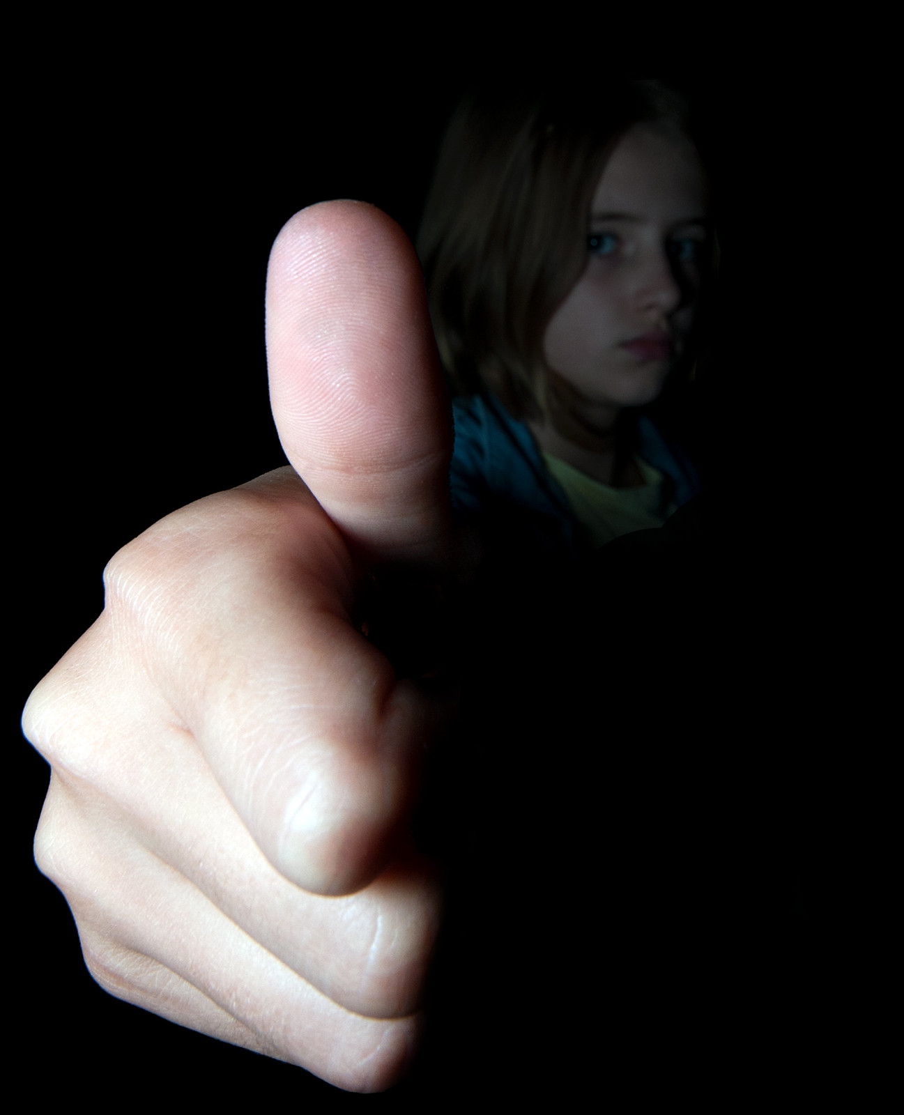
Bugger, I should not edit when tired. I make Woody bigger but didn't notice I'd covered part of Buzz :)
 
Hi Andy ....I mentioned Toy Story on Paul's thread but didn't expect to see it cropping up! It's a very original idea for the theme and well put together, I actually quite liked the rays of light on the first one ....maybe they were a bit bright, but the second one looks a bit flat to me and has lost some of the horrible gruesome look the first one had.
 
Hi Ya

catch up time again!!!

Fall.....I didn't actually notice those huge feet till I read some comments.....the Apple drew my eye straight away .Given the lens you used I think it works ok ,neat original idea & a good selfie..:)

Dark......1st one the light rays are over powering , 2nd one ,for me, is just too dark....1/2 way between the 2 maybe ? The rays just help to ground the image a bit but I'm wondering what the line thing is across the top of the image :thinking:is it part of the frame you added ?..which I quite like by the way :)

Communicate.....back to your best I feel.....great expressions, great words with a flow effect that works well.....brilliant idea , brilliant execution :clap:
 
Hi Andy ....I mentioned Toy Story on Paul's thread but didn't expect to see it cropping up! It's a very original idea for the theme and well put together, I actually quite liked the rays of light on the first one ....maybe they were a bit bright, but the second one looks a bit flat to me and has lost some of the horrible gruesome look the first one had.

Thanks, I feel I rushed the processing on this one somewhat :)

Hi Ya

catch up time again!!!

Fall.....I didn't actually notice those huge feet till I read some comments.....the Apple drew my eye straight away .Given the lens you used I think it works ok ,neat original idea & a good selfie..:)

Dark......1st one the light rays are over powering , 2nd one ,for me, is just too dark....1/2 way between the 2 maybe ? The rays just help to ground the image a bit but I'm wondering what the line thing is across the top of the image :thinking:is it part of the frame you added ?..which I quite like by the way :)

Communicate.....back to your best I feel.....great expressions, great words with a flow effect that works well.....brilliant idea , brilliant execution :clap:

Cheers, I enjoyed Communicate. Fall was annoying due to the lens issue and Dark, well the idea was there but it was let down by the processing.
 
Absolute cracker Andy, on every level.

Composition is perfect, lighting on the hand is great, and the lighting reaching the face is lovely also. Imagine it could have been easy to lose the eye on the far side into the darkness here.

Even getting the detail of the finger prints in the thumb coming through.

:clap:
 
A big thumbs up from me too :oops: :$

I agree with just about everything Graham has said, except I feel the lighting on the lower part of the hand tends to give it a bit of a deathly pallor, but any less light and you might have been in danger of losing the face, so you probably got the level just right.
 
Absolute cracker Andy, on every level.

Composition is perfect, lighting on the hand is great, and the lighting reaching the face is lovely also. Imagine it could have been easy to lose the eye on the far side into the darkness here.

Even getting the detail of the finger prints in the thumb coming through.

:clap:

Cheers. There's always room for improvement and it's costing me a firtune in 'model fees'!

Cheers.

A big thumbs up from me too :oops: :$

I agree with just about everything Graham has said, except I feel the lighting on the lower part of the hand tends to give it a bit of a deathly pallor, but any less light and you might have been in danger of losing the face, so you probably got the level just right.

Thanks. I might try and warm it up a little as she was very much alive....but a tad cold :)

Cheers
 
Nice "big" Andy. I tried doing an image like that earlier in 52s (can't remember what the theme was). Anyway, I couldn't get the lighting right so abandoned the idea.

You've got it spot on, the perfect model too.
 
Hi Andy, great pic for big had a similar idea using a wide angle,
agree with Graham about the lighting not easy to achieve but you have done it well, sits nice in the frame too (y)
 
Nice "big" Andy. I tried doing an image like that earlier in 52s (can't remember what the theme was). Anyway, I couldn't get the lighting right so abandoned the idea.

You've got it spot on, the perfect model too.

Hi Andy, great pic for big had a similar idea using a wide angle,
agree with Graham about the lighting not easy to achieve but you have done it well, sits nice in the frame too (y)

Cheers, guys.

The lighting wasn't easy but I had to make it work otherwise she'd have been off :)
 
Hi Andy ....love this one .... a real smasher :clap:

Ahhhhhhh the edit for dark works much better for me mate (y)

Big - Damn I like that, all works well for me, nice bright hand and thumb, just the right DoF to still work out your daughters face, the background doesnt intrude, super detail too - Love it :clap:

Thanks, both, simplicity sometimes is our saviour.

Cheers.
 
Thought I was the first to post but Elaine beat me to it :bat:

Anyway, Jackie and the girls went out so I decided to grab my camera and do a test photograph for an idea I had for Cut. Very much a rough draft but thought I'd post. Ideally I need a better location but it looked like it might rain so I went local. I might try a night photograph during the week.

Anyways, here's my Cut.

First draft for Week 40 Cut
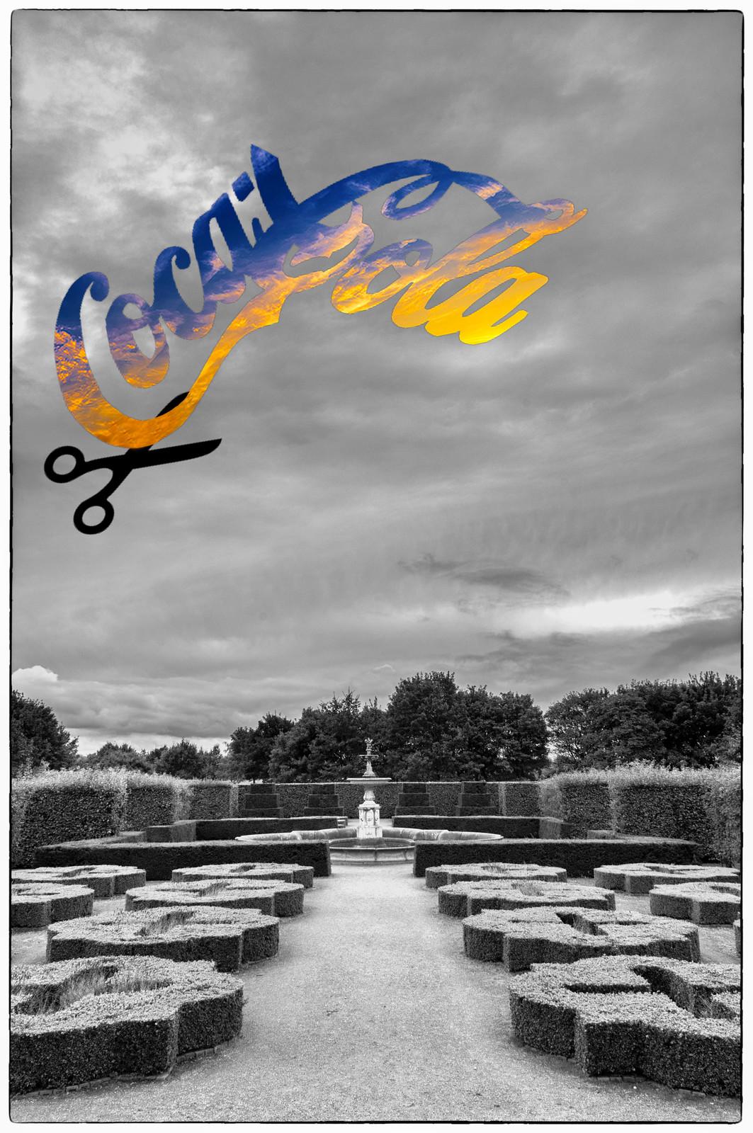
 by andysheader (Posiview), on Flickr
 
Thought I was the first to post but Elaine beat me to it

Haha, sorry :p Still, a good idea and I quite like the view! The colours are lovely and really stand out against the grey.
 
Big: cracking pic. A lesson in how to represent Big in a picture without resorting to manipulation (like me...lol) As always your lighting is fine tuned to a T and as others have said, I like that the thumbs owner is still identifiable.

Cut: Great original idea. Said it before but ill say it again - I always admire your creativity and willingness to take risks and this one doesn't disappoint on that front. No crit from me and will deffo keep an eye out to see how you develop this idea further
 
Hi I hope all is well in your world, I am still having a catch up with various themes.

Big - very good composition, and works for the theme great idea all I can say is have a big thumbs up from me.

Cut - fits the theme for me, I like it a lot no crit at all.
 
Certainly like the idea Andy (y), but think the 'cut' section could have done with being part of the same sky....if you see what I mean :)
 
Hi Andy, got to say I agree with the above comment I do feel it needs to be part of the same sky, its a good idea and as you say a rough draft
look forward to seeing if you can expand on the idea
 
Big - A thumbs up from me for this one (sorry I couldn't resist). Isabelle's expression doesn't quite match the thumb though. Whilst the hand is well exposed I also feel her face could just do with a little lift - not too much tough.

Cut - Looks like a trip to Temple Newsam to me. Blimey I've walked the dogs past those trees I don't know how many times. I like the idea but I feel the subject matter doesn't quite suit it unless it's because the clouds don't seem to match the wider scene
 
Love the idea... agree it needs something more to make it work... if anyone can find that something... it'll be you!
 
HI ya

thanks for inspiring me to use pp for this weeks theme (y)

not quite sure what to make of this ,think I like the idea, certainly different ( where do you get your idea's from by the way ?) think the lines could do with being a little less heavy maybe ? Dunno.....needs something more which I'm sure you'll come up with (y)
 
Hi, all, appreciate your comments, all taken on board.

Busy...busy...busy here so I'll look to do a reshoot at some point.

Cheers all (y)
 
Love (no pun intended) the heart one, taking the original sky and bringing it through works much better than using a different one.

Can't fault what you've done there, a young couple sat under the tree holding hands could have been nice but I don't think I would have asked any passers by to help if it were me so I can't knock anyone else.
 
Hi Andy

Fall - clever idea and well handled but lacks a bit of impact ( not literally:)) for me

Communicate - that one does have impact. another very creative idea - glanced at some other comments and the light on you is not as good as that on your daughter.

Dark - I prefer the first - the light ray dopes not bother me altho it need not be included i feel. I think that the blood is rigth as it is a Toy Story and so unreal anyway. Just would like to see the blood on the head coming from the neck rather than the top of the head.

Big - top shot.(y) Good light, comp and detail throughout. really nice shadowy b/g

Cut - I think that I ma missing something here judging by the other comments, but for what it is worth, the heart in the sky is the best as it includes the orig sky and smaller cut marks.
 
Hi Andy :)

Good to see you are getting out and about... love these two, the colours in the first are real nice and goes to show how far you could take this idea... and no: 2 is perfect for me, a much nicer sky and the heart shape hovering over that individual tree - super image (y)
 
Hi Andy!

Dark - well that really is good fun. I prefer the edit but I did quite like the light leaks (it was the extra blood which was just a touch overkill for me). I see others wondered about a half-way house and I think I agree. It's a great image though - made me smile!

Big - top drawer and a slightly disgruntled looking daughter to boot! Brilliant lighting, super detail and an excellent photo. :clap:

Cut - for me it's "Cut 2" (the heart-shaped one) which for me just really works. I think it's super and although I really didn't "get" the original, once I saw Cut 2 I realised its potential which you've delivered on completely (y)
 
Love (no pun intended) the heart one, taking the original sky and bringing it through works much better than using a different one.

Can't fault what you've done there, a young couple sat under the tree holding hands could have been nice but I don't think I would have asked any passers by to help if it were me so I can't knock anyone else.

Hi Andy

Fall - clever idea and well handled but lacks a bit of impact ( not literally:)) for me

Communicate - that one does have impact. another very creative idea - glanced at some other comments and the light on you is not as good as that on your daughter.

Dark - I prefer the first - the light ray dopes not bother me altho it need not be included i feel. I think that the blood is rigth as it is a Toy Story and so unreal anyway. Just would like to see the blood on the head coming from the neck rather than the top of the head.

Big - top shot.(y) Good light, comp and detail throughout. really nice shadowy b/g

Cut - I think that I ma missing something here judging by the other comments, but for what it is worth, the heart in the sky is the best as it includes the orig sky and smaller cut marks.

Hi Andy :)

Good to see you are getting out and about... love these two, the colours in the first are real nice and goes to show how far you could take this idea... and no: 2 is perfect for me, a much nicer sky and the heart shape hovering over that individual tree - super image (y)

Hi Andy!

Dark - well that really is good fun. I prefer the edit but I did quite like the light leaks (it was the extra blood which was just a touch overkill for me). I see others wondered about a half-way house and I think I agree. It's a great image though - made me smile!

Big - top drawer and a slightly disgruntled looking daughter to boot! Brilliant lighting, super detail and an excellent photo. :clap:

Cut - for me it's "Cut 2" (the heart-shaped one) which for me just really works. I think it's super and although I really didn't "get" the original, once I saw Cut 2 I realised its potential which you've delivered on completely (y)


Cheers, all.

I rarely moan about work but it's been an absolute 'mare if a week...and I'm about to get rather tipsy.

This is an idea that has potential but I simply didn't have the patience to see it though.

PABD is the order of the day, and perhaps a reshoot. NO comments expected.

Anyways, I'm on aTP meet tomorrow so happy day will return.

I'll only be posting quick comments because Jack Is already getting lonely :)

Week whateveritisBalance by andysheader (Posiview), on Flickr
 
That does look very funky. Nice idea and they are certainly balanced. The spoon does look fake though, almost CGI. I commend the white bg though.

Enjoy your tp meet!
 
Would take a brave man to try to balance a spoon on a fork on two cocktail sticks. Probably best you did this before keeping jack company.

The fact is been cut out hints at how its been done, but doesn't entirely give it away. :thinking:
 
That does look very funky. Nice idea and they are certainly balanced. The spoon does look fake though, almost CGI. I commend the white bg though.

Enjoy your tp meet!

Would take a brave man to try to balance a spoon on a fork on two cocktail sticks. Probably best you did this before keeping jack company.

The fact is been cut out hints at how its been done, but doesn't entirely give it away. :thinking:

Cheers.

Thought I'd post the SOOC to show what I managed to produce SOOC. Think I need a sensor clean :)

Forgive him for he knows not what he does :)

Balance SOOC by andysheader (Posiview), on Flickr
 
Hi Andy, like the idea definitely has potential, but I feel the BG lets it down a little its sort of obviously added afterward
seeing you have had a busy week I will let you off
 
Back
Top