
-
Important: the Server Hamster is in need of a bit of TLC so the site will be off line for a while on Friday morning, the 17th
You are using an out of date browser. It may not display this or other websites correctly.
You should upgrade or use an alternative browser.
You should upgrade or use an alternative browser.
weekly Posiview's TP52 for 2014 Week 52 Support added and FINISHED :)
- Thread starter posiview
- Start date
OP
- Messages
- 19,461
- Name
- Andy
- Edit My Images
- Yes
Well, this was easy :banghead:
Raining outside so another indoor submssion from me.
I started doing it, slowly....and Jackie said, 'Why don't you use a plate to make the shape?'.
Genius!
Not perfect, and it's still on the table for a reshoot, if needed.
It's a nice broad theme so other ideas are stewing.
NB: just seen a small spot near the top...I'll remove later...work to do")
Cheers.
 Week 19 Shape B&W by andysheader (Posiview), on Flickr
 Week 19 Shape by andysheader (Posiview), on Flickr
Raining outside so another indoor submssion from me.
I started doing it, slowly....and Jackie said, 'Why don't you use a plate to make the shape?'.
Genius!
Not perfect, and it's still on the table for a reshoot, if needed.
It's a nice broad theme so other ideas are stewing.
NB: just seen a small spot near the top...I'll remove later...work to do
Cheers.
Week 19 Shape B&W by andysheader (Posiview), on FlickrWeek 19 Shape by andysheader (Posiview), on Flickr
Last edited:
- Messages
- 822
- Name
- Richard
- Edit My Images
- Yes
nice idea, really quick off the mark too lol
- Messages
- 13,760
- Edit My Images
- Yes
Oooo I like that Andy !!!
The first one for me, preferring the starker contrast of the black and white
The first one for me, preferring the starker contrast of the black and white
- Messages
- 601
- Name
- Andrew
- Edit My Images
- Yes
Clever use of cocktail sticks - and so precisely arranged. I like them both.
- Messages
- 1,417
- Name
- Judi
- Edit My Images
- Yes
Clever use of cocktail sticks - and so precisely arranged. I like them both.

OP
- Messages
- 19,461
- Name
- Andy
- Edit My Images
- Yes
nice idea, really quick off the mark too lol
Oooo I like that Andy !!!
The first one for me, preferring the starker contrast of the black and white
Clever use of cocktail sticks - and so precisely arranged. I like them both.
God, Andy, don't know where to start. A huge number of stunning images since I last managed to get in here. Well done. Just... well done.
Cheers, all.
I've been looking at them again and can't help thinking something is missing. I like minimal but I'm wondering if the central black circle maybe too large.
Cheers all.
- Messages
- 822
- Name
- Richard
- Edit My Images
- Yes
i think it works as it is, was thinking maybe another circle of sticks in the middle going the other way but think it may look too clutttered then so not a good idea lol.
Just noticed your colour version has one cocktail thats slightly a different colour to the others, stands out now i have noticed it lol
Just noticed your colour version has one cocktail thats slightly a different colour to the others, stands out now i have noticed it lol
- Messages
- 1,412
- Name
- Elaine
- Edit My Images
- Yes
What an extremely effective idea! Personally, I prefer the yellow one, I think it looks more real and looks like what it is, whereas the white version could just as easily be something created in graphics.
- Messages
- 261
- Name
- Richard
- Edit My Images
- Yes
I like the colour one, great shot.
OP
- Messages
- 19,461
- Name
- Andy
- Edit My Images
- Yes
What an extremely effective idea! Personally, I prefer the yellow one, I think it looks more real and looks like what it is, whereas the white version could just as easily be something created in graphics.
Cocktail sticks great idea there Andy first image for me the Mono really sets them off well
Hi Andy well executed idea but I feel the same way about it you do, something missing maybe a tighter smaller centre
its good non the less
I think the mono works better, the colour of the sticks looks a little uneven.
When I scroll up and down it looks like they are turning, spooky
I like the colour one, great shot.
mono version for me Andy, would like to see other colour versions, something like a red or a blue. I like the simplicity of it.
Thanks, all.
I've done a few more, including one with a smaller circle.
Yup the lighting is a tad uneven. I noticed that which is why I change to B&W...bit lazy, I know.
Never thought about different colours, might even blend some textures on it.
Cheers all.
OP
- Messages
- 19,461
- Name
- Andy
- Edit My Images
- Yes
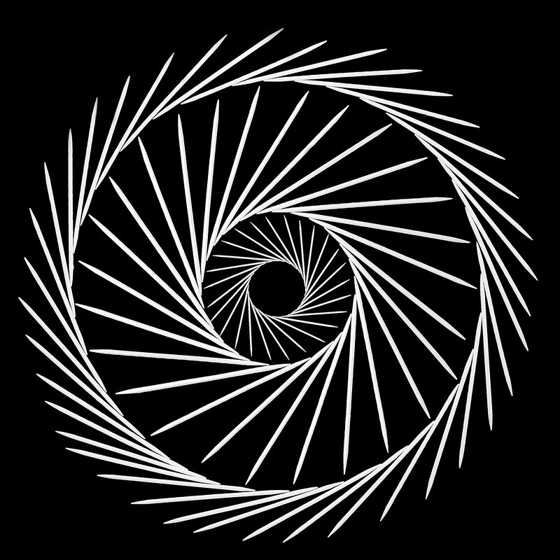
It's been a while since I posted more than one , so here's three more.
Of the 4, 2nd one below is my favourite.
3rd one below was a bit of an extravagance
Cheers all.
NB, for the first one below, if you scroll up and down the left and right sticks seem to move
 Week 19 Shape B&W 3 by andysheader (Posiview), on Flickr
 Week 19 Shape B&W 2 by andysheader (Posiview), on Flickr
 Week 19 Shape B&W 5 by andysheader (Posiview), on Flickr
, so here's three more.Of the 4, 2nd one below is my favourite.
3rd one below was a bit of an extravagance
Cheers all.
NB, for the first one below, if you scroll up and down the left and right sticks seem to move
Week 19 Shape B&W 3 by andysheader (Posiview), on FlickrWeek 19 Shape B&W 2 by andysheader (Posiview), on FlickrWeek 19 Shape B&W 5 by andysheader (Posiview), on Flickr
Last edited:
- Messages
- 13,760
- Edit My Images
- Yes
BLIMEY !!!
That first one really does my eyes in
Like the all Andy, my pick of the four is the middle one above, although i like the complexity of the last one, the middle ones simplicity (and smaller circle) really make it the winner for me
That first one really does my eyes in
Like the all Andy, my pick of the four is the middle one above, although i like the complexity of the last one, the middle ones simplicity (and smaller circle) really make it the winner for me
- Messages
- 822
- Name
- Richard
- Edit My Images
- Yes
lol i was going to say that dark knight.
I really like one and three. Nothing wrong with 2 though.
The more I look at the 3 the more it has an eye look to it, quite mesmerising
I really like one and three. Nothing wrong with 2 though.
The more I look at the 3 the more it has an eye look to it, quite mesmerising
OP
- Messages
- 19,461
- Name
- Andy
- Edit My Images
- Yes
BLIMEY !!!
That first one really does my eyes in
Like the all Andy, my pick of the four is the middle one above, although i like the complexity of the last one, the middle ones simplicity (and smaller circle) really make it the winner for me
lol i was going to say that dark knight.
I really like one and three. Nothing wrong with 2 though.
The more I look at the 3 the more it has an eye look to it, quite mesmerising
Really like these, the third of the three above stands out more in my eyes. You must have a lot of patience to set them out as you did
Cheers all.
I could get used to the simple takes on themes.....although my patience was tested a few times especially when a book fell on the table and scattered the picks.
Cheers.
- Messages
- 4,088
- Name
- Graham
- Edit My Images
- Yes
go andy....
first is good, close enough to perfect arrangement, second on the square is another good idea, but has too many sticks not quite in allignment / symmetry...
#3 is good too,
but you have taken the idea and really worked it through in the fourth.. love it!
first is good, close enough to perfect arrangement, second on the square is another good idea, but has too many sticks not quite in allignment / symmetry...
#3 is good too,
but you have taken the idea and really worked it through in the fourth.. love it!
OP
- Messages
- 19,461
- Name
- Andy
- Edit My Images
- Yes
go andy....
first is good, close enough to perfect arrangement, second on the square is another good idea, but has too many sticks not quite in allignment / symmetry...
#3 is good too,
but you have taken the idea and really worked it through in the fourth.. love it!
Thanks, Graham. Second one was perect until I removed the template box and they moved. jackie was cooking and giving me 'the eye' so I had t call it a day.
Cheers.
- Messages
- 7,548
- Name
- susie
- Edit My Images
- Yes
Hi Andy...wow...from me too .... yes, some of those really do make my eyes go funny, the first two look almost 3d to me. Super images there and well done to you for having the patience to make them in the first place. hard to choose a favourite as they are all excellent, but I think it would be the square one for me.
OP
- Messages
- 19,461
- Name
- Andy
- Edit My Images
- Yes
Hi Andy,
Shape - Wow!
I liked the first arrangement as soon as I saw it but then I saw the other ones and they stood out even more to me. Very impressive. No crit from me really.
Hi Andy...wow...from me too .... yes, some of those really do make my eyes go funny, the first two look almost 3d to me. Super images there and well done to you for having the patience to make them in the first place. hard to choose a favourite as they are all excellent, but I think it would be the square one for me.
Hi, appreciate the FB
With the weather improving I might get outside for the next theme.
Regards.
- Messages
- 9,095
- Name
- Mandy
- Edit My Images
- Yes
I can only echo every one else's comments regarding shape good take for the theme.
OP
- Messages
- 19,461
- Name
- Andy
- Edit My Images
- Yes
I can only echo every one else's comments regarding shape good take for the theme.
Scrolling down on my phone gives a zainy effect. Love them all, can't really pick a favourite.
Thanks for the FB
Cheers.
- Messages
- 8,398
- Name
- Lynne
- Edit My Images
- Yes
Hi ya
Fresh.........yuk & wow in equal amounts Not keen on the one with blood in it as it looks a little to fake ( the blood that is not the hand ! ) Of the 1st 2 images I'd probably go for #1......though I'm not particularly taken with the pp effects on either but I do see the effect you were aiming for . On 2nd thought's I'd prefer the coloring of #2 on the bg of #1....just to be awkward .Sorry 
However.....Shape....belters the lot of them . You must have some patience mister , to arrange them so painstakingly ! My favorite one is the last.....draws you in to the middle....has overtones of 007
Woondering why , in the last one......the outer circle is not arranged in the same direction as the inner...or the inner circle not arranged in the same direction as the outer 2....whichever way you want to go with that ?
Fresh.........yuk & wow in equal amounts
Not keen on the one with blood in it as it looks a little to fake ( the blood that is not the hand ! ) Of the 1st 2 images I'd probably go for #1......though I'm not particularly taken with the pp effects on either but I do see the effect you were aiming for . On 2nd thought's I'd prefer the coloring of #2 on the bg of #1....just to be awkward .Sorry However.....Shape....belters the lot of them . You must have some patience mister , to arrange them so painstakingly ! My favorite one is the last.....draws you in to the middle....has overtones of 007
Woondering why , in the last one......the outer circle is not arranged in the same direction as the inner...or the inner circle not arranged in the same direction as the outer 2....whichever way you want to go with that ?
OP
- Messages
- 19,461
- Name
- Andy
- Edit My Images
- Yes
Hi ya
Fresh.........yuk & wow in equal amounts
However.....Shape....belters the lot of them . You must have some patience mister , to arrange them so painstakingly ! My favorite one is the last.....draws you in to the middle....has overtones of 007
Woondering why , in the last one......the outer circle is not arranged in the same direction as the inner...or the inner circle not arranged in the same direction as the outer 2....whichever way you want to go with that ?
Cheers, Lynne, I noticed the outer circle...should have changed it and I'm surprised no one else. Noticed it
OP
- Messages
- 19,461
- Name
- Andy
- Edit My Images
- Yes
Evening all.
Well I'm off work tomorrow and have a few ideas for Numbers
While I'm on, check the TP52 meet thread in my signature. The venue is likely to be Scotland and I'll have no "it's too far for me" nonsense attendance is mandatory.
Sign up here I guarantee...yes, I guarantee you'll have a great time....very little sleep, but a great time.
Cheers and I'll be watching you
OP
- Messages
- 19,461
- Name
- Andy
- Edit My Images
- Yes
Hi, all. I really must get out and take some photographs of pretty flowers
Processed in Analog Efex Pro and one in one was then desaturated in PS.
Cheers all.
 Week 20 Numbers (up) by andysheader (Posiview), on Flickr
 Week 20 Numbers (Up) B&W by andysheader (Posiview), on Flickr
Processed in Analog Efex Pro and one in one was then desaturated in PS.
Cheers all.
Week 20 Numbers (up) by andysheader (Posiview), on FlickrWeek 20 Numbers (Up) B&W by andysheader (Posiview), on Flickr- Messages
- 601
- Name
- Andrew
- Edit My Images
- Yes
Clever - if gruesome- idea. I prefer the one with colour as it gives more "reality" to the feet.
- Messages
- 4,088
- Name
- Graham
- Edit My Images
- Yes
have to admit the first thing I did was read the tag - for doing that.
all works really well, the dirty feet make it, adding to the wonderment as o the cause of death.
Have you added a vignette?? making the big toes darker than they need be?
for doing that.all works really well, the dirty feet make it, adding to the wonderment as o the cause of death.
Have you added a vignette?? making the big toes darker than they need be?