You are using an out of date browser. It may not display this or other websites correctly.
You should upgrade or use an alternative browser.
You should upgrade or use an alternative browser.
weekly 2021 TP52 - week 52 - SHOWCASE (sort of)
- Thread starter Kell
- Start date
- Messages
- 1,246
- Edit My Images
- No
That's a great picture, I tired that a few years ago with little success. It was too windy for my wobbly tripod, I must try again in the future.
- Messages
- 3,419
- Name
- Kell
- Edit My Images
- Yes
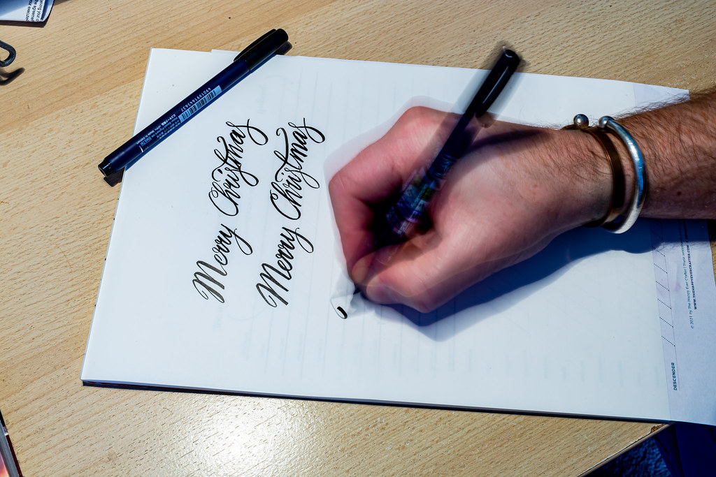
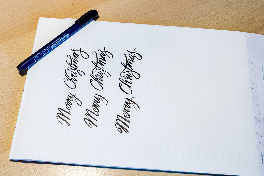
Week 42 - Irregular.
I've always had a passing interest in calligraphy (had one of those calligraphy sets as a kid) but, being a kid meant I soon lost focus as I didn't crack it immediately.
Anyway, I've been following a few online tutorials recently as I wanted to hand-write some Christmas cards this year and I've been practising getting the flow correct.
What I love about doing them all by hand is that no two will be identical, because no matter how hard you try, the writing is always somewhat IRREGULAR.
Preferred this top one with a relatively slow shutter speed - tried it by freezing the action, but it looked like I was just posing with the pen. Tried it slower, but wasn't sure it added anything more.
 5D3_6543 by Kell Lunam-Cowan, on Flickr
 5D3_6546 by Kell Lunam-Cowan, on Flickr
 5D3_6560 by Kell Lunam-Cowan, on Flickr
 5D3_6561 by Kell Lunam-Cowan, on Flickr
I've always had a passing interest in calligraphy (had one of those calligraphy sets as a kid) but, being a kid meant I soon lost focus as I didn't crack it immediately.
Anyway, I've been following a few online tutorials recently as I wanted to hand-write some Christmas cards this year and I've been practising getting the flow correct.
What I love about doing them all by hand is that no two will be identical, because no matter how hard you try, the writing is always somewhat IRREGULAR.
Preferred this top one with a relatively slow shutter speed - tried it by freezing the action, but it looked like I was just posing with the pen. Tried it slower, but wasn't sure it added anything more.
 5D3_6543 by Kell Lunam-Cowan, on Flickr
 5D3_6546 by Kell Lunam-Cowan, on Flickr
 5D3_6560 by Kell Lunam-Cowan, on Flickr
 5D3_6561 by Kell Lunam-Cowan, on Flickr
Last edited:
- Messages
- 7,130
- Edit My Images
- No
I've always had a passing interest in calligraphy after they gave us a lesson once at primary school. Your attempts look remarkably more regular than mine 
I like the slower shutter speed too, and the first would be my favourite. Good luck with the cards. I reckon you have it nailed.
I like the slower shutter speed too, and the first would be my favourite. Good luck with the cards. I reckon you have it nailed.
Last edited:
- Messages
- 3,419
- Name
- Kell
- Edit My Images
- Yes
- Messages
- 3,787
- Name
- Simon
- Edit My Images
- Yes
I like the shot you've chosen as a general shot - the blurring of the hand writing gives it the movement that makes the photo for me. However, the "irregularity" is harder to see because there are less words to compare (and you seem to be pretty consistent and good at calligraphy!!!!!!), so for a more exact fit to the theme I think I prefer the 4th image.
- Messages
- 115,214
- Name
- The real Chris
- Edit My Images
- No
As already mentioned, that is an Interesting take on the theme, well though out
Now you are just showing off
- Messages
- 4,344
- Name
- Martin
- Edit My Images
- Yes
I write with a fountain pen every day. While I would love to have neat writing but I wouldn't get many words to a page if I wrote like that 
A unique interpretation of the theme and I think you picked the right picture to show it.
A unique interpretation of the theme and I think you picked the right picture to show it.
- Messages
- 4,659
- Name
- Pete
- Edit My Images
- Yes
Great take and photo for the theme, you would think I was a doctor if you saw my hand writing.
Pete
Pete
- Messages
- 1,246
- Edit My Images
- No
Lovely calligraphy! Although I will say it’s too soon to be thinking about Christmas! 
Scots_quine
In memoriam
- Messages
- 1,753
- Name
- Joan
- Edit My Images
- Yes
Lovely writing and also prefer the one you chose. I have a calligraphy set somewhere ! Are your pens felt-tipped or are the ink pens?
- Messages
- 3,419
- Name
- Kell
- Edit My Images
- Yes
Lovely writing and also prefer the one you chose. I have a calligraphy set somewhere ! Are your pens felt-tipped or are the ink pens?
Thanks.
The pens for that are Tombow Fudenosuke. So felt-tipped brush pens.
THIS is the set I bought, and I have to say, I prefer the slightly firmer of the nibs, but when I was buying them pretty much every review said it's very much personal choice.
- Messages
- 3,419
- Name
- Kell
- Edit My Images
- Yes
Week 43 - Halloween.
We weren't out and about at all this weekend, but we were at friends and I spotted this. The whole thing says "Books", but it just so happened that a bit was hidden, making it perfect for this week's theme.
 5D3_6590 by Kell Lunam-Cowan, on Flickr
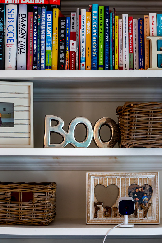 5D3_6593 by Kell Lunam-Cowan, on Flickr
We weren't out and about at all this weekend, but we were at friends and I spotted this. The whole thing says "Books", but it just so happened that a bit was hidden, making it perfect for this week's theme.
 5D3_6590 by Kell Lunam-Cowan, on Flickr
 5D3_6593 by Kell Lunam-Cowan, on Flickr
- Messages
- 4,159
- Name
- Jim
- Edit My Images
- Yes
well it made me smile and a good alternative take on the theme - I like your thinking. I think I prefer the one you chose although I may have been tempted to just crop a bit to lose the top of the frame that is showing at the bottom of the image.
- Messages
- 3,419
- Name
- Kell
- Edit My Images
- Yes
Week 44 - Underneath.
Well - I treated myself to a compact this week (SH of course). While it's great to have a 'nice camera' when you go out for meals, having a FF camera, 24-70 lens and a flash is overkill. Great pictures, but there's almost never anywhere to put it down.
So I've been looking at various cameras to replace the Panasonic Lumix TZ20 that I've never been happy with.
In the end I went for the Canon G5 X (as it does still have the option to add a flash on top, plus has a fully reticulating screen.
Thought it might be nice to show the comparison. So here's the G5 X with its big Brother underneath.
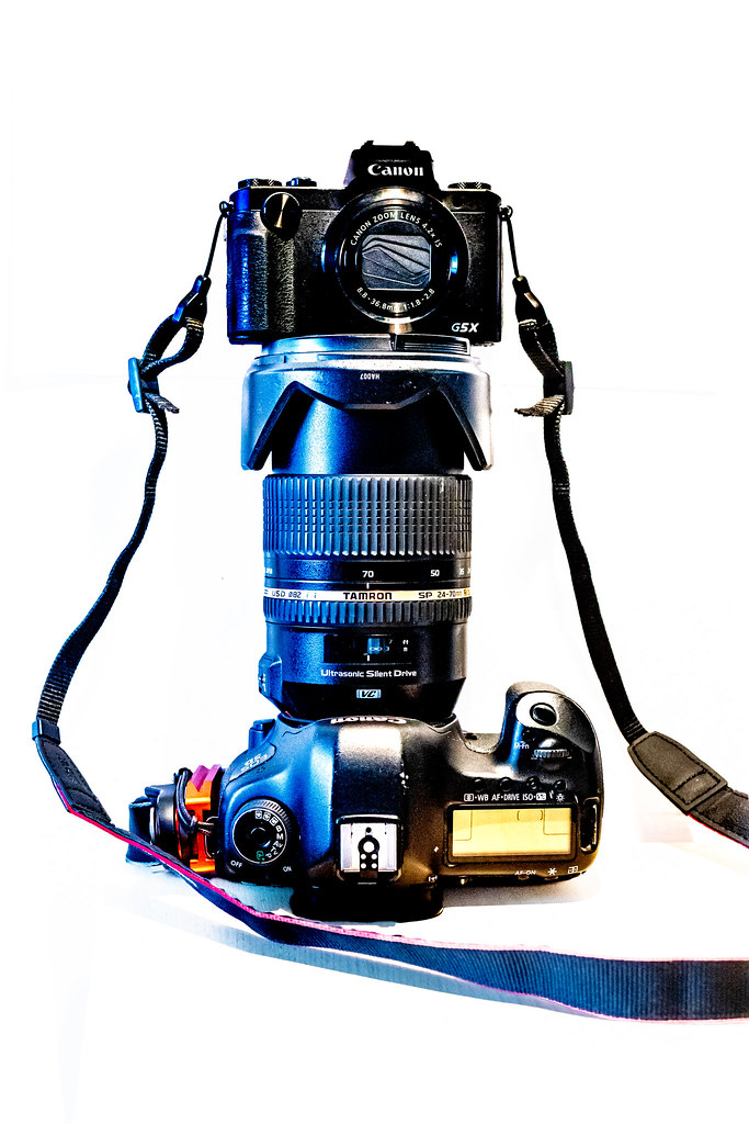 IMG_4907 by Kell Lunam-Cowan, on Flickr
I did also look at doing the technique this week with this Comp. But it hasn't quite stitched it together properly and the lens looks like a T/S lens.
However, I quite liked the fact that you can see the edges of the different pics, so that’s something I might carry over to when I actually do one properly.
 IMG_4925-Pano by Kell Lunam-Cowan, on Flickr
Well - I treated myself to a compact this week (SH of course). While it's great to have a 'nice camera' when you go out for meals, having a FF camera, 24-70 lens and a flash is overkill. Great pictures, but there's almost never anywhere to put it down.
So I've been looking at various cameras to replace the Panasonic Lumix TZ20 that I've never been happy with.
In the end I went for the Canon G5 X (as it does still have the option to add a flash on top, plus has a fully reticulating screen.
Thought it might be nice to show the comparison. So here's the G5 X with its big Brother underneath.
 IMG_4907 by Kell Lunam-Cowan, on Flickr
I did also look at doing the technique this week with this Comp. But it hasn't quite stitched it together properly and the lens looks like a T/S lens.
However, I quite liked the fact that you can see the edges of the different pics, so that’s something I might carry over to when I actually do one properly.
 IMG_4925-Pano by Kell Lunam-Cowan, on Flickr
Last edited:
- Messages
- 3,419
- Name
- Kell
- Edit My Images
- Yes
Nice!
I like the idea and the composition, and the blueness of the lighting gives it an odd, but cool look.
Thanks. The blueness was an accident TBH.
It was shot with a desk lamp providing a lot of the light to the right and daylight providing light to the left. When I colour corrected it, the daylight came in really blue, but I also quite liked it, so left it.
Last edited:
- Messages
- 3,419
- Name
- Kell
- Edit My Images
- Yes
Blimey that is tiny.
Nice comparison
It's funny as it's still slightly bigger than my Lumix, but I think because it sort of looks and feel like a tiny 'big' camera (if that makes sense), when I unpacked it I was very surprised by the size.
- Messages
- 3,419
- Name
- Kell
- Edit My Images
- Yes
WEEK 45 SNAPPER'S CHOICE + COMPOSITE
After this week's win over Australia (taking us up in the WvL for all games - 26 Wins, 25 Losses and one draw) I thought this might make a good subject this week.
Composite of a heavily edited B&W version of the same shot, with the emblem separated from the colour version and overlaid.
 rOSE cOMP by Kell Lunam-Cowan, on Flickr
After this week's win over Australia (taking us up in the WvL for all games - 26 Wins, 25 Losses and one draw) I thought this might make a good subject this week.
Composite of a heavily edited B&W version of the same shot, with the emblem separated from the colour version and overlaid.
 rOSE cOMP by Kell Lunam-Cowan, on Flickr
Last edited:
- Messages
- 3,419
- Name
- Kell
- Edit My Images
- Yes
It certainly stands out the emblem that is , it looks almost 3d,
I have no idea what the WvL is though
Thanks Allan - Wins v Losses. Before the game at the weekend, England had won 25 games, Australia had won 25 games and there was one draw.
This particular shirt has a 3d plastic/rubber emblem rather than stitched or heat transfer.
- Messages
- 1,246
- Edit My Images
- No
The logo certainly pops out doesn't it, good use of the composite technique
- Messages
- 3,419
- Name
- Kell
- Edit My Images
- Yes
Week 46 - Back.
Didn't get the picture I wanted this week as it's near my old office and I didn't get time to get down there.
But it would have been a version of this sign:
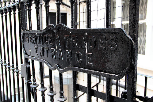 IMG_9969 by Kell Lunam-Cowan, on Flickr
As it was, I took my little camera in to work and had a walk around the BACK streets of Camden.
So I took this: Good to see that the Camden Palace (KOKO) dome is almost BACK to its former glory after the fire last year.
 IMG_0223 by Kell Lunam-Cowan, on Flickr
This house number is down a BACK Alley - I was surprised that it's so intricate for where it is.
 IMG_0217 by Kell Lunam-Cowan, on Flickr
But I'd also spotted this Van BACK a few weeks ago and thought it would make a good subject - if the van was there during the day.
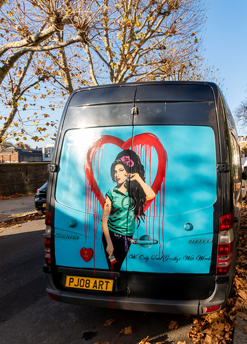 IMG_0204 by Kell Lunam-Cowan, on Flickr
However, I did the conversion to B&W to make the title work a little harder (it's a play on her eponymous Back to Black album title).
Van Back to Black and White
 Van Back to Black and White by Kell Lunam-Cowan, on Flickr
Didn't get the picture I wanted this week as it's near my old office and I didn't get time to get down there.
But it would have been a version of this sign:
 IMG_9969 by Kell Lunam-Cowan, on Flickr
As it was, I took my little camera in to work and had a walk around the BACK streets of Camden.
So I took this: Good to see that the Camden Palace (KOKO) dome is almost BACK to its former glory after the fire last year.
 IMG_0223 by Kell Lunam-Cowan, on Flickr
This house number is down a BACK Alley - I was surprised that it's so intricate for where it is.
 IMG_0217 by Kell Lunam-Cowan, on Flickr
But I'd also spotted this Van BACK a few weeks ago and thought it would make a good subject - if the van was there during the day.
 IMG_0204 by Kell Lunam-Cowan, on Flickr
However, I did the conversion to B&W to make the title work a little harder (it's a play on her eponymous Back to Black album title).
Van Back to Black and White
 Van Back to Black and White by Kell Lunam-Cowan, on Flickr
Last edited:


