weekly Blondie606's 52 in 2014 Wk 52 Support-THE END :-)

Hi Lynne

Grow:
Would look right at home in a catalouge. Perfectly on theme and technically well executed, although maybe just a tad bright for my tired eyes.

Week 43 Reshoot: Out of the three I like the one with the three leaves. You do these triptych's so well and this one does'nt disappoint. The strong use of shapes, colours and textures makes this a stand out image for sure.

Live: First off really like the square crop which works well with the wee round subject. Like the OOF leaves bottom right which add some nice framing. The glisten on the snail and leaves is probably my fav part. Super sharp all round and you've definitely got the shot in the back under tricky conditions - The mark of a real compitent photographer! :clap:

First: Definitely number one for me. The vibrant bokeh background, shallow dof and warm tones all work well together. Not the most photogenic little fella, but I do very much appreciate the skill involved in capturing natures little critters.

Smooth: Such a beautiful and somewhat stark landscape. Would never have guessed its Cyprus. Sure looks like a dream and so badly make me want to jump in and swim. Composition is good and like how the land is placed on the upper third. Also like the foreground interest - just enough there on show, any more might detract. Obviously the milky water and soft cloud reflections just add to the dreamy atmosphere. Good work Lynne!


WOW...thanks for the mega catch up JAson , time is short I know so really appreciate your comments (y)
 
Hi Lynne

Grow- like the idea - the juxtaposition of box and bulb. A bit hard to see the vase and if roots ah been appearing in water it would have been a bonus for the theme

Reshoot of Promise is good with the rose

Live - good focus, lovely healthy sheen to the snail, and nice sticky out things on head

First - #1 does seem to have a much warmer feel, which is the point of the title and its connection to the theme. #2 looks a little lifeless. Good comp on both but agree with DK @Dark Knight about position of bug

smooth - like the comp, the serenity. Good framing with the cliffs and good lead in lines to the horizon. good colours on RHS 2/3 altho LHS 1/3 has a bit less oomph

Thanks Alan.....sticky out things on head....lol....those are it's eye's :D & drove me made trying to get both in focus !

As for the sky in Smooth...couldn't do a lot about that , the clouds were moving in from the left casting shadows on the lh rocks....might have been able to lift them a bit in pp but wanted to keep it as close to reality as I could......

& the bulb is just starting to show roots so hoping we get another re-shoot week :D

Hi Lynne ....I love the name of that location .... Dreamers Bay .....and you've captured a wonderful dreamy image .... smashing composition, beautiful colours and the water really looks as smooth as glass :clap:


Thanks Susie...it's certainly a place you can just sit & drift off in to dreams.....as real get away place

Ouch, hope your bum back's feeling better. :) could have been worse, could have dropped the camera as well.

Looks like a lovely peaceful spot here, well suited to the long exposure. Whatever corrections you've done to exposure / colour balance look good to me. Could you take a shot without the filter on, at normal exposure, just so you have something to compare the colours to when you get home??

Love the hint of movement in the clouds, nice to see a LE not converted to B&W.


Thanks Graham.....yeah , sooo glad I didn't have the camera with me ! Have checked but not got any normal exposures to cmpare with......got a real thing about silky smooth water so that's all I took :rolleyes: I did think about doing a mono conversion but I loved the colors so much I decided not to .& Lee filters really don't give a color cast , my old Hitech one was a mare , had to mono everything !

Hi Lynne, looks a beautiful spot, love the composition, good detail in the surrounding rocks/cliffs, land and lovely smooth water (y).......in fact it just makes me jealous because I want to be there too :p

Cheers Phil...I didn't want to come home , could quite happily have spent all my time down there as the Cyprus weather is so wonderful at this of year , constantly changing , storms come & go & the clouds are just fantastic :)

Hi Lynne, I trust that you are well and are looking forward to Xmas. I am a little late with my comments again been very busy with work. I have had a look back at what I missed and may I say some great work as per the normal. Some cracking takes on the themes with grow, smooth being my favs. Some great use off pp skills in week 43 reshoot, your talent never ceases to amaze me I really do enjoy looking at your work.

many thanks Mandy , wayy to kind :)
 
& wk 48 which requires some lateral thinking...Energy

Not been feeling so good this last couple of weeks so gave myself a kick up the rear & challenged myself to going out with just the Macro lens

Wk 49 Energy by Blondie606 Photography, on Flickr


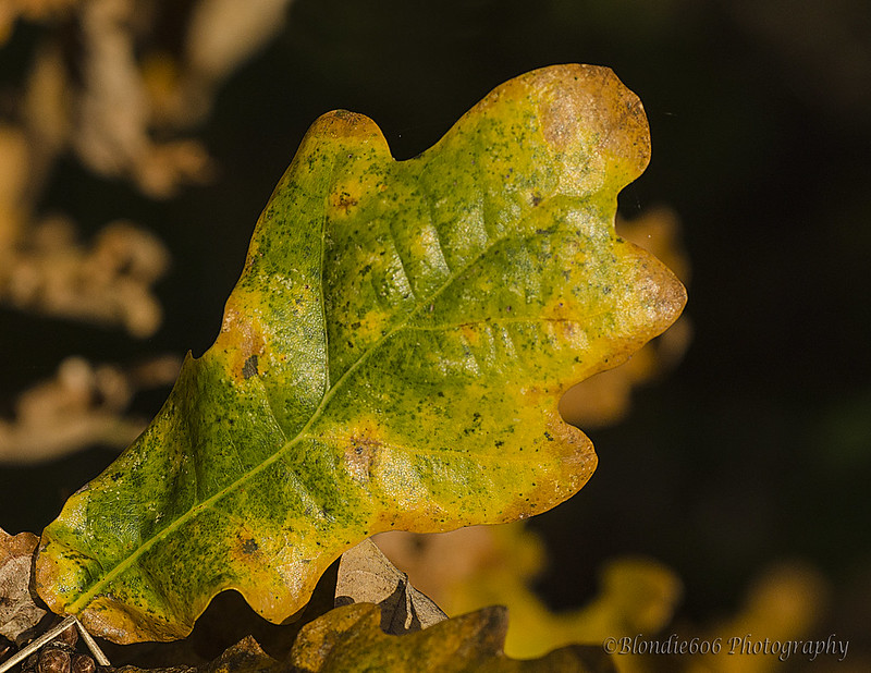
& the connection to the theme is........ In Autumn Tree's draw all the nutrients & goodness back from the leaves to give themselves enough energy to survive the winter months....nutrients & goodness = energy . This is the process that causes leaves to turn from green to red to yellow until eventually they die & fall from the tree :D everyday's a school day ;)
 
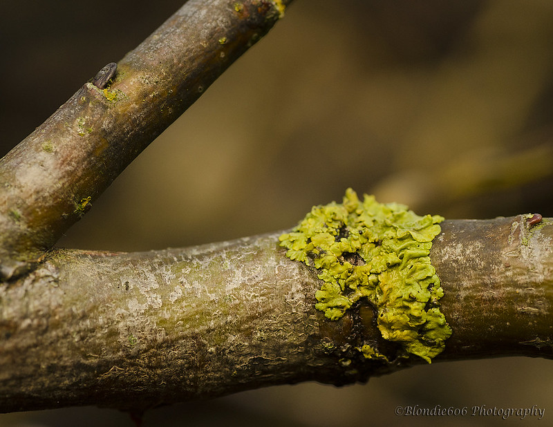
Hiya Lynne... Nice shot for Attached. Not a million miles away from erm... whose was it? Graham? Andy? The fungus shot, anyway... I like it and it's nicely on theme. Technicals are all good for me... not 100% certain on the V bit of the branch but it's not particularly distracting. I think it's a well done shot :)

Energy - you've implied you think it's a bit of a cop out, but I reckon it's nicely on theme. I thought of the same idea but wanted a really "green" something full of chlorophyll and couldn't find anything. The colours are lovely and I like the positioning. It's a decent shot which keeps you totally up to date so well done!
 
Hi Lynne, love the first attached I do like a good bit of fungus, lovely DoF looks excellent large on flickr, as does "energy" really like the colours in the leaf just perfect :clap:

the explanation to the theme is perfect don't know why you were worried (y)
 
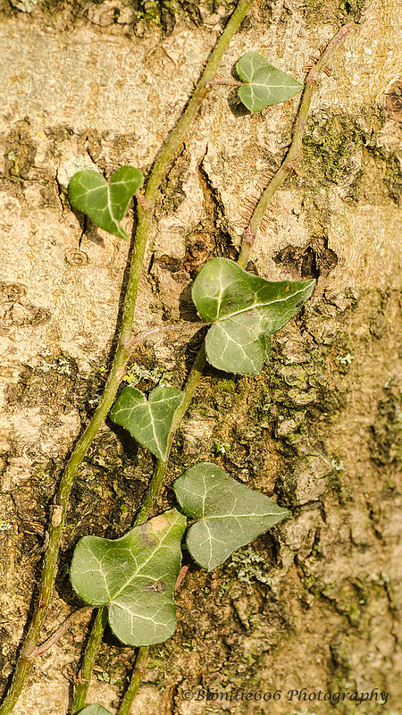
The lichen one for me Lynne, though both are good pics. Just a shame about that oof branch in the 1st shot,but its only a minor niggle. Colours and lighting are lovely. The ivy, just a slightly different angle needed fir me, perhaps a step to the right would have done it.

energy, fits the theme with or without explanation for me. The almost square crop works and again great colours and lighting.

Hope you feel better :)
 
super detail, colours, OOF smooth BG, on the lichen / moss / whateveritis. not bothered by the other branch, a bit more of a diagonal might have been more conventional, but things can tend to be a bit samey if we follow convention all the time. (y)

Ivy doesn;t do much for me, wonder if dropping the exposure a tad might give it a bit more punch?

For a simple study of an oak leaf, this is great. Super close, super light, sharp as anything, lovely BG, very autumnal. I did think loosing the bit of colour behind the right side of the leaf would help... but it doesn;t. :)
 
Hi, Attached #2 for me, mainly due to the V at the TL. Nice detail in #2, looks a little orange? I don't really mind the bark being orange, just the leaves. Might be my Mac...I've been looking at getting it calibrated.

Energy, sounds like you need some (y) It's a pleasing photograph with a good angle and detail.

Cheers.
 
Hi Lynne ...super shot of the lichen .... focus is spot on and I like the angle of the branch. The ivy one looks a bit washed out but I really like the texture of the bark.

The leaf is a great choice for energy ... perfect focus, clarity, and colour ... a very nice macro shot :)
 
Hi Lynne .... three very nice English Autumnal observations.
 
Hey Lynne :)

Attached - I'm liking the tones in the first but the subject of the second, the first is also a good composition and a cracking background, but the second is still my fav, I'd just like to see the ivy stems to stand out a bit more, baybe increasing the blacks would bring them out a bit ?? - Both bang on for the theme though :)

Energy - Well, I must bit really dim as I didn't have a clue what you were thinking when I first saw that leaf, having read the comments it sprang back to me,, but even before that I loved the image, smashing detail to the extent of the fine webs, wonderful colours and again a great background, perfect DoF too - Love It :clap:
 
Hi Lynne

Attached - #1 is an unusual bit of lichen and nicely attached with muted tones. Good b/g - might be tempted to clone off a touch from top just to get rid of that light mark on the branch. Just a bit of drop off of focus on the top of the lichen which I cannot understand given that the left hand branch is well in focus.

Energy - no explanation needed as my first take was that the leaf had dissipated its energy, done its job and about to fall. Good position in the frame and lovely colours and focus. Simple and effective.(y)
 
Hiya Lynne... Nice shot for Attached. Not a million miles away from erm... whose was it? Graham? Andy? The fungus shot, anyway... I like it and it's nicely on theme. Technicals are all good for me... not 100% certain on the V bit of the branch but it's not particularly distracting. I think it's a well done shot :)

Energy - you've implied you think it's a bit of a cop out, but I reckon it's nicely on theme. I thought of the same idea but wanted a really "green" something full of chlorophyll and couldn't find anything. The colours are lovely and I like the positioning. It's a decent shot which keeps you totally up to date so well done!


Cheers as always Paul...glad you saw the theme connection for Energy (y)

Hi Lynne, love the first attached I do like a good bit of fungus, lovely DoF looks excellent large on flickr, as does "energy" really like the colours in the leaf just perfect :clap:

the explanation to the theme is perfect don't know why you were worried (y)

Thanks Alan.....Worry is my middle name ;)

The lichen one for me Lynne, though both are good pics. Just a shame about that oof branch in the 1st shot,but its only a minor niggle. Colours and lighting are lovely. The ivy, just a slightly different angle needed fir me, perhaps a step to the right would have done it.

energy, fits the theme with or without explanation for me. The almost square crop works and again great colours and lighting.

Hope you feel better :)

Cheers Michael.....a step to the right for the Ivy & I'd have run out of tree :D
 
super detail, colours, OOF smooth BG, on the lichen / moss / whateveritis. not bothered by the other branch, a bit more of a diagonal might have been more conventional, but things can tend to be a bit samey if we follow convention all the time. (y)

Ivy doesn;t do much for me, wonder if dropping the exposure a tad might give it a bit more punch?

For a simple study of an oak leaf, this is great. Super close, super light, sharp as anything, lovely BG, very autumnal. I did think loosing the bit of colour behind the right side of the leaf would help... but it doesn;t. :)

Cheers Graham...that Ivy shot is bugging me...I spent ages trying to make sure it came in from the bottom left corner so I would'nt have to play in pp with a crop....there's a shot in there waiting to get out....but it's fighting me all the way :D

:agree: With Graham's comments.


Cheers Mandy :)

Hi, Attached #2 for me, mainly due to the V at the TL. Nice detail in #2, looks a little orange? I don't really mind the bark being orange, just the leaves. Might be my Mac...I've been looking at getting it calibrated.

Energy, sounds like you need some (y) It's a pleasing photograph with a good angle and detail.

Cheers.

Cheers Andy...yup , you could be right , I didn't see it when editing but now you've mentioned it there is possibly a slight orange hue to the Ivy leave's - I set the WB to cloudy cos it was such a miserably weak light day....hey ho , live n learn ;)

Hi Lynne ...super shot of the lichen .... focus is spot on and I like the angle of the branch. The ivy one looks a bit washed out but I really like the texture of the bark.

The leaf is a great choice for energy ... perfect focus, clarity, and colour ... a very nice macro shot :)

Thanks Susie , appreciate you popping in (y)
 
Hi Lynne .... three very nice English Autumnal observations.

Cheers David :)

Hey Lynne :)

Attached - I'm liking the tones in the first but the subject of the second, the first is also a good composition and a cracking background, but the second is still my fav, I'd just like to see the ivy stems to stand out a bit more, baybe increasing the blacks would bring them out a bit ?? - Both bang on for the theme though :)

Energy - Well, I must bit really dim as I didn't have a clue what you were thinking when I first saw that leaf, having read the comments it sprang back to me,, but even before that I loved the image, smashing detail to the extent of the fine webs, wonderful colours and again a great background, perfect DoF too - Love It :clap:

Cheers Dean....I know you're busy busy with work so appreciate you stopping by...ps...only 12wks......:banana:

Hi Lynne

Attached - #1 is an unusual bit of lichen and nicely attached with muted tones. Good b/g - might be tempted to clone off a touch from top just to get rid of that light mark on the branch. Just a bit of drop off of focus on the top of the lichen which I cannot understand given that the left hand branch is well in focus.

Energy - no explanation needed as my first take was that the leaf had dissipated its energy, done its job and about to fall. Good position in the frame and lovely colours and focus. Simple and effective.(y)

Thanks Alan....the focus drop off...I think it's the angle.....not easy to see from the shot but the left hand upright branch is actually a little in front of the lower branch with the lichen on........if that makes sense ?
 
Last edited:
I just had a very surreal moment...I've posted a photograph of you taking that photograph :wacky:

I find it quite disorientating, almost uncomfortable. Don't get me wrong, I like it a lot. Just feels like it's popping out of my screen.

The sky looks better than it was.

Crit, well, there seems to be an OOF part at the end go the spiral :thinking:

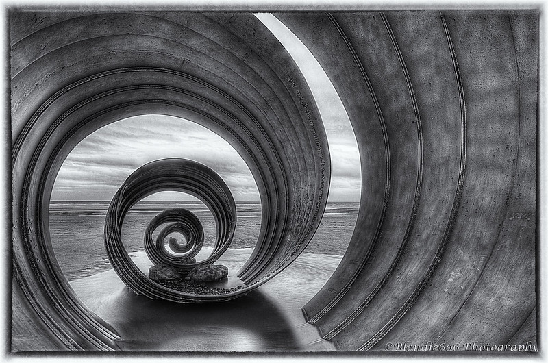
I can't decide which I prefer....I'm drawn to the second because of the inclusion of the border...I like my borders :). But I'm opting for #1. I just like the desaturated feel on it.

Silver Efex Pro...love it....try Analoge Efex Pro :exit:

Cheers.
 
:wave: Lynne, 1st one for me, desaturated, good detail, the slightly oof gives it dof and, as Susie, it suits the grey, overcast sky, great shot (y)

 
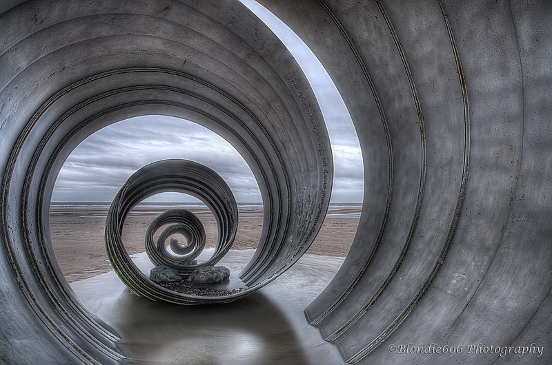
Round - I think that these are super:clap: You got taken the right angle to get the roundness, the swirl and the depth. We can see from Andy's post of you taking the shot just how big it is and your shot conveys that really well. I like the sky, those brooding scudding clouds seem to fit far better with the ethereal nature of the shell than would a blue sky with puffy clouds. And the colour one for me as it just holds my attention longer and encourages me to look around the shot in more detail.

To borrow a phrase 'God work missus...(y)

I would be interested to know what was the difference in the 3 shots and how you have achieved that sky - some sort of filtering presumably?
 
HI Lynne, either one for me both brilliant :clap::clap: can't fault them, saw them earlier in the week on Flickr was wondering if you where going to use them, glad you did
 
Smooth - Nice seascape with some lovely blues in both sky and sea. I'm wondering whether getting down lower with that seaweed as a feature foreground would have strengthened the image

Attached #1 - A super capture of this fungi. That green is great as is the complimentary brown background which has been nicely thrown out of focus

Energy - Lovely and sharp and super lighting. I like the slight hint of foreground leaves and again the oof background

Round - I keep meaning to take photos of this when we visit the inlaws in Blackpool. I really like the up close and personal approach for your shot. As #1 is quite desaturated there's not a lot between them but I'd probably go for #1 if pushed.
 
WOW ... I saw the image of you there with your thingy on a tripod ...

3D? is that overlayed layers?

Love the colour version.
 
hi lynne, its the desat colour version for me, extremely well composed with teh end of the spiral drawing you through the image.. some really nice clouds poking through the ends, and great detail brought out in the inside of the spirals, therese even some text on the edge of the centre vertical bit.

On the downside, the HDR processing has introduced a bit of noise and white lines / halo's round the edges of the spiral. Both those are unwanted side effects of getting the effect you are after, and I think I'd rather have the detail and the look and accept the side-effects. (Although the white lines are relatively easy to cover over with the clone tool set to darken blend mode, cloning from a simlarly coloured area will only darken the bright pixels).

The positives far outweigh that slight negative by the way. :)
 
Hi Lynne ...I love them both ...the sky doesn't bother me in fact I like it .... really superb shots :clap:

Thanks Susie :)

I just had a very surreal moment...I've posted a photograph of you taking that photograph :wacky:

I find it quite disorientating, almost uncomfortable. Don't get me wrong, I like it a lot. Just feels like it's popping out of my screen.

The sky looks better than it was.

Crit, well, there seems to be an OOF part at the end go the spiral :thinking:

I can't decide which I prefer....I'm drawn to the second because of the inclusion of the border...I like my borders :). But I'm opting for #1. I just like the desaturated feel on it.

Silver Efex Pro...love it....try Analoge Efex Pro :exit:

Cheers.

Analogue Efex Pro.....tried it , not for me....it's all sort of filmy :p Not sure what the oof bit is you mention ( though I can see where you mean) , nothing on the originals so suspect it's something to do with the HDR process ?? & if iyou think it's popping out of the screen my work here is done....exactly the effect I was after :)

Cheers Andy ;)

:wave: Lynne, 1st one for me, desaturated, good detail, the slightly oof gives it dof and, as Susie, it suits the grey, overcast sky, great shot (y)

Cheers Phil.....I think the oof bit my be something to do with the HDR process ?


Yes it does. Ta(y)

Hmmm.....that's a 1st for me...explaining something so someone else can understand it :D
 
Round - I think that these are super:clap: You got taken the right angle to get the roundness, the swirl and the depth. We can see from Andy's post of you taking the shot just how big it is and your shot conveys that really well. I like the sky, those brooding scudding clouds seem to fit far better with the ethereal nature of the shell than would a blue sky with puffy clouds. And the colour one for me as it just holds my attention longer and encourages me to look around the shot in more detail.

To borrow a phrase 'God work missus...(y)

I would be interested to know what was the difference in the 3 shots and how you have achieved that sky - some sort of filtering presumably?

Thanks Alan....I used a Lee hard grad filter (0.9 I think it is) on all 3 shots ( one under exposed on the shell to get some detail in the sky , one very over exposed on the sky but got lots of detail in the shell & one somewhere in the middle then ran them through Photomatix which bought the sky out quite nicely...I just twiddled the sliders , Photomatix did the hard work :)


HI Lynne, either one for me both brilliant :clap::clap: can't fault them, saw them earlier in the week on Flickr was wondering if you where going to use them, glad you did

Thanks Allan :)

Oooo I love that shot Lynne, it really does appear to be spiraling out of the screen, I definetly prefer the desaturated rather than the B&W, the horizontals of the shoreline and clouds/sky are a great contrast to the curves of the sculpture, super shot :clap:


Awww...you're way too easily pleased Dean ;)

:clap::clap: Round - great images nice and sharp, lovely tones and colours well done hun.

Thanks Mandy :)
 
Smooth - Nice seascape with some lovely blues in both sky and sea. I'm wondering whether getting down lower with that seaweed as a feature foreground would have strengthened the image

Attached #1 - A super capture of this fungi. That green is great as is the complimentary brown background which has been nicely thrown out of focus

Energy - Lovely and sharp and super lighting. I like the slight hint of foreground leaves and again the oof background

Round - I keep meaning to take photos of this when we visit the inlaws in Blackpool. I really like the up close and personal approach for your shot. As #1 is quite desaturated there's not a lot between them but I'd probably go for #1 if pushed.


Thanks Peter....appreciate your catch up when time is in short supply (y) As for Smooth....no room to get lower to the seaweed I'm afraid.......but I'll happily try next time I'm over there:D That Shell is amazing...really would love to get a sunrise/set shot with it......

WOW ... I saw the image of you there with your thingy on a tripod ...

3D? is that overlayed layers?

Love the colour version.

Hi David & thanks for commenting :) Not quite sure where you're coming from with the "3D" comment....it's 3 exposures blended by Photomatix if that helps ?

hi lynne, its the desat colour version for me, extremely well composed with teh end of the spiral drawing you through the image.. some really nice clouds poking through the ends, and great detail brought out in the inside of the spirals, therese even some text on the edge of the centre vertical bit.

On the downside, the HDR processing has introduced a bit of noise and white lines / halo's round the edges of the spiral. Both those are unwanted side effects of getting the effect you are after, and I think I'd rather have the detail and the look and accept the side-effects. (Although the white lines are relatively easy to cover over with the clone tool set to darken blend mode, cloning from a simlarly coloured area will only darken the bright pixels).

The positives far outweigh that slight negative by the way. :)

Cheers Graham.......I never even spotted the white lines until you mentioned them.....could go off you ya know :D:p
 
Figured I'd best post Wk 450 before Sarah launches the penultimate theme...I really can't belive how quick this year has gone !

Not inspired in any way shape or form with this theme so PABD for me
......
I went to the Dictionary.com for this definition

Blarney.......Noun.....
deceptive or misleading talk; nonsense; hooey:


Wk 50 Nonsense by Blondie606 Photography, on Flickr

& before ANYONE comments....the coin is not stuck on the rock squarely.......I cannot do anything about it ....& YES....it kills my OCD :bat:
 
Cheers Graham.......I never even spotted the white lines until you mentioned them.....could go off you ya know :D:p

Sorry. :whistle:. But at least you know when I say something is spot on and perfect... I think it really is and I'm not just saying so to be kind. :)

Nonsense - spot on and perfect. :D I found it an 'orrible theme to start with but I just let my eyes wander and let my mind run away and look where it got me. Really not much to crit here, simple shot, nice shadow and white BG.

Cripes, this time next week, it'll be boxing day. :runaway:
 
Hiya Lynne... let's start with Round. I LOVE the first image. I think it's just captivating. I'm not always a big fan of high clarity shots but it works and I just find the subtle colouring magical. I really, really like it. The frame filling composition is just perfect and there is not a single thing I'd change in that shot... it is as close to perfect as I can imagine. :clap::clap:

It's funny how some images just really work - I'd happily have that on my wall and stare at it constantly (at least when there's no rugby on TV ;)). The B&W version is a very good photo but not in the same league as the first... the colouring really makes it for me.

Nonsense - a nicely executed shot with super white background in the middle (slight vignetting top right and maybe another corner or two) but overall pretty even. I'm not sure if the B&W conversion allows us to see as much texture in the rock, but it's an interesting shot. I wonder if this might be a shot which benefits from more negative space? Perhaps it's the long shadow which makes me think that...?
 
Hi David & thanks for commenting :) Not quite sure where you're coming from with the "3D" comment....it's 3 exposures blended by Photomatix if that helps ?

Helps? ... a lot thanks ... 3 exposures blended eh! ... I thought as much.

Just googled Photomatix and that's interesting.
 
Woops ... just scrolled back ... I thought you had mentioned 3D but no! I'd misread your earlier post, and you'd already explain about the 3 images. :exit:

:banghead:
 
Back
Top