weekly BobBCN's 52 for 2024 (WEEKS 16 - EMPTY added)

Interesting shot Bob :)

Bombers? :oops: :$
 
Interesting shot Bob :)

Bombers? :oops: :$
Cheers Dave!

Yes, bombers indeed. It's Catalan (bomberos in Spanish) and means firemen. The fire station is quite close to home, too!!
It comes from the verb 'bombear', more or less, which means to pump (as in water). So the literal translation would be pumpers!! If they knew the connotations, eh?
 
I agree the colour version is better.
IMO it could have done with a little more light / more contrasty light, but I guess you can only work with what you have.
I do like it when graffiti is more than just tagging and you've caught both there :)
 
Well spotted, colour version for me as well as lots of the blues disappear/ blend into the wall in the conversion and I think they with the red bricks work well together.
 
I agree the colour version is better.
IMO it could have done with a little more light / more contrasty light, but I guess you can only work with what you have.
I do like it when graffiti is more than just tagging and you've caught both there :)
Thanks. Yes, more contrasty. I will bear that in mind.
Well spotted, colour version for me as well as lots of the blues disappear/ blend into the wall in the conversion and I think they with the red bricks work well together.
Cheers. I actually took the BW first, then the colour. The colour version worked better for me, maybe the red bricks and the blues as you say.
 
Colour for me too Bob, Not sure how its recession lead as spray paint must be the most expensive, unless they steal it of course. It is an increasing problem which the local council spends loads of tax payers money to remove. Some looks ok, loads is unintelligible.
 
Colour for me too Bob, Not sure how its recession lead as spray paint must be the most expensive, unless they steal it of course. It is an increasing problem which the local council spends loads of tax payers money to remove. Some looks ok, loads is unintelligible.
Cheers Pete!! Here it's just left as it is. Taxpayers' money goes towards things like 2nd residences for government officials.....
 
I like it. A half step to the right would have put the split in the contrast of the buildings down the middle which would have been icing on the cake, but it does look tidily copmposed so I suspect there was stuff in the way? Nice way to kick off though.
 
I like it. A half step to the right would have put the split in the contrast of the buildings down the middle which would have been icing on the cake, but it does look tidily copmposed so I suspect there was stuff in the way? Nice way to kick off though.
Cheers Ian. Yes, I see what you mean about the split. It's just a touch off.
 
Colour version works better for me too. There looks to be some interesting brickwork under the plaster.
 
I really like your graffiti images.
Thanks!!
Colour version works better for me too. There looks to be some interesting brickwork under the plaster.
Yes, they did that a lot here. Hide the brickwork. They call it "rebozado" which if used for meat (pollo rebozado, for example) would translate as chicken in breadcrumbs!!
 
and another vote for colour :)
No idea how it looks in real life but think a bit more colour/contrast would give it more impact and still not look over cooked
Good to read the info you added(y)
 
Nicely composed shot and full of interest, I'm leaning towards colour as well... Have to say the Bombers caught my eye too!
 
WEEK 2 - HARD


The bundle in the doorway is a homeless man (or woman) whose life must be incredibly hard. Obviously, as with most big cities, I could have taken hundreds of shots.
But I went for this which is more 'anonymous' . You have the homeless person asleep in the doorway of a shop which is now abandoned (it would have had its heyday selling tablecloths, napkins and various household fabrics I guess). The business which is thriving is, of course, the chemist's in the backgound. Shot in Barcelona's gothic quarter, 22mm so a bit of curving.


W2 by Bob Newsome Photography, on Flickr
 
Yep - hard indeed. Subtly shot :)
 
Well framed and exposed with the contrast between the doing well and not so well
Thought provoking shot.
 
Wonderful image. If I was going to make any suggestions, it might be to tone the highlights on top of the pharmacy a little. I love the composition and the buildings framing the pharmacy. Well thought out and executed. Even the pigeon adds to it.
 
Yep - hard indeed. Subtly shot :)

Thanks. appreciated.

Well framed and exposed with the contrast between the doing well and not so well
Thought provoking shot.

Thought provoking indeed.
Governments around the globe should be thinking about what to do about this. Cheers.

Wonderful image. If I was going to make any suggestions, it might be to tone the highlights on top of the pharmacy a little. I love the composition and the buildings framing the pharmacy. Well thought out and executed. Even the pigeon adds to it.

Yes, I see what you mean. Well spotted. Maybe I should have cropped a tad lower....
Thanks.
 
I like the emotional angle on this one. Shame it's not (at least for me) immediately obvious what it is, needed the explanation.
 
A sad and poignant shot.. but have to say the architecture is stunning!
 
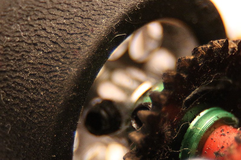
WEEK 3 - SOFT


My other hobby was bound to crop up at some point .......

Anyways, in the world of slot racing (as in the real world) having the softest tyres you can find is an absolute must, unless you really want to finish last.
Fitting these special racing slicks is just one of the many tweaks we employ.

I used my ever-faithful macro rings to get in close so as to be able to see how the rubber starts to wear out. I think I got what I wanted. The fluff is extra!!


W3 by Bob Newsome Photography, on Flickr


The same but with a tighter crop which gets rid of some of the fluff and the nut. I should have spotted that sooner.......................

W3.2 by Bob Newsome Photography, on Flickr
 
Last edited:
An interesting take on the theme - thanks for the explanation, it would have had me stumped.
 
Back
Top