You are using an out of date browser. It may not display this or other websites correctly.
You should upgrade or use an alternative browser.
You should upgrade or use an alternative browser.
weekly brownin's prjct52: 52,FINISHED!
- Thread starter brownin
- Start date
- Messages
- 213
- Name
- Laura
- Edit My Images
- Yes
Great images for support! I prefer the second one but the first is composed well that it just says support. The reason I like the second more is because of how arty it looks. 
- Messages
- 13,760
- Edit My Images
- Yes
Hi Nathan  ]
]
Animal - Oh my goodness, what a pleasing image this is, cracking detail an unusual background but works well thrown so much oof, but this little chap is in such a great position - love it
Medical - Crop is a bit tight to the glass top for me, other than that a nice image, good focus on the tablet and liking the B&W conversion
Proverb - Works well, nice bright simmering embers, liking the composition too
Pale - Ahhhh just what I was looking for when I was out and about, love the touch of the dripping rag hanging out and the low pov, the background is real nice also
Tear - Crop again is a tad tight for me but the detail still works despite the noisy image
Words - Scary words in a nice peaceful looking place, the pale tones works well for me too, it wouldn't be the same bright and punchy
Support - Good idea again, I'm preferring the first image, both work really well but for me the screens showing just a tad more detail really help with the theme, as does the more inclusive headset/mic
Animal - Oh my goodness, what a pleasing image this is, cracking detail an unusual background but works well thrown so much oof, but this little chap is in such a great position - love it

Medical - Crop is a bit tight to the glass top for me, other than that a nice image, good focus on the tablet and liking the B&W conversion
Proverb - Works well, nice bright simmering embers, liking the composition too
Pale - Ahhhh just what I was looking for when I was out and about, love the touch of the dripping rag hanging out and the low pov, the background is real nice also
Tear - Crop again is a tad tight for me but the detail still works despite the noisy image
Words - Scary words in a nice peaceful looking place, the pale tones works well for me too, it wouldn't be the same bright and punchy
Support - Good idea again, I'm preferring the first image, both work really well but for me the screens showing just a tad more detail really help with the theme, as does the more inclusive headset/mic
- Messages
- 2,480
- Name
- Steve
- Edit My Images
- Yes
Hi Nathan
Sorry I haven't been to your thread for a while So here's the catch up!
Broken.... Ah Calne High St! I know it cos my brother lives there and my mother is in an old peoples home there we visit every other weekend.
Nice shot, think the B&W treatment works well, like the highlights in the tiles over the face and the B&W helps to mute the BG.
Entertain .... Saw Queen a couple of times Freddie certainly knew how to work the crowd! Nice use of DOF here and some nice bokeh behind works very well
Spiral... Very nice shot well set up, it's not cheating it's planning very well shot and original. Nice colour and you managed to get the aircraft pulling out at the bottom. Nice work! We saw the Vulcan at Fairford sad this it's last year in flight, thought it was money problems but it's not it's the aerospace industry pulling there support miserable gits!
Silhouette ..... Your silhouette is as dodgy as mine Nice shot though! Bags of atmosphere and mood. Great lighting. But have to agree about the mike stand. It is fairly easy to get rid of however using a combination of cloning tool and the fill tool (edit>fill>content aware in Photoshop). The big mistake most people make with cloning is they try to do too much. The secret is to zoom right in until just before the image starts to pixelate, come out just a tad then do a very small area at a time. Good cloning is time consuming as you have to do such small areas at a time!
Animal ... Nice little sit up and beg wasp, really nice and sharp and nice colour the only enhancement as Andy said would be a nice clean BG. Well spotted and nice of him to turn up in time for the theme
Medical ... Not nice hay fever. Good use of DOF looks like focus is on the glass / tablet, think the B&W works well here.
Proverb ... Love the hot embers that's really nice shot, great colour and texture can almost feel the heat, works well
Be back to catch up with the rest shortly! Well Done nice work!
Sorry I haven't been to your thread for a while
Broken.... Ah Calne High St! I know it cos my brother lives there and my mother is in an old peoples home there we visit every other weekend.
Nice shot, think the B&W treatment works well, like the highlights in the tiles over the face and the B&W helps to mute the BG.
Entertain .... Saw Queen a couple of times Freddie certainly knew how to work the crowd! Nice use of DOF here and some nice bokeh behind works very well
Spiral... Very nice shot well set up, it's not cheating it's planning
Silhouette ..... Your silhouette is as dodgy as mine
Animal ... Nice little sit up and beg wasp, really nice and sharp and nice colour the only enhancement as Andy said would be a nice clean BG. Well spotted and nice of him to turn up in time for the theme
Medical ... Not nice hay fever. Good use of DOF looks like focus is on the glass / tablet, think the B&W works well here.
Proverb ... Love the hot embers that's really nice shot, great colour and texture can almost feel the heat, works well
Be back to catch up with the rest shortly! Well Done nice work!
- Messages
- 908
- Name
- nathan
- Edit My Images
- Yes
WOW, thanks guys for all the comments, its very much appreciated. I must be doing something right 
Thanks Carl, IT support can be a very scrutinised area of work, the 'turn it off and on again' seems to be the most common phrase people associate us with, However we are pretty bloody good here (if I do say so myself)
appreciate your comments and critique.
Each to their own mate no need to apologise, I'm not quite sure I'm happy with the colour pop in all honesty but hey ho,
The grit is totally accidental, with the Raynox using F1.8 makes the image one big blur due to DOF so had to stop down to f14 and boost ISO as I didn't have my flash, 60d known for being particularly hideous with noise past 1600 especially if you pull shadows and darks in post.
glad you like it though
Its a beautiful spot isn't it, even though its very 'plain' *groan*, I lived in Netheravon when I were a lad whilst my Dad served in the Royal Welch Flusiliers many many moons ago. Its a very pretty spot of the country.
TP Everywhere
Cheers Dood, I tried to make it subtle. not quite happy with the SC though, maybe better with another subject.
Thanks Laura, ooh arty, I like that he he
Cheers for the catch up Dean,
Took a leaf out of your book with animal, however a lot easier when dead and not moving around all the time, Commend you, the macro god on that one
Thanks for such comprehensive comments
Awesome catch up Steve, Thanks for stopping by
I'd love to have seen Queen, unfortunately I was only 2 when he passed.
"It's planning" - I'll take that I know what you mean about the Vulcan I've seen it twice this year and I would have gone to RIAT had it not sold out so quickly. Heard it put on quite a show! Selfish multimillion dollar enterprises pulling support on something like that grips me, the public support and funding surely shows its a worthwhile investment for them.
Thanks again
Hi Nathan.
Support: Brilliant interpretation (although dare I say ... personal experience puts the title of IT Support under serious scrutiny ha ha). #2 with the reduced clutter makes a nice image but #1 with it's busy background is I think more appropriate to your interpretation - dare I say, typical workspace in an IT function. Selective colour seems to suit #2 better .... imo. Both good.
Thanks Carl, IT support can be a very scrutinised area of work, the 'turn it off and on again' seems to be the most common phrase people associate us with, However we are pretty bloody good here (if I do say so myself)
appreciate your comments and critique.
Hi Nathan,
Tear: I really like this. The grain gives it grit and emotion and the focal point of the eyelashes links to the mascara in the tear. Good stuff
Words: Strong words indeed! Interesting cloudscape too. Nice composition but the colours seem a bit muted to me but it could be my screen settings.
Support: I prefer the first one too. All the screens help with the support theme. The selective colour isn't my bag though - sorry.
Each to their own mate no need to apologise, I'm not quite sure I'm happy with the colour pop in all honesty but hey ho,
The grit is totally accidental, with the Raynox using F1.8 makes the image one big blur due to DOF so had to stop down to f14 and boost ISO as I didn't have my flash, 60d known for being particularly hideous with noise past 1600 especially if you pull shadows and darks in post.
glad you like it though
Hi, Tear, like this one. Nice and close and I don't mind the processing.
Words, brings back memories of my time in the Army and training on the Plains
Support, TP at work, sheeshOn theme and I like the subtle selective colour.
Cheers.
Its a beautiful spot isn't it, even though its very 'plain'
TP Everywhere
... wouldn't have known it was SC had it not been mentioned ... #2 says it all.
Cheers Dood, I tried to make it subtle. not quite happy with the SC though, maybe better with another subject.
Great images for support! I prefer the second one but the first is composed well that it just says support. The reason I like the second more is because of how arty it looks.
Thanks Laura, ooh arty, I like that he he
Hi Nathan]
Animal - Oh my goodness, what a pleasing image this is, cracking detail an unusual background but works well thrown so much oof, but this little chap is in such a great position - love it
Medical - Crop is a bit tight to the glass top for me, other than that a nice image, good focus on the tablet and liking the B&W conversion
Proverb - Works well, nice bright simmering embers, liking the composition too
Pale - Ahhhh just what I was looking for when I was out and about, love the touch of the dripping rag hanging out and the low pov, the background is real nice also
Tear - Crop again is a tad tight for me but the detail still works despite the noisy image
Words - Scary words in a nice peaceful looking place, the pale tones works well for me too, it wouldn't be the same bright and punchy
Support - Good idea again, I'm preferring the first image, both work really well but for me the screens showing just a tad more detail really help with the theme, as does the more inclusive headset/mic
Cheers for the catch up Dean,
Took a leaf out of your book with animal, however a lot easier when dead and not moving around all the time, Commend you, the macro god on that one
Thanks for such comprehensive comments
Hi Nathan
Sorry I haven't been to your thread for a whileSo here's the catch up!
Broken.... Ah Calne High St! I know it cos my brother lives there and my mother is in an old peoples home there we visit every other weekend.
Nice shot, think the B&W treatment works well, like the highlights in the tiles over the face and the B&W helps to mute the BG.
Entertain .... Saw Queen a couple of times Freddie certainly knew how to work the crowd! Nice use of DOF here and some nice bokeh behind works very well
Spiral... Very nice shot well set up, it's not cheating it's planningvery well shot and original. Nice colour and you managed to get the aircraft pulling out at the bottom. Nice work! We saw the Vulcan at Fairford sad this it's last year in flight, thought it was money problems but it's not it's the aerospace industry pulling there support miserable gits!
Silhouette ..... Your silhouette is as dodgy as mineNice shot though! Bags of atmosphere and mood. Great lighting. But have to agree about the mike stand. It is fairly easy to get rid of however using a combination of cloning tool and the fill tool (edit>fill>content aware in Photoshop). The big mistake most people make with cloning is they try to do too much. The secret is to zoom right in until just before the image starts to pixelate, come out just a tad then do a very small area at a time. Good cloning is time consuming as you have to do such small areas at a time!
Animal ... Nice little sit up and beg wasp, really nice and sharp and nice colour the only enhancement as Andy said would be a nice clean BG. Well spotted and nice of him to turn up in time for the theme
Medical ... Not nice hay fever. Good use of DOF looks like focus is on the glass / tablet, think the B&W works well here.
Proverb ... Love the hot embers that's really nice shot, great colour and texture can almost feel the heat, works well
Be back to catch up with the rest shortly! Well Done nice work!
Awesome catch up Steve, Thanks for stopping by
I'd love to have seen Queen, unfortunately I was only 2 when he passed.
"It's planning" - I'll take that
Thanks again
Bruja
Los Cojones del Perro
- Messages
- 3,883
- Name
- Just call me Mad Madam Mim
- Edit My Images
- Yes
Hi Nathan
Tear is just perfect for me, great compostion and the b&w really works here


Words - another really good compostion and well spotted
Support - I like both of these, the first for its busyness and the second for its simplicity
Well done for catching up too, I know how difficult it is
Tear is just perfect for me, great compostion and the b&w really works here


Words - another really good compostion and well spotted
Support - I like both of these, the first for its busyness and the second for its simplicity
Well done for catching up too, I know how difficult it is
- Messages
- 908
- Name
- nathan
- Edit My Images
- Yes
Hi Nathan
Tear is just perfect for me, great compostion and the b&w really works here
Words - another really good compostion and well spotted
Support - I like both of these, the first for its busyness and the second for its simplicity
Well done for catching up too, I know how difficult it is
Cheers Jill, im pretty chuffed i caught up finally, actually getting themes in before the next one is announced
- Messages
- 908
- Name
- nathan
- Edit My Images
- Yes
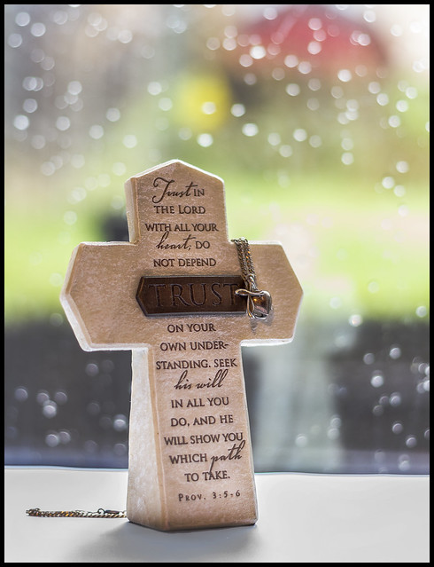
Week33: Religion
As a christian, fairly simple theme for me this week just had to have a think of how or what I was going to take a picture, first idea fell through when my normal band practice in the church was cancelled last night so resulted in some naturally lit ornament type thing of my wife's. So set up by Patio door, with a pop up bbq as the base and a couple of table placemats, then couple of sheets of A4 on top to provide the white base, was gonna try some flash work but settled on this. Hope you like.
 week33b by Nathan Browning, on Flickr
As a christian, fairly simple theme for me this week just had to have a think of how or what I was going to take a picture, first idea fell through when my normal band practice in the church was cancelled last night so resulted in some naturally lit ornament type thing of my wife's. So set up by Patio door, with a pop up bbq as the base and a couple of table placemats, then couple of sheets of A4 on top to provide the white base, was gonna try some flash work but settled on this. Hope you like.
 week33b by Nathan Browning, on Flickr
- Messages
- 213
- Name
- Laura
- Edit My Images
- Yes
Ok I'm a sucker for the bokeh effect in the back ground. I really like this 
- Messages
- 13,760
- Edit My Images
- Yes
Hi Nathan
Now that is very effective, nice idea with the wet glass behind, adds some real good depth to the image, nicely lit too
Now that is very effective, nice idea with the wet glass behind, adds some real good depth to the image, nicely lit too
Brian_of_Bozeat
Jeff
- Messages
- 3,235
- Name
- Brian (not Jeff)
- Edit My Images
- No
Very nicely done. 
- Messages
- 3,925
- Name
- Carl
- Edit My Images
- Yes
Nicely done Nathan. A clean & sharp image against a beautiful backdrop. 

- Messages
- 908
- Name
- nathan
- Edit My Images
- Yes
Well, nice to know there's a proper Christian amongst us.
Ha ha, thanks d00d
Ok I'm a sucker for the bokeh effect in the back ground. I really like this
Cheers Laura.
Hi Nathan, Simple, effective, and of course a perfect choice for the theme, the rain on the patio door makes the ideal back drop, I like the personal link .... It makes it more than just a photo
Thanks Susie.
Hi Nathan
Now that is very effective, nice idea with the wet glass behind, adds some real good depth to the image, nicely lit too
All naturally lit, its amazing how many times my shots end up being taken by this very door, the next is too
Very nicely done.
Cheers mate
Nicely done Nathan. A clean & sharp image against a beautiful backdrop.
Thanks Carl, miserable day actually lended a hand
- Messages
- 908
- Name
- nathan
- Edit My Images
- Yes
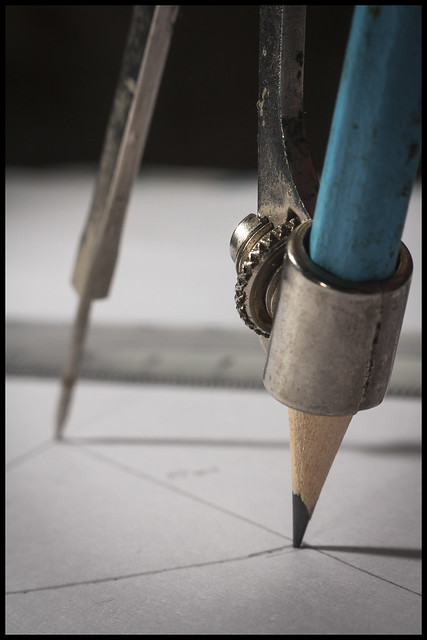
Week34: Geometric
Well bucking the trend a little, not using any architecture or angular object. Simply an old compass some off camera flash (slaved to pop-up) and some strategically drawn lines (with the compass of course) to form this weeks challenge. Had a crappy compass from my school days but popped up my parents to grab this 60's jobby, much more character and details for the photo.
Hope you like
 week34 by Nathan Browning, on Flickr
Well bucking the trend a little, not using any architecture or angular object. Simply an old compass some off camera flash (slaved to pop-up) and some strategically drawn lines (with the compass of course) to form this weeks challenge. Had a crappy compass from my school days but popped up my parents to grab this 60's jobby, much more character and details for the photo.
Hope you like
 week34 by Nathan Browning, on Flickr
Last edited:
Brian_of_Bozeat
Jeff
- Messages
- 3,235
- Name
- Brian (not Jeff)
- Edit My Images
- No
I like! - as Susie says I think the line near the point of the pencil is a slight distraction, other than that it has character and charm and fills me with nostalgia! (I learned to draw in the days before CAD). 

- Messages
- 2,480
- Name
- Steve
- Edit My Images
- Yes
Religion, Now I really like this shot. I really like the Bokeh created by the raindrops on the window, reflections in the glass and the soft colours very nice... Also impressive control of the lighting Nathan, nice job .
.
Geometric... Great interpretation of the theme See now those were the days when you could rub out that little wonky bit with a rubber . There's a lot to be said for being able to draw isn't there. Light the shot and the OOF rule, really nice DOF here!
Geometric... Great interpretation of the theme See now those were the days when you could rub out that little wonky bit with a rubber
- Messages
- 3,925
- Name
- Carl
- Edit My Images
- Yes
Nice one Nathan. Original, well composed and great DoF. 

- Messages
- 908
- Name
- nathan
- Edit My Images
- Yes
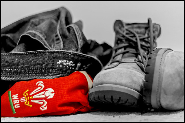
Really dreaded this one, had no ideas, so a bit a of a shoehorn I'm afraid, Match day fashion, and if its a big welsh international day this is normally the Male attire throughout the country.
Week35 : Fashion
 week35 by Nathan Browning, on Flickr
Week35 : Fashion
 week35 by Nathan Browning, on Flickr
- Messages
- 908
- Name
- nathan
- Edit My Images
- Yes
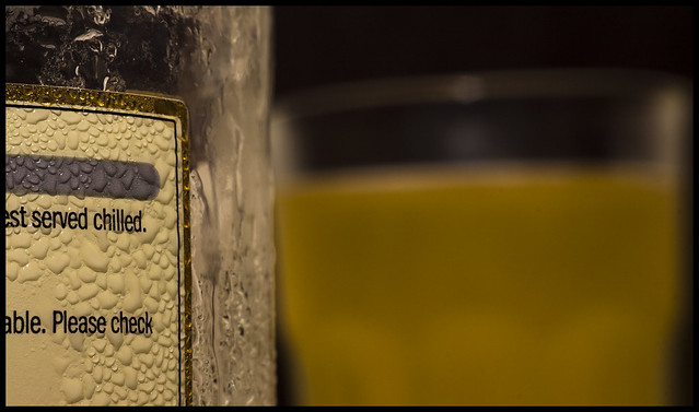
So... Sorta caught up again, can't believe how quick this year is going, chilled. Had an idea, slightly changed idea as i wanted to use a green glass bottle and attempt some off camera gelled flash, but oh well, didn't come out too bad. On camera flash gun along with my raynox dcr250 and the nifty fifty. Hope you like.
Week 36: Chilled
 week36 by Nathan Browning, on Flickr
Week 36: Chilled
 week36 by Nathan Browning, on Flickr
- Messages
- 115,214
- Name
- The real Chris
- Edit My Images
- No
Fashion, Yeah I think you can get away with that, its not as though its a Panda up a tree or anything silly like thata bit a of a shoehorn I'm afraid
Chilled, good idea no shoe horn required there
Maybe the whole of "best" would be better visible though? just a thought.
- Messages
- 7,548
- Name
- susie
- Edit My Images
- Yes
Hi Nathan I commented on your Fashion photo on Friday but I see it's not here ...don't know how that happened ! Anyway ... my comment was same as d00d it's an excellent choice for the theme.
Chilled ....another excellent choice, I love the bottle and the label, I would prefer the ratio to be more label than the glass because I that part is so well done, excellent use of your Raynox.
Chilled ....another excellent choice, I love the bottle and the label, I would prefer the ratio to be more label than the glass because I that part is so well done, excellent use of your Raynox.
- Messages
- 11,087
- Name
- Allan
- Edit My Images
- No
Hi, I live next to Wales there are certainly a lot of welsh rugby shirts around, fits the theme, not sure on the selective colour but I see why you did it
I agree with Susie more bottle less glass but you have captured the condensation really well
I agree with Susie more bottle less glass but you have captured the condensation really well
- Messages
- 3,925
- Name
- Carl
- Edit My Images
- Yes
I think your Fashion shot is terrific - well themed too. Chilled is excellent for the condensation on the label ... if anything a bit more label for me.
Brian_of_Bozeat
Jeff
- Messages
- 3,235
- Name
- Brian (not Jeff)
- Edit My Images
- No
Hi Nathan, Certainly looks cold but but I feel like there's something missing. Perhaps the crop is a little too tight?
- Messages
- 908
- Name
- nathan
- Edit My Images
- Yes
Week 37: Special
2 very different images for special both of which are archive images but from my first wedding in May. My wife is very special to me but she also looks rather "special" on times
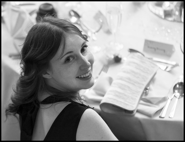 week37a by Nathan Browning, on Flickr
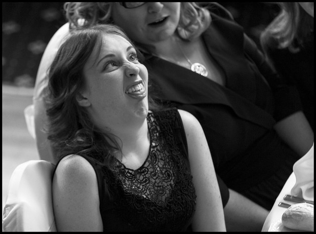 week37b by Nathan Browning, on Flickr
2 very different images for special both of which are archive images but from my first wedding in May. My wife is very special to me but she also looks rather "special" on times

 week37a by Nathan Browning, on Flickr
 week37b by Nathan Browning, on Flickr
Bruja
Los Cojones del Perro
- Messages
- 3,883
- Name
- Just call me Mad Madam Mim
- Edit My Images
- Yes
Hi Nathan
Religion, love the backdrop of this very effective portrayal, it really sets it off.
Fashion, not really a fan of selective colouring but this works really well
Love the Chilled shot, great DOF and the condensation really pops out at you reinforcing the theme
Special - I assume you mean the first wedding your were photographer rather than you are planning to get married again at some time in the future
She looks really special in the first shot and like she has 'special needs' in the second
Nice catch up

Religion, love the backdrop of this very effective portrayal, it really sets it off.
Fashion, not really a fan of selective colouring but this works really well
Love the Chilled shot, great DOF and the condensation really pops out at you reinforcing the theme
Special - I assume you mean the first wedding your were photographer rather than you are planning to get married again at some time in the future

She looks really special in the first shot and like she has 'special needs' in the second
Nice catch up


- Messages
- 3,925
- Name
- Carl
- Edit My Images
- Yes
Beautiful and a sense of humour ...very Special.
Brian_of_Bozeat
Jeff
- Messages
- 3,235
- Name
- Brian (not Jeff)
- Edit My Images
- No
Ha! Made me laugh. Thank you for sharing.
- Messages
- 908
- Name
- nathan
- Edit My Images
- Yes
Hi Nathan
Religion, love the backdrop of this very effective portrayal, it really sets it off.
Fashion, not really a fan of selective colouring but this works really well
Love the Chilled shot, great DOF and the condensation really pops out at you reinforcing the theme
Special - I assume you mean the first wedding your were photographer rather than you are planning to get married again at some time in the future
She looks really special in the first shot and like she has 'special needs' in the second
Nice catch up
Beautiful and a sense of humour ...very Special.
Special indeed. A very attractive lady.
It's #2 for me, great sense of humour and what's more that's the face Isabelle pulls when she's had enough of being a model
Cheers.
Ha! Made me laugh. Thank you for sharing.
Special, I'm sure. I hope you got permission to post that #2 on the net.
Hi Jill, Carl, Andy, Brian, David, thanks for taking the time to comment, I have been amiss recently so will catch up with your lot this evening, She is indeed very special, I am an incredibly lucky man he he,
However I was told strictly not to post anywhere where friends can see i.e Facebook lol. so I will have to play it safe with the first image when updating my '52' folder in FB.
Thanks again.
- Messages
- 908
- Name
- nathan
- Edit My Images
- Yes
I finally have 'sort of' caught up, I have really struggled last few weeks and especially with despair in particular. But... I had ideas they came and went and finally settled on these.
Despair:
Shot with my remote, messing around in living room, I often 'Despair' working in IT specifically with BSOD problems (blue screen of death)
 week38 by Nathan Browning, on Flickr
Noise:
Noise is more than one sense of the word, White noise from a horrificly noisy static TV page. Made extra noisy by pulling out the shadows in Post
 week39 by Nathan Browning, on Flickr
C&C always welcome
Despair:
Shot with my remote, messing around in living room, I often 'Despair' working in IT specifically with BSOD problems (blue screen of death)
 week38 by Nathan Browning, on Flickr
Noise:
Noise is more than one sense of the word, White noise from a horrificly noisy static TV page. Made extra noisy by pulling out the shadows in Post
 week39 by Nathan Browning, on Flickr
C&C always welcome

