weekly ChickenDipa's 52 week 2012 Colour + Shadow added

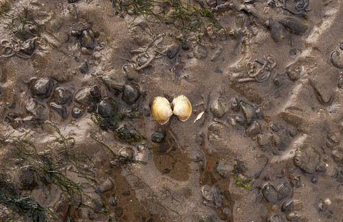
Week 37 : Duo - another one on the beach, was a really interesting location to shot. Might crop it a bit more, not sure yet. A lot going on and the dogs enjoyed it which was a bonus!


Duo by ChickenDipa, on Flickr

Ones left to do...

Week 34 : Body
Week 35 : Reshoot and Liquid
Week 36 : Up
Week 38 : Flow
Week 43 : Spread
Week 44 : Together
 
Good work on your continued catch up Alex :)

Friendship - Your explanation helps this along ;). I like it, the flowing seaweed has curves which are echoed in the sand. It is pleasing on the eye, well spotted.

Age - #2 gets my vote here, the age stands out by your use of selective focus, I like the subtle colour tones and your chosen dof.

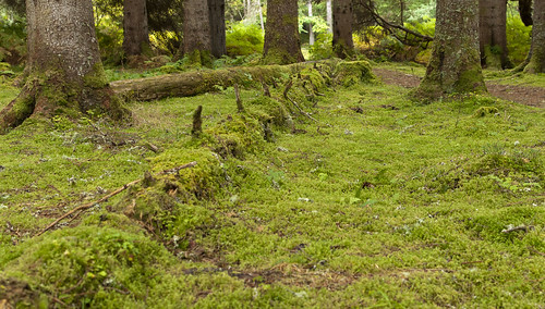
Natural - I like this too, it is a calm scene with lovely natural colour and depth.

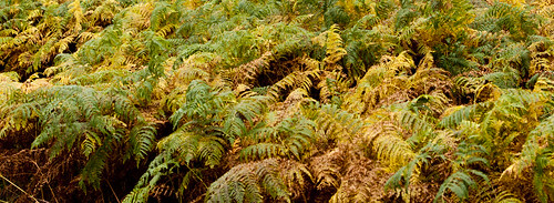
Change - again well spotted, with yet again lovely warm colour tones, displaying the changing seasons.

I am biased in the last two on account of my Scottishness :LOL:

Pack - is probably for me the weakest of the set but hey its getting you up to date, I appreciate your hard work, keep it up you're nearly there. Iain
 
yayyyy......good to see you here again Alex & with some great images(y)


The 2nd whisky shot for me,love the angle & the simple tones....posibly a little more DOF if I'm being really picky (y)

& love your take on Friendship......beautifully sharp & nicely exposed (y)

change.....lovely colors ,works as an almost abstract

Duo was a good find but possibly a little central for me.

What I have noticed with this latest batch of images is the clarity...really really good.....are you processing diferently or doing something different in camera ?
 
Thanks Iain and Lynne for the comments.

I hopefully have another idea for pack but its just finding the subjects I require.

Scotland is gorgeous, I wish we had taken more shots whilst we were there. Some stunning scenes.

Thanks Lynne, not sure whats changed. Not done anything differently I dont think. Maybe got to grips with things in the camera a bit more.
 
Hi Alex

Change - on theme, good autumn change colours and I like the saturation. Not sure why the letter box crop - would like to have seen a little more.

Natural - spot on theme. I like the comp of this with the large trees at the back and the fallen one being overtaken by nature (moss and lichens). Also good diag line of the lump ( don't know what else to call it :D- it looks like a fallen tree or is it an old fence line which has rotted away?) Whatever it is it really adds to the shot (y) and it has also benn overtaken by nature.

Duo - think I agree with Lynne re the central nature of it. But lots of sea shore detail in the shot. if you try another crop, perhaps have a look at trying it a little less central.

Pretty impressed by your catch up rate. :clap:
 
Hey Alex

Right... here we go

Friendship - Very original idea, liking the crop and the all natural look to it

Age - Whiskey 1, nice angle, but I think the barcode distracts - Whiskey 2 for me, I prefer the oof/in focus area's on the level plain, good blacks too

Pack - nice twist, like the pp and the crop sure helps the carpark look expansive yet full

Change - For me a wider dof would be better, but again like the wide crop, and the colours of the foliage

Natural - Now I really like that, shallow dof again but it works well, great colours, and the ridge leads the eye nicely

Duo - Liking the reflections, casts, wet look and the touches of green/colour, just not liking the central placing of the shells, a different crop maybe ??

<EDIT> Ahhhh the crop is much more pleasing (y)
 
Last edited:
What a spell of catching up Alex. It&#8217;s good to see you back up and running.

Friendship &#8211; I love your take on a theme. Good use of a square(ish) crop

Age &#8211; I like the small DoF on both these. Although I like the angle of #1 I would probably go with #2 as I prefer the perspective of the box

Pack &#8211; I recognise that car park. You kept that one quiet :LOL: I like what you&#8217;ve done with the crop

Change &#8211; Great use of the changing autumnal colours. Another example of a nice crop

Natural &#8211; Well seen. It does look like a carpet as well.

Duo &#8211; I couldn&#8217;t decide whether putting the shells on the third would help this and after seeing the edit I feel it works better


Keep going Alex. You'll soon catch up at this rate.
 
I like the crop of duo and natural looks interesting well done for keeping going you will soon catch up
 
Thanks for the comments and welcome backs. Away this week with work so slowing down my catchup progress.

I do have up, spread and together sorted. Hopefully body too!

Peter, I did keep pack quiet, being with 3 52ers I couldn't divulge!! Also it was a 'hope it's ok once I get home' shot!
 
Thanks Michael, no probs with the not commenting :)

Lets see what I got left

Week 36 : Up - another Scotland shot, it was throwing it down when I took this and we still were quite near the beginning of the walk!!!

Up the path by ChickenDipa, on Flickr

Week 43 : Spread - not my best but hopefully fits the theme.

Spread 2_1 by ChickenDipa, on Flickr
Or (looked better in my head...)

Spread_1 by ChickenDipa, on Flickr

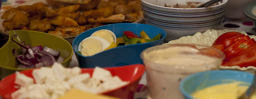
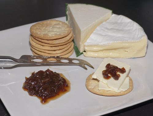
Week 44 : Together - yummy!

Cheese and biscuits by ChickenDipa, on Flickr

Leaving...

Week 34 : Body
Week 35 : Reshoot and Liquid
Week 38 : Flow
 
Hi Alex


keep going girlie...almost caught up:)


UP......like the image but possibly needs the addition of a body/dog walking away ?

Spread..........not had a cold boiled egg for years , must pack one on the next picnic ! Can ee what you were aiming for but I think you needed either a slightly higher POV or greater DOF to show more of your picnic spread

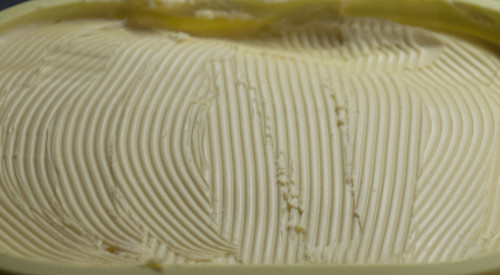
The 2nd image for spread would work really well as an abstract if cropped square ? Lovely texture in that spread

Together....yum yum...cheese n crackers with pickle...ohhh yes please ! Colors look good on crackers & pickle but lighting seems a little harsh? on camera flash ? I know how difficult it can be with flash & a white platepossibly needs some sort of a diffuser ?
 
Hi Lynne!

Thanks for stopping by. I might even have a bash at Art tonight to keep the momentum going.

There was more of the picture but it looked a bit messy and I wasnt keen on the content. I'll try a better crop on the 2nd one.

The picture does look a bit brighter than I remember. Had the diffuser on the the flash, probably just fiddled with it a bit too much!!

Thanks!!
 
Hi, Alex mahhoossivvee :clap: :clap: :clap: for catching up (y)

Friendship, liking the interpretation you've captured here and I like your narrative. When I was in Scotland there were some very large rocks with huge clumps or seaweed attached. Never seen it before. Being picky, the rock looks a little hot. Reckon a subtle vignette would work well here.

Age #2 for me. Just feels right. Nice selective focus and nice blacks. What colour is the box? NB: I Goggled and in some it's the colour you have and in others it's white :thinking:

Pack, well spotted and fits the theme.

Change, it's a bit, erm, samey, if you know what I mean. I actually prefer Fargaig Forest 3 from your Flickr for Change. It is on theme, though.

Natural, again on theme and good lead in, nice greens and I really like the low angle, especially how you've just included a small section of the lower part of the trees.

Duo, like it and well spotted. Much closer for me, though. NB, edit is better but closer...closer...tiny white to the right of the shells draws my eye a tad.

Up, sky was against you but, again, nice greens and it's Scotland so what's not to like. I'd like to see a steeper Up, though ;)

Spread, nice spread to boot :D; #2 for me. Really says Spread.

Together, cheese and biscuits, nice. I didn't have OCD still I started here, but I'd like to see the crackers stacked better and the cheese more square :)thinking:) on the green surface...eeek I sound like a right geek :geek:

Right, that's me caught up :clap:
 
Hi Alex, welcome back :wave:

Here goes with the catch up:

Friendship, what an unusual idea but it works for me(y) I think it would suit a true square crop.

Age, I prefer the colours and lighting in number one but the barcode jumps out a little. I prefer the DOF in number two but it's a tad dark for me.

Packed, in surprised there was any room in that car park for all the ducks! The crop gives it a wide feel adding to the shot (y)

Change, lovely colours and tones befitting the theme and the season.

Natural, nice diagonal leads through the shot. Lovely colours too (y)

Duo, the cropped version is better but it highlights the little bit of stray shell bottom right, I would be tempted to clone that out.

Up, the sky draws my eye a little. Have you considered cropping it to make the path more prominent?

Spread, yummy. I agree with Lynne though a greater DOF would help this a lot.

Together, yummy again I had cheese and crackers last night. Yes the lighting is a touch harsh but the composition works well (y)

New change, my habitual urge to crop is running rampant tonight, I would lose a tad off the bottom left to lose the little bit of shrubbery.

Phew, I'm done! Well done on your monster catch up. Oh and it was lovely meeting you last week :)
 
Hey Alex :)

Up - Nice path leading through the picture, the top left is a bit blown on my monitor, but for the theme it fits nicely

Spread - Large on Flickr with black background is great, really like the crop, dof and wide subject matter - Love It (y)

Together - Nice idea, I would prefer a deeper dof with the knife in focus too, but liking the composition

Great catch up again :clap:
 
Up &#8211; I can see where you&#8217;re going (forgive the pun) with this image for the theme. Sounds like you did well getting any shot if it was throwing it down

Spread &#8211; I do like the first of these. Nice and colourful and a good use of a narrower crop. It certainly gives the impression of a spread.

Together &#8211; Cheese and biscuits definitely fit the theme. The lighting and composition have been nicely done.

Change &#8211; I do like the edit. The square format works well with the browns and greens in the image complimenting nicely.
 
Up – I can see where you’re going (forgive the pun) with this image for the theme. Sounds like you did well getting any shot if it was throwing it down

Spread – I do like the first of these. Nice and colourful and a good use of a narrower crop. It certainly gives the impression of a spread.

Together – Cheese and biscuits definitely fit the theme. The lighting and composition have been nicely done.

Change – I do like the edit. The square format works well with the browns and greens in the image complimenting nicely.

Thanks Peter, ask Jon about the day we went out and it was raining. He was such a happy chappie!

I think I am changing my change to this one, a lot better than the other one!


Not had chance to work on my catchup themes but I did do Art. Manage to snap it early on in the week but not been on my PC to upload.

The idea behind the shot was mastering the art of light painting. I've never really got into techniques as such so took the opportunity to have a play around, well for as long as my helper would allow! I feel more confident with this kind of a shot now so please with the result. The picture isnt perfect but we were a bit limited.


Art 5 by ChickenDipa, on Flickr
 
I had a go at doing the same sort of thing with a torch and I pushed the contrast to create a kind of disembodied lettering. And why not experiment, that's what art is all about anyway.
 
Hi Alex, some lovely shots there.

Friendship; what a fantastic idea! Can't fault that one; it's wall material!

Age; I like the first one best, but don't bar codes spoil traditional packaging like this! Great exposure, DoF and composition.

Pack; not one of your best, but rescued nicely by the B&W and the crop. Works fine.

Change; doesn't do a lot for me I'm afraid; I think it needs a point of interest.

Natural on the other hand; lovely :)

Duo is special; one of my favourites!

Up's good, but somehow I think you needed to convey more of the gradient. Not sure how though!

Spread; I like spread 2 best; the crop makes it look like the spread goes on forever!

Together; nice!

Change 2; Now that's better! Back on track!

Art; it's nice to see you creating your own art. Very nicely done.

Flow; this is the best of the bunch. I love the abstract nature of it, and the colour.
 
Hi Alex,

Please except my delay in commentating on your images. Life at sea and all that. You've done brilliantly to catch up

Change - I prefer your second image. nice composition, focus and lighting. Good PP work too.

Art - Very creative, nice work and bang on theme.

Flow - i really like the strong diagonal line and Cyanotype toning. Great composition and PP. You really do have quite a distinctive flair with all your work.
 
Hi Alex


well done for having a try at light painting ( I keep bottling out of it !) , not perfect but far off...well done you (y)

Liking your image for Flow but can't visualise whereabouts you took it ? Like the fact it's on the diagonal , works well missus :clap:
 
Hi, Alex, Art, not easy writing with light. You've done a credentials job, but feel maybe given more time you could improve it. Outside, maybe?

Flow, like it a lot. Has a real abstract feel to it and I like the cool tones and composition. The bricks are a tad out, noticeable at the very bottom, slight CE rotation maybe.

Good show and thumbs up for catching up.

Cheers.
 
Hi Alex,
I think art works well and is something I have thought about doing with sparklers! Like you say it's not perfect, but it's a good go:clap:

Flow, well you know already that I like this shot :)

Sparklers would be good, wish I had got some a few weeks ago at Bonfire night but forgot. It was really about learning so happy with what I came out with!

Thanks for the flow comment, hope you dont mind me using it!

That looks good, there is a real sense of motion in there and I like the pp.

Thanks Michael, one of those I did not think much of at the time but has turned out well!

Hi Alex, some lovely shots there.

Friendship; what a fantastic idea! Can't fault that one; it's wall material!

Age; I like the first one best, but don't bar codes spoil traditional packaging like this! Great exposure, DoF and composition.

Pack; not one of your best, but rescued nicely by the B&W and the crop. Works fine.

Change; doesn't do a lot for me I'm afraid; I think it needs a point of interest.

Natural on the other hand; lovely :)

Duo is special; one of my favourites!

Up's good, but somehow I think you needed to convey more of the gradient. Not sure how though!

Spread; I like spread 2 best; the crop makes it look like the spread goes on forever!

Together; nice!

Change 2; Now that's better! Back on track!

Art; it's nice to see you creating your own art. Very nicely done.

Flow; this is the best of the bunch. I love the abstract nature of it, and the colour.

Thanks Mark for the catchup and thanks for the lovely comments. I am quite proud of one or two of these :)

Hi Alex,

Please except my delay in commentating on your images. Life at sea and all that. You've done brilliantly to catch up

Change - I prefer your second image. nice composition, focus and lighting. Good PP work too.

Art - Very creative, nice work and bang on theme.

Flow - i really like the strong diagonal line and Cyanotype toning. Great composition and PP. You really do have quite a distinctive flair with all your work.

Hi Nick, hope you are well!! No worries about the commenting, I am making my way round the threads I missed.

Thank you, never thought I would have a distinctive flair but I guess its in there some where :D Thanks

Hi Alex


well done for having a try at light painting ( I keep bottling out of it !) , not perfect but far off...well done you (y)

Liking your image for Flow but can't visualise whereabouts you took it ? Like the fact it's on the diagonal , works well missus :clap:

Thanks Lynne! It was ok once I got going, it is a bit of a scary one to conquer.

Trying to think how to describe where it is, just up the steps of the first fall and then peering over the side. Does that help??

Thanks for the comments!

Hi Alex :)

Art - a bit tight at the top, apart from that great effort, I'm impressed if not done before (y)

Flow - That's great, love the angle and the colour, flow well caught :clap:

Hey Dk! Nope not done that before, bit of wire wool spinning and such but always had help with that. This was all me except for the writing, my lovely husband helped there.

Thanks!

Hi, Alex, Art, not easy writing with light. You've done a credentials job, but feel maybe given more time you could improve it. Outside, maybe?

Flow, like it a lot. Has a real abstract feel to it and I like the cool tones and composition. The bricks are a tad out, noticeable at the very bottom, slight CE rotation maybe.

Good show and thumbs up for catching up.

Cheers.

Hellllo! It was one of those I did not want to perfect really, it was the art of learning and also making art.

Thanks for the comments!
2 more to catchup on and this weeks so going well I think!
 
Art - Looks well done. I've never tried this so difficult to provide any crit

Flow - Nice one. I like how you've used the diagonal to make the image much stronger.
 
Hi Alex

Well I go away for a week and you motor on!! :D

Up - with others on the unkind sky and trying to get a steeper gradient.

Spread - #2 for me. excellent take on the theme.

Together - bang on theme (all thos foodie together things: cheese and biscuits, peaches and cream, fish and chips , gin and tonic ...ooops)

Change - agree good colours and crop

Art - super (y) I don't know how to that. Can't make out the b/g - Just put paper over my screen cutting out the grey/brown bit on RHS and seems to work better. But I may be wrong.

Flow - lovely . Nice motion and PP.
 
Art - Looks well done. I've never tried this so difficult to provide any crit

Flow - Nice one. I like how you've used the diagonal to make the image much stronger.

Thanks Peter, Art is on the cards for a reshoot. I am thinking a trip to Seckar Woods carpark at night would be good! But may attract unwanted attention!!

Hi Alex

Well I go away for a week and you motor on!! :D

Up - with others on the unkind sky and trying to get a steeper gradient.

Spread - #2 for me. excellent take on the theme.

Together - bang on theme (all thos foodie together things: cheese and biscuits, peaches and cream, fish and chips , gin and tonic ...ooops)

Change - agree good colours and crop

Art - super (y) I don't know how to that. Can't make out the b/g - Just put paper over my screen cutting out the grey/brown bit on RHS and seems to work better. But I may be wrong.

Flow - lovely . Nice motion and PP.

I am trying to keep going! Seems like photography is a better winter activity for me :)

Thanks for the comments!
 
Colour - this idea has been floating around in my head all week but it turned into a busy one (trying to sort out job applications!) so its had to wait until today. I accidentally got a Shadow whilst setting up too :)

I am not happy with the individual pictures - this is what I get for playing with the studio lights on my own! I really dont have a clue :)


Colour rejig by ChickenDipa, on Flickr

And my accidental sinister scary grainy ....mug!


Shadow by ChickenDipa, on Flickr
 
Apologies Alex, I thought I'd commented on your thread recently :thinking:

Flow is a cracker, its got it all, lovely colour tones, great composition with the strong diagonal through the frame and lots of detail and texture (y)

Art, I like too. Bang on theme. As Andy mentioned perhaps trying it outside when you get the time, so as you have a darker, more even background maybe?

Colour, at first glance I thought the pencils were spelling out a word but on a second look, I realised not. It certainly says colour but feel maybe that there is too much space around the pencils, the white background tends to dominate more than the subject. On a third look, the penny has dropped in your choice of colour arrangement, a rainbow :D

Shadow, again bang on theme but I feel it just needs a little bit of something else to add context. Maybe a biscuit being dunked in the mug :thinking: I am not sure I can put my finger on it.
 
Thanks Iain.

I will definitely venturing off to darker places for my next attempt at light painting. Might wait for the weather to change a little bit first though :)

I was going to see if anyone got the rainbow influence. Might crop them a bit closer, thanks for the suggestion.

Shadow may change yet, it was just there in front of me when lining up the pencil shots. If you insist I'll pop a biscuit or two in there. Then I'll have to eat them! :D
 
Hi Alex

Colour - Good idea with the pencils (I did not see the rainbow influence tho :wacky:) Agree with Iain that too much white space - pencils shold be a bit mire dominant. B/g looks a bit pink on my monitor.

Shadow - on theme but again as Iain says, possibly need something else. I have tried that sort of shadow and the trouble to me was the oof edges, which are typical of such shadows, but not necessarily good in a photo.
 
Hi Alex, colour is a good idea. The colours are nice and vibrant, though I would them to make a bit more of an impact, perhaps closer up, or a larger square format maybe? THere is a noticeable line viewable between the green and blue crayons which doesn't show anywhere else to my eyes. Lighting looks very good

Shadow, as said needs a little something extra, maybe a saucer if you have one to include that in the shadow, oh and I fancy a biscuit now, and I have none left lol!
 
Back
Top