weekly Dark Star's 52 '09ers: Week 16/17 Poverty/Self

If only - I had to buy it :)!!!! :D

Any excuse!

Love the idea and very impressed with the effort you put into the set up. Agree it looks a tad cut n paste which is a shame after you had put so much effort in. Agree with Jean - I think it is about depth and perspective.
 
Doom and Gloom...in 2009 I choose a bottle of booze and a handful of pills...pretty depressing stuff :)

This year I toyed with a good few ideas and settled on this one.

The blues can be damn doomy at times and I love it!

The challenge here was composition I took 49shots before I was happy....amazing! I'll post a set up shot later....

I used a vintage preset in LightRoom just to add some gloom :)

So here is...

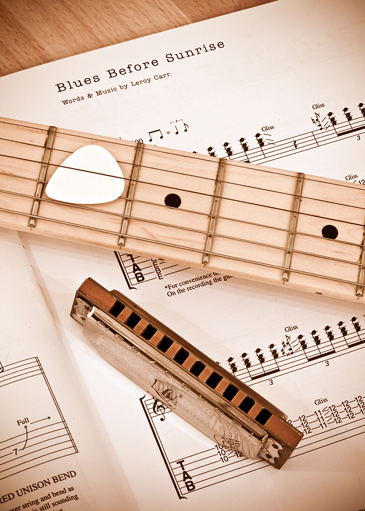
Doom and Gloom


6732273125_2d941e5cc8_b.jpg

I remember your 2009 shot - and I remember liking it in a depressing kind of way. I like this one for completely different reasons. I think it is the contrast between the "gloomy" theme and props and the light and airy feel of the shot.

It could have ended up looking a bit stark but there is just enough warmth to make it work. Great job - interesting shot for the theme :clap:
 
Liking your idea this week. I different take on the obvious ones...like mine is LOL.
Lovely and sharp, nice and warm, and I likethe reflection too. Only critique is the guitar picky disc thingy is a bit blown and catches my eye.
 
Last edited:
I like the interpretation and the composition. Spot on and well worth the 48 previous shots to get this one! :D The overall tone and colour look great - a bit warm but 'smoky cellar under pub' chilled at the same time. :)

There's something about music scores in photos that I love - I can't resist trying to read the tune and 'hear' it. The plectrum looks ok on my screen.

A good week, John and great to see the creative juices haven't ebbed. :clap:

Jean
 
I think the composition works so clearly it was worth the 49 shots to get it right :) The colouring adds to the image imo and I guess thats from the processing.

Thanks Ruth...much appreciated...yep the colouring is the tint from the 'vintage' pre-set in LR

I've only just spotted this John.
I love the "Lego wars" a great idea well executed (y)

Cheers Chris....we're all big kids at heart :D

Any excuse!

Love the idea and very impressed with the effort you put into the set up. Agree it looks a tad cut n paste which is a shame after you had put so much effort in. Agree with Jean - I think it is about depth and perspective.

Call it a valuable lesson learned Fi :) "Look at the final image however you know it has been set up - others won't know!"

I remember your 2009 shot - and I remember liking it in a depressing kind of way. I like this one for completely different reasons. I think it is the contrast between the "gloomy" theme and props and the light and airy feel of the shot.

It could have ended up looking a bit stark but there is just enough warmth to make it work. Great job - interesting shot for the theme :clap:

Good powers of recall Fi...glad you like it...one of several ideas I had... I'm glad I plumped for this one in the end :)

Liking you ridea this week. I different take on the obvious ones...like mine is LOL.
Lovely and sharp, nice and warm, and I likethe reflection too. Only critique is the guitar picky disc thingy is a bit blown and catches my eye.

Cheers Miss C much obliged....agree the pick looks a little bright but it was pure white... i tried with a darker one but I found that even more distracting :)

I like the interpretation and the composition. Spot on and well worth the 48 previous shots to get this one! :D The overall tone and colour look great - a bit warm but 'smoky cellar under pub' chilled at the same time. :)

There's something about music scores in photos that I love - I can't resist trying to read the tune and 'hear' it. The plectrum looks ok on my screen.

A good week, John and great to see the creative juices haven't ebbed. :clap:

Jean

Thank you very much Jean...the preset did a lot here as the original looked way to 'clean'...no atmosphere!

The music book is Eric Clapton's From the Cradle...all corking blues songs :)
 
Very good John... well composed and the feel is excellent. A great idea too... given you're current activities, I guess a musical take is a good choice.
 
You, musical, never :LOL::LOL::LOL:

Love the shot and the colour tint stops it being too stark and Clapton is a perfect choice too :D

One tiny tiny niggle is the very bottom right of the frame which keeps catching my eye.
 
Hi John..:wave:.
I’m back to looking and posting on the site again after a very long break... mostly landscapes from me... so thought I would look up the old gang...

Everyone doing the 52s are so good, but as you know you spend many hours viewing and commenting on the great photography on this site.

So I’m going to look, but only comment on you, Jill, and Jean as I want to be out taking photo’s and away from the computer as much as I can.

So what a great start from all of you...

1 Future... lovely idea, and great fun to boot.... excellent set up and well executed...:LOL:

2 Float... so easy yet very effective and apt for the theme...:clap:

3 Doom & Gloom... This is a classic shot from you, well thought out and put together...:clap::clap::clap:

looking forward to your 52s for 2012... good luck...
 
Very good John... well composed and the feel is excellent. A great idea too... given you're current activities, I guess a musical take is a good choice.

Thanks John much appreciated :)!

You, musical, never

Love the shot and the colour tint stops it being too stark and Clapton is a perfect choice too :D

One tiny tiny niggle is the very bottom right of the frame which keeps catching my eye.

Oi you :)

Hmmm I see what you mean the vignetting a little too strong maybe !

And Clapton...of course :)

Hi John..:wave:.
I’m back to looking and posting on the site again after a very long break... mostly landscapes from me... so thought I would look up the old gang...

Everyone doing the 52s are so good, but as you know you spend many hours viewing and commenting on the great photography on this site.

So I’m going to look, but only comment on you, Jill, and Jean as I want to be out taking photo’s and away from the computer as much as I can.

So what a great start from all of you...

1 Future... lovely idea, and great fun to boot.... excellent set up and well executed...:LOL:

2 Float... so easy yet very effective and apt for the theme...

3 Doom & Gloom... This is a classic shot from you, well thought out and put together...

looking forward to your 52s for 2012... good luck...

Marcus a big welcome back :) Nice to hear from you :)

Thanks for the kind comments and I look forward to the fruits of your photographic labours . Make sure you post them on TP :D
 
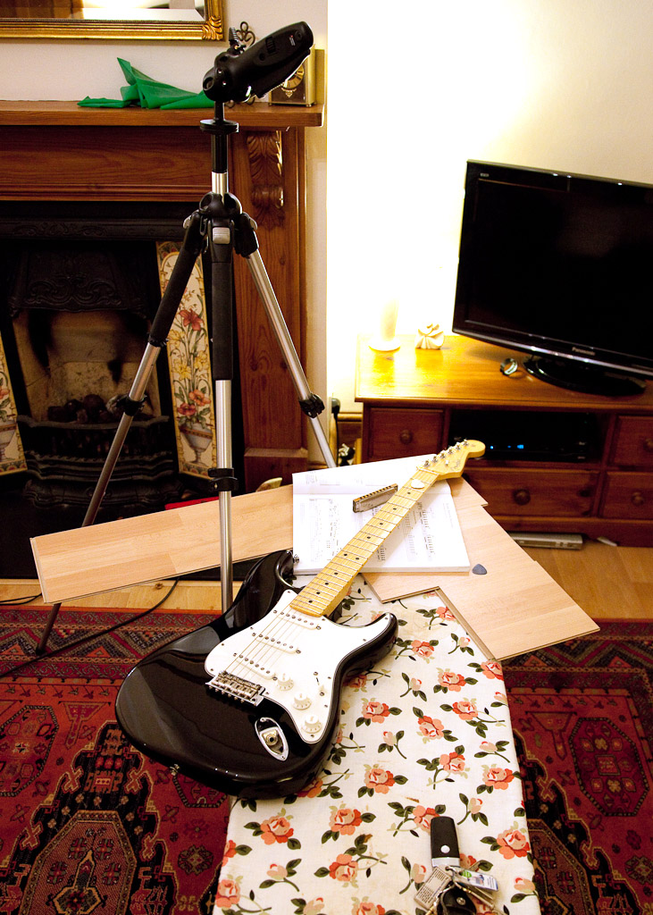
If anyone is interested here is my set up shot for doom and gloom :)

6757314817_84a1096b3c_b.jpg
 
And here after not much thought and two cans of weightwatchers soup is my communication shot.

I spend 75% of my life on a Blackberry (for work) so I thought of shooting a simpler form of communication :) One that will still work after being dropped down the loo (yes it happened to my Blackberry) and one that doesn't need a battery :)

Communication


6757281113_c357a26f2e_b.jpg
 
Well another cracking shot from you John....

Love it...:clap::clap::clap:

Ps see your putting that 5Dmkii to good use... I upgraded to the same model, the picture quality is amazing as we can see...(y)
 
Well another cracking shot from you John....

Love it...:clap::clap::clap:

Ps see your putting that 5Dmkii to good use... I upgraded to the same model, the picture quality is amazing as we can see...(y)

Thanks Marcus...its a corking bit of kit isnt it :) Very little processing needed these days by me as shots are so good out of the camera :)


Nice and old school :) Great detail on the string and good job with no crazy reflections :clap:

Cheers Ruth - it was good to get the old light box out :D
 
Another thread not spotted !!!!

Future - That's excellent, great to see how you have set your shot up, your selective shopping to support your 52 is inspiring :D

Float - Fluffy little clouds, really like the detail in them, nice shot

Doom and Gloom - That processing is perfect for the image, it helps set off the sharpness to imo... and the reflection in the harmonica, very nice, and again great to see your set up

Communication - Cracking take on the theme, I like the lighting especially

Look forward to following the rest of your 52 !!!
 
John - that was a truly inspired shot for Communication. :LOL:

I know that because I had exactly the same idea - even to the composition. :cautious: Fortunately, as you know, I saw yours on FB earlier in the week and saved myself from ending up very embarrassed, because this is a cracking shot!!!

So I'll forgive you for leaving me with something of a dilemma about my shot and just say - yet another scorcher! :clap::clap::clap:

Jean
 
Jajajajajaja, what a great idea :LOL::LOL:

Lovely clean shot, great placement and it made me laugh too ;)

Your enjoyment is showing (y)
 
Really like your communication shot, very clear and excellent idea (even if I am now confused over why there are different themes :thinking:). I tend to chose darker exposures but the brightness of week 4 and week 3 make the shots.

 
:clap: very good, very clever John... I saw this on FB also.. Sometimes it would be nice if we could go back to the simple forms of communication without the immediate demands of the current tech... and that's coming from a tech-head...
 
Cracking communication shot John, excellent lighting and composition.

Many thanks Michael :)


Another thread not spotted !!!!

Future - That's excellent, great to see how you have set your shot up, your selective shopping to support your 52 is inspiring

Float - Fluffy little clouds, really like the detail in them, nice shot

Doom and Gloom - That processing is perfect for the image, it helps set off the sharpness to imo... and the reflection in the harmonica, very nice, and again great to see your set up

Communication - Cracking take on the theme, I like the lighting especially

Look forward to following the rest of your 52 !!!

Thanks for taking the time to comment DK glad you like 'em so far :)

Fab shot.....string looks so sharp and and the tins too. Great idea as well

Thanks Miss C :)

John - that was a truly inspired shot for Communication.

I know that because I had exactly the same idea - even to the composition. Fortunately, as you know, I saw yours on FB earlier in the week and saved myself from ending up very embarrassed, because this is a cracking shot!!!

So I'll forgive you for leaving me with something of a dilemma about my shot and just say - yet another scorcher!

Jean

Jean I love your similar take on the theme I'm avoiding FB for these now :)

Thanks for the kind comments too :D

Jajajajajaja, what a great idea

Lovely clean shot, great placement and it made me laugh too ;)

Your enjoyment is showing (y)


Thats what its all about Jill Fun! :D (Oh and a bit of learning too! (y))

Really like your communication shot, very clear and excellent idea (even if I am now confused over why there are different themes ). I tend to chose darker exposures but the brightness of week 4 and week 3 make the shots.


Hi aurorae...thanks for the comments - different themes? Well this set is a retake of 2009's 52s as opposed to the current fresh set thats going on for 2012 :)

Super work......

Cheers Jeff :)


very good, very clever John... I saw this on FB also.. Sometimes it would be nice if we could go back to the simple forms of communication without the immediate demands of the current tech... and that's coming from a tech-head...


Thanks John....you and I both eh? :D
 
Week 5 Fresh Start....

Last time I shot the opening move on a chess board this time round...well nothing nicer than a good hot shower to start the day I reckon so here's my attempt this year :)

Fresh Start

6822501755_4cf37e8928_b.jpg
 
Hi John,

Sorry I am late with my coments - only managed to get my last two shots today. Love your shot for Communication - simple idea but the theme is completely clear and the shot is technically great. Looks like we both had a similar idea for Fresh Start - although your shower looks WAY nicer than ours - very inviting. I think the DOF in this one is perfect :clap:
 
I like the simplicity of the shot and water always works imo have to say sat here in the cold it looks very inviting :)
 
Hi John,

Sorry I am late with my coments - only managed to get my last two shots today. Love your shot for Communication - simple idea but the theme is completely clear and the shot is technically great. Looks like we both had a similar idea for Fresh Start - although your shower looks WAY nicer than ours - very inviting. I think the DOF in this one is perfect

Late? Never you mnd Fi - no rules here :D Thanks for the comments and I'm glad you like the shots....I'll head on over to yours shortly...although I do like your shower shot as I saw it on flickr - had I tried that a cracked lens would have ensued :)

I like the simplicity of the shot and water always works imo have to say sat here in the cold it looks very inviting

Cheers Ruth - simple is me :D

Now that's what I call a shower head, John!

Excellent shot - looks very inviting, and good enough to make up for the early start on Toothie's shot!

Everything about it works well - composition, dof, hot water :clap:

Jean

Cheers Jean its a recent addition to the household and by god it works

:D

Lovely jubbly :)

The kind of shot you are so good at :clap::clap::clap:

simple but stunning - a bit like you :LOL:


Well I'll agree with the simple bit.....jejeje :)

Cheers Jill :D
 
Very clever... fits the theme perfectly... damn shower here is broken... again!!!! we've got cold and cold running water :crying: and that is no fun with the current weather (and just for clarification, no, I do not fit the grunge theme :LOL:).
 
Very clever... fits the theme perfectly... damn shower here is broken... again!!!! we've got cold and cold running water :crying: and that is no fun with the current weather (and just for clarification, no, I do not fit the grunge theme :LOL:).

I like it, a nice simple idea and the dof is spot on.

Gents thank you both very much for your comments and John I hope you've warmed up :)
 
Identity...hmm .....

I'm late but sod it no-one's watching the clock are they :)

I had half a dozen passports lined up, then I had my macro out for a fingerprint shot and then some one sent me a mail asking if I remembered this:

"On 28 November 2003, the show saw one of its most radical overhauls in what was widely reported as a make-or-break attempt to revitalise the long-running series. In a break with the previous format, the show played more up-and-coming tracks ahead of any chart success, and also featured interviews with artists. The launch show, which was live and an hour long, was notable for a performance featuring hordes of hooded teenagers choreographed to dance around the outside of BBC Television Centre."

And it reminded me of my lad :)

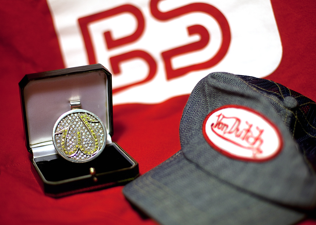
When he appeared on stage he had two trademarks: a medallion he had made up (the 'W' stands for 'Weighty Plates' the band's own label) and a hat, he always wore a hat :). That was his identity within the band

So I gathered the hoodie he wore on that very Top Of The Pops 9 years ago, his medallion and one of his hats and voila....

(By the way if you're in any doubt about the band he was in look at my custom name :))

Identity


6877119181_3c823d37d6_b.jpg
 
Spot on... great idea John... love the way the medalion takes centre stage (in the dof kind of way :D)... the others sit very nicely and complement it though. A very personal Identity :clap:
 
I seem to remember you shooting some BS memorabilia first time aroud :thinking: but maybe it was for a different theme :shrug:

As ever you have done it justice :clap::clap::clap:
 
iirc it was a jacket that you shot for 2009 :thinking:
I love seeing this stuff though, and if your boy ever contemplates getting rid of or selling it, tell him a firm "no" and store it away safely. It's stuff that he'll really treasure in years to come.

Lovely shot, strong composition and great colours. My only niggle, if you can even call it that, is that the oof herringbone pattern on the cap is playing havoc with my eyes :LOL:

(y) for fresh start too. That's a typical John style shot and you've carried it off well.
 
Catching up....
Fresh start. Great shot.....so simple. Love the way the showerhead fills the frame. Blown bit though, you can sort that out!
Identity. Good idea and well excetuted. nicely filling the frame too. Vibrant, sharp (y)
 
Back
Top