You are using an out of date browser. It may not display this or other websites correctly.
You should upgrade or use an alternative browser.
You should upgrade or use an alternative browser.
weekly Daryl's 52 for week 9 Money
- Thread starter daryl1969
- Start date
- Messages
- 253
- Name
- Ben
- Edit My Images
- No
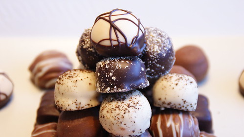
I like these DoF shots but it's too tightly cropped for me.
- Messages
- 13,760
- Edit My Images
- Yes
Liking your Sigh idea Daryl... as you say a bit red indeed, but a cracking idea !!!
Sweet - Mmmmmm.... Nice image, like the dof, but a shame the top chocky is clipped, and with such a light background, what do you think of a tiny border to make it stand out a tad - anyway... Nice Pic
Sweet - Mmmmmm.... Nice image, like the dof, but a shame the top chocky is clipped, and with such a light background, what do you think of a tiny border to make it stand out a tad - anyway... Nice Pic
D
Deleted member 3428
Guest
Yummy sweets, nice. 
- Messages
- 71
- Name
- Daryl
- Edit My Images
- No

DSC05586 by .daryl1969, on Flickr
hope this looks a bit better its the only one I have that has the top choc on
- Messages
- 1,513
- Name
- Alex
- Edit My Images
- Yes
Yum 
Like the last one posted, the wide shot is better. Great DOF.
Like the last one posted, the wide shot is better. Great DOF.
D
Deleted member 3428
Guest
Yep the retake is better I think and I'm surprised you still had them for a retake, if it was me I would have had to go and buy some more. 

- Messages
- 406
- Name
- kristien
- Edit My Images
- Yes
i like the just for fun one lol nice twist
- Messages
- 999
- Name
- Roly
- Edit My Images
- Yes
Lovely DOF on that last one Daryl and like the thinking behind the TP chocolates 
Also like the lighting, good work mate..
Just waiting for a phone call on how to edit the post now...lol
Also like the lighting, good work mate..
Just waiting for a phone call on how to edit the post now...lol
- Messages
- 2,820
- Name
- Mark
- Edit My Images
- Yes
Sweet looks great; another person concentrating on a great photo instead of an out of the box idea, which is a good way to go. Great DoF and tones.
Agree re the crop; the second one is better in that respect, but doesn't work as well for me for some unknown reason. Possibly because of the line in the background?
Agree re the crop; the second one is better in that respect, but doesn't work as well for me for some unknown reason. Possibly because of the line in the background?
Last edited:
- Messages
- 522
- Edit My Images
- Yes
Really nice shot, def the 2nd version though.
There is a slight line in the background but it's not massively obvious until it's pointed out.
There is a slight line in the background but it's not massively obvious until it's pointed out.
- Messages
- 2,820
- Name
- Mark
- Edit My Images
- Yes
I've worked out what it is; needs cropping left and right to get rid of the sweets there. So left and right cropped like the original, but the top like version 2.
- Messages
- 8,398
- Name
- Lynne
- Edit My Images
- Yes
Hi Daryl
Sigh....oh yes...every blooming week great idea...bang on theme....love it
Sweet......ooooh...yes please....they look scrummy......of the 3 images posted ,your last edit works best for me...nice focus , colors & textures.....crop the sides & you have a winner
Sigh....oh yes...every blooming week
Sweet......ooooh...yes please....they look scrummy......of the 3 images posted ,your last edit works best for me...nice focus , colors & textures.....crop the sides & you have a winner

- Messages
- 2,167
- Name
- Liz
- Edit My Images
- Yes
Hi Daryl sorry i haven't managed to drop by before
Direction - i'm a sucker for a light trail and this works well
Fear - Nice perspective and the lighting is just right
Sigh - yes, stopped doing the lottery a while ago as i was always sighing
sweet - like the second one, the wider crop is much better and a good use of DOF
Direction - i'm a sucker for a light trail and this works well
Fear - Nice perspective and the lighting is just right
Sigh - yes, stopped doing the lottery a while ago as i was always sighing
sweet - like the second one, the wider crop is much better and a good use of DOF
happygolucky
Suspended / Banned
- Messages
- 3,101
- Name
- Andrew
- Edit My Images
- No
"Sweet" certainly fits the bill and makes me want one NOW 
- Messages
- 71
- Name
- Daryl
- Edit My Images
- No

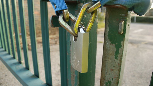
DSC05722 by .daryl1969, on Flickr
Well had trouble finding the time this week and eneded up doing what i really didnt want to do a Padlock, but hey i got in there at the last minute again. I wanted to put something else but the other half chose this one.
Last edited:
- Messages
- 999
- Name
- Roly
- Edit My Images
- Yes
You make me laugh Daryl, wasn't it you that said wait for all the padlock pictures??? Lol
However I like your take on it, maybe slightly more depth of field to make the last couple of bars more out of focus, really like the point of view, colours and lighting.
You sure left that to the last minute mate, but you got there
However I like your take on it, maybe slightly more depth of field to make the last couple of bars more out of focus, really like the point of view, colours and lighting.
You sure left that to the last minute mate, but you got there
- Messages
- 13,760
- Edit My Images
- Yes
Yep... like the angle, cropped slightly on the right to reduce the open space and less central for the lock would be nice, but really nice worn paint contrasting with the shiny lock - well spotted 
- Messages
- 4,831
- Name
- Alan
- Edit My Images
- Yes
Hi Daryl
Sweet - good creative ideas, well shot and like the lighting
Secure - as you say, perhaps you did not want to do a padlock and so maybe the pic suffers in comparison with your other work.
Sweet - good creative ideas, well shot and like the lighting
Secure - as you say, perhaps you did not want to do a padlock and so maybe the pic suffers in comparison with your other work.
- Messages
- 6,502
- Name
- Peter
- Edit My Images
- Yes
Sweet - The last image definitely works. I could imagine the image being used in some advertising
Secure - I would like to have seen more of the padlock rather than a side view I'm afraid
Secure - I would like to have seen more of the padlock rather than a side view I'm afraid
- Messages
- 8,398
- Name
- Lynne
- Edit My Images
- Yes
Hi Daryl
Secure....quite liking this one , on theme , good focus , nice DOF....yup hits the spot for me
Secure....quite liking this one , on theme , good focus , nice DOF....yup hits the spot for me
- Messages
- 71
- Name
- Daryl
- Edit My Images
- No

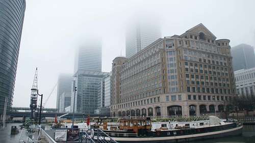
Industry by .daryl1969, on Flickr
Im a week to late for this but im not giving up, I was at Canary Wharf today looking how the old shipping quays are now all but gone in london and how the modern Industry has taken over. If your ever around there visit the museum its well worth the look
Last edited:
- Messages
- 999
- Name
- Roly
- Edit My Images
- Yes
Like the thinking behind this one Daryl, certainly captures the way that industry had changed in London over the years.
Like the way that the cloud is eating away at the buildings, would crop the building out on the left hand side as its slightly distracting and not really adding anything to the picture.
Good work
Oh your not a week late, only a day...
Like the way that the cloud is eating away at the buildings, would crop the building out on the left hand side as its slightly distracting and not really adding anything to the picture.
Good work
Oh your not a week late, only a day...
- Messages
- 8,398
- Name
- Lynne
- Edit My Images
- Yes
Hi Daryl
nice shot for Industry....the inclusion of the boat & the mix of new & old buildings work really well ( least I think the centre building looks old ? )
Keep up the good work
nice shot for Industry....the inclusion of the boat & the mix of new & old buildings work really well ( least I think the centre building looks old ? )
Keep up the good work
- Messages
- 71
- Name
- Daryl
- Edit My Images
- No
Thanks for the comments, not sure why it didnt look industry considering its canary wharf the biggest part of the banking industry. Blondie i think the old building is actually a new build, but in the 1800's this was such a busy area for trade with shipping etc

