weekly debrito's 52 week 7-9

Week 1 Direction

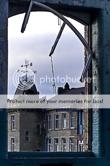
Well of to a good start with 3 different images although all the same subject
hope this gets my mojo back !! it does look promising(y)

I have posted them in order i prefer but feel free to choose
Direction3web-1.jpg

2
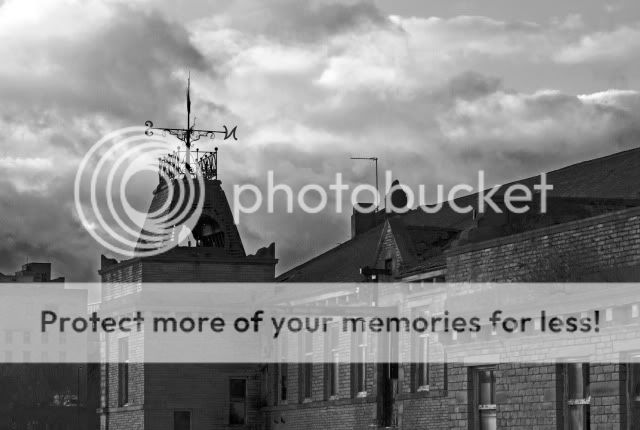
Direction2-1.jpg

3
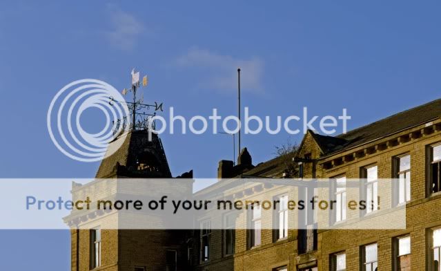
Direction.jpg
 
Hi ya Paul....welcome back to the madhouse....in it to the end this year (y)

Good start to your challenge as well....

2#....stands out far above the other 2...great conversion , nice detail in the sky...really like it :clap:
1#....the clutter in the window niggles me....if you could get rid of that it'd tie for top spot as like the effect of looking through a window (y)

Best of luck for the next 50 weeks...see you at the finish line this year mister (y)

ps....don't forget to update the spreadsheet...makes it far simpler keeping up with who's done what...link is in the 1st post where the themes are posted ....I've updated wk 1 for you (y)
 
well this was doing my head in and its only week 2 lol
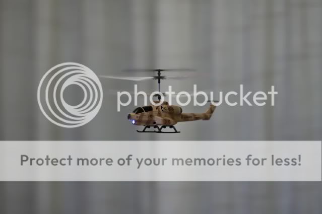
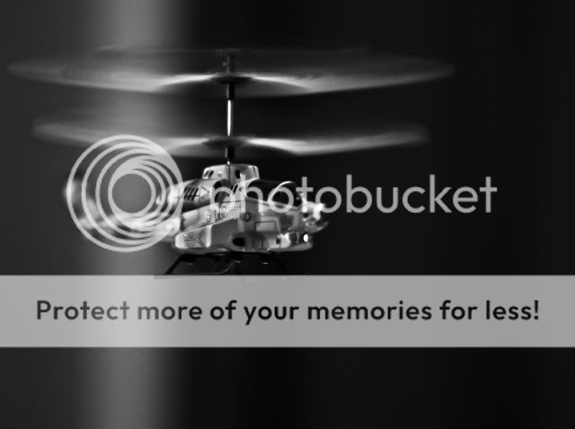
Came up with this it took me hours to fly helicopter and try and hover so i could take shots

hi iso but it was poor light might give it ago in morning with some natural light
The fear of flying (or as BA used to say" i ant flying fool")

1
Fear1.jpg

2
Fear2.jpg

3
fear3.jpg


my Favorited is the mono
 
some really nice images there
week 1 direction i like your second image think it works well as a b&w

week 2 fear yep some people do suffer fear of flying or getting hit by the helicopter very well shot as they can't be the easiest thing to photograph like that , i can't make my mind up between 2 or 3 i think i like the angle on no 3 well done luck forward to seeing week 3
 
Just trying to work my way through

Direction,#1 too much going on for me, it took me a while to twig that the weather vane was there.

#2 My favourite , the sky is great, but i would probably have lost some of the building out.

Fear, personally i like the last one, the brightness of the green in the helicopter and the rotor blades really draw my eye, coupled with a good use of DOF it draws me in
 
andybod said:
some really nice images there
week 1 direction i like your second image think it works well as a b&w

week 2 fear yep some people do suffer fear of flying or getting hit by the helicopter very well shot as they can't be the easiest thing to photograph like that , i can't make my mind up between 2 or 3 i think i like the angle on no 3 well done luck forward to seeing week 3

Cheers thanks yes I think I'm going through the mono thing
 
Hi Paul

#1 Direction - seem to have been taken on differnt days as the sky has changed. Like 3 best because of the angle of view and how the vane is lit up in the sunshine

#2 - Fear - like my take outside the strict parameters, which some people did not 'get' without an explanation, this is something that did not strike me at first. However i think that #3 is a v good image. It seems to convey movement towards the camera rather than just a hover. And i felt fear because it's a bit like a stinging flying insect - which I hate:eek: Really good pic with all that is going on with movement, light etc.
 
superpippo said:
Hi Paul

#1 Direction - seem to have been taken on differnt days as the sky has changed. Like 3 best because of the angle of view and how the vane is lit up in the sunshine

#2 - Fear - like my take outside the strict parameters, which some people did not 'get' without an explanation, this is something that did not strike me at first. However i think that #3 is a v good image. It seems to convey movement towards the camera rather than just a hover. And i felt fear because it's a bit like a stinging flying insect - which I hate:eek: Really good pic with all that is going on with movement, light etc.


Hi thanks for input, but no same day just about a hour later after I explored the building more the clouds had gone when I got back
 
superpippo said:
However i think that #3 is a v good image. It seems to convey movement towards the camera rather than just a hover.

I agree, I like the sense of movement it gives.
Must have been fun to shoot!
 
Direction : the first has too many distractions around it, the third the direction isn't clear enough... but the second... very good. The direction is clear, and I love the moody B&W

Fear : Thanks for the explanation, I think it needed it. Of the three, the mono closer view is my fave. Very nicely done.

thanks for input i like the mono's i think im going towards mono at the moment dont know why but am trying mono for everything(y) i shoot
 
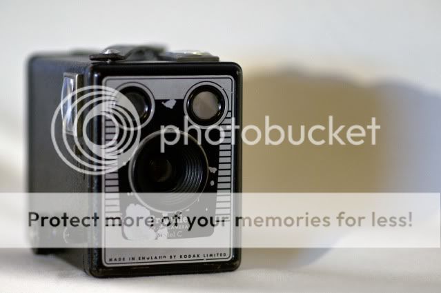
i had a no ideas for this until i read a post on here about the end of Kodak and i "sighed" bang on theme" that's an idea !! they had a shot of a brownie!! and i thought im having some of that, so i can't take full credit for the idea

sighkodak.jpg
 
Direction - #3 for me because of the alignment of the weather vane although maybe a B&W version would have worked as I liked the tones in #2

Fear - Whilst I understand the fear of flying link I don't think a r/c model helps convey it. That said I like the DoF on #2

Sigh - Very topical this week.
 
Hi Paul; any chance you could use the spreadsheet, as I almost missed your post completely. Lots of people use it to keep track of where to comment :)

I think direction you were getting into your stride, as not as good as the following two weeks.

Fear I love the B&W one; spot on focus, and the conversion gives it a menacing look that works with the theme.

Sigh, yes, very sad indeed, and well expressed. My favourite camera of all time was a Kodak 4Mp bridge camera. I still have it, but it has a huge lump of dirt on the sensor after I dropped it in a river :(
 
Thanks I wondered why I was not getting much response !lol were is it ?
 
Hi Paul

Liking your idea for Fear.....& sounds like you had a tricky time trying to fly the 'copter & take the shot......#3 takes top spot for me....like the crop , the angle of the 'copter , the colors & the focus...great shot :clap:

Sigh....like it....nice n simple & very topical....good'un mister (y)
 
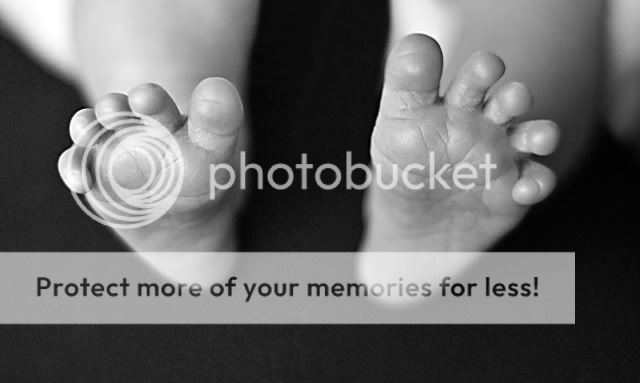
here is my take on sweet i might revisit this theme im running out of time (y)

monosweet.jpg
 
Liking it a lot but there's something odd about the inside of the right (babies left) foot, about halfway up?
 
Hi Paul
Good take on direction, think #2 is my preferred.
Fear. Definately, have experienced this myself when #2 son tried this in the living room.
Sigh. The demise of Kodak will surely make a few film lovers sigh
Sweet. Hope the next theme is not 'smelly' but can relate to theme as its a baby. As said about left foot. It look like the DOF a bit too tight.
 
Such sweet little tootsies! Quite a shallow DOF which highlights the toes nicely. I know how difficult it is to catch any part of a small person in focus.

I have to ask, how old is the owner of these?

Rico said:
Liking it a lot but there's something odd about the inside of the right (babies left) foot, about halfway up?

Is that the babies little ankle bone?
 
Thanks for input , no the white blob is part of the baby grow that I countdown get rid of in pp need more skill in that department. As for age 1 year old
 
Hi Paul

Sigh - good photo but probably would not work without the explanation and if you were not a togger.

sweet - again good photo, focus and dof. i think that the b&w is appropriate as it draws attention to the outline and shape of the foot, including the wrinkles, without the distraction of skin colours.

As an aside the little curly toes illustrate how they could grasp an object until we put them in our shoes and flatten them out.

That pretty much sums it up for me too.
 
hi im a little behind but im sure ill catch up
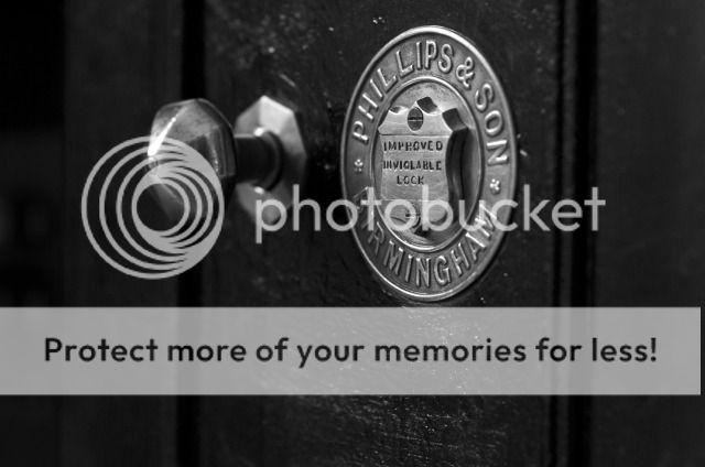
here my take on above theme i must of tried 200 shots at least on this one with different lens and positions but i final choose this one
Sucure.jpg

i didn't have to go far its in my office although there's nothing in it (lol)
 
Hi Paul


great image for Secure....lovely DOF , mono suits it (y)....possibly a little more room at the top :shrug:...keep looking at it....maybe a smidge off the bottom instead ?

You sound like me...200 shots & eventually you get one you're pleased with :LOL:
 
I agree it's a good image for secure and I like the mono. I agree that a little crop along the bottom may help, but I can't decide.

I know what it's like though to take hundreds of images to get just one! I'm a master at that, so my goal is to reduce the camera abuse and try and get the settings right first time.
 
Back
Top