weekly Gil Bev's 52s for 2018 - Week 6 Sharp Added

Very good light in your over photo, nice leading lines, well composed.
 
I persevered and have to say the Photoshop Cloning Stamp Tool is a great to use!! Thanks @LC2 for the advice. I spent around an hour removing the car. Thanks @Kodiak Qc also for sending me an updated edit. Hopefully my updated version is as acceptable as yours is :). Let me know.

 
Last edited:
Really like the colours Gil you've done an excellent job of removing the car in the edited version.
 
Thanks all. So good to be learning!!
 
Lovely colour in that museum shot. And very well done with impounding the car!

Now ... have you tried adjusting perspectives??
 
Nice work with the car, colours are really nice. I can see a few stars in the sky, so perhaps a longer exposure would have exposed a few more, you need to be careful to stop the stars trailing, something to have a play with later on.

Pete
 
I really like your image for Over, though don't quite get how it fits the theme? Am I being thick? :)
 
Nice work with the car, colours are really nice. I can see a few stars in the sky, so perhaps a longer exposure would have exposed a few more, you need to be careful to stop the stars trailing, something to have a play with later on.

Pete

Hi Pete,

Thanks for the advice. I had found that I was at the far end of the exposure time - 30s was the last setting, and after that it was 'bulb' which I'm not sure how to use. I don't have a remote shutter. Would you recommend a narrower aperture and a longer exposure? Any advice much appreciated.
 
Lovely colour in that museum shot. And very well done with impounding the car!

Now ... have you tried adjusting perspectives??

Hi d00d, thanks for the kind words. I had tried using the settings within Lightroom to improve the perspective. I can see that the towers are leaning ever so slightly into the middle of the picture, and are not perpendicular.

I tried the 'auto' transform button and come out with this, does this look better?

HSC_7445-Edit-2-Edit.jpg
 
I really like your image for Over, though don't quite get how it fits the theme? Am I being thick? :)
It was a bit of a shoe horned picture / joker week for me. I called it 'Night falls over the Westend of Glasgow' so the theme word 'over' is kinda in there. Lol. I'll try getting my next picture closer to the theme!!
 
Hi Gil, I really like stark and over :). Stark especially as I'm a sucker for snowy landscapes. A couple of thoughts....a smaller aperture for both may have given a bit of starburst for the sun and for the lights? and for stark was it possible to get the sun reflection in the water? might have added more foreground interest.
 
Welcome aboard, Gil, and you found two good subjects for Gate(d). Although the second one is a lovely scene, I prefer the first as it's full of interest and the big yellow sign grabs your attention immediately. Well done on getting your images while on holiday and without your main camera, too :) The second one for People is the pick for me, with that row of bodies all concentrating on their fishing and the yellow lines handily pointing towards them, and your scene for Stark is great for the theme; you've caught a cold and empty landscape that conveys 'stark' perfectly.

Finally, that's a lovely night scene for Over; it might be a bit of a shoehorn into the theme but you have a super leading line, I like the pink and red colours in the roof, and well done on your editing to get rid of the car :)
 
Hi Pete,

Thanks for the advice. I had found that I was at the far end of the exposure time - 30s was the last setting, and after that it was 'bulb' which I'm not sure how to use. I don't have a remote shutter. Would you recommend a narrower aperture and a longer exposure? Any advice much appreciated.

Depending on which lens you have on your camera, the wider the lens the longer exposure you can have. You could also up the ISO a bit.

see https://petapixel.com/2015/01/06/avoid-star-trails-following-500-rule/

Pete
 
Over - that is a pleasing image, I do agree with a small keystoning tweak, and i would probably be tempted to clone out the red car. But other than that the image is very pleasing to look at and the different accents of colour in the lighting on the roof of the building is lovely. And now having typed all this out I didnt see that you had done an edit, and may I say you have done brilliantly on your edit, fantastic stuff.
 
Great photo, love the feeling of grandiosity and the colours :)
 
Thanks for all the nice comments and constructive feedback I got from last weeks submission.

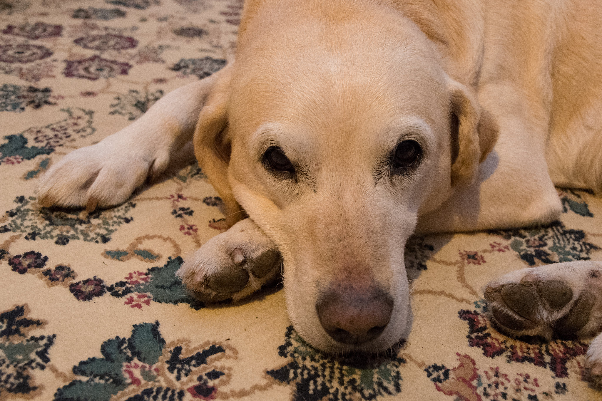
This week I'm going for something a little more simple. Tyro is our lovely dog, and he must be about 13 now. He first came to visit many years ago when he was just a young dog and my folks fell in love with him so much so - that they gave him a new home. A relief for his first owner who had bad allergy reactions to his hair.

Now he's an elderly gentleman, and we have such a soft spot for him in our hearts. This week's theme made the perfect opportunity to do a nice picture of him taking it easy in his later years - bless him.

Ageing Doggy by Gilbo B, on Flickr
 
Last edited:
I knew some dogs would be getting put in, it`s a lovely shot for age Gil but maybe might of been better if you`d cloned out the back paw as it looks odd just coming in to view.
Good point!!
 
I don't think the back paw is a problem as the continuity of the dog to the paw is implied. And it's a picture of a dog so it's always going to be a winner for me.
 
I don't think cloning the back paw out would work with the pattern in the carpet. WB is a little off maybe but it could do with a lift a bit brighter maybe
 
Lovely image for Age Gil. The Paw dosen't really bother me I do find the pattern on the carpet a little distracting though.
 
Lovely Ageing shot Ma’am, fits theme really well, but agree with others about the hind paw being clone out.(y)

George.
 
Lovely shot Gill; he looks very calm, though doesn't look his age to my eye. Great shot for the theme:)
He has been kept very active throughout his life, and many say he's looking good for his age. His hind legs are going a bit though, and he's stiff around his joints, but still a happy dog who enjoys his Winalot Shape biscuits
 
Good doggy portrait but yes could do with a colour/contrast lift, and I too find that carpet a little distracting ... but that's where he's happy!
 
Last edited:
Nice old dog portrait, but the carpet is a bit distracting...
 
Comfort shot for me this week - I'm a keen birder and couldn't resist using one of the pictures I took at the weekend for this week's theme

HSC_8258-Edit.jpg
 
Really like that Gil some beautiful detail and texture in the feathers and a catch light in the eye.
 
Lovely sharp image Gil - you could also argue that the beak may be sharp too ;)
 
Back
Top