weekly Jambo *52* 2012 Thread - Wk 8 *HAND MADE* ADDED

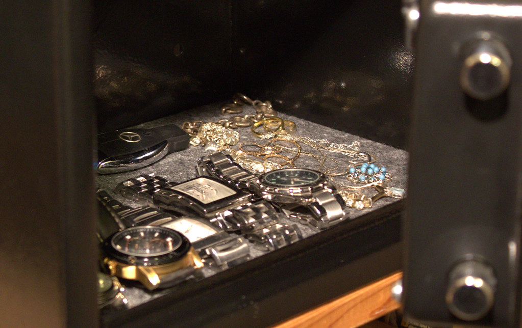
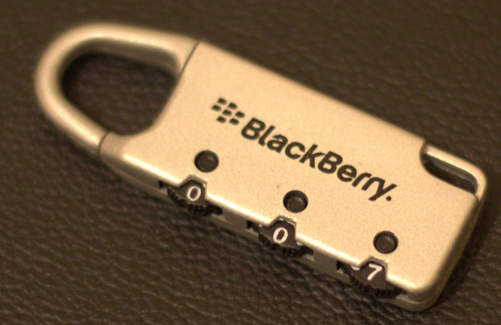
Secure. A couple of ideas, still not happy with the sharpness of the photos. Need more practice!!
6778437325_ffd69d1ae4_b.jpg


6778455893_dde1b58960_b.jpg

second one for me, the first one doesn't make it obvious enough that it's a safe.
 
I like the idea of the first one but for me its a bit cluttered in the safe. But good DoF (y)
 
Hi, there. Secure, as you mention sharpness is an issue and I'm not sure why :thinking: What settings did you use?

I'd like to see the safe door a bit more closed, so just a slither of the inside was showing.

#2, blurred again and I'm not keen on the shallow dof....

Cheers.
 
Both good opportunities and I think the greatest potential is with #1 making it a bit more obvious what it is.
 
Secure, i like the idea of 1, but agree with Andy i'd have liked to have seen more of the safe so that its recognisable

2 does nothing for me at all
 
Hi James, still trying to get round threads so apologies for not spotting yours much earlier.

Direction - Wonderful take on the theme, actually i think the blown white on the controller adds to the shot. Maybe crop in from the right slightly but not as tight as Andy's edit.

Fear - What a bloody good shot fella (y) The mono version my preference of the two, excellent lighting and the light falling onto the mask in the background is spot on.

Sigh - again good take on the theme and extra bonus points for weight display too :LOL:

Sweet - love the idea and the shot, but needs a white background. For me the orange tint to it is slighty distracting.

Secure - again good ideas but for me neither shot is sharp enough, and the first one maybe too cluttered.

Hi Simon, Thanks for the feedback on the photos. I actually agree with everything you said!!! I will continue to work on what i'm learning everyweek. thanks again
 
Jambo said:
Hi Simon, Thanks for the feedback on the photos. I actually agree with everything you said!!! I will continue to work on what i'm learning everyweek. thanks again

You're welcome, but I'm certainly no expert hehehe. We all still learn by posting on here, this is why this is such a cracking forum to take part in :)
 
I'm sorry mate, I was sure I'd commented on your pics. Clearly not though..

I like all your takes on the themes, particularly the B&W fear. Fantastic.
I'm taken with your secure shot (of the safe) too, Although I'd like to see more of the safe itself in focus.
 
Another thread I missed, sorry for that.

Great first 5 weeks on your 52, the mask you used in fear actually scares the sh!t out of me haha.

Matt
 
Some really good shots for your themes so-far, unfortunately the two for industry don't do anything for me, they just don't seem to directly convey 'Industry'. Sorry.
 
Good roots subject, shame you couldnt get behind that fence.

For industry, I agree with Gareth a little but I think the pub one has legs. I would maybe convert to B&W and mess with the contrasts for a bit more drama. Was there a for sale sign on the pub? That may have added to the conext of the shot.
 
HI James


Secure....prefering the 2nd image barring the funny focus...says the theme spot on & like the simplicity (y)

Industry....I think both images are good starting points...the pub industry was hit hard when the smoking ban came in ( from what I've been told by several people in the business) . Could I suggest that you maybe work a little on what you see in the view finder ? For me an image with the whole building in would have worked even better , get more of the boarded up windows in shot & maybe more dead plants etc to add to the feel of a dead industry ? An alternative would be a close up of the central bit with just the boarded up doors , pub name & dead plant plus maybe a conversion to B&W ?

Hope the above doesn't come across as too critical as I'm no expert by a long way but I find owther peoples views & suggestions help me when I'm out shooting....I try to look at different angles & then see which works best .

The funeral parlour made me laugh....it's one industry that won't ever go out of business...again a wider view may have more impact ?

Roots....well thats bang on theme...& pretty darn amazing (y) Shame about the fence but hey , thats life ! Can't help wondering of B&W would suit this as well :thinking:

Onwards & upwards to week 8 ( I think) , well done for still being here (y)
 
What a great tree, such a shame about its environment, fence etc ... any chance of getting a different angle to improve it?
 
I agree with Lynne on the industry photographs James, you are onto something there and with a wee bit of work should really make something.

I agree also on the root image, a fantastic tree with lots of photographic potential. I see its an old photograph ;), is there any potential for a revisit?

Iain

:plus1:
 
Thanks for the comments guys. Will indeed take on board the really useful advise. On the "Root photo" well spotted it being an old photo. Unfortunately after a few poor attempts this week at a new photo I decided to use this one.... Its in Brisbane so no chance of a revisit anytime soon!!!

thanks again
 
Well done Emma :clap:

Oh and well done dad too :D
 
Cool idea for hand made the shadow effect adds the extra dimension. If you can take out the shadow of the nylon string it would help.

Nice picture all the same and I can imagine it being frustrating to take, getting it to stay in the right place and get the lighting right must have been a pain.
 
Hi James,

secure - #2 for me, the focus seems a little iffy but apart from that a good take on the theme. Like the 007.

Sweet - Too much coke, a feeling I remember well. Great idea just a bit orange.

Industry - Excellent take on the theme, as soon as I saw this it dawned on me how many closed pubs I had seen lately. Agree with the other comments but there is a decent shot there waiting to come out. Think B&W might add a bit of atmosphere.

Root - What a shame about the fence, because apart from that its a real corker.

Handmade - Awww, now that is lovely. I still get things like this made for me by my son and love it. Really nice photo that, good work :)
 
Handmade, lovely shot of a lovely subject. The only thing I'd change if it was down to me would be the thread it's hanging on; I'd clone that and it's shadow out because I think it's a little distracting. Hope you don't mind, but I had a go at that:


6920682571_2a03c66eec_b.jpg by MarkBerry1963, on Flickr

Great shot though!
 
I don't think it suits B&W tbh - I think this type of shot is crying out for lots of colour (by type I mean the subject) because it's made by a child and kids and their stuff are colourful :)
 
Hi ya


Handmade.....nicely on theme & like the angle ,like the shadow , cloning out the thread finishes it off nicely (y)

I do agree with Summer though ...I also think a color verison may have more impact for the reasons she stated but hey,each to their own & it's your shot , you like it & it has personal importance so thats all that matters (y)
 
Industry – Spot on theme

Root – As said shame about the fence

Handmade – I like this. The B&W conversion has worked well with the blacks being black and whites being white.
 
Back
Top