weekly Jambo *52* 2012 Thread - Wk 8 *HAND MADE* ADDED

Messages
139
Name
James
Edit My Images
Yes
My 52 *2012*


Week 1 : Direction. http://www.talkphotography.co.uk/forums/showpost.php?p=4301861&postcount=3
Week 2 : Fear. http://www.talkphotography.co.uk/forums/showpost.php?p=4318444&postcount=21
Week 3 : Sigh. http://www.talkphotography.co.uk/forums/showpost.php?p=4336225&postcount=36
Week 4 : Sweet. http://www.talkphotography.co.uk/forums/showpost.php?p=4362840&postcount=55
Week 5 : Secure. http://www.talkphotography.co.uk/forums/showpost.php?p=4373681&postcount=75
Week 6 : Industry. http://www.talkphotography.co.uk/forums/showpost.php?p=4406425&postcount=92
Week 7 : Root. http://www.talkphotography.co.uk/forums/showpost.php?p=4429157&postcount=94
Week 8 : Handmade. http://www.talkphotography.co.uk/forums/showpost.php?p=4442860&postcount=103
Week 9 :
Week 10 :
Week 11 :
Week 12 :
Week 13 :
Week 14 :
Week 15 :
Week 16 :
Week 17 :
Week18 :
Week 19 :
Week 20 :
Week 21 :
Week 22 :
Week 23 :
Week 24 :
Week 25 :
Week 26 :
Week 27 :
Week 28 :
Week 29 :
Week 30 :
Week 31 :
Week 32 :
Week 33 :
Week 34 :
Week 35 :
Week 36 :
Week 37 :
Week 38 :
Week 39 :
Week 40 :
Week 41 :
Week 42 :
Week 43 :
Week 44 :
Week 45 :
Week 46 :
Week 47 :
Week 48 :
Week 49 :
Week 50 :
Week 51 :
Week 52 :
 
Last edited:
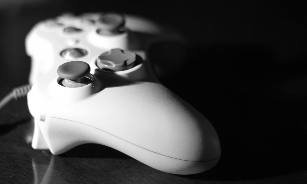
Here goes. Running out of time and ideas!! Just wanted to make sure I got one in.

Week 1. DIRECTION

6637497367_af1ee4b83b_b.jpg
 
Hi, James, I don't edit other's posts often but I was really drawn to the dead space on the right and thought I'd emphasise it with a big crop.

I really like the contrast between the black and the whites, even though they are blown, works for me (y).

I'll remove, if needed.

Cheers and good luck.


control NOT MINE by andysheader, on Flickr
 
Click "Edit" bottom right of your first post, then click "Go Advanced". You'll now be able to edit the title.
 
you have to click on edit post, and then go to advanced, it should bring up the option to change the thread title.
As for the shot, good concept. I like the minimalist approach, and its something i hadn't thought of using for my take on direction.
I think the crop that Andy has done works a bit better for me, as the lead coming out of the controller was drawing my eye a little bit. Black and white works for this as well. It looks to me like the light was not from on camera. what did you use? ocf or just natural light?
Well done on week one mate. Cheers
 
Hi James

good start to your 52 project ...like the angle & the mono...suits the subject well (y). Slightly blown highlights but not to much...somewhere between your original & Andy's crop would work better for me..sorry Andy...touch to much on the crop for my likes

Best of luck for the next 51 weeks...look forward to seeing your images :)
 
A good idea and interpretation. Simplicity works well and is the right approach. Great depth of field and well shot.

May be worth trying some other crops to reduce the black on the right e.g. a square crop of the main subject ?
 
Another vote for the edit but I think it might be the wire I find a little distracting, maybe a wireless controller would of looked better.

However certainly a good take on the theme and really like the DOF and B&W conversion.

Nice start James, look forward to seeing more soon :)
 
Another vote here for the edit! It looks great as black and white and it makes a lovely simple picture.

Well done and I look forward to seeing your next 51!!
 
Yet another vote for the edit. I like the point of focus on this. You must play as much as me to have an almost smooth left thumbstick :D

Good luck with the project!
 
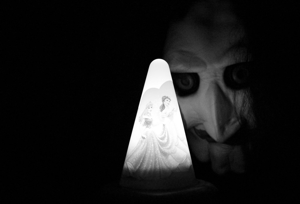
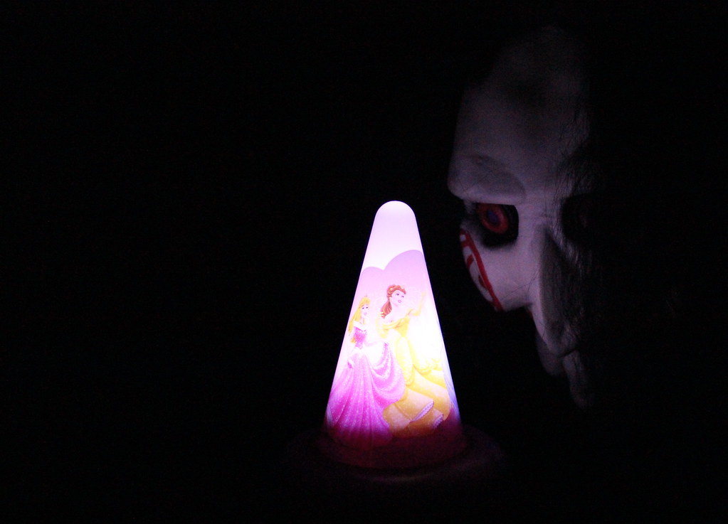
The thinking behind this is that my daughter has a fear of the dark. She has this Princess lamp that she has to have on at night to keep the "monsters" away..... Not this time!!!

Happy with the idea but not the results if i'm honest.

6675454077_5168145b2d_b.jpg


6669664929_7c8cbe4f75_b.jpg
 
Last edited:
I like the mask - it really suits the theme well but am not so convinced of the cinderella/princess on the light. My preference is #1 though due to seeing more of the face.
 
Delta Skies said:
I like the mask - it really suits the theme well but am not so convinced of the cinderella/princess on the light. My preference is #1 though due to seeing more of the face.

Because its the Cinderella and princesses that protect my daughter from the horrible monsters! ;)
 
Spot on scared me to be fair great shot i was very fearful darkness spot on
 
James, that is proper scary (in a good way!). I prefer the mono, as for me personally, the colours of the lamp don't quite 'fit', if that makes sense.
 
Week 2 Fear - very good James, just don't show your daughter you'll never get off to sleep for months.....

Image works very well. I prefer the mono version as it more sinister (y)
 
Ooooh James....fab images for Fear....well done on your thinking ,ister & on the execution :clap:

Like both of them equally....they both look sinister....had another look & it's 2# for me...there's just something about the colors that make it more scary...great stuff :clap:

just a thought... if you could put the face from 1# in to the 2nd image ( you can see more it & the mouth ) that would just be the icing on the cake for me....don't worry...I'll get me coat & :exit: :LOL:
 
I prefer no. 2 because the colours add something to the mask, also I like the way his beady eye is on the lamp, as if to say "just gotta get rid of this lamp then she's all mine mwhhaahhhaa"
 
Really good execution of both themes. Prefer the b&w for the second as I think it fits the theme better
 
Fear...who doesn't have a fear of the dark...all them boogymen :puke:

I'd prefer same composition without the light and eye contact.

Saw...cracking movies (y)
 
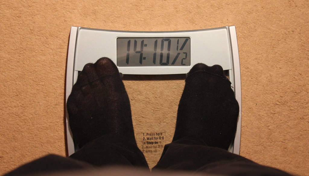
Great take on the theme. I take it you didn't get any socks for xmas;)
 
heh great minds n all that :)
 
Direction - simple but effective, think i prefer Andy's edit thats given it some punch.

Fear - great idea, portrays the theme well, B/W for me as well

Sigh - liked it on Summers, like it on yours too, think we can all relate to that sigh at this time of year
 
Back
Top