weekly Marks' TP52 2018 Will He Actually Complete It??? Weeks 18 - 20 Added

That chap behind the bars is a smashing find for straight ...really unusual subject, b&w suits it perfectly.

Lots of shadows but I think the swing wins that one.

The car is amazing ...he must be so proud of that, I'm sure he gets many admiring glances. The b&w reminds me of photos from when I was a kid ...all the cars were black! The colour one definitely shows off its true beauty.
 
Hi Mark, sorry not been around for a while, have been very bad for commenting so far this year.

Wet - mono one for me, I like that you caught the spray from the back of the bus/lorry
Juxtaposition - Well it works for the theme but as you say maybe one fora reshoot
Oval - Your forget how basic those old minis are. Going to be awkward and say I like the 2nd one with the closer crop but I prefer the b&w processing of the 1st one
Straight - Great portrait, good focus on the eyes and I like the hand coming out, that really draws you in
Unattractive - 1st one for me. That really is an ugly building
Shadow - Had a quick look at the images on Flickr and I prefer the B&W one where the two are swinging in from the side.
Beautiful - Now that is a beautiful car. In that location I prefer the mono but in a different place the colour would probably swing it

:D
 
For me the first for every theme!
straight - great portrait of the guy behind bars, B&W works well
shadow - the first one is clean and simple, I like that
beautiful - it's all about lines and curves, so works best in B&W!
 
Good to see you back again, Mark, and so sorry to read about your doggy. We went through the same thing at the start of the year and they leave a massive hole :(

Good catch up; I really like your image for Straight - it's unusual with the hand reaching towards the camera and the strong eye contact, and suits black and white very well. That's a good selection of shadow images too, and the edit to rotate the one of the pair on the swing is the pick of the bunch; a nice image as well as spot on for the theme :clap: Hard to choose between your Beautiful images; I think the colour version shows off the rich reds but the B&W version makes the most of the smooth lines and curves and helps to minimise the background distractions. I would definitely like to see a reshoot, maybe against a contrasting green background :)

Thanks Andrea once the weather picks up again I hope to re shoot the Jag in a better location

Straight - the guy behind the bars for me, really nice mono, plenty of interest.
Last shadow is my pick, good dark shadow and I like the angle
The mono Jag is a real beauty

Thanks Chris :)

Same here, the guy reminds me of the Childcatcher in Chitty Chitty bang bang
The Jag deserves a much nicer BG tho....
Shadow edit nails it...

Thanks Mark I hadn't noticed it but he does!
 
A good selection of catch-up shots there, Mark.

Straight; the first one works well, love the guy's expression.
Shadow; prefer the barrier shot.
Beautiful; agree with your choice of car model, a classic sports car with lovely curves!

Thanks Stan appreciate you taking the time to comment

Welcome back Mark.

Straight - Loving the image of the chap behind bars. Great expression, great pose, mono soooo suits it :clap:

Shadow - I'm with you on your choice for the main main thread post. the simplicity of it combined with the contrast directs you to the shadow.

Beautiful - Old jags are lovely. I really like the S Type, but perhaps that's due to it's Gangster heritage. that old XK140 is lovely. I tend to agree with your choice of mono, to remove other distracting colours in the background. (Not that there's much).

Cheers Tim :)

I like the bloke behind bars, nice find :thinking::runaway:

and the shadow of the two figures. (y)

and the Jag .... irresistible. (y)

Thanks David (y)
 
That chap behind the bars is a smashing find for straight ...really unusual subject, b&w suits it perfectly.

Lots of shadows but I think the swing wins that one.

The car is amazing ...he must be so proud of that, I'm sure he gets many admiring glances. The b&w reminds me of photos from when I was a kid ...all the cars were black! The colour one definitely shows off its true beauty.

Thanks Susie he does get quite a few people talking to him about it funnily enough it used to be black! But it was already red when he brought it.

Hi Mark, sorry not been around for a while, have been very bad for commenting so far this year.

Wet - mono one for me, I like that you caught the spray from the back of the bus/lorry
Juxtaposition - Well it works for the theme but as you say maybe one fora reshoot
Oval - Your forget how basic those old minis are. Going to be awkward and say I like the 2nd one with the closer crop but I prefer the b&w processing of the 1st one
Straight - Great portrait, good focus on the eyes and I like the hand coming out, that really draws you in
Unattractive - 1st one for me. That really is an ugly building
Shadow - Had a quick look at the images on Flickr and I prefer the B&W one where the two are swinging in from the side.
Beautiful - Now that is a beautiful car. In that location I prefer the mono but in a different place the colour would probably swing it

:D

Wow Georgina thank you for taking the time to comment on all of those it is much appreciated :ty:

For me the first for every theme!
straight - great portrait of the guy behind bars, B&W works well
shadow - the first one is clean and simple, I like that
beautiful - it's all about lines and curves, so works best in B&W!

Cheers Bernd :beer:
 
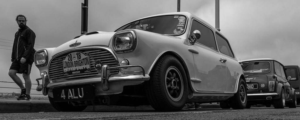
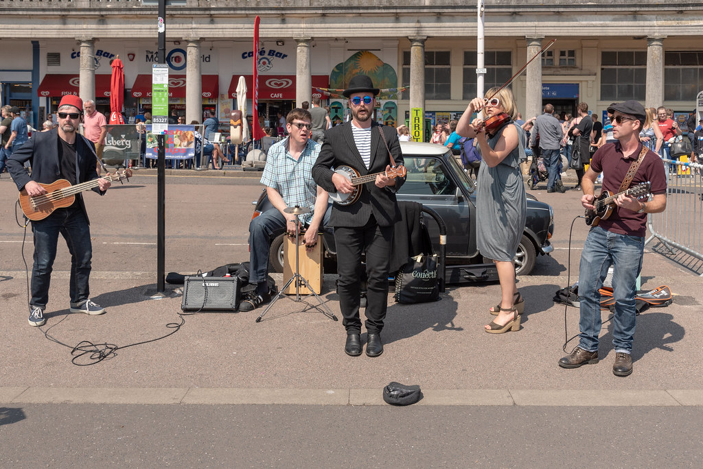
Thought you might of done the Mini run this year, liking the 1st low shot and goes well in mono. Music the signers on in Brighton is bang on theme too. It was foggy when I first arrived at Madeira Drive so only stayed a few hours but loved seeing the old mini cars.

Thanks Dave yes we were there in our new MINI but it was great to see so many Minis there. We stayed in Brighton on Sunday night so had a morning around Brighton on the Monday morning
 
Shoehorn or not I think I prefer the colour image for match and for music either of the first two work just as well as each other they look like a crazy bunch
 
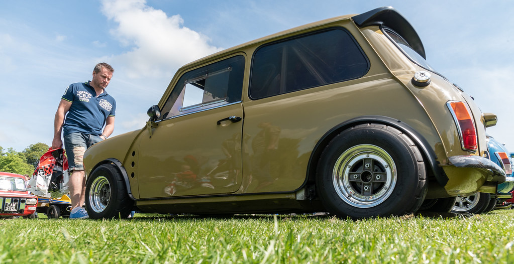
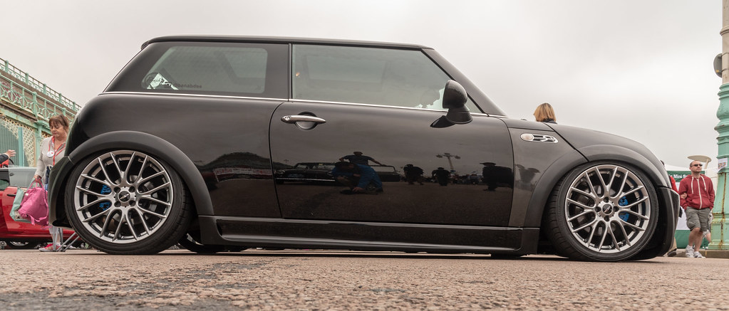
Really liking the Low pov on those minis.

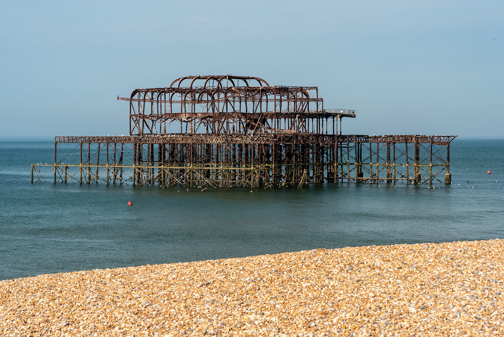
The old pier ... crowbar required but I always like to see pictures of it.

Music in Brighton ... nice find, the band look fun ... Mini too!

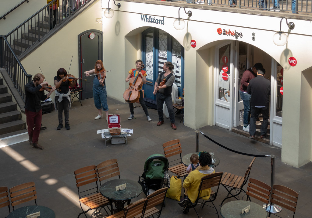
and good old covent garden, inc. the WC that charges £1 (the Punch & Judy is free!)
 
You need to stop showing me minis, I had a couple in my youth and when I see your shots I keep being tempted by one. First with the low POV fits the theme nicely I think.

I like the "old photo" processing for the pier in the first, different take on the theme.

Second music for me, just for the positions/poses of the musicians.
 
low - the first one, great low PoV, great processing and great price tag :)
match - the first one again, I like the vintage look, suits the subject.
music - I like that you've managed to sneak a Mini in that photo! Nice photo, very energetic, shame that you didn't get more blur into the background... The one from Covent Garden works less well in my opinion.
 
Hi Mark,

Low - I'm agreeing with your choice for the main thread. They all work, but 4/4 does it for me. I think it's added to be the interaction of the chap on the left.
Match - The B&W version. The framing is slightly better than the colour version of the same (I know it's only fractionally different) and the conversion seems to add to the story.
Music - Is the 3rd shot downstairs at the Punch & Judy? (It's ages since I've been to Covent Garden). I think that's the one for me, even though I'm chuckling at the way you've shoe-horned a mini into the other shots. :)
 
Mark

Oval, I prefer the 3rd Image, then the 2nd ( but it's close) , then the 5th and 4th being the worst in my eyes.

Unattractive, I feel the 3rd one wins out for being the most unsttarctive, right bang in the middle.

Straight, straight bars, straigh faced as well. boat picture is nowherenear as good for the theme.

Shadow, I like the idea of the swing and prefer the colour version with 2 people.

Beautiful, must better than the etype I agree. B&W works better than the colour, but it is a nice red.

Low, nice low Mini, they do look good like that.

Match, like the humour of that match. works well with the B&W processing you have done.

Music, prefer the 3rd image due to the angle of the shot. It gives a bit of depth to the Image

Pete
 
Hiya,

Catch up coming.....

Low - Really like the second image posted. The bloke on the left makes the car look like a tiny toy. Great pov, and great colours. Great. Now I want a mini...

Match - Lovely bit of shoehornery. Definitely the b+w. Nicely composed with good details. Gives it a nice old worldy vibe.

Music - Either of the first two works for me. Personal preference but I'm not super keen on the looking down pov of the Covent Garden shot. Weirdly, I know one of the violinists in the CG shot from music college.

Ross
 
Hi Mark, I do like that set of shiny Minis for Low, and from my uninformed point of view my favourite is #3 for the impressive shininess of the paintwork. A good set for Music too, and while the first two set the scene of an outdoor street performance and hint at the energy of their performance, I like the higher angle and setting of the third one so that would be my pick. A good catch-up from you (y)
 
Oval - a detailed set of images but i find the last image in the set is the strongest for the theme, as it cuts out the loose wires and other distracting items.
Unattractive - I agree not the most prettiest of building, the first image for me as well as you've not cropped the top of the room.
Straight - I love the first image with the chap behind the bars, good choice on converting it to B&W.
Shadow - good set of images all fit the theme, I prefer the simplicity of the first image, with a nice strong shadow showing on the floor and to me a much cleaner composition.
Beautiful - I have to admit Jags are beautiful cars, and your 2nd image is the strongest for me love the red of the car.
Low - another nice set of images, and for me the first image is my favourite, composition is much cleaner than that of the other images, just a shame about the person in the left of the frame hes a slight distraction for me.
Match - first image for me again, loving the processing i find it works very well for the image, very good image for a bit of a shoehorn.
Music/Musical - all images fit the theme, i think the second is the better image for me.
 
Back
Top