
OP
- Messages
- 1,164
- Name
- Simon
- Edit My Images
- Yes
Hi all, thanks very much for the comments. Noted regarding the dullness of the veggies - I think the main problem is that I guess the exposure in post as my screen is too bright. I try to dull my screen when I edit, but sometimes it still comes out too low.
I shall see what I can do. Good job I shoot in RAW huh!
I shall see what I can do. Good job I shoot in RAW huh!
 PureNutritionalGoodness2
") (and if you think I'm preachy about it, you should see some of the other proponents of it in the Computers subforum!)
(and if you think I'm preachy about it, you should see some of the other proponents of it in the Computers subforum!) Sparkle
")

 Communicate

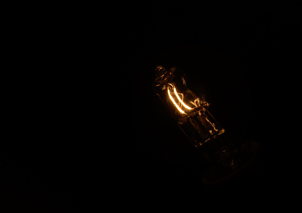 GlowintheDark
 BigDipper (*cough* The Plough)
 TheUniverseisaBigPlace
 focus spot on the middle bank of 4 with good dof
  Fall
Fall Cut
Cut Balance