You are using an out of date browser. It may not display this or other websites correctly.
You should upgrade or use an alternative browser.
You should upgrade or use an alternative browser.
weekly Mr.Si's 52 Week Challenge - Final Photos Added
- Thread starter mr.si
- Start date
- Messages
- 4,088
- Name
- Graham
- Edit My Images
- Yes
Nice catch on the falcon, not a problem with the cropped wing, eyes are sharp and to have all the wings would give less detail in the head. Very well done given the movement in the wings.
Hmmm, cheetah.. Not only an old pic but not yours either
Nice enough shot though, big in the frame and no distractions around it, direct eye contact is about the only thing that would better this.
Hmmm, cheetah.. Not only an old pic but not yours either
Nice enough shot though, big in the frame and no distractions around it, direct eye contact is about the only thing that would better this.
Last edited:
- Messages
- 19,461
- Name
- Andy
- Edit My Images
- Yes
Hi, cheetah is an ok shot needs a little lift its a little dull exposure wise
Yeah, I'd agree. Seems to have a slight green cast a well

Cheers.
- Messages
- 601
- Name
- Andrew
- Edit My Images
- Yes
Nice shot of the cheetah, although it could benefit from being a little brighter/contrasty.
- Messages
- 1,084
- Name
- Craig
- Edit My Images
- Yes
Well caught, as said, nice bit of motion blur.
Pity about the cropped wing and slightly distracting BG.
Cheers.

- Messages
- 8,398
- Name
- Lynne
- Edit My Images
- Yes
can't see your Clouds image ? seem to recall it was nice though
Wild....yup, you've done well to get the motion in the wings with a sharp head
- Messages
- 1,159
- Name
- Simon
- Edit My Images
- Yes
Hi Si
can't see your Clouds image ? seem to recall it was nice though
Wild....yup, you've done well to get the motion in the wings with a sharp head
That cloud image seems to be a little evasive... Maybe it was blown away by the wind.
- Messages
- 9,095
- Name
- Mandy
- Edit My Images
- Yes
Wild - lovely cheetah shot but I agree the shot does look a little dull, but nice work all the same from Mrs Mr.si.
- Messages
- 1,159
- Name
- Simon
- Edit My Images
- Yes
Hi all,
Thanks all for the comments, the Cheetah was submitted because I thought it was framed well. Regarding the colour, "that's auto mode for ya!"
For week 24, I wanted to a photo of Dream (our little one dreaming of milk or something) but I couldn't pull that off practicably in the time available, so maybe I'll work on it for a reshoot week.
I've decided just to submit a wild card. Three different flower shots from the weekend:
1 - playing with flash to light the foreground whilst keeping the background also sensibly exposed
 Rose by Mr_Si, on Flickr
2 & 3, some close ups of flowers that I thought looked pretty as an "open garden" event on Sunday. Just taken in the natural light with the kit 18-105 on my D7000
 Flower by Mr_Si, on Flickr
 Flower2 by Mr_Si, on Flickr
No comments required, but always welcome.
Thanks all for the comments, the Cheetah was submitted because I thought it was framed well. Regarding the colour, "that's auto mode for ya!"
For week 24, I wanted to a photo of Dream (our little one dreaming of milk or something) but I couldn't pull that off practicably in the time available, so maybe I'll work on it for a reshoot week.
I've decided just to submit a wild card. Three different flower shots from the weekend:
1 - playing with flash to light the foreground whilst keeping the background also sensibly exposed
 Rose by Mr_Si, on Flickr
2 & 3, some close ups of flowers that I thought looked pretty as an "open garden" event on Sunday. Just taken in the natural light with the kit 18-105 on my D7000
 Flower by Mr_Si, on Flickr
 Flower2 by Mr_Si, on Flickr
No comments required, but always welcome.
- Messages
- 9,095
- Name
- Mandy
- Edit My Images
- Yes
Your images for your wild card are nice beautiful flowers.
The first image I would be tempted to do a different crop, to hide the dead flower buds on the bottom rhs of the image. The second image I like the best, my only small niggle is it's a tiny bit to tight in the frame. That said it's an excellent shot of a beautiful flower. The third image the composition is good and the crop works well, my only crit would be to clone out the little black spots on the flower.
The first image I would be tempted to do a different crop, to hide the dead flower buds on the bottom rhs of the image. The second image I like the best, my only small niggle is it's a tiny bit to tight in the frame. That said it's an excellent shot of a beautiful flower. The third image the composition is good and the crop works well, my only crit would be to clone out the little black spots on the flower.
- Messages
- 6,502
- Name
- Peter
- Edit My Images
- Yes
Texture - Nice fluffy cloud for the theme
Wild - I like the blur of the wings. It's always difficult with these displays not to get a distracting background.
Wild#2 - I'd agree about the lighting comments on the Mrs Si's entry
Dream - I'd go with #2 as the stronger of the three this week
Wild - I like the blur of the wings. It's always difficult with these displays not to get a distracting background.
Wild#2 - I'd agree about the lighting comments on the Mrs Si's entry
Dream - I'd go with #2 as the stronger of the three this week
- Messages
- 8,398
- Name
- Lynne
- Edit My Images
- Yes
Hi Simon
your 3 flower shots for wildcards ....1st one , unusually for me I knew it was flash , something about it shouted not natural light...a bit harsh maybe ? On the plus side there's no heavy shadows,the color looks good & the blue sky compliments it well I agree a bit of a crop maybe ?
The Lily type one I love....perfect focus on the staemen and interior of the petals , nice DOF & good color If you get the chance for a reshoot of this subject ' look to remove the bud that's just behind the rh petal
Yellow rose....slightly awkward angle & the oof one gets in the way of it being a nice clean image. On the plus side....lovely use of DOF & good yellow color
your 3 flower shots for wildcards ....1st one , unusually for me I knew it was flash , something about it shouted not natural light...a bit harsh maybe ? On the plus side there's no heavy shadows,the color looks good & the blue sky compliments it well
The Lily type one I love....perfect focus on the staemen and interior of the petals , nice DOF & good color
 If you get the chance for a reshoot of this subject ' look to remove the bud that's just behind the rh petal
Yellow rose....slightly awkward angle & the oof one gets in the way of it being a nice clean image. On the plus side....lovely use of DOF & good yellow color
- Messages
- 7,548
- Name
- susie
- Edit My Images
- Yes
Hi Simon .... Three lovely images there, the top one I would crop to the main rose, the lily is perfect , but my favourite has to be the bottom one, although the bottom rose is slightly distracting I just love the soft lemon against the blue background.
- Messages
- 13,760
- Edit My Images
- Yes
Hey Simon 
Texture - Nice deep blue sky, white and grey fluffy cloud and the composition works well, I think you have managed to pull out a bit of depth from it, not tried it before myself in such detail, so bang on theme
Wild - Nicely framed shot, shame the bottom wing is clipped but no biggie... Crit wise, I would be tempted to clone out the two posts in the top of the frame, works easily on grass type surfaces, other than that, I like the motion blur too, good for the theme ?? yes of course, works several ways, 'Should be/Born to be Wild' Etc
Wild 2 - As said, shot by Mrs Si and an archive shot... although it fits the theme, the auto mode makes it a typical point and shoot image, not the best of colours
Dream/Dreamy - 1) you have handled the flash well, a little shine on the petals that also still look very delicate, my minor crit would have been to deadhead and a slightly tighter crop - 3) To me just needed a different PoV, the shot shows a very fine flower, looks very delicate, nice DoF but the background lets it down for me, the purple dappled sections are perfect, either re-position when composing the shot or clone the other yellow out and that would be great... - 2) By FAR my favorite, a lovely tight crop but still enough room around it, good focus on the pollen, nice background and super colours, no crit from me
THANKFULLY this is another thread caught up with
Texture - Nice deep blue sky, white and grey fluffy cloud and the composition works well, I think you have managed to pull out a bit of depth from it, not tried it before myself in such detail, so bang on theme
Wild - Nicely framed shot, shame the bottom wing is clipped but no biggie... Crit wise, I would be tempted to clone out the two posts in the top of the frame, works easily on grass type surfaces, other than that, I like the motion blur too, good for the theme ?? yes of course, works several ways, 'Should be/Born to be Wild' Etc
Wild 2 - As said, shot by Mrs Si and an archive shot... although it fits the theme, the auto mode makes it a typical point and shoot image, not the best of colours
Dream/Dreamy - 1) you have handled the flash well, a little shine on the petals that also still look very delicate, my minor crit would have been to deadhead and a slightly tighter crop

THANKFULLY this is another thread caught up with
- Messages
- 1,159
- Name
- Simon
- Edit My Images
- Yes
Hi all, wow, that's a lot of comments - I wasn't expecting so many. Thanks for all the advice and suggestions. Certainly something to think about in terms of composition next time I shoot something similar.
In the meantime, here are a couple of shots for my Vertical week 25.
I'm not particularly happy with them to be honest, so I might try something else tomorrow evening...
Vertical 1:
Trying to play with my new yn568ex but not getting the lighting right yet and the WB is off too.
 Vertical1 by Mr_Si, on Flickr
Vertical 2:
Shameless Bokeh in a friend's garden on Sunday after church
 Vertical2 by Mr_Si, on Flickr
In the meantime, here are a couple of shots for my Vertical week 25.
I'm not particularly happy with them to be honest, so I might try something else tomorrow evening...
Vertical 1:
Trying to play with my new yn568ex but not getting the lighting right yet and the WB is off too.
 Vertical1 by Mr_Si, on Flickr
Vertical 2:
Shameless Bokeh in a friend's garden on Sunday after church
 Vertical2 by Mr_Si, on Flickr
- Messages
- 1,159
- Name
- Simon
- Edit My Images
- Yes
Hi Simon... both shots fit the topic, I would have been tempted to get the cactus against a clear blue sky and aim upwards ...if you know what I mean
I DO! Thanks for the comment.
I should have done that, I just shot that at about 10pm yesterday!
Might try it though if I get a moment tomorrow.
- Messages
- 4,088
- Name
- Graham
- Edit My Images
- Yes
cactus is a tad dull tbh - agree with both your comments too.
I'm always happy to be a bit harsh on one shot if there's another MUCH better one in the same set!! And here the little red ferny plants are much better....
who doesn;t like a bit of sparkly bokeh? , the colour of the BG works well with the red of the plants, DOF looks too be a bit shallow, with quite a bit of teh foreground distractingly OOF, did you try any with smaller apertures, or just go all out at f/1.8?? (It's very tempting and easily done if you did!!),
I'm always happy to be a bit harsh on one shot if there's another MUCH better one in the same set!! And here the little red ferny plants are much better....
who doesn;t like a bit of sparkly bokeh?
- Messages
- 19,461
- Name
- Andy
- Edit My Images
- Yes
Hi Simon... both shots fit the topic, I would have been tempted to get the cactus against a clear blue sky and aim upwards ...if you know what I mean
Yeah, this for me. I might get in closer as well.
Cheers.
- Messages
- 4,182
- Name
- Paul
- Edit My Images
- Yes
Hi Simon... catcus doesn't pop that much and the shadow on the rear wall is a bit distracting. If you bring the subject a lot further from that rear wall you may be able to darken out the wall and you're far less likely to get a shadow. Also, the closer your flash is to the subject, the greater the effect of the inverse square law, so minimise flash-subject distance and maximise subject-wall distance to concentrate the light just on the subject (also keeping your shutter speed at flash sync and choosing a smaller aperture should help reduce the balance of ambient).
But having said all that, I could be talking mince as I'm pretty new to flash photography as well!
Second shot for vertical is nice - I really like the colour contrast, POV, lighting is good and DOF chosen well. Only thing for me is the bokeh is a bit "ringy" - not sure if that's just the nature of the lens used though? Good shot and perfectly on theme for me.
- Messages
- 1,084
- Name
- Craig
- Edit My Images
- Yes
Three nice flower shots. Middle one for me - I like the tighter crop. Lovely colours/lighting and DOF is perfect for me. Only thing it's missing are a few raindrops (but then we get too much of that stuff where I am!)
must agree with this

- Messages
- 8,398
- Name
- Lynne
- Edit My Images
- Yes
HI Simon
Red fren type plants for me as well....Bokeh is lovely & the red contrast nicely both with the green lower half & darker upper half of the shot
Red fren type plants for me as well....Bokeh is lovely & the red contrast nicely both with the green lower half & darker upper half of the shot
- Messages
- 1,159
- Name
- Simon
- Edit My Images
- Yes
Thank you all for commenting.
Sorry it's late... but the new oven has now been successfully and officially tested by baking these.
Week 26, Yum / Yummy
3 crops of same image, not sure which I like most at the moment, please help me choose!
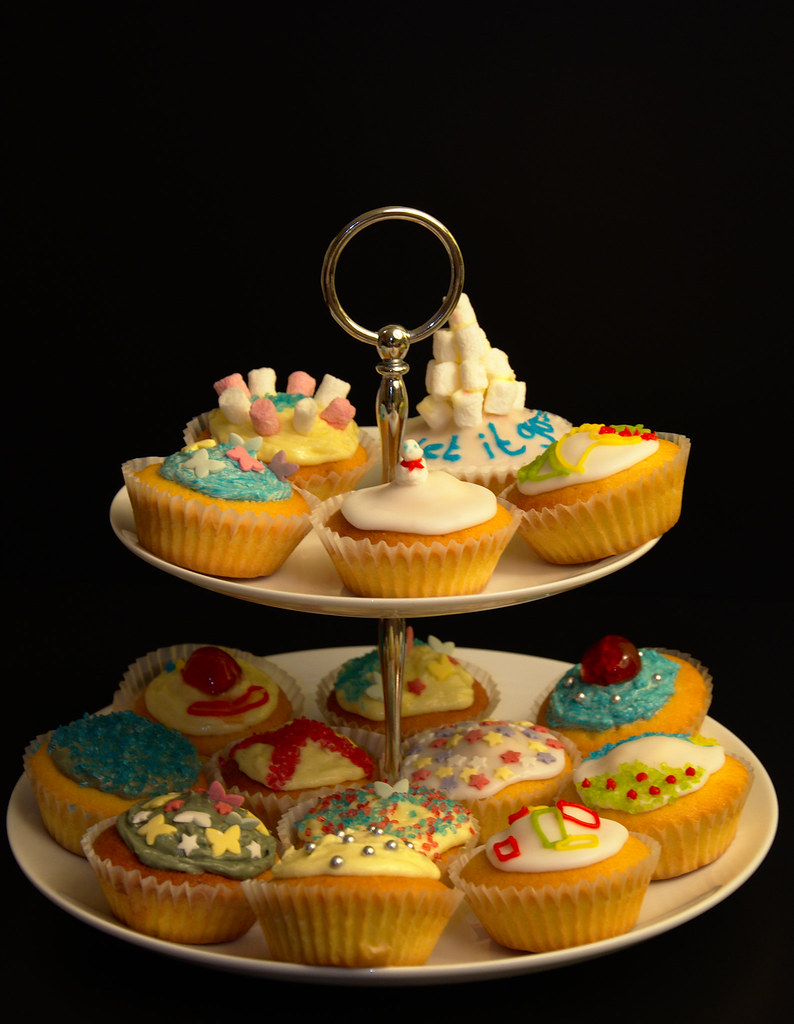 Yummy3 by Mr_Si, on Flickr
 Yummy2 by Mr_Si, on Flickr
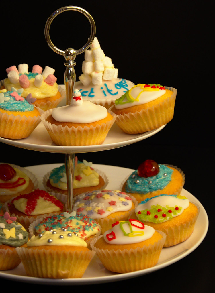 Yummy1 by Mr_Si, on Flickr
Sorry it's late... but the new oven has now been successfully and officially tested by baking these.
Week 26, Yum / Yummy
3 crops of same image, not sure which I like most at the moment, please help me choose!
 Yummy3 by Mr_Si, on Flickr
 Yummy2 by Mr_Si, on Flickr
 Yummy1 by Mr_Si, on Flickr
- Messages
- 1,159
- Name
- Simon
- Edit My Images
- Yes
Hi Simon, yum bang on theme, I like the contrast of the cakes against the black background.
Small crit, the white balance appears a little too warm but other than that good work
Thank you. Yeah I had it on auto on camera but had to change it in darktable to incandescent, but yes, still slightly off.
- Messages
- 8,398
- Name
- Lynne
- Edit My Images
- Yes
Hi Si
yummy looking cupcakes there,love the decorations on the top
WB has been mentioned though strangely it 's less obvious viewing on my netbook ? Of the crops I think I'm preferring 3 but I'vd maybe be a little more severe with it
yummy looking cupcakes there,love the decorations on the top
WB has been mentioned though strangely it 's less obvious viewing on my netbook ? Of the crops I think I'm preferring 3 but I'vd maybe be a little more severe with it

 Cheetah