weekly Pete's Weekly 52 Challenge 2020

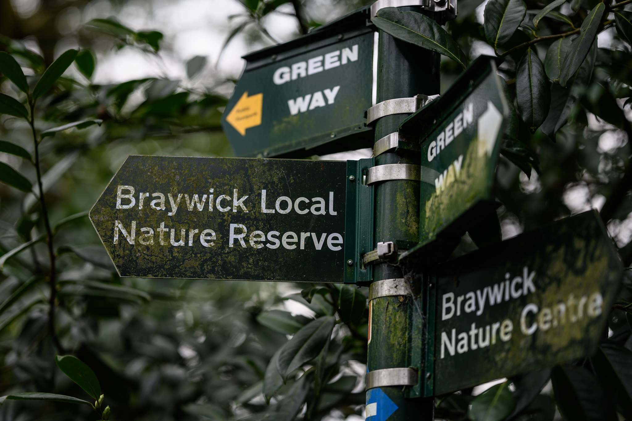
Thanks. I kind of liked how the image is very monochrome in some respects. I took a few different ones with varying DOF but this one seemed to suit it best.
 
Good start Pete :)
 
Interesting how it could easily be too busy, yet the close crop has prevented that, very clever.
I too like the green monochromatic appearance (greens being part of the yellow spectrum yeah?)
 
Nice start, very green! :)
 
Hi Pete, nice start to the challenge. Don't worry about inspiration, you are not the only one, I have to rack my brains when it comes to some subjects.
 
Hi Pete good opening image for your 52 nice use of DoF I too like the shade of green with the couple of splashes of colour.
 
Someone seems to be enjoying her self (y)
Love the cheeky smile too.
 
A Cracking fun shot.
 
Hi Pete

Good first entry for your 52, I like the colour of the signs and leaves matching, only problem is the sign post is not vertical .

Great photo of your daughter on her bike, nice sharp details and colours. I'm not keen on the sun being so burnt out.

Pete
 
As with the other comments, yes, I love the expression. :)
On to the critique... The composition is very central and missing part of the bike. I appreciate that this wasn't a posed shot (it looks like an action shot to me) but you need to keep things like the rule of thirds in mind and with something like an action shot, give her space to ride into.
The sky is also very badly blown.

I personally feel there is a better image in that shot trying to get out. Have you considered cropping this to a landscape image, losing most of the top and some of the right hand side to place your daughter on the right hand third? I think it would be a stronger composition :)
Something along the lines of (as you have "Edit my images=Yes" set)...
Petestewardson-1.jpg
This was very quick from a screen grab (so you could do a lot better). Don't be afraid to crop in tight :)
 
Hi LC2,

Thanks for the critique. Not much I could do about the sky being blown out, it was shot on an iPhone so it did its thing to get the best exposure it could. I did think of cropping like your edit, but then it lost some of that golden light, and also with it being an iPhone image the quality is already not the best. Technically there's loads you can pick out of it, but it still seemed to fit the theme :)
 
Hi Pete, that expression is so perfect for this theme - well done! (y) I liked the original image with the sunshine and you clearly wanted to include that in the image, whereas Tim's edit removes the distraction of the bright sky and brings the viewers' eye straight to that happy face which (as Gareth says) is the heart of the image and the theme. There's probably a happy medium somewhere but it was obviously difficult light and your iPhone has done superbly to manage the details against the strong light.
 
Very nice textures fits the theme well Pete.
 
Thanks all.

The photo was taken on the kitchen table. Used a garden chair to arrange the tools on and then snooted and gelled OCF to imitate some golden light as if coming through a window.
 
Great take on the theme there Pete, some lovely textures in those tools, and the wooden table also blends well with some similar tones.
 
Very good take on the theme with great composition, I wonder what a mono conversion would look like?
 
Very rusty indeed. I like the light and the randomness of the tools.
 
Back
Top