You are using an out of date browser. It may not display this or other websites correctly.
You should upgrade or use an alternative browser.
You should upgrade or use an alternative browser.
weekly Sheylara (DSLR Noob) 52 for 2016 - Week 19-22 added
- Thread starter Winter
- Start date
- Messages
- 371
- Name
- Colm
- Edit My Images
- Yes
I think it's a great image and suits the theme very well
- Messages
- 688
- Name
- Sheylara
- Edit My Images
- Yes
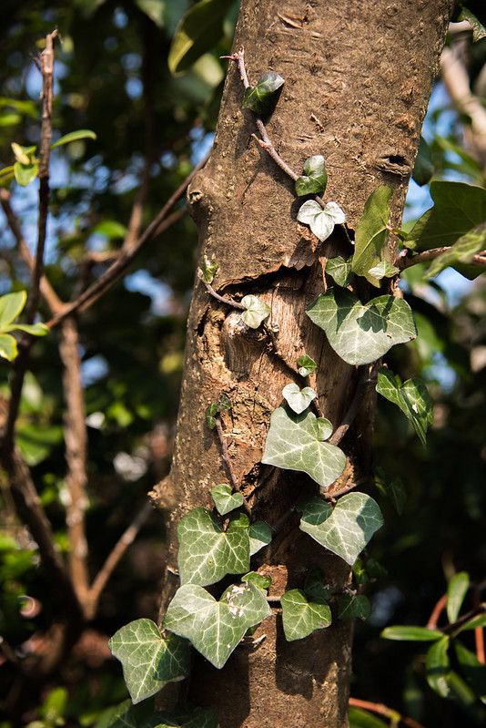
Hi Sheylara ....your crop definitely works better, and those light reflelections are smashing ....I actually like it cropped even more to just a tiny bit of stem and the leafgood original thinking for the theme well done.
Thank you for your comment, Susie! I might try your suggestion when I have a minute. Have spent all day today catching up on comments here and I'm all spent!
Abandoned - Well spotted and captured - interesting you stumbled across him rather than setting it up and think the people walking away in the BG adds to the abandonment
Happy - it certainly is a happy subject matter and image !
Camo - I like it -took a while to spot, but nice (also loving the one of the squirrel looking up at you)
Dangerous - Looks wonderful but, yes, the figure it in real danger of ending up a pool of plastic!
Living World - I really like the composition and light across the image as it is
Thanks for looking through my previous photos and commenting, and thanks for the nice words!
another vote for the crop, i really like it, the reflections constrasting against the dark of the leaf really works for me
Thank you for that nice comment!
Hey Sheylara
Now that I like, and mainly for the light shining through the blind, definitely the crop image for me, as this helps the nice highlight on the leaf and stem edges
Thank you, Dean. Appreciate the comment!
Yeah, they should have an 'unsuck' button on LR
I do like it, the contrast between the natural on the LHS and the gemometric on the RHS works for me.
Cheers
Hehe, don't we all wish!
I think it's a great image and suits the theme very well
Thank you, Colm!
Hi I like the idea for the living world, like the light coming in and just touching the leaf, the dark band across the top is my only crit maybe you could of got a little higher to eliminate it
Thanks for the comment! Yes, I can see how the dark band on the top is a bit annoying and distracting. Didn't notice it at the time though. I did many angles and pov and nothing seemed right. Finally just picked this one as sucking the least, lol.
Shaylara, I love your image for Living World.
I too thought it was a chrysalis!!
Really like the minimal overall feel of the picture.
Thanks, Ruth! I wish it were a chrysalis! That would make the photo more special, wouldn't it?
Living world - I too prefer the 1st one
Thanks for looking and commenting!
- Messages
- 688
- Name
- Sheylara
- Edit My Images
- Yes
Week 10 - Spiky
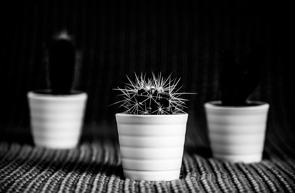
No inspiration this week, and with the deadline looming, I had to do the obvious cactus shot or fall behind more and more. I decided to process the hell out of this one so that it didn't look like a regular cactus shot but I don't know if I've only made it worse.
You know how when you spend hours staring at the same photo, tweaking it back and forth, you start not being able to tell what looks good or bad anymore? (Well, I don't know if it happens to you pros, but it sure does happen to me. )
)
Spiky by Sheylara, on Flickr
No inspiration this week, and with the deadline looming, I had to do the obvious cactus shot or fall behind more and more. I decided to process the hell out of this one so that it didn't look like a regular cactus shot but I don't know if I've only made it worse.

You know how when you spend hours staring at the same photo, tweaking it back and forth, you start not being able to tell what looks good or bad anymore? (Well, I don't know if it happens to you pros, but it sure does happen to me.

Spiky by Sheylara, on Flickr
- Messages
- 3,925
- Name
- Carl
- Edit My Images
- Yes
That's a nice little cactus Sheylara - very spiky indeed .... looks great against the black bg.
- Messages
- 7,548
- Name
- susie
- Edit My Images
- Yes
Week 10 - Spiky
You know how when you spend hours staring at the same photo, tweaking it back and forth, you start not being able to tell what looks good or bad anymore?
I know that feeling perfectly Sheylara
Your centre cactus looks super spiky and the b&w suits it really well ....a good choice.
SamuelSlade007
RENEGADE!!!!!!
- Messages
- 7,802
- Name
- Frank
- Edit My Images
- No
Hi Sheylara... great start to the year  .. Old could do with more on the RHS but i like the image as it is.. Metal stands out with detail and composition, though i note the added space to the RHS again does help.
...Abandoned is a great find, but could you have gotten lower.. still ..the inclusion of ppl walking away as it were makes a statement..
...tigger is well 'happy'... almost missed camouflage ... dangerous is delicious at the same time.... your first living world is brilliant..as well as your spiky.. brilliant contrasting effect going on there.
...Abandoned is a great find, but could you have gotten lower.. still ..the inclusion of ppl walking away as it were makes a statement..
...tigger is well 'happy'... almost missed camouflage
- Messages
- 13,760
- Edit My Images
- Yes
Hmmmmmmmmm 
Well, for me 3 normally works well, in this case the pots do but at the same time they distract from the center stake cactus, for me I think that little beaut holds it's own, such nice bright spikes that rightly overpower the pot, I'd prefer it on its own

Well, for me 3 normally works well, in this case the pots do but at the same time they distract from the center stake cactus, for me I think that little beaut holds it's own, such nice bright spikes that rightly overpower the pot, I'd prefer it on its own
- Messages
- 688
- Name
- Sheylara
- Edit My Images
- Yes
That's a nice little cactus Sheylara - very spiky indeed .... looks great against the black bg.
Thanks for your comment, Carl.
Hi Sheylara,
Works well in B&W and you've got it exceptionally sharp in focus considering the shallow DoF.

Thank you!
I like that - nice and sharp in all the right places - as it should be for the theme!
Thanks, Emma!
I know that feeling perfectly Sheylara
Your centre cactus looks super spiky and the b&w suits it really well ....a good choice.
Thanks for understanding!
Hi Sheylara... great start to the year.. Old could do with more on the RHS but i like the image as it is.. Metal stands out with detail and composition, though i note the added space to the RHS again does help.
...Abandoned is a great find, but could you have gotten lower.. still ..the inclusion of ppl walking away as it were makes a statement..
...tigger is well 'happy'... almost missed camouflage... dangerous is delicious at the same time.... your first living world is brilliant..as well as your spiky.. brilliant contrasting effect going on there.

Thanks for catching up on all my previous themes and providing feedback!
Hmmmmmmmmm
Well, for me 3 normally works well, in this case the pots do but at the same time they distract from the center stake cactus, for me I think that little beaut holds it's own, such nice bright spikes that rightly overpower the pot, I'd prefer it on its own
Fair comment and I know what you mean. I did many versions of - 1 pot, 2 pots, 3 pots, different placements, different angles, etc. At first, I was going to go with just the one pot and it looked as good as the 3 pots, but I felt it was a bit more boring. I did feel that 3 pots was a bit distracting with all the whiteness of the pots but somehow in the end I preferred it to the single pot. But it could have been just the loss of good judgement from staring at pots all day long.
- Messages
- 9,071
- Name
- David
- Edit My Images
- Yes
- Messages
- 13,760
- Edit My Images
- Yes
I can think of worst things... okay maybe not...... But it could have been just the loss of good judgement from staring at pots all day long.

- Messages
- 4,182
- Name
- Paul
- Edit My Images
- Yes
Hi Sheylara... first of all, I think the shot works for me - especially on first glance. The shallow DOF is pleasing, your choice of surface accentuates that and the pots are great. Your processing of the cactus is a super artistic decision for me - it might not look conventional but it really brings out the spikes without affecting the pots or background very much... so for me, that's a big success.
I can see what DK, David etc. mean about the other two pots - they almost look empty which makes you stare at them for a bit longer before realising there are cacti in them too. So that's probably all it is - less about them being there and more about the processing making them look empty - for me, at least.
But still, I think it's very well done - it's good to experiment and your processing was one which worked well, even if it had that slight side effect on the rear two pots? Really well done and keep playing!
- Messages
- 688
- Name
- Sheylara
- Edit My Images
- Yes
Great B&W / lighting and POV - love the DOF as well with the two OOF cacti on the flanks - nice image
Thank you of your kind words.
Thanks for your feedback, David.
Hi Sheylara... first of all, I think the shot works for me - especially on first glance. The shallow DOF is pleasing, your choice of surface accentuates that and the pots are great. Your processing of the cactus is a super artistic decision for me - it might not look conventional but it really brings out the spikes without affecting the pots or background very much... so for me, that's a big success.
I can see what DK, David etc. mean about the other two pots - they almost look empty which makes you stare at them for a bit longer before realising there are cacti in them too. So that's probably all it is - less about them being there and more about the processing making them look empty - for me, at least.
But still, I think it's very well done - it's good to experiment and your processing was one which worked well, even if it had that slight side effect on the rear two pots? Really well done and keep playing!
Thank you, Paul. You always give such thoughtful and helpful crit, and it's much appreciated!
After deciding that I really wanted 3 pots instead of 1, it was another decision whether to have really dark shadows so that the spikes stood out more, but the visibility of the 2 cacti were sacrificed, OR, lighten the shadows a bit so you can see all the cacti but then sacrificed the overall darkness I was going for. I also wanted the back to be almost completely black so that it's not too obvious my backdrop is a wool throw I draped over the sofa.
Sadly, the other 2 cacti had very minimal white parts, and that's one reason they got lost in the shadows.
But anyway, the point is there were many tough decisions to make but I made them and I'm glad to be told what worked and what didn't so I will get better at evaluating my future works.
- Messages
- 688
- Name
- Sheylara
- Edit My Images
- Yes
Week 8 - Topical
Not sure if this is shoehorning it but I'm 2 weeks late on this theme so really wanted to post something today!
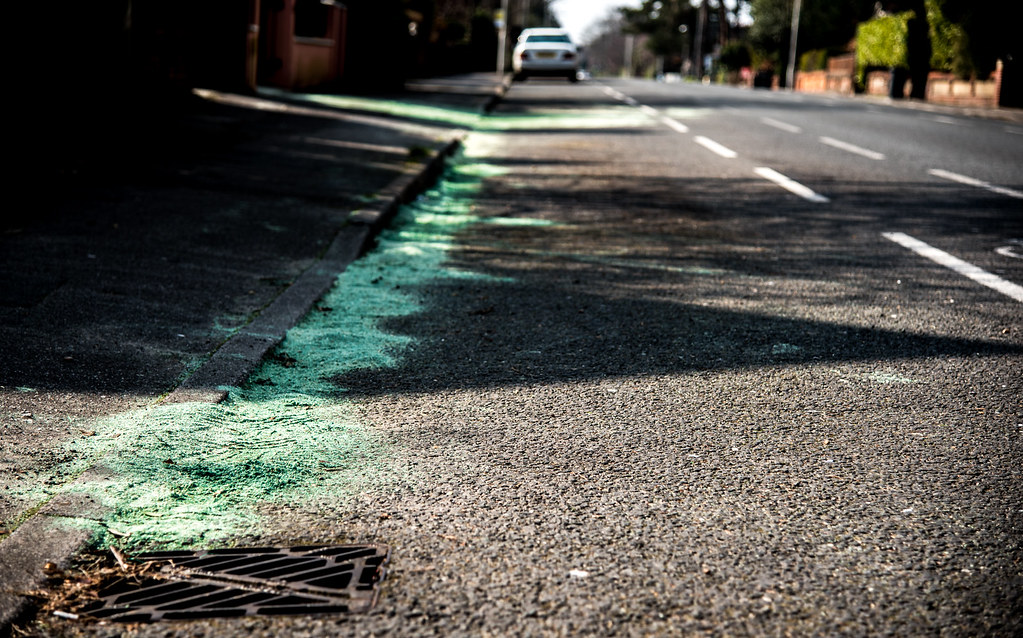
Here's the story: I drove past this street yesterday and saw police scattering this green stuff all over the road. There'd just been an accident. Here's an article about it: http://www.bournemouthecho.co.uk/news/14336145.Motorcyclist_breaks_leg_in_crash/
Today, I went back to the same street to photograph something else I'd spotted yesterday, nearby, which I thought would fit theme Topical. But then I saw this green stuff had formed a line and thought it might be good for a photo. On the way home, I thought I could probably shoehorn it for Topical because my original idea had turned out to be boring and stupid. (I hope it's not mean or inappropriate to photograph accident sites where people had been hurt. )
)
Anyway, not sure if the shallow dof works because focusing on just a small patch of green sand in this whole scene seems a bit inadequate. But I tried wider dofs and felt that changed the mood of the photo and I didn't like it.
Topical by Sheylara, on Flickr
Not sure if this is shoehorning it but I'm 2 weeks late on this theme so really wanted to post something today!
Here's the story: I drove past this street yesterday and saw police scattering this green stuff all over the road. There'd just been an accident. Here's an article about it: http://www.bournemouthecho.co.uk/news/14336145.Motorcyclist_breaks_leg_in_crash/
Today, I went back to the same street to photograph something else I'd spotted yesterday, nearby, which I thought would fit theme Topical. But then I saw this green stuff had formed a line and thought it might be good for a photo. On the way home, I thought I could probably shoehorn it for Topical because my original idea had turned out to be boring and stupid. (I hope it's not mean or inappropriate to photograph accident sites where people had been hurt.
Anyway, not sure if the shallow dof works because focusing on just a small patch of green sand in this whole scene seems a bit inadequate. But I tried wider dofs and felt that changed the mood of the photo and I didn't like it.

Topical by Sheylara, on Flickr
Last edited:
- Messages
- 4,182
- Name
- Paul
- Edit My Images
- Yes
Well Sheylara... it's an interesting backstory and certainly a journalistic photo (if that's a phrase)... It's easy to see what's supposed to be the subject and although without the explanation behind it it's difficult to know why on the face of it... although probably a bit of guesswork would get you to the right answer.
The photo does the job then - I like the texture in the road which is well captured despite the shallow DOF and the OOF background is interesting enough without distracting. I think it certainly passes muster and as you've said, allows you to catch up So well caught up!
The photo does the job then - I like the texture in the road which is well captured despite the shallow DOF and the OOF background is interesting enough without distracting. I think it certainly passes muster and as you've said, allows you to catch up
- Messages
- 3,925
- Name
- Carl
- Edit My Images
- Yes
Well, it's certainly Topical if it's appeared in the local press and the image is an abstract of the event in a way. The shot conveys the story in a subtle tasteful way so not mean at all imo. Image is nice and sharp where it's meant to be and the DoF gives enough to show the environment without overwhelming.
- Messages
- 688
- Name
- Sheylara
- Edit My Images
- Yes
Well Sheylara... it's an interesting backstory and certainly a journalistic photo (if that's a phrase)... It's easy to see what's supposed to be the subject and although without the explanation behind it it's difficult to know why on the face of it... although probably a bit of guesswork would get you to the right answer.
The photo does the job then - I like the texture in the road which is well captured despite the shallow DOF and the OOF background is interesting enough without distracting. I think it certainly passes muster and as you've said, allows you to catch upSo well caught up!
Thank you, Paul. Appreciate your kind comments as always!
Well, it's certainly Topical if it's appeared in the local press and the image is an abstract of the event in a way. The shot conveys the story in a subtle tasteful way so not mean at all imo. Image is nice and sharp where it's meant to be and the DoF gives enough to show the environment without overwhelming.
Yay, thanks, Carl! Much obliged!
It's certainly eye-catching an made me want to know more. I like the low angle and that the kirb runs from the bottom corner away into the distance, good angle. nice DoF
Thanks for your nice words, Chris!
Minx
Papillon
- Messages
- 2,513
- Edit My Images
- Yes
Spiky- I find the pots in the background distracting, maybe if you could see what's in them a bit more it would be better or maybe just the centre pot on its own. I do like central part of the picture is is spot on for the theme and those spikes really stand out against the background.
Topical- an interesting shot with the story behind it certainly fits the theme. Good catch up.
Topical- an interesting shot with the story behind it certainly fits the theme. Good catch up.
LC2
Negan
- Messages
- 10,447
- Name
- Tim
- Edit My Images
- Yes
Hi Sheylara,
Before I read the backstory I thought this shot was commentary on the death of cyclists caused by poor road maintenance.
After reading your backstory, I wasn't too far out (but in a less morbid way (though as I commuted to central london on various m/bikes for 20 years, I've seen plenty of related accidents where I've thought that they wouldn't have walked away )
)
As Paul says, that shot is a good piece of photo journalism as it does stand alone and tell a story.
No issue with the way you've used the DoF. You could also say that it points out that drivers often only focus on what's immediately in front of them and don't view the bigger picture.
Before I read the backstory I thought this shot was commentary on the death of cyclists caused by poor road maintenance.
After reading your backstory, I wasn't too far out (but in a less morbid way (though as I commuted to central london on various m/bikes for 20 years, I've seen plenty of related accidents where I've thought that they wouldn't have walked away
As Paul says, that shot is a good piece of photo journalism as it does stand alone and tell a story.
No issue with the way you've used the DoF. You could also say that it points out that drivers often only focus on what's immediately in front of them and don't view the bigger picture.
- Messages
- 115,214
- Name
- The real Chris
- Edit My Images
- No
I'm no pro but I do it all the time(Well, I don't know if it happens to you pros, but it sure does happen to me.)
Spiky indeed nice use of DoF too
Green stuff, I guess its always topical
As being green is always
- Messages
- 688
- Name
- Sheylara
- Edit My Images
- Yes
Spiky- I find the pots in the background distracting, maybe if you could see what's in them a bit more it would be better or maybe just the centre pot on its own. I do like central part of the picture is is spot on for the theme and those spikes really stand out against the background.
Topical- an interesting shot with the story behind it certainly fits the theme. Good catch up.
Thanks for your feedback! Points taken aboard.
Hi Sheylara,
Before I read the backstory I thought this shot was commentary on the death of cyclists caused by poor road maintenance.
After reading your backstory, I wasn't too far out (but in a less morbid way (though as I commuted to central london on various m/bikes for 20 years, I've seen plenty of related accidents where I've thought that they wouldn't have walked away)
As Paul says, that shot is a good piece of photo journalism as it does stand alone and tell a story.
No issue with the way you've used the DoF. You could also say that it points out that drivers often only focus on what's immediately in front of them and don't view the bigger picture.
I love your interpretation of the dof!
I'm no pro but I do it all the time
Spiky indeed nice use of DoF too
Green stuff, I guess its always topical
As being green is always
Thanks for your comments and a different interpretation of the green stuff for the theme!
- Messages
- 671
- Name
- Nigel
- Edit My Images
- Yes
Hi Sheylara, love your Spikey shot, looks great in B/W and love the DOF. 
- Messages
- 13,760
- Edit My Images
- Yes
That's a nice low down shot Sheylara, The converging lines work nicely, just wish I knew what the green stuff actually was, very interesting and does fine as a catch up 
- Messages
- 688
- Name
- Sheylara
- Edit My Images
- Yes
Hi Sheylara, love your Spikey shot, looks great in B/W and love the DOF.
Thank you, Nigel! Very kind of you.
That's a nice low down shot Sheylara, The converging lines work nicely, just wish I knew what the green stuff actually was, very interesting and does fine as a catch up
Thanks for your nice comments, Dean!
- Messages
- 9,071
- Name
- David
- Edit My Images
- Yes
Hi Sheylara
Topical ... It's a tricky theme because the best we can do is post something topical as in news big time. Something that's topical to all works best. Anyway the photo ... nice POV but those wretched long shadows and the shallow DOF seem like a bad combo.
Reshoot ... is perfectly good, shallow DOF works well here.
Neither shot has the magic of some of your other works.

- Messages
- 115,214
- Name
- The real Chris
- Edit My Images
- No
I think that ticks the boxUm... just a quick one so I can have the box ticked.
- Messages
- 3,925
- Name
- Carl
- Edit My Images
- Yes
Nice take Sheylara - like the wrap-over ivy for the theme.


