weekly Sworks 52 in 2013

Hi

Vertical - on theme and a good comp. Really good sky. As to being flat, maybe it is the shoreline, which isn't the most scenic, but that is not your fault.

Pattern - on theme. Like others i would like to see it in colour as the mono is a bit lacking in contrast. Also, as Andy says, comp is a bit off. Good idea tho.
 
Can't help but feel there's a passable image here - bit more square on, or a lower down view, and needs bit more brick at the bottom are the main things lacking in it for me.

keep going, nearly at the half way point!
 
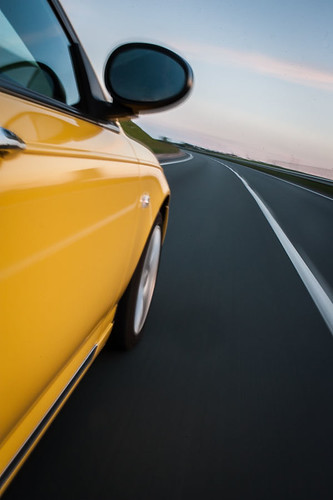
Movement, both are great, prefer #2

Below, s#2 for me again, like how the steps lead you down into it....the first one, doesn't work for me, trees in foreground are not helping and I think it generally just feels a bit too "busy" if that makes sense?
 
Last edited:
Hi Mark,

Love your movement shots, straight out of a car brochure or top gear. Excellent.

Below: I prefer the second one, but I think if you had of concentrated on the stairs then your shot would have been more compelling, as it is there is nothing there to "hold" me. So I find myself looking for the "subject"...
 
Hi Mark,
Your shots for movement are bang on theme, the vivid yellow of the car is particularly striking and the ambient lighting looks good too (y)

I feel they have suffered from camera shake though. The detail on the car isn't as sharp as it could be IMHO.

Below #2 gets my vote but as Brian mentioned perhaps more could be made of the stairs to grab the viewers eye?
 
Thanks for the comments on these and the last uploaded photo. I agree about the steps seeing it now, think I was wrapped up in getting the 'below' image rather than making the best it could be. I have a habit of not getting some details right as I get wrapped up in just getting the shot. The movement shots aren't as sharp as they could be as I was hanging out the back window hand held :)
 
Hi Mark

love both the shots for movement.....no crit to add just a (y)

Below.....nu 1 for me ,lovely view of the city below with nice brightness to it (y) I see what the others are saying about the steps & agree...they're just a little to much in the shade for me
 
Morning, Movment #1 for, I like the angle and motion blur. Lovely colours as well.

Below, #1 is a bit busy for me and the FG trees don't help. #2 is much better, nice use of RH stairs. Might have been an opportunity to blend two images, on of the steps and one of the sky mainly to bring mor detail into the steps.

Cheers.
 
Movement: Fantastic shots.

below: On theme for me. 2nd one for me, think its the leading line of the stairs i like.
 
rather liking the movement shots - would have been great to have had the large amount of the car from the second shot, in the first with the bg of the speed camera and the houses. (y)

below has to be the one with teh stairs for me.
 
Hi Mark,

Having seen your 'movement' shots over on the Oc ( that will confuse peeps on here! ) thought I'd come and check the rest of your thread out :)
 
Last edited:
Movement are a couple of crackers. Number 2 for me, as it's just a bit cleaner IMO, like a magazine shot.

The portrait version of below works best for me, the steps help a lot.
 
Mark: I like the pattern, like the mono (although maybe the conversion might be addressed), and I'd have it even more off centre, so it's obviously deliberate!

Movement number 1 for me, has more interest with the ghostly sign/gantry. But Below number 2 because of the steps leading down, which really take you into the scene! Good stuff!
 
Hi, I like both movement shots but I have to say the first would be my pick. As for below it would have to be the second, I like how the stairs lead you into the shot.
 
Hi
The first movement I like as it gives a sense of speed with the blurring of the background.

The second below looking down the steps is great, the steps seem to lead me into the rest of the picture.
 

Size by Mark McGrady, on Flickr

Size, difficult to shoot my right arm against the sun with my left hand. Size of the hand tattoo against the size of my hand and also the size of the tattoo is real life size - just over 1" in length. My hand is slightly twisted so the tattoo isn't perfectly central but the best shot I got
 
Hi Mark :)

I'm miles behind so will have to make these brief...

Size - That's a real nice idea, good thinking getting that nice sky behind, I keep thinking you need something in your hand but then realise it would remove the comparison of 'size' - so nice one :)

Process - Thinking it needs more than just a photo of a page, but it's well lit, a nice angle and fits the theme well :)

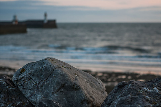
Rock - The third shot really does nothing for me at all, but I'm really liking the DoF in the first shot with the harbor entrance and the sky in the second - a couple of really great images (y)

Pair - The background is a bit busy for me but the pair of pairs have great detail and I like the long shadows cast :)

The background (chopping board??) for me would look more a part of the image if a knife was in the shot and maybe one of the pairs cut??

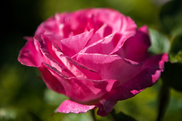
Shape - I like the pattern of the first shot but would like a broader DoF to catch it all in focus, but the rose's DoF works fine for me, nice colour and the tight crop works well too :)

what a great catch up :clap:
 
Must apologies but I'm struggling with a rather large catchup so will say...I like Rock #2. Nice detail, composition and colours.

Cheers.
 
Pair of pears, haha, very creative! Nice lighting as well.

For shape, I personally prefer the first one for more on-theme, but love the second one for the colours and the composition.
 
Hi Mark, great catchup, I'm behind with commenting, so brief as per usual, sorry!

Size: a very unusual idea, well thought out and executed. Just not sure "why?"! But I guess we don't have to know, just enjoy!

Process: good idea, and bang on theme. Not sure on the depth of field issue though; seems to me the depth of field ought to be telling us something, somehow, eg highlighting the critical area to look at. But unless I'm mistaken the in-focus area is just a bit random?

Rock: number 1 for me, I think, although I've been havering a bit between it and no 2. The out-of-focus parts of no 1 sold it to me in the end, but both are crackers! No 3 I don't think has done enough to earn itself a place, if you know what I mean!

Pair of pears on a chopping board: simple and effective. The sideways light gives good shadows that add interest. Nice shot.

Shape: no 1 for me, really emphasises the shapeness of it! The rose in no 2 is more rose than shape if you get my meaning, plus here the out of focus area reduces the feeling of shape further!

Great catchup though, well done that man!
 
Hi Mark

Size - original idea and well handled (gettit??). Like the fact that the tattoo hand is not central. Good scale

Process - a little ordinary I feel

Rock - #3 is s little bland but the 2 landscapes are very good. #2 is super - I like the comp, the foreground and the hills in the b/g with a lovely sun and sky

Pair - can't add to DK's comments

Shape - #1 is spot on for me. Good b/g and minimal colour palette works well. Apart from a little bit oof because of dof, the seed pod looks like it is floating. (y)
 
Hi Mark

bit of a catch up from me so ......

Rock......I'm torn between 1 & 2....1 for the great use of DOF with the lighthouse & water adding context & 2 for the beautiful colors of the sunset (y)

Size....different but good idea with a most unusual tat....

Pair.....good placement ,like the lighting with the shadows but not keen on the bg...sort of distracts from the lovely patterns on the skin of the pears

Shape.....1 for me , lovely details,great use of DOF & lovely smooth bokeh (y)
 
Hi
well done for the catch up, I like the first shape pic interesting seed head, the 2nd rock shot is good but needs a bit more pp to darken the sky so the sunset stands out, overall a good catch up(y)
 
Well done on the catch up having just done one (well almost) myself I know how hard it can be - my tip is teh liberal use of a shoehorn to squeeeeze those pics into theme :D

BTW that first shape show is very nice - a great find.
 
You caught up again, well done.;)

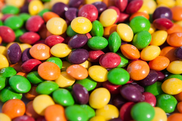
Skittles in the glass is my Favourite. (y)

See you in another six weeks :naughty: :LOL:
 
Back
Top