You are using an out of date browser. It may not display this or other websites correctly.
You should upgrade or use an alternative browser.
You should upgrade or use an alternative browser.
Tillys 52 for 2017 Week 52 Weather
- Thread starter Tilz
- Start date
- Messages
- 992
- Name
- Tilly
- Edit My Images
- Yes
Wood
This is a tree stump I have in my garden. It used to be about 5ft tall but my cousins and myself cut it down when we were kids. It has my assistant Lego cameraman standing on top of it because I've been looking at this piece of wood all my life and I wanted to add something to it. During editing I zoomed in close on the stump and notice how pretty it looked when in the right light and up close, well to me anyway. I guess this weeks shot has given me a greater appreciation of something simple
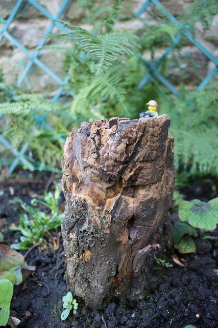 Tree Stump by Craig Tillotson, on Flickr
This is a tree stump I have in my garden. It used to be about 5ft tall but my cousins and myself cut it down when we were kids. It has my assistant Lego cameraman standing on top of it because I've been looking at this piece of wood all my life and I wanted to add something to it. During editing I zoomed in close on the stump and notice how pretty it looked when in the right light and up close, well to me anyway. I guess this weeks shot has given me a greater appreciation of something simple
 Tree Stump by Craig Tillotson, on Flickr
Last edited:
- Messages
- 1,075
- Name
- Georgina
- Edit My Images
- Yes
Hi Tilly, Love the children doing their display of strength, that made me smile. Most unusual sculpture, good find for the theme, I have to agree with the other comments but sometimes we just have to make the best of the situation and I think you did a good job. Very interesting bit of wood, some very nice textures, but I think the lego man is a bit too out of focus 
- Messages
- 992
- Name
- Tilly
- Edit My Images
- Yes
Wall(ed)
I took this earlier this evening, I haven't had time this week to get the 2 shots I wanted to try use so headed out into the yard to see what I could come up with. After taking shots of several walls and various things on walls I came up with this containing many walls. I edited out a couple of washing lines as they spoilt the image. This was my first attempt at removing something from an image using Canon DPP so I hope it looks ok.
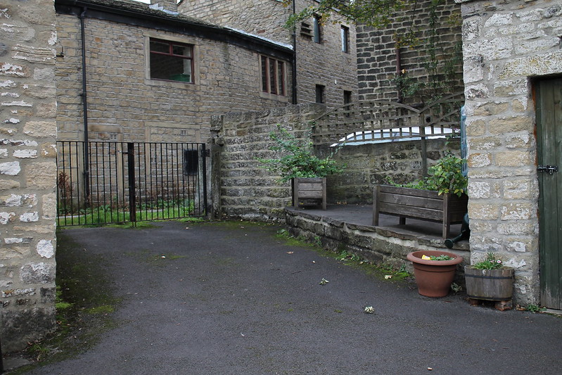 Walls by Craig Tillotson, on Flickr
I took this earlier this evening, I haven't had time this week to get the 2 shots I wanted to try use so headed out into the yard to see what I could come up with. After taking shots of several walls and various things on walls I came up with this containing many walls. I edited out a couple of washing lines as they spoilt the image. This was my first attempt at removing something from an image using Canon DPP so I hope it looks ok.
 Walls by Craig Tillotson, on Flickr
- Messages
- 5,919
- Name
- Dominic
- Edit My Images
- Yes
Bent
That's an interesting piece of art and you've captured it well.
Wood
I think if you are going to include the Lego figure, then he needs to be more in focus and maybe slightly larger in the frame.
I like the stump and think you could have got closer (your lens does focus quite closely, especially at 18mm).
Wall
A right old mix of walls there. It looks like quite a dull day or late afternoon. Maybe try and see if you can brighten it up a bit.
LC2
Negan
- Messages
- 10,447
- Name
- Tim
- Edit My Images
- Yes
Hi Tilz,
Bent - As other have mentioned, interesting subject, but a distracting background.#
You were at 43mm on the kit lens, so I think f/5.6 was about as wide as it would go. (The other option would be to get a bit closer so that you could stay at f/3.5)
When you zoom in full size on flickr, it appears that actually the sign in the background was the point in focus and not the subject, so perhaps even at f/5.6 you could have blurred the background out a bit. On for a re-shoot maybe?
Wood - A good example of how you can blur out the background, even with a kit lens. Doing so makes the chain link fence less obtrusive.
Wall(ed) - Editing looks good to me. As Chris says, there are no obvious editing artefacts. Verticals look about right too, which can be difficult in this kind of shot.
- Messages
- 992
- Name
- Tilly
- Edit My Images
- Yes
Week 42 Symmetrical
Had trouble finding something worth shooting for this weeks theme so this is what I ended up with
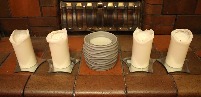 Symmetrical by Craig Tillotson, on Flickr
Had trouble finding something worth shooting for this weeks theme so this is what I ended up with
 Symmetrical by Craig Tillotson, on Flickr
- Messages
- 13,760
- Edit My Images
- Yes
A nicely set out collection opf candles there Tilly, and well cropped too, liking the letterbox format 
- Messages
- 992
- Name
- Tilly
- Edit My Images
- Yes
LC2
Negan
- Messages
- 10,447
- Name
- Tim
- Edit My Images
- Yes
Hi Tilly,
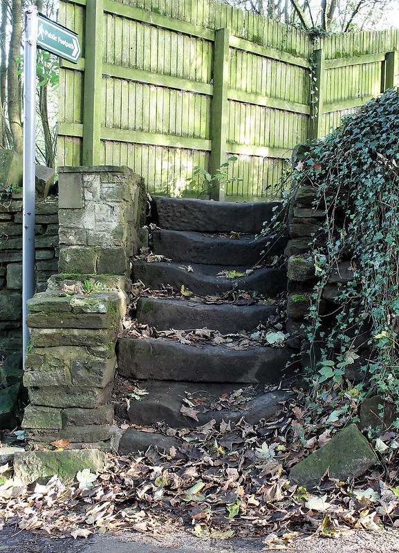
Symmetrical - Hits the theme. I'd agree with Mark that a low POV might have improved it. Did you try that at all?
Worn - I'm going to have to change this record, but I think you could give it more oopfh by playing with the levels a bit to boost the blacks.
I would also have considered an instagram square crop as the sky and footpath sign aren't adding anything.
Great find for the theme. Certainly worn
- Messages
- 992
- Name
- Tilly
- Edit My Images
- Yes
Thanks for the comments guys, I'll crop it down to just show the steps when I get chance and post it to see what you all think.
Thanks for the advice Tim, but what levels would I need to adjust to boost the blacks? I'm still getting used to editing my shots
Thanks for the advice Tim, but what levels would I need to adjust to boost the blacks? I'm still getting used to editing my shots
- Messages
- 3,413
- Name
- Mark
- Edit My Images
- Yes
I don't mind it how it is, I quite like the inclusion of the sign it's a part of a well worn pathway it tells more of a story than just a square crop on the steps
Yep, my thoughts too Allan.
I really like the worn steps and have to say that idea was one of my first, but none around here as good as those....
- Messages
- 992
- Name
- Tilly
- Edit My Images
- Yes
Hi guys, I've downloaded the free trial for Affinity Photo and have used that to re-edit my shot for Worn. I've adjusted the curves to try make the blacks darker as suggested and adjusted a few other things to try improve the final image. Any comments on whether what I've done has made the image better or worse would be appreciated as its the first time I've used the software and I'd like to know if I'm heading in the right direction.
 Worn modified jpg by Craig Tillotson, on Flickr
 Worn modified jpg by Craig Tillotson, on Flickr
- Messages
- 104,465
- Name
- The other Chris
- Edit My Images
- Yes
It's a great subject for the theme and good-on-ya for trying an edit as suggested but I prefer the original. If I was processing it I would tone down the fence at the back either with the adjustment brush or just by adding a graduated filter (or crop it off as Tim suggested). That said if you ask 5 people for processing advice you will get 7 opinions  . There may be more to be had but it is the start of a journey so keep on learning.
- Messages
- 992
- Name
- Tilly
- Edit My Images
- Yes
Thanks for the reply Chris I appreciate the comments and advice, I'll have another look at it and see how it goes. I prefer the original too, I think I did too much to the original. Got a bit carried away with the new software which I'm liking and getting used to 
- Messages
- 7,548
- Name
- susie
- Edit My Images
- Yes
Hi Tilz, editing isn't easy is it, I spend ages flicking between edits trying to get things right, then they look different on everyones screen!! Personally I still like the original best, I prefer the softer look for that particular photo, but that's just my personal choice.
I'm not sure how experienced you are with editing but I would choose a relatively easy programme to start with and not one that's too complicated. I'm not familiar with Affinity Photo, so I'm not quite sure where that fits.
I'm not sure how experienced you are with editing but I would choose a relatively easy programme to start with and not one that's too complicated. I'm not familiar with Affinity Photo, so I'm not quite sure where that fits.
- Messages
- 992
- Name
- Tilly
- Edit My Images
- Yes
Week 44 Colourful
I took this shot using my new Tamron 55-200mm f/4.0-5.6 AF lens that I got off eBay last week. I wanted to get the canon version but don't have the money at the moment and at £18 I thought I'd give it a chance. It lacks IS but apart from that I'm very impressed with this lens
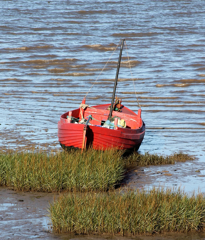 Red Boat by Craig Tillotson, on Flickr
I took this shot using my new Tamron 55-200mm f/4.0-5.6 AF lens that I got off eBay last week. I wanted to get the canon version but don't have the money at the moment and at £18 I thought I'd give it a chance. It lacks IS but apart from that I'm very impressed with this lens
 Red Boat by Craig Tillotson, on Flickr
Last edited:


 Worn
Worn