

You are using an out of date browser. It may not display this or other websites correctly.
You should upgrade or use an alternative browser.
You should upgrade or use an alternative browser.
Tillys 52 for 2017 Week 52 Weather
- Thread starter Tilz
- Start date
OP
- Messages
- 992
- Name
- Tilly
- Edit My Images
- Yes
Thanks for the comments and suggestions on different ways I could have cropped the shot. I can't crop it to show more water on either the side or to as the image is pretty much as I shot it. I only cropped out some sand at the bottom. I guess it's a good job I like the image as it is then ") . Thanks again for the input guys
. Thanks again for the input guys
. Thanks again for the input guysLC2
Negan
- Messages
- 10,454
- Name
- Tim
- Edit My Images
- Yes
£18 for the lens... Looks like you got a bargain. That looks spot on for sharpness and detail.
Good use of complimentary colours with the red and green.
Composition wise, I'm going to disagree with the lot of them and say you need to turn in through 180' so that the water is at the top
You could crop in at the bottom left giving the impression of there being more at the top and more at the left for the boat to lean into possibly to satisfy d00d, Chris, Susie & Allan, but if it's how you want it to look, then leave it alone, as you're the one who needs to be happy with it
LC2
Negan
- Messages
- 10,454
- Name
- Tim
- Edit My Images
- Yes
I was joking and taking the mick out of the other commentsTim. What do you mean by turning it 180?
I meant turn it upside down
If you do have a go at cropping in from the bottom left, make sure you turn on "constrain proportions" (or ratio) so that you keep the same relative dimensions.
OP
- Messages
- 992
- Name
- Tilly
- Edit My Images
- Yes
Week 45 Height and Re-Shoot
Didn't have chance to get out much this week because of the weather so had to make do with a shot I took the other week while at the seaside for height which I thought of using for colourful and one of my colourful fish for the re-shoot. Neither are anything special its just what I've got
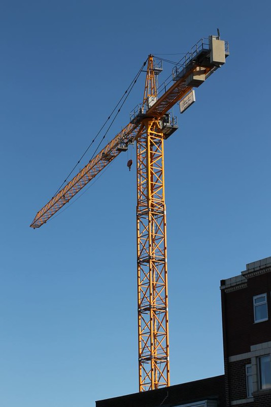 Crane by Craig Tillotson, on Flickr
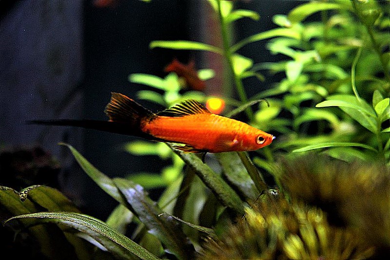 Swordtail 2 by Craig Tillotson, on Flickr
Didn't have chance to get out much this week because of the weather so had to make do with a shot I took the other week while at the seaside for height which I thought of using for colourful and one of my colourful fish for the re-shoot. Neither are anything special its just what I've got
Crane by Craig Tillotson, on FlickrSwordtail 2 by Craig Tillotson, on Flickr- Messages
- 13,760
- Edit My Images
- Yes
The tower crane works fine Tilly, not so sure on the fish with it being so central to the image, but saying that hits the theme, so my fave is the tall crane towering into the sky - 2 more boxes ticked
LC2
Negan
- Messages
- 10,454
- Name
- Tim
- Edit My Images
- Yes
Hi Tilz,
Height - Liking the colours in the crane shot, the yellow works well against the blue.
You need to have a look at the verticals though. The crane is leaning and the building more so.
You're always going to get something off vertical with the perspective you're using, but the crane itself, I feel, should be upright.
Colourful - Orange and green are good contrasting colours. It's not sharp though. Still, PABD and onto the next one
OP
- Messages
- 992
- Name
- Tilly
- Edit My Images
- Yes
Week 46 Remote
Took this one and edited on my phone as I didn't have my camera with me whilst camping at the weekend. I was surprised by the amount I could do with the software on the phone. I could have waited till I got home to process the shot but decided to use what I had at the time
 Remote Cabin by Craig Tillotson, on Flickr
Took this one and edited on my phone as I didn't have my camera with me whilst camping at the weekend. I was surprised by the amount I could do with the software on the phone. I could have waited till I got home to process the shot but decided to use what I had at the time
Remote Cabin by Craig Tillotson, on Flickr
Last edited:
- Messages
- 3,413
- Name
- Mark
- Edit My Images
- Yes
Its almost Hansel and Gretel like, very definitely remote well spotted and a good subject for the theme
Indeed, this.
OP
- Messages
- 992
- Name
- Tilly
- Edit My Images
- Yes
Week 47 Build
This is a shot of the parts of my R/C cars transmission after I'd done a re-build on the diff which is the part in the middle. I then had to re-build the car ready to be raced on Friday night
 Re-Build by Craig Tillotson, on Flickr
This is a shot of the parts of my R/C cars transmission after I'd done a re-build on the diff which is the part in the middle. I then had to re-build the car ready to be raced on Friday night
Re-Build by Craig Tillotson, on Flickr- Messages
- 9,075
- Name
- David
- Edit My Images
- Yes
Remote... a good one. A little more of the desolate surroundings (if possible) would add to the remoteness. But, still, works well.
Build ... good idea for the theme. I do think you could have got in closer to those working parts, eliminating distant BG altogether.
Build ... good idea for the theme. I do think you could have got in closer to those working parts, eliminating distant BG altogether.
- Messages
- 13,760
- Edit My Images
- Yes
I like the idea but feel it is too staged with all the items spaced out, or maybe it's just me that would have stuff randomly placed and messy - as I said a real good idea for the theme and not badly lit
- as I said a real good idea for the theme and not badly lit
OP
- Messages
- 992
- Name
- Tilly
- Edit My Images
- Yes
 Juicy
Juicy