OP
The goblin
<span class="poty">POTY Winner 2015</span></br>
- Messages
- 4,407
- Name
- Marsha
- Edit My Images
- Yes

The colour one is fantastic. I was looking at it and marvelling at the textures you've managed to capture, then read that you took it on your phone. Amazing! The leading lines, the textures, the colour, the concentric shape... totally awesome.
") Well done and well spotted!
Well done and well spotted!Cheers Sarah.Hi Marsha, I can't really add anymore to what Vicky has already said! The colour one is great!!
Thanks for dropping in Mark, glad my letter shot appealed tooLetter, very funny! I'm not normally a fan of those little people shots for no particular reason, but this one is so clever I'll make an exception!
Contrast, I like the stones one, and think it serves the theme well. I'm not so keen on the RAF one, mainly because I'm not sure it does the sculpture justice. Sorry
Mineral, I like the first one best; better context, and the second one a is a bit brash for me.
Dark, truly wonderful! Can't say much more!
Body, I like the colour one best. My only crit would be the buildings in the background, which distract a little I think, but other than that it's fantastic!
Up, I LOVE the first one! Great colours and textures. The others don't come close IMHO!
Ta Michael.Colour shot is really nice Marsha. The cropped version of the b+w shot certainly improves on the first,
Oh Vicky I posted a copy of the Dakota in B&W here.


Thanks AllanThey bring back memories I used to climb a ladder exactly like that pretty much every day for 20 years, says up to me
Cheers Vicky. You hadn't missed it I just took a while to get round to adding it!Ooh thanks for pointing it out, I hadn't noticed! Naughty me. I really like the B&W, I'd be tempted to shop in some more contrast to the sky, but I think it makes it a more evocative picture.
Thanks Summer, I can't choose between them either!ooo I'm loving all these up shots, making me dizzy, it's great
I like both shots, I like the up-the-wall angle in the colour and I like the wider view in the B&W, so please don't make me choose a best one
Glad you like them Alan.Up - fast off the mark
All good shots for the theme. Usually that type of material suits mono treatment and this is so in this case - partic like the square crop. However I really like the colour version because of the textures and vibrancy of the shot - blue sky bonus too which makes it fit the theme more for me.
Many thanks Peter.My vote is for the colour version. I also think it brings out the texture in the bricks and bottom rung better than the monos. I also like the wider crop.
The colour one definitely seems to be winning all the votes, thanks for dropping in again John.Up, very good, I do like the mono version, and think the crop is better, the colour is a better version for me
Cheers Andy, phones can take amazing shots of stationary subjects! I find any movement at all is too much for them to cope!The ability of mobile phones to take photographs has really come on recently.
I like the B&W...does make ame feel a bit queezy...
Gawd... I'm even further behind with yours than I thought too
Letter - Yay !!!! love the first shot, good pov and love the props
2nd shot, l like the colour and angle but I wish I could read it
Contrast - Like the description, good angles, a general nice picture
2nd shot - I really like that, love the shine and black against the sky, excellent
Mineral - First shot for me, a great idea that really works !!!! good light, lovely colours and a good depth of field - spot on
Dark - Love the way you sneakily caught it, the row of hangers is really effective and the spotlights for me add to the dark feel !!
Time - Oooo girlie
again nice colours, and a good black background, the dof is very effective with the time still being able to be read fully
Body - Great point of view from the rear, good detail works very well, I prefer the colour version, the spots of colour lift the muted colours of the plane for me !!!
Liquid - Very effective.... nice detailed ripples indeed
Up - Minor niggle, would have loved it to be more straight on, but in any case, love the colour and detail of the bricks, very nice image for up
Mineral re-shoot - Damn that's good, again love the colour of the brick, excellent light and detail in that macro shot - super shot
 It's amazing isn't it, you get busy with life for seemingly about a week and come back to six years worth of photos to catch up on:bonk:
Do you mean straight on as in further away from the wall looking up?Up - Minor niggle, would have loved it to be more straight on, but in any case, love the colour and detail of the bricks, very nice image for up
Thank you. I think the neighbours may be questioning my sanity, they returned home to find me stood behind my camera taking photos of the wall waving a shiny silver reflector around:bonk:Mineral re-shoot - Damn that's good, again love the colour of the brick, excellent light and detail in that macro shot - super shot
I know time is something you're lacking as well! I will get round to your thread again soon, I know you've been playing catch up.blondie606 said:Liquid....lovely image , very calming in B&W , as someone mentioned , the angle makes it seem as if the camera is slightly submerged...good capture
UP...#1 without a doubt is the top shot....great colors , fab sky , brilliant view point...love it
Reshoot....soon as I saw it I said...OOOh now that nice...brilliant detail in the wall & snail, superb macro shot ...no crit from me
You aint kidding... I REALLY didn't think I was far behind :shrug:Hi DK
NopeDo you mean straight on as in further away from the wall looking up?

I bet they did... the things we do for this hobbyThank you. I think the neighbours may be questioning my sanity, they returned home to find me stood behind my camera taking photos of the wall waving a shiny silver reflector around:bonk:

No worries...I feel I am nearly caught back up with it all... so should *touch wood* be plainer sailing up to the end of the year nowI appreciate the time you spent looking at all my shots
Well spotted that manIs it me or can other people see a smily face in that shot.
I was dead centralNope
I meant to the side a bit so it was dead central... my OCD kicking in me thinks
 The bit at the bottom looks square on to me but the shadows may make it look off balance, but the bit at the top isn't, so maybe I held my phone at a wonky angle, or more likely, the rail is poorly constructed Either way, you need to see a dr for that OCD:nuts:
Yup, I've lurked outside toilets too for one of my letter shots! We are all a bit odd really!!!I bet they did... the things we do for this hobby
Is it me or can other people see a smily face in that shot.
Well spotted that man
Thanks Michael.Hi Marsha, excellent re-shhot picture, very nice colour, detail and lighting in there.
Looks like I missed liquid; I absolutely adore this one! It's simply perfect (and perfectly simple!).
 *blush*
Oops, I didn't actually say did I! It was my mineral reshoot, just a VERY small one!Is the snail a reshoot for small? Whatever it is, I love the detail and the colours, and don't think any amount of PP would improve it
I'm still here, having a busy time just now but planning on catching up soon.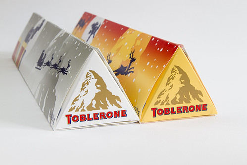
 I like the graduated b/g and the halo around the glass and the lovely dark portions on the glass and in the fluid. Good strong diagonal. My only minor niggle is the colour of the wine. I actually like the colour as part of the shot but if it is wine then it looks a bit pallid.
superpippo said:Duo - I thought like Michael about the angle but I see your explanation and would go with that. I like the shot and the lighting has come out well, partic the area between the peaks. I might have tries gluing down the boxes better - but then perhaps you would not be able to get inside quickly enough
superpippo said:Flow - very good
......I settled for Ribena!
Thanks for dropping in.
That was exactly how I was going to desccribe it but I desisted as I thought that might be insulting if you had used wine that would be the poor excuse for wine that my mother in law enjoys! The lack of intense colour in the liquid gives it an almost mono feel!Thanks Peter.Duo - Nice shot. Lovely and bright plus sharp where it needs to be
Flow - I very much like this one. The slightly vignetting and textured background really works well. I didn't have a problem with the colour of the wine - I just thought it was rose rather than red.
Hi DK, I'm just about keeping up! I've had to ease back on the photography obsession a bit as I was becoming a bit of a pc recluse and hiding away too long! Although now I'm hiding away from the months worth of photos that need sorting :bonk:Glad to see you getting a couple of shots up
Duo - Nom Nom... love Toblerone, I think I would prefer the Brightest one not being slightly hidden (swapped), but I like the composotion and the lighting
Flow - A great wine shot, like the angled glass and the background i spot on, nice and sharp, no faults from me
Flow - I like the halo around the glass as well and the angle you took it at!
Well done on catching up as well!!
Don't tell anyone, it was actually a sherry glass My wine glasses are seriously water marked and hand blown, recycled green glass so full of imperfections! But I may just have to buy some cheap ones for this posiview said:Hi, Duo, ooohhh I haven't have Toblerone for ages. Well composed and lit. Nice orientation. Being very picky, I did not the slight shadow lower right of the left Toblerone.
posiview said:Flow, one of the sharpest I've seen for a while. Suits Flow. Liking the lighting. Bit tight for me.