
You are using an out of date browser. It may not display this or other websites correctly.
You should upgrade or use an alternative browser.
You should upgrade or use an alternative browser.
weekly Michael23's 2012 52 COMPLETED! WooHoo! Slide show added
- Thread starter michael23
- Start date
 I like the idea you mentioned though, it would suit it more. I could use the art one again couldn't I.....
- Messages
- 19,461
- Name
- Andy
- Edit My Images
- Yes
Pack, on theme and well composed. Think I'd prefer a nice vibrant colour photograph. Black BG has a few creases....4 weeks 
Art, now I like this one. I like the aged fell, the lighting works well and the orange sky is a cracker. Is it one of yours
Cheers.
Art, now I like this one. I like the aged fell, the lighting works well and the orange sky is a cracker. Is it one of yours
Cheers.
- Messages
- 531
- Edit My Images
- No
Hi Michael,
Spread - I prefer the close-up of the seals for this, even if the connection to the theme is not as obvious. There's more detail, and I like the comp. The wide angle shot has more of a quick snap-shot feel to it.
Together - I think this is cute, but the way it's photographed and processed, it doesn't have a 'happy' together feel to it, if you know what I mean. I would have liked to see it against a brighter, perhaps white, background, and less dark overall.
Pack - Not sure about this. To me, the subject itself isn't terribly interesting, and the way it's been lit, unfortunately, it doesn't do a huge amount for me. Sorry!
- Messages
- 2,820
- Name
- Mark
- Edit My Images
- Yes
Hi Michael, here goes catch up!
Change, I like the money one best. Great PP and bang on theme
Natural is a gorgeous shot; so simple yet so effective.
Age; yep, definitely on theme, and a nice treatment for a landscape. I can almost feel the cold!
Spread doesn't really say spread to me, but no matter; it's a lovely photo.
Together, I don't like these ornaments one bit, BUT, you've photographed it nicely, and the B&W works for me.
Pack yes, it's on theme and well taken. Not a have, but a good shot none-the-less.
Art is lovely, and the way you've photographed it has brought it to life.
- Messages
- 6,408
- Edit My Images
- No
Hi Michael,
Apologies for not keeping up but you know the score I've been away at sea for a few months.
By the way 'Defender 06' was originally named as 'AL MAJIHAD' and built at Brooke Marine, Lowestoft for the Sultan of Oman's Navy but they gave it back!. I have no idea who owns it now but it doesn't belong to HM Forces or HM Coastguard so probably in the hands of a private collector. Lets hope the gun has been decommissioned !
Spread - Nice image of seals basking. looks like you had some difficult lighting conditions so you've done well. Good focus too.
Together - I think you final re-worked image is the best one of the set. works well for the theme.
Pack - Nappies! I guess your going to be very busy soon. Bang on subject although i think i would have preferred to have seen the original in colour.
Art - Nice image. Again bang on theme and very colourful !
- Messages
- 8,398
- Name
- Lynne
- Edit My Images
- Yes
Hi Michael
4 weeks to go....
My thoughts pretty much match Nathalie's.... not a terribly interesting image & not so keen on the tone...can';t help thinking a nice baby type surround ( fluffy blankets , cuddly toys etc etc) may have lifted it a touch but still been on theme ?
Art....colorful , on theme , like how you lit it- very imaginative & right on theme .It's lasted well for being in the loft too . Clever wifey you got there mister
OP
- Messages
- 14,766
- Name
- Michael
- Edit My Images
- No
Hi Michael,
Spread - I prefer the close-up of the seals for this, even if the connection to the theme is not as obvious. There's more detail, and I like the comp. The wide angle shot has more of a quick snap-shot feel to it.
Together - I think this is cute, but the way it's photographed and processed, it doesn't have a 'happy' together feel to it, if you know what I mean. I would have liked to see it against a brighter, perhaps white, background, and less dark overall.
Pack - Not sure about this. To me, the subject itself isn't terribly interesting, and the way it's been lit, unfortunately, it doesn't do a huge amount for me. Sorry!
Hi Nathalie, thanks for the comments. Pack, was a bit last minute really, and I just went with it, for something different. I have an alternative image, which is below.
Hi Michael, here goes catch up!
Change, I like the money one best. Great PP and bang on theme
Natural is a gorgeous shot; so simple yet so effective.
Age; yep, definitely on theme, and a nice treatment for a landscape. I can almost feel the cold!
Spread doesn't really say spread to me, but no matter; it's a lovely photo.
Together, I don't like these ornaments one bit, BUT, you've photographed it nicely, and the B&W works for me.
Pack yes, it's on theme and well taken. Not a have, but a good shot none-the-less.
Art is lovely, and the way you've photographed it has brought it to life.
Thank you Mark for doing a catchup
Hi Michael,
Apologies for not keeping up but you know the score I've been away at sea for a few months.
By the way 'Defender 06' was originally named as 'AL MAJIHAD' and built at Brooke Marine, Lowestoft for the Sultan of Oman's Navy but they gave it back!. I have no idea who owns it now but it doesn't belong to HM Forces or HM Coastguard so probably in the hands of a private collector. Lets hope the gun has been decommissioned !
Spread - Nice image of seals basking. looks like you had some difficult lighting conditions so you've done well. Good focus too.
Together - I think you final re-worked image is the best one of the set. works well for the theme.
Pack - Nappies! I guess your going to be very busy soon. Bang on subject although i think i would have preferred to have seen the original in colour.
Art - Nice image. Again bang on theme and very colourful !
Hiya Nick, thanks for the info on the defender, I like little nuggets of info like this
Pack as said a bit last minute and just went with it. An alternatve is below. Hi Michael
4 weeks to go....
My thoughts pretty much match Nathalie's.... not a terribly interesting image & not so keen on the tone...can';t help thinking a nice baby type surround ( fluffy blankets , cuddly toys etc etc) may have lifted it a touch but still been on theme ?
Art....colorful , on theme , like how you lit it- very imaginative & right on theme .It's lasted well for being in the loft too . Clever wifey you got there mister
Hiya Lynne, yeah, bit of a marmite one isn't it for pack. Another take below.
So, here is another shot of the pack of nappies. Had no chance to do it in daylight hours, just late at night :bonk:
Is it any better?

pack 1 by scilly puffin, on Flickr
- Messages
- 13,760
- Edit My Images
- Yes
Hey Michael
Pack - I'm not so sure it works for me, the dark pp with the black background... Great blacks though
Art - You have caught that nicely, good even lighting and like the colour, nice one
<EDIT> Pack edit... now that's more like it, baby stuff looking baby like
Pack - I'm not so sure it works for me, the dark pp with the black background... Great blacks though
Art - You have caught that nicely, good even lighting and like the colour, nice one
<EDIT> Pack edit... now that's more like it, baby stuff looking baby like
Last edited:
- Messages
- 531
- Edit My Images
- No
Yup, much better!Is it any better?
- Messages
- 4,836
- Name
- Alan
- Edit My Images
- Yes
Hi Michael
Pack - i have looked at both and sorry to say that I cannot get excited by either
As to Art ....- what a contrast - really like that. Terrific vibrant colours which you have caught very well. Naive art and the creases in the paper help a lot. It made me smile - love the drifting smoke from the chimneys.
Just think in a couple of years time you will have lots of these little pieces of art, usually, in my experience, with a little note giving a declaration of love. Not long now.
Pack - i have looked at both and sorry to say that I cannot get excited by either
As to Art ....- what a contrast - really like that.
Terrific vibrant colours which you have caught very well. Naive art and the creases in the paper help a lot. It made me smile - love the drifting smoke from the chimneys.Just think in a couple of years time you will have lots of these little pieces of art, usually, in my experience, with a little note giving a declaration of love. Not long now.
OP
- Messages
- 14,766
- Name
- Michael
- Edit My Images
- No
Hi Michael
Pack - i have looked at both and sorry to say that I cannot get excited by either
As to Art ....- what a contrast - really like that.
Just think in a couple of years time you will have lots of these little pieces of art, usually, in my experience, with a little note giving a declaration of love. Not long now.
Cheers Alan, I pack, totally understand, if I had more time I could have done much better.
Not long now indeed, only around 3 weeks to go now!
Hopefully will get colour done tomorrow, and all being well the subject will suit my new 85mm f1.8.
OP
- Messages
- 14,766
- Name
- Michael
- Edit My Images
- No
Onto colour, this one will pop in for now, unless something else crops up
Also testing out my new Canon 85mm F1.8

Colour, aka Ribenna berry by scilly puffin, on Flickr
Also testing out my new Canon 85mm F1.8
Colour, aka Ribenna berry by scilly puffin, on Flickr
- Messages
- 2,820
- Name
- Mark
- Edit My Images
- Yes
I like that for colour. I don't think it says "colour" without knowing that's what it is - it's colourful, but it doesn't make colour the subject of the photo - but it's a good image anyway. Great DoF.
- Messages
- 8,398
- Name
- Lynne
- Edit My Images
- Yes
Hi ya
 could've sworn I posted up to say your reshoot of Pack was far better......which it is by the way
Color....fits the theme & a winner cos I just lurve purple but , as an image it doesn't do much for me I'm afraid, sorry . How long till the bay arrives mister ?
could've sworn I posted up to say your reshoot of Pack was far better......which it is by the way Color....fits the theme & a winner cos I just lurve purple
but , as an image it doesn't do much for me I'm afraid, sorry . How long till the bay arrives mister ?
OP
- Messages
- 14,766
- Name
- Michael
- Edit My Images
- No
Thanks Lynne, comments noted. If I get chance I will see if I can do something else. Currently sat in the hospital atm, could be with in the next couple of days, although official date is 16th december. These doctors take flaming ages!
Last edited:
- Messages
- 4,836
- Name
- Alan
- Edit My Images
- Yes
Hi Michael
Colour - like the image but looks a bit cold and the black band at the rear detracts.
Hope everything went well yesterday.
Colour - like the image but looks a bit cold and the black band at the rear detracts.
Hope everything went well yesterday.
- Messages
- 6,502
- Name
- Peter
- Edit My Images
- Yes
Brought a smile to me face and certainly colourful.
OP
- Messages
- 14,766
- Name
- Michael
- Edit My Images
- No
Thanks John and Peter.
Shadow,
Been a tricky one this, not knowing what to do and seeing how good the first pics were, it really got me thinking.
A couple for your thoughts, not sure which one to go with!

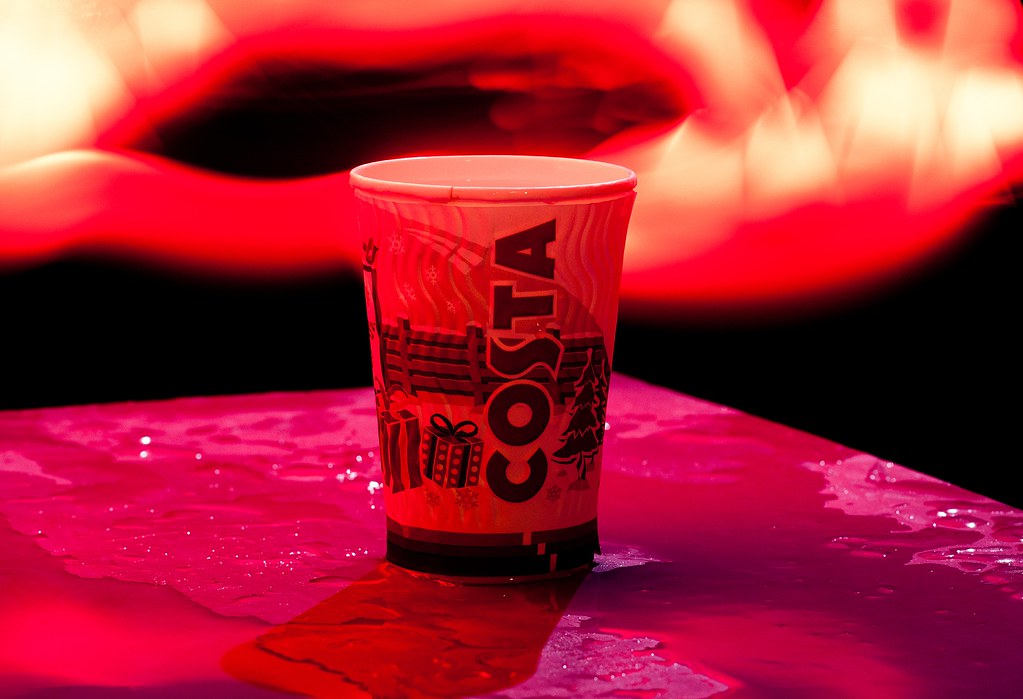
glass by scilly puffin, on Flickr

shadow idea 1 by scilly puffin, on Flickr
Both lit by moonlight in around -2 temperature! The cup actually froze to thing it was standing on!
Shadow,
Been a tricky one this, not knowing what to do and seeing how good the first pics were, it really got me thinking.
A couple for your thoughts, not sure which one to go with!
glass by scilly puffin, on Flickr
shadow idea 1 by scilly puffin, on Flickr
Both lit by moonlight in around -2 temperature! The cup actually froze to thing it was standing on!
The goblin
<span class="poty">POTY Winner 2015</span></br>
- Messages
- 4,407
- Name
- Marsha
- Edit My Images
- Yes
Hi Michael,
Colour, is he one of Fluffy's friends? I have to say this seems a bit of a snap to me, cute shot but certainly not up to your normal high standard! Is he trialling out the new carry cot? Not long now
Shadow, I can't decide either! I think I prefer the first version as the shadow is more interesting, but the reflection distracts from the shadow a little. I do like the second one for technical reasons, how you got the well lit cup from the front without losing the shadow
OP
- Messages
- 14,766
- Name
- Michael
- Edit My Images
- No
Thanks Marsha, colour was a bit of a snap, Had Ribenna berry for ages and he was refound when clearing the loft out! And yes, a new friend for Fluffy!
I know what you mean about the reflection, I had poured boiling water around to get some steam coming off, but it didn't quite work out. Ending up with the reflection as well, there was also some disaronno ameretto in there too! The lighting worked very well on the cup, although looking a little flat to begin with, I did a little pp, reduced saturation in camera raw, pushed the blacks and the fill light sliders (a very good alternative for b+w processing) i boosted the contrast, I think I altered the levels and then toned it blue.
Infact, I am going to change my colour image, I know the subject is the same but who cares, I wanted something better and I really like this even if I do say so myself
Take a sip! by scilly puffin, on Flickr
Last edited:
- Messages
- 2,820
- Name
- Mark
- Edit My Images
- Yes
Hi Muchael. I like the second shadow one best. It's not as interesting a shadow, but I prefer the tones, and really like the look of what the cup is standing on; nice lighting.
Colour reshoot is good, but I'm not too sure it says colour to me, and I'm distracted by whatever it is that's going on behind the cup.
I might be being too picky over the theme though. I tend to think for colour the shot needs to be more than just a shot of something colourful (especially if its a single colour), more a shot about colour, or that makes colour it's subject.
- Messages
- 4,836
- Name
- Alan
- Edit My Images
- Yes
Hi Michael
Shadow - I prefer #2 for the comp and the crisp shadow - also like the dark, shadowy b/g.
Also the lighting has given a cold, frosty feel which complements the winter scene on the cup
Reshoot of Colour - not sure about this. It just seems like a shot that has had a heavy touch with the sliders and the b/g is very distracting
jgs001
Brian Cox
- Messages
- 12,646
- Name
- John
- Edit My Images
- Yes
Shadow, I like both of them... the lines in the first are much more interesting... however, the costa cup works best for shadow, as the shadow is far more clearly defined.
Not so keen on the new Colour... the background above the cup I find rather distracting.
Not so keen on the new Colour... the background above the cup I find rather distracting.
- Messages
- 6,502
- Name
- Peter
- Edit My Images
- Yes
I'd go for the first Costa Shadow shot. For the theme it feels stronger. I like the tone as well.
OP
- Messages
- 14,766
- Name
- Michael
- Edit My Images
- No
Thanks guys.
Glow, An instagram shot of a floor lamp is for starters. Not sure if I will be able to get anything else done.
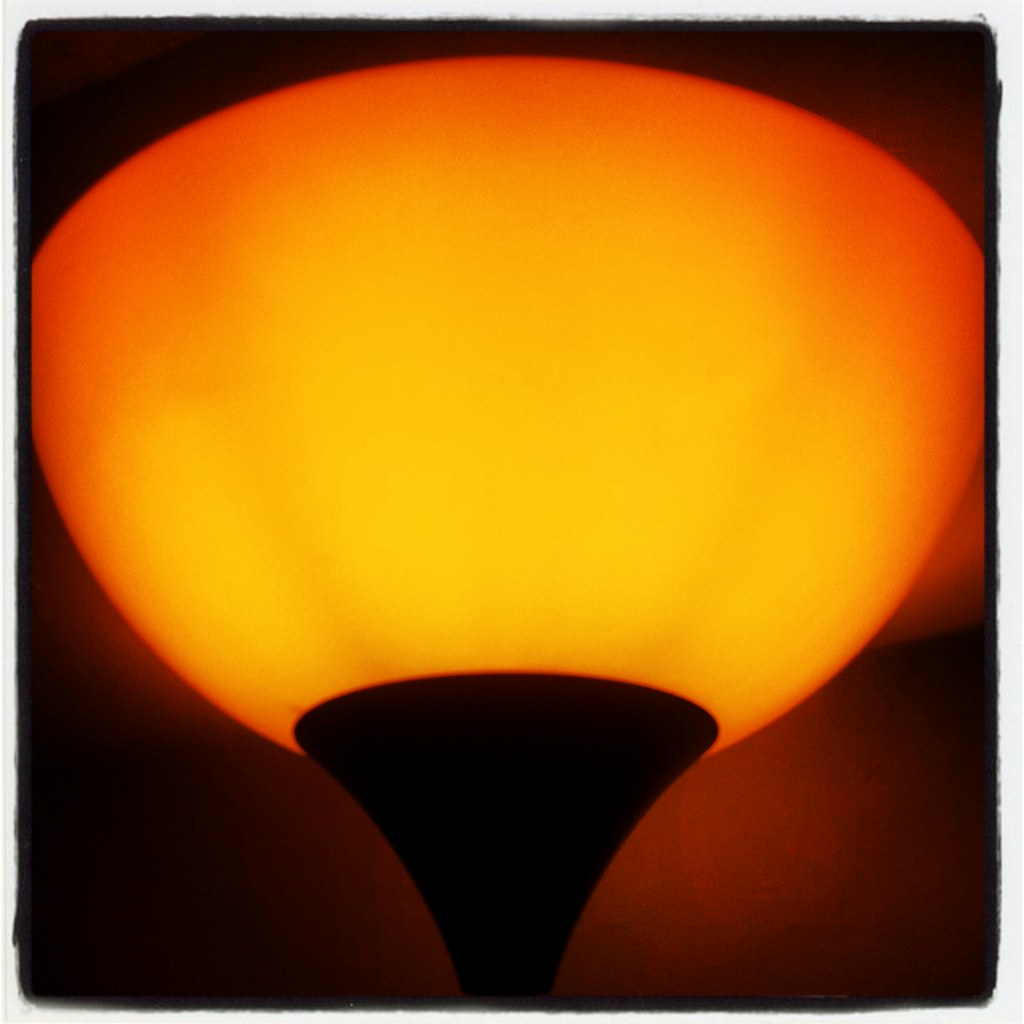
glow by scilly puffin, on Flickr
Glow, An instagram shot of a floor lamp is for starters. Not sure if I will be able to get anything else done.
glow by scilly puffin, on Flickr
- Messages
- 2,820
- Name
- Mark
- Edit My Images
- Yes
Hi Michael, I love that glow shot. The colour and the soft light, almost with a matt feel to it, is great, and is complemented by the border. For perfection I'd have liked to see the edges of the shade not cut off, and the patch of light to the right of it is a little unbalancing to my mind, but I think it's great despite those minor crits.
Last edited:
- Messages
- 2,908
- Name
- Summer
- Edit My Images
- Yes
now there's something I read once about how hollywood photographers used to get that 'misty' look on the leading ladies - know the ones I mean? well they used to put a silk stocking over the lens, or a bit of vaseline around the edge of the lens - now I would love to try the silk stocking, and I think this shot would suit the effect perfectly
- Messages
- 4,836
- Name
- Alan
- Edit My Images
- Yes
Hi Michael
Glow - good warm colour and crop. Agree with Mark about the slight distraction of the patch to the lower right.
Glow - good warm colour and crop. Agree with Mark about the slight distraction of the patch to the lower right.
Last edited: