- Messages
- 1,417
- Name
- Judi
- Edit My Images
- Yes
Works well in red Michaelcould be a health warning against smoking


Works well in red Michael
I'm very jealous. I'd love a Macbook Pro but couldn't justify it at the moment.Thank you. I used a long exposure and light up with so red fairy lights.
Totally agree about the smoke just couldn't get it to show up with the red. Maybe I should have used a white light on the smoke from the other side
Any way I've bitten the bullet and have got an iMac on route, hopefully be with me for tomorrow
I'm very jealous. I'd love a Macbook Pro but couldn't justify it at the moment.
That skull is a great base shot, for some silvery smoke to be overlaid at another time.
Do it!!!!
HI Michael
hope the imac has landed ...ya lucky beggar
Agree with what's already been said...very spooky image , the red give's it a real kick....look forward to seeing some smoke added in there

OOooo, I'd have been tempted to rotate 90 degrees clockwise to give the impression of a butterfly. Lovely blues and nice swirls in the stone.
Cheers.
OOooo, I'd have been tempted to rotate 90 degrees clockwise to give the impression of a butterfly. Lovely blues and nice swirls in the stone.
Cheers.
I'd have been tempted to rotate 90 degrees clockwise to give the impression of a butterfly.
Fits the theme I love the different shades of blue very nice.
OOooo, I'd have been tempted to rotate 90 degrees clockwise to give the impression of a butterfly. Lovely blues and nice swirls in the stone.
Cheers.
Me too, cetainly looks like a butterfly but better rotated.
Tend to agree lovely swirly blueness
This most definitely.
Lovely colours though and on theme.
Gorgeous colours and patterns in there, but yes, I agree that it definitely has butterfly potential!

The rotation suits it perfectly .... fabulous colours in the stone
A vote for the rotation here too
Really great colours. Liking the rotation, but size and position I think would benefit from being a bit more symmetrical.
I like it Michael, good colour, prefer the rotation, looks suspended, very butterfly like
Thank you. The colours were what did it for me in choosing that particular stone.Prefer original version. Beautiful colours, sharp and reasonable bokeh.
Thank you. The BG was a surprise as I took most shots with White and bBlack BGs and ended up using a focus test shot with just the reflected BGYeah that looks good to me... super colours and detail with nice background too
Mineral: Very nicely done....like the touch of bokeh in the background
Hi Michael
can't really add to what's been said , the rotation works a treat & some really vibrant blue's
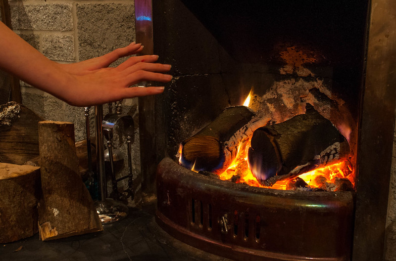
Fits the theme, good attempt at the theme, crit wise I'd like the hands to be a bit closer in the frame and a bit sharper.
Hi Jason
Sense - Works for me, the fire looks fine on my monitor too (Uncalibrated) agree the hands could be a tad sharper, but a nice warm glow to the shot
Thanks. I did take a couple without the hands but didn't seem to look right.Good take on the theme Michael, sense of heat/warmth would still be there
Thank youFits the theme well Michael
Thank youHi there....it looks fine to me ... I like the darkness of the shot, it adds to the glow.....it really conveys a sense of warmth
Ah yes the T.V I did wonder what that wasNice picture that fits the theme. Sharpness has been mentioned so I'll be picky and suggest cloning out the blue reflection (TV?) in the fire surround just above the hands.
. Thats the sort of thing I need to concentrate more on, would have been so easy to turn it off.
