weekly ChrisHeathcote TP52 Challenge - Back with "Animal" and "Special"

Messages
3,724
Name
Chris
Edit My Images
Yes
Ok for some ridiculous reason I've decided to join in this year, hopefully it won't end in tears!

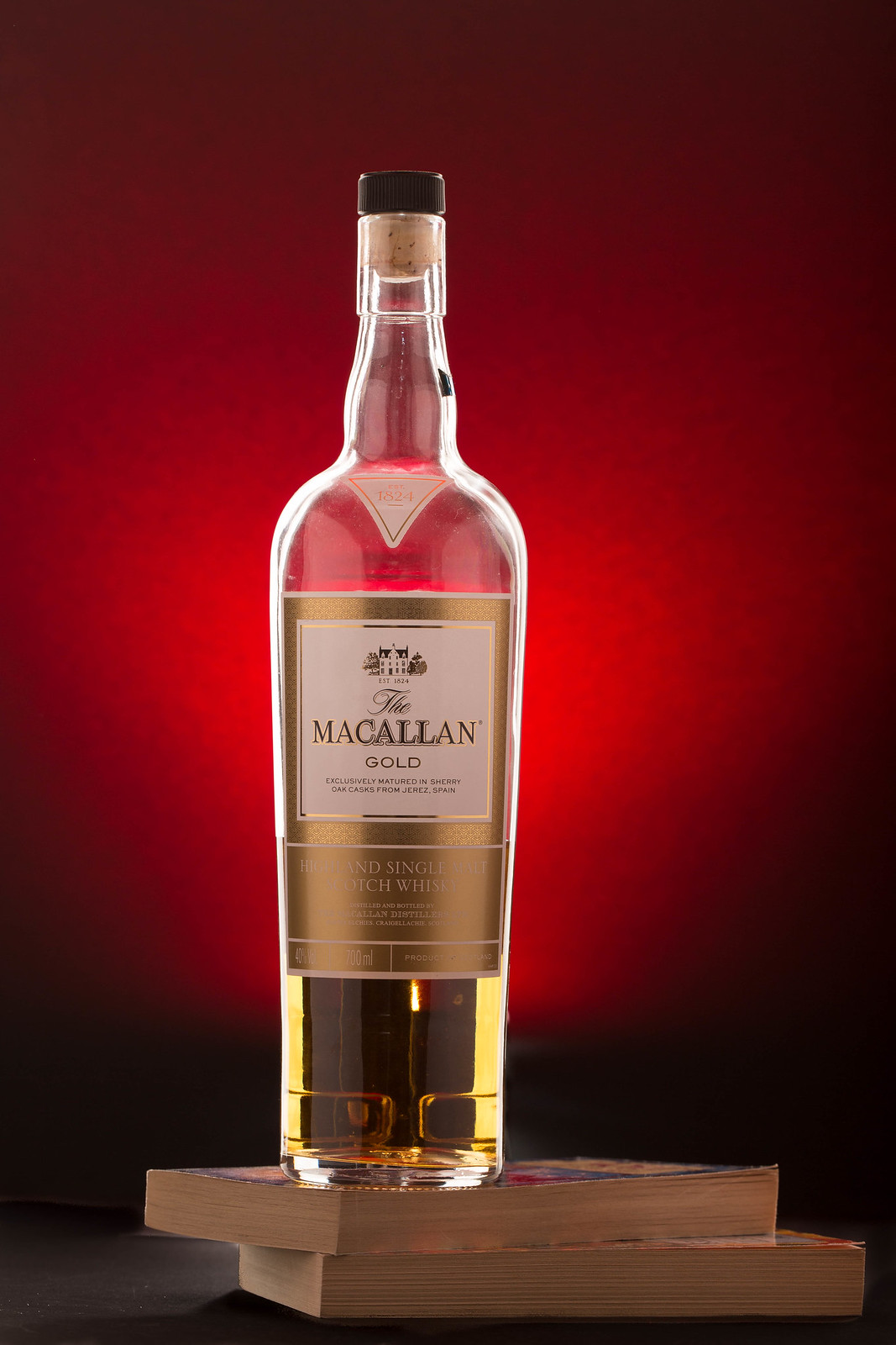
After a stressful week trying to come up with an idea, seeing my original idea already appear a few times (great minds and all that :D ) I finally chose what would constitute a perfect evening in my mind.

Week 1 - Bliss
Week 2 - Fragile
Week 3 - Scenic
Week 4 - Companions
Week 5 - Elegant
Week 6 - Watery
Week 7 - Bold
Week 8 - Relax
Week 9 - Vertical
Week 10 - Mouth
Week 11 - Crowd
Week 12 - Close -up

Week 13 - Reshoot & Machine
Week 14 - Alphabet (still to follow)
Week 15 - Sound
Week 16 - Experiment
Week 17 - Heat
Week 18 - Figures (to follow)
Week 19 - Household (To follow)
Week 20 - Reshoot & Limit
Week 21 - Bizarre

Week 22 - Broken
Week 23 - Entertain
Week 24 : Spiral
Week 25 : Silhouette
Week 26 : Animal
Week 27 : Medicine / Medical
Week 28 : Proverb
Week 29 : Pale
Week 30 : Tear
Week 31 : Words
Week 32 : Support
Week 33 : Religion / Religious
Week 34 : Geometric
Week 35 : Fashion
Week 36 : Chilled
Week 37 : Reshoot & Special
TP52-Bliss - Pick 106-January 10, 2015.jpg by Chris Heathcote, on Flickr
 
Last edited:
Hi Chris, welcome to the 52, great image to start off, really like the background and the lighting on the bottle, I am not too keen on the book that's stood up at the back, I don't know why, possibly because it's cut in half, off to a flyer non the less though. I look forward to seeing more from you.
 
Hi, and welcome.

I haven't read Pratchett for a long time and used to really enjoy his books. DEATH was my favourite character :)

Bliss, cracking lighting and I like the red BG. Not overly keen on the BG book, it sees to compete for attention with the bottle.

Cheers.
 
You've got this 52 Challenge game well organised, Chris! :clap:

... Week #2 - same shot, bottle half-full. :whistle:

... Week #3 - same shot, bottle empty! :LOL:
 
Welcome to the mad house Chris :)
Off to a nice start, though I do agree with Andy, that the background book is a slight distraction.
 
Very nice image, I like the background but I find the books distracting.
 
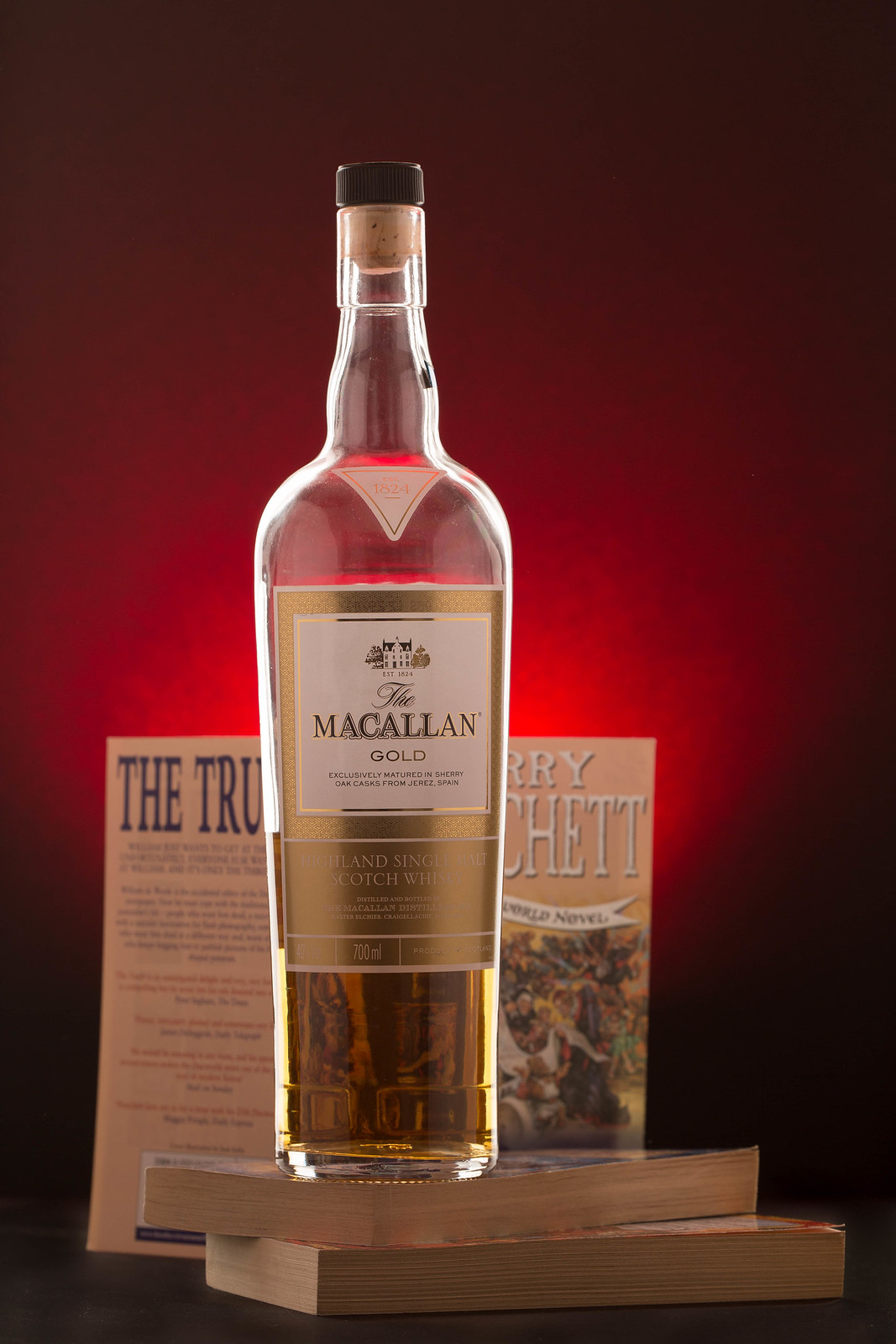
As I mentioned in post #3, I wasn't completely happy, so I got up this morning and redid it, much better in my opinion,
I see the level in the bottle is lower too
but I guess you can blame the camera angle for that :p
 
Hi. definitely an improvement to the first one, one thing though if the books are important could you not have put the spines in the front so we could see what they are, I presume Terry Pratchett
Nicely lit with the splash of red (y)
 
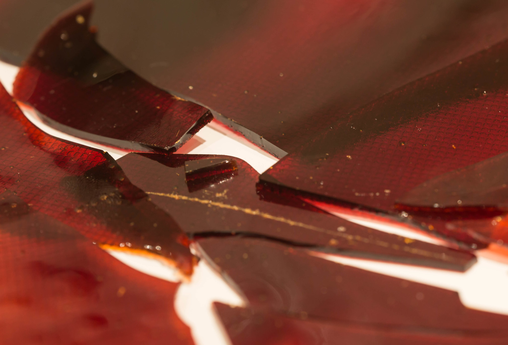
Ok after a bit of brain rattling and wondering what to do this is what I came up with. Originally I thought about broken glass, however from a safety point of view I went against it it, but decided to use melted sugar to create a sheet. Personally I quite like the colours , although I'm not sure about the white background, however I wanted a contrast. All feedback is gratefully received as this is my first attempt at macro and abstract. :

Week 2 - Fragile

Fragile 113-January 11, 2015.jpg by Chris Heathcote, on Flickr
 
Hi, a choice of prop that you can eat, well done :)

It's on theme, but doesn't really say macro or abstract to me. Maybe a little abstract, but I feel you could have done a little more with the placement.

Cheers.
 
Thanks for the feedback, I guess it's more close up rather than macro. Either way I feel there is something missing, I just can't place what it is. I'm more comfortable taking photos of animals :)
 
Bliss - I'm liking the lighting on this. It makes the bottle look very classy. The edit is far better but my preference would be to still lose them. The other thing the lighting has done is light up the golden colour of the whisky nicely.
 
Hi Chris and welcome

I like the idea of the Macallan bottle with all the red ... the edit is an improvement but now we can see the torch through the malt.
 
Bliss - I'm liking the lighting on this. It makes the bottle look very classy. The edit is far better but my preference would be to still lose them. The other thing the lighting has done is light up the golden colour of the whisky nicely.

Thanks David, its actually the gelled speed light to illuminate the background :p I am currently building a stage to place the object on and the speed light below for the retakes week :)

Bliss - I'm liking the lighting on this. It makes the bottle look very classy. The edit is far better but my preference would be to still lose them. The other thing the lighting has done is light up the golden colour of the whisky nicely.

Thanks for the feedback Peter, Granted the Macallan is very good on its own (with maybe a small splash of water ;) But you can't beat sitting down with a good book in one hand and a glass of scotch in the other , aaahhhhh Bliss :D

Good take and nicely shot

Thanks Perry
 
Nice one Chris... in fact, nice two!

I love your final edit for Bliss - as a SMW fan I'm of the same view and a good choice of malt, too. Gelling the light has worked really well - that's an investment I'm thinking about, although as my lighting is split between speedlights and strobes I'll need to buy the sheet gels and cut to size. Perhaps I'll get round to it after getting the ND filters I'm hankering after!

The lighting on the bottle has worked really well for me - cracking bit of lighting all round. The books as a surface works well and I'm glad you reshot without the background books, too. All in all, a very well executed technical shot which also has the bonus of looking great as a photograph as well! Really well done :clap:

Fragile is smart - I actually thought it was the glass from a brake light at first because of the colour and the pattern. There's quite a lot going on in the shot for such a simple idea: shallow DOF, quite a few (albeit fairly soft) shadows caused by the sugar being very close to the surface it's on and then additional patterns, marks etc. on the sugar. For me, I think there's perhaps a touch too much going on: whilst it keeps my eyes on the image for longer, they're struggling to find somewhere to settle - if you know what I mean. I think simplifying the composition further might work better? It's still a well executed photo, but doesn't work as well for me as an image (in contrast to the first)... still loads of positives but not quite sure how well they all come together?

Looking forward to your next week though!

Thanks for the detailed feedback Paul. I only started photographing inanimate objects in December, before that it had been primarily wildlife, so it good to hear a second opinion on what is and isn't working (part of the reason I've started on this challenge).

I hadnt seen the "brake light" until you mentioned it :) I agree on "fragile", although I hadn't any idea on how to improve it. I think I'm going to try and spend a bit more time in Photoshop and try and clean up the marks and see what difference that makes, although it could be challenging because of the pattern :)
 
Hi Chris ... a super shot for bliss. I really like the idea behind your Fragile but it looks a bit 'flat'... Maybe if some of the pieces were stood up allowing the light to shine through them it would make them more translucent and show off the lovely colour. Love the idea of using the sugar I may steal that one :)
 
Hi Chris :)

Bliss - I much prefer your second shot, I personally would prefer the books in front of the bottle rather than under it, other than that, really like the colours and light (y)

Fragile - Again nice detail, liking it being close in, maybe a slightly deeper DoF would be nice but that again is a minor point, a couple of nice shots :)
 
I love that panorama, it's so, er, panoramic. Light is excellent and the shapes make for an interesting picture.

The sun shot though I find a little 'ordinary'.
 
Not overly keen on the moon shot Chris, I must admit.

But the Panoramic ticks all the boxes for me (y)
 
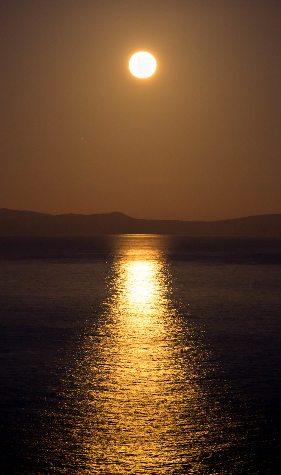
Scenic - I am going to be the odd one out so far and say I prefer the first image over the second. I love it's simplicity and the golden glow across the water.
Thanks Mandy, Its good to see a differing opinion, I may try it either in B/W or simply alter the temperature and see what effect it has

Panorama for me (y)
Thanks Jill

Than you to everyone for their responses. Landscapes are not something I even touch so this week was a difficult one for me
 
Scenic

I do like both photos, but have to say the moon shot pinches it for me. The colour just steal make it

I find the panoramic very plain... I like the image and think it would be something you would see in the harbor office..

Thanks for taking the time to feedback. I wonder if he'd like to but it ;)

Hi Chris, it's the panorama fr me too

Thanks Lorraine, glad you like it
 
I'm a fan of moon reflections so has to be number 1 for me
 
I too prefer the panoramic image of the two. I do feel a tad more exposure would lift it particularly on the right hand side. I feel this may accentuate the ships a little more.
 
Hiya Chris... I like both. Quite different shots: the panorama is a really interesting image with lots of good stuff going on within frame. Looks very slightly off-level, but that might be the panorama stitch doing its bendy thing.

The sunset glow image is lovely and simple: perfect example of symmetry working well.

Hard to decide but a couple of cracking shots!
 
Back
Top