

You are using an out of date browser. It may not display this or other websites correctly.
You should upgrade or use an alternative browser.
You should upgrade or use an alternative browser.
weekly overbez's 52 for 2013.... ** COMPLETE **
- Thread starter overbez
- Start date
- Messages
- 13,760
- Edit My Images
- Yes
Hi Graham ")
Wild - Very nice indeed, the edit tells a story nicely, I can see why you suggested it to me now
Great birds in flight, not easy to catch
Wild - Very nice indeed, the edit tells a story nicely, I can see why you suggested it to me now
Great birds in flight, not easy to catch
M
Mad Hatter
Guest
...Wild - ...Great birds in flight, not easy to catch...
Absolutely!
The edit and re-arrangement is much better for reasons already said - tells a story. The focus and clarity is spot on. A lovely shot Graham.
- Messages
- 1,353
- Name
- Chris
- Edit My Images
- Yes
As a series I think these work really well, nice one
OP
- Messages
- 4,088
- Name
- Graham
- Edit My Images
- Yes
Thanks everyone - I think if the gull on the post had been looking dead on - and I'd zoomed in more - it could have made it on it's own, but I love the landing one too - and there was enough light to get 1/1000 sec too!
Here's a couple of the shots used.
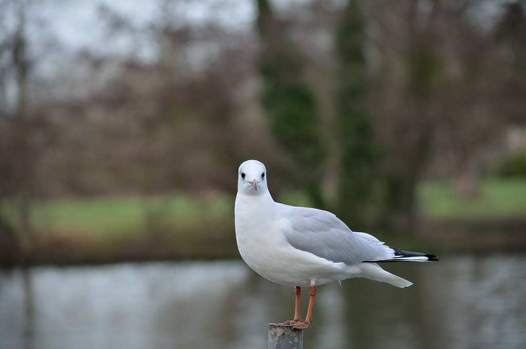
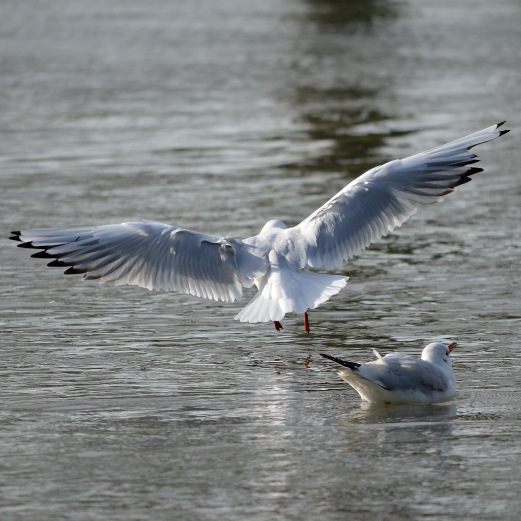
Here's a couple of the shots used.
OP
- Messages
- 4,088
- Name
- Graham
- Edit My Images
- Yes
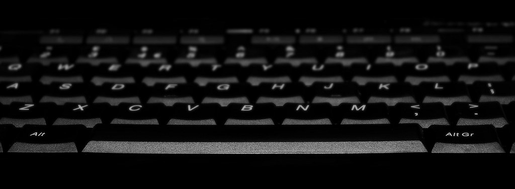
Week 5 - SPACE......
Quite a few idea's this week....
First one I wanted to get was a low-key shot of the space-bar on my keyboard, and the second one was Buzz Lightyear, Space-Ranger
So I shot them both with the same set-up this morning.
and...

Comments welcome,
Quite a few idea's this week....
First one I wanted to get was a low-key shot of the space-bar on my keyboard, and the second one was Buzz Lightyear, Space-Ranger
So I shot them both with the same set-up this morning.
and...
Comments welcome,
Last edited:
- Messages
- 8,323
- Name
- Ian
- Edit My Images
- No
The space bar doesn't do much for me I'm afraid. Maybe if you were straight on to the keyboard it might have had more impact?
I'm liking the Buzz Lightyear shot and it's an innovative idea for the theme. Maybe having him a bit less central would help the composition but then again - maybe I'm just being picky. The lighting is good too with no stark reflections or blown bits.
Well done!
Ian.
I'm liking the Buzz Lightyear shot and it's an innovative idea for the theme. Maybe having him a bit less central would help the composition but then again - maybe I'm just being picky. The lighting is good too with no stark reflections or blown bits.
Well done!
Ian.
- Messages
- 8,398
- Name
- Lynne
- Edit My Images
- Yes
Hi Graham
good work on the dit of your original Wild shot....as Iain says ,it tells more of a story ,focus is great , exposure looks good....nice work mister
Space.....Buzz for me..nicely lit & focused...smidge off the rhs to make him slightly less central & it's a poster on a kids wall
good work on the dit of your original Wild shot....as Iain says ,it tells more of a story ,focus is great , exposure looks good....nice work mister
Space.....Buzz for me..nicely lit & focused...smidge off the rhs to make him slightly less central & it's a poster on a kids wall
blakester
Shine On Harvest Moon
- Messages
- 6,679
- Name
- Iain
- Edit My Images
- No
As others have said Graham, another vote for a less central Buzz.
Small crit, the shadows on his leg from his arm are a little distracting. What about trying a little light painting over the model? Dark room, long(ish) exposure and a small light source painted over? Just a suggestion, please feel free to ignore Iain
Small crit, the shadows on his leg from his arm are a little distracting. What about trying a little light painting over the model? Dark room, long(ish) exposure and a small light source painted over? Just a suggestion, please feel free to ignore
Iain
OP
- Messages
- 4,088
- Name
- Graham
- Edit My Images
- Yes
Maybe if you were straight on to the keyboard it might have had more impact?
Is it straight?
I was aiming for straight - it is level, the keys aren't all in line though. 90º to the space bar goes up to the right of 'B', and then the left of 'Y'. It's not far off, but I'll agree something does look amiss.
But it's turned out as I imagined it in my head, so a positive result there.
As others have said Graham, another vote for a less central Buzz.
Small crit, the shadows on his leg from his arm are a little distracting. What about trying a little light painting over the model? Dark room, long(ish) exposure and a small light source painted over? Just a suggestion, please feel free to ignore
A small crop off the right is easy - thanks everyone
Crit always welcome Iain, we (me and Buzz) were in a dark room, 15 sec exposure, 2 small LED desk lamps. One each side. I was trying a few different lighting positions once I got my set-up right. One of my attempts was one static light on the left, and moving the other around - but too much spilled onto the background.
Still - plenty learned today. Never done an exposure over 1/2 a second before this week. So the challenge is working for me
- Messages
- 13,760
- Edit My Images
- Yes
I quite like the space bar, but the letters not being face on do my OCD
So another vote for Buzz, great colours, focus and spot on the theme of course
So another vote for Buzz, great colours, focus and spot on the theme of course
M
Mad Hatter
Guest
I'm not so keen on the keyboard shot but certainly like the Buzz. It's a clever take within theme. Agree with the other comments already posted.
OP
- Messages
- 4,088
- Name
- Graham
- Edit My Images
- Yes
Thanks guys
Must admit the Space bar was my first idea, and I did get it as I wanted, but Buzz is my favourite too. I'm pleased I made efforts to set up and try and use lighting to get a different shot.
Will probably be trying to shoehorn the same technique into coming weeks - so look out for it
Must admit the Space bar was my first idea, and I did get it as I wanted, but Buzz is my favourite too. I'm pleased I made efforts to set up and try and use lighting to get a different shot.
Will probably be trying to shoehorn the same technique into coming weeks - so look out for it
Brian_of_Bozeat
Jeff
- Messages
- 3,235
- Name
- Brian (not Jeff)
- Edit My Images
- No
To infinity and beyond! - Great shot of buzz, I like the lighting and the colours.
10% done
10% done
- Messages
- 5,787
- Name
- Storm Trooper
- Edit My Images
- Yes
Wild....not sure which of the first 2 I prefer, the first has 2 very similar shots which don't quite work and with the second I prefer the larger shot on the left.
Space...The lighting on the keyboard is really nice but you have to love Buzz Lightyear although I would prefer a clean background.
Space...The lighting on the keyboard is really nice but you have to love Buzz Lightyear although I would prefer a clean background.
OP
- Messages
- 4,088
- Name
- Graham
- Edit My Images
- Yes
Thanks michelle - bet your version of Buzz would have been awesome - I'm a bit glad you didn't
Cheers Brian,
Buzz was shot with a black background - stars were added after and I think they added to it. I did put them in and pull the opacity right down to make them a subtle effect to not detract from Buzz.
Here's the plain BG version....

Cheers Brian,
Space...The lighting on the keyboard is really nice but you have to love Buzz Lightyear although I would prefer a clean background.
Buzz was shot with a black background - stars were added after and I think they added to it. I did put them in and pull the opacity right down to make them a subtle effect to not detract from Buzz.
Here's the plain BG version....
OP
- Messages
- 4,088
- Name
- Graham
- Edit My Images
- Yes
Week 6 already - couple of ideas again this week - but as the kids used the job vacancy pages of the paper for their painting at the weekend, my "looking-for-work" idea was a non-starter!
So we have "Work-in-progress".....
Main challenge here was getting dead straight on to it, I nearly managed that but had to have a little pull of the corners to get it square properly.
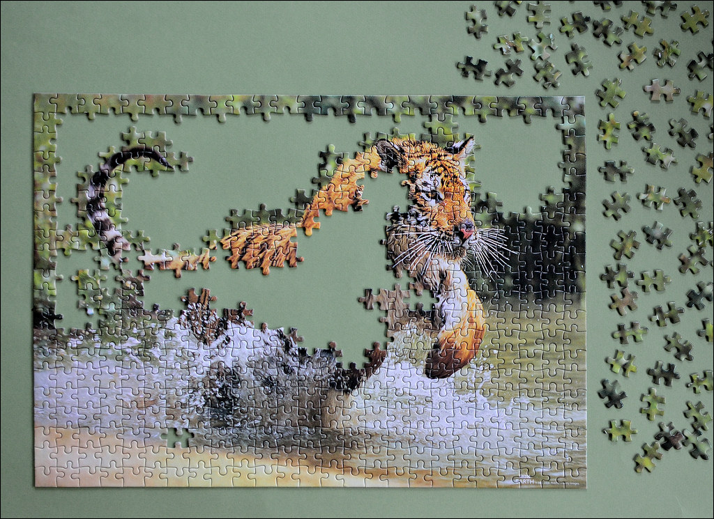
So we have "Work-in-progress".....
Main challenge here was getting dead straight on to it, I nearly managed that but had to have a little pull of the corners to get it square properly.
- Messages
- 1,353
- Name
- Chris
- Edit My Images
- Yes
overbez said:Week 6 already - couple of ideas again this week - but as the kids used the job vacancy pages of the paper for their painting at the weekend, my "looking-for-work" idea was a non-starter!
So we have "Work-in-progress".....
Main challenge here was getting dead straight on to it, I nearly managed that but had to have a little pull of the corners to get it square properly.
http://www.flickr.com/photos/83470296@N06/8465320280/in/photostream/lightbox/
Not sure about this tbh, can't quite put my finger on it....
I like the unfinished puzzle, I think given all the pieces at the side are essentially the same they aren't really adding much to the image for me
Also I wonder what a different background board colour might have done to help or hinder the shot?
- Messages
- 5,787
- Name
- Storm Trooper
- Edit My Images
- Yes
I do prefer the buzz with the plain background but a planet added to a corner could work, the stars just make me think you have a really dusty sensor
Not commenting on work yet as I haven't done mine yet
Not commenting on work yet as I haven't done mine yet
- Messages
- 19,461
- Name
- Andy
- Edit My Images
- Yes
Hi, graham, i rather like Work. It's well thought out and composed. I like how you've part completed the puzzle, especially the parts you used.
Nice overall colours.
But, I'd also like to see a contrasting or complimentary BG. Also the pieces on the right don't look as sharp as the rest.
Cheers.
Nice overall colours.
But
, I'd also like to see a contrasting or complimentary BG. Also the pieces on the right don't look as sharp as the rest.Cheers.
blakester
Shine On Harvest Moon
- Messages
- 6,679
- Name
- Iain
- Edit My Images
- No
Hi Graham,
I like your take on this weeks theme, it certainly works.
I also like the background colour too, I think it is a complimentary colour to the jigsaw, all taken from the same pallette, they work well together.
No real crit to give, it is to the theme, technically good too so from me. Iain
I like your take on this weeks theme, it certainly works.
I also like the background colour too, I think it is a complimentary colour to the jigsaw, all taken from the same pallette, they work well together.
No real crit to give, it is to the theme, technically good too so
from me. Iain
OP
- Messages
- 4,088
- Name
- Graham
- Edit My Images
- Yes
Cheers Guys, so.... "nearly... but not quite", is what we're saying.
I'm not sure either, the background is limited by what flat plain "things" I can find (of the right size), the jigsaw is in an entirely 'natural' state of in-progress, it's literally where we got to and I think has enough completed to show, but enough still undone.
The loose pieces do look less sharp than the others - the green is the background which is very OOF (and noisy) in the actual puzzle pieces which may be what we're seeing. There are obviously still some orange ones left in the box too.
I have an idea I may try, along with extra lighting to counter the small shadows that are at the edges of the pieces (which may be contributing to the softness of the loose pieces).
The goblin
<span class="poty">POTY Winner 2015</span></br>
- Messages
- 4,407
- Name
- Marsha
- Edit My Images
- Yes
Hi Graham  Sorry it's taken me a whole to get here! A quick catch up...
Sin, this idea crossed my mind. I like the narrow DOF going diagonally across the shot.
Season, having two little ones that love a park it doesn't matter what season it is it'll get used! I can't really see the movement in the roundabout but the movement in the swing works by making you think only the hardened few would be out in this weather:bonk: The SC doesn't work for me, sorry. It's not selective enough. Especially as the surrounding shrubbery is fairly mono anyway. Also the fire engine climbing frame has gone a bit dayglo in pp, it needs toning down a bit!
Gravity, very clever My only crit is the lines along the top right of the background. The set up is amazing, there was I thinking it was simply frozen and shot in an angle!
Wild, I prefer the second version. The triptych works well Space, I prefer the Buzz shot. Great lighting and a nice black background
Work, as a big fan of tigers with a large collection of tiger puzzles you'll get no complaint from me I especially like that there's enough detail in the tiger from the tail to the face and foot. You've done well to get it straight on with no glare on the pieces.
Phew, all caught up.
Sorry it's taken me a whole to get here! A quick catch up... Sin, this idea crossed my mind. I like the narrow DOF going diagonally across the shot.
Season, having two little ones that love a park it doesn't matter what season it is it'll get used! I can't really see the movement in the roundabout but the movement in the swing works by making you think only the hardened few would be out in this weather:bonk: The SC doesn't work for me, sorry. It's not selective enough. Especially as the surrounding shrubbery is fairly mono anyway. Also the fire engine climbing frame has gone a bit dayglo in pp, it needs toning down a bit!
Gravity, very clever
My only crit is the lines along the top right of the background. The set up is amazing, there was I thinking it was simply frozen and shot in an angle! Wild, I prefer the second version. The triptych works well
Space, I prefer the Buzz shot. Great lighting and a nice black background Work, as a big fan of tigers with a large collection of tiger puzzles you'll get no complaint from me
I especially like that there's enough detail in the tiger from the tail to the face and foot. You've done well to get it straight on with no glare on the pieces. Phew, all caught up.
Last edited:
OP
- Messages
- 4,088
- Name
- Graham
- Edit My Images
- Yes
Wow - thanks Marsha, a potted crit of my 52 thus far - very much appreciated...
Take 2 of my Work-in-progress..... used the blackout blind from our bedroom as my BG this time, still have light blue and red which may get used in coming weeks....
removed a couple more pieces from the lower left hole, added some orange to the loose pieces, set my two small LED lamps to the bottom corners. Except these were shining on the BG so I had to clone some from the top down and use a gradient on a layer mask to blend it back in (and paint through the loose pieces)... Talk about making work for myself. :bonk:
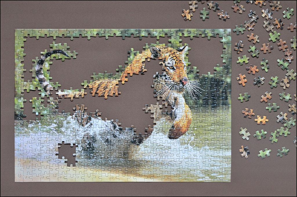
That's it now. Roll on week 7!
Take 2 of my Work-in-progress..... used the blackout blind from our bedroom as my BG this time, still have light blue and red which may get used in coming weeks....
removed a couple more pieces from the lower left hole, added some orange to the loose pieces, set my two small LED lamps to the bottom corners. Except these were shining on the BG so I had to clone some from the top down and use a gradient on a layer mask to blend it back in (and paint through the loose pieces)... Talk about making work for myself. :bonk:
That's it now. Roll on week 7!
The goblin
<span class="poty">POTY Winner 2015</span></br>
- Messages
- 4,407
- Name
- Marsha
- Edit My Images
- Yes
This is why it takes me so long to comment! I'm not your 'good shot' kind of person!Wow - thanks Marsha, a potted crit of my 52 thus far - very much appreciated...
I can't decide on the background, I like the green, it's more complimentary to the puzzle pieces. But the new background and lighting has bought more life to the puzzle itself!
- Messages
- 1,796
- Name
- hayley
- Edit My Images
- Yes
i like it think the puzzle looks better in the first but prefer the background of the second
- Messages
- 8,323
- Name
- Ian
- Edit My Images
- No
My first impression of "Work" was that the background blended too much with the greenery in the puzzle pieces. Then - along came a different coloured background.
Your second take works much better than the first, and it's square enough for my old eyes. I am beginning to look and see if I can get any of those pieces to fit though Damn jigsaws...
Ian.
Your second take works much better than the first, and it's square enough for my old eyes. I am beginning to look and see if I can get any of those pieces to fit though
Damn jigsaws...Ian.
- Messages
- 213
- Name
- Everton
- Edit My Images
- Yes
Hi Graham, the whole thing shouts work (or work in progress)
The 2nd is the one for me BG wise, the extra pieces at the side just give it that feel of we nearly done
The 2nd is the one for me BG wise, the extra pieces at the side just give it that feel of we nearly done
Brian_of_Bozeat
Jeff
- Messages
- 3,235
- Name
- Brian (not Jeff)
- Edit My Images
- No
Forgive the pun, but this really lept out at me! - Great Idea and you've done just enough of the puzzle too.
I much prefer the first one.
I much prefer the first one.