weekly Posiview's TP52 for 2014 Week 52 Support added and FINISHED :)

Hi Andy. I scrolled up and saw your SOOC and got very confused. I was thinking, "what on earth is that supposed to be?" then I realised it wasn't your submission :oops: :$

Scrolling further up to the actual picture :) I like it. Very clever submission for the theme and nicely done. Lighting is good but I would say it's all a bit "midtone" for me - would prefer to see more highlights and metal looking like shiny metal rather than brushed pewter. Also, the cutting out of the background is quite hard-edged. No problem with it, but it looks more cut-out that your usual ones (even on flickr).

It's a good take and a good photo but a tweak here and there could make it even better IMO. Hope you don't mind me saying so!
 
Now then matey...how's the new job, apart from tiring ??

your 2 reshoots for.....Cut ( possibly) the one with the blue sky works best of all of the I feel , after all , who doesn't love a bit of blue sky :)

Balance....think Paul covered my crit so won't re-iterate but I'm itching to know how the hell you managed to balance a fork & spoon on 2 cocktail sticks :wideyed::thinking:
 
Nice original idea and good composition. As someone else has already said, the spoon looks a bit strange in the finished version, although not in the SOOC shot. Not sure whether that's due to the mono conversion or something else you've done to it in pp?
 
Thanks all. This is another one that had potential, but I've rather made a hash of it. One for a reshoot :)

Thanks for the feedback ) thumbs:

Cheers.
 
Well, here's Week 42.

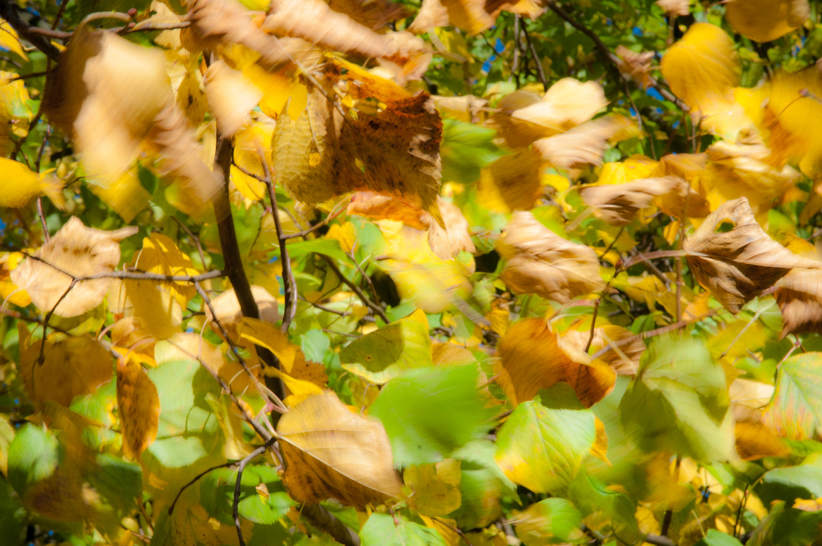
Not quite a grab shot because I saw what I was after, but it's a fallback if I don't get what I am really after. The mother-in-law told me about a wonderful row of trees of autumnal various colours. I'd love to get there for a sunset but the area is a bit dodgy :runaway:

Anyways, here's Change.

Cheers.

Week 42 Change by andysheader (Posiview), on Flickr
 
Nice one Andy. I think it's brilliantly on-theme with the leaf towards the top of the frame looking quite decrepid and very much "changing". I like the colours and the mix of green and autumn-orange which really does highlight the change. I also like the leaves being in motion as the wind is very autumnal... especially around these parts!

Two minor things which I might tweak: it seems a touch over-exposed to me (perhaps midday sun?) and I might be inclined to increase the DOF given there's quite a bit of blur with the movement, just to bring more of the twigs further back in focus? That's perhaps more of a question than a suggestion though.

But great spot and nicely on theme. :)

Cheers, Paul.

Nothing is over-exposed, just checked :), but when I reduced the exposure, it did look better and strangely seemed to increase the DOF :thinking:

Week 42 Change 2 by andysheader (Posiview), on Flickr
 
Sorry Andy, might have been some miscommunication - I didn't mean any highlights were blown, but I felt it was exposed too far to the right for my taste. I definitely prefer your edit but exposure is a personal thing...

Ahh, this is what it's all about. Recently I've been a bit sloppy/lazy/impulsive and haven't really thought through my final submissions and as a consequence I've ended up editing several after suggested edits.

Cheers.
 
I'll agree with your "impulsive", maybe less so the other two words....... But I think that can only be attributed to your enthusiasm so isn't all bad.

I do agree the edit is a huge improvement on an already super imaginative image, the lower exposure just brings out the colours more, deepening the gold in the leaves.

The motion in the leaves is an excellent touch, with someone having that one static gives a nice anchor point to the image.

I think I would have probably cloned over the bits of blue sky behind the leaves though... But that's just me. :)
 
Last edited:
Hey Andy :)

Balance - Glad you gave us the sooc, as I was struggling to see how you rigged this one up... A nice original idea, the background looks good on my monitor... would like to know how you did it, was it all brushed or is it a one click jobbie I<here's hoping for a one click answer> either way... like it :)

Change - Love the colours and motion, adds a real sense of the autumn, I actually like both versions, and struggle to crit at all... all that I can come up with is not so keen on the blue patches, reminds me of summer rather than autumn :)

Hope you manage to get out and get a shot of the autumn trees at sunset, sounds very nice (y)
 
Hi Andy, interesting image particularly like the movement in it, second one better than the first exposure wise,
don't mind the blue patches in the sky don't see why its been mentioned plenty of blue skies autumn and winter
 
I'll agree with your "impulsive", maybe less so the other two words....... But I think that can only be attributed to your enthusiasm so isn't all bad.

I do agree the edit is a huge improvement on an already super imaginative image, the lower exposure just brings out the colours more, deepening the gold in the leaves.

The motion in the leaves is an excellent touch, with someone having that one static gives a nice anchor point to the image.

I think I would have probably cloned over the bits of blue sky behind the leaves though... But that's just me. :)
Hey Andy :)

Balance - Glad you gave us the sooc, as I was struggling to see how you rigged this one up... A nice original idea, the background looks good on my monitor... would like to know how you did it, was it all brushed or is it a one click jobbie I<here's hoping for a one click answer> either way... like it :)

Change - Love the colours and motion, adds a real sense of the autumn, I actually like both versions, and struggle to crit at all... all that I can come up with is not so keen on the blue patches, reminds me of summer rather than autumn :)

Hope you manage to get out and get a shot of the autumn trees at sunset, sounds very nice (y)
Hi Andy, interesting image particularly like the movement in it, second one better than the first exposure wise,
don't mind the blue patches in the sky don't see why its been mentioned plenty of blue skies autumn and winter

Thank, all, appreciate the FB. On the blue, I did see these but decided to leave them in for a bit of colour contrast.

Dean, if you mean the BG, it was a rather naff one click, refine edge job.

Cheers.
 
Well, although I've mentioned it before, please forgive my self indulgence....this is my 200th week posting on the TP52, no missed or late weeks and no Jokers. Quite proud of this.

Anyways, I'm not one for blowing my own trumpet so on with the show.

Two from me.

#1, I've done a similar one before but could not pass up the opportunity to have another go.

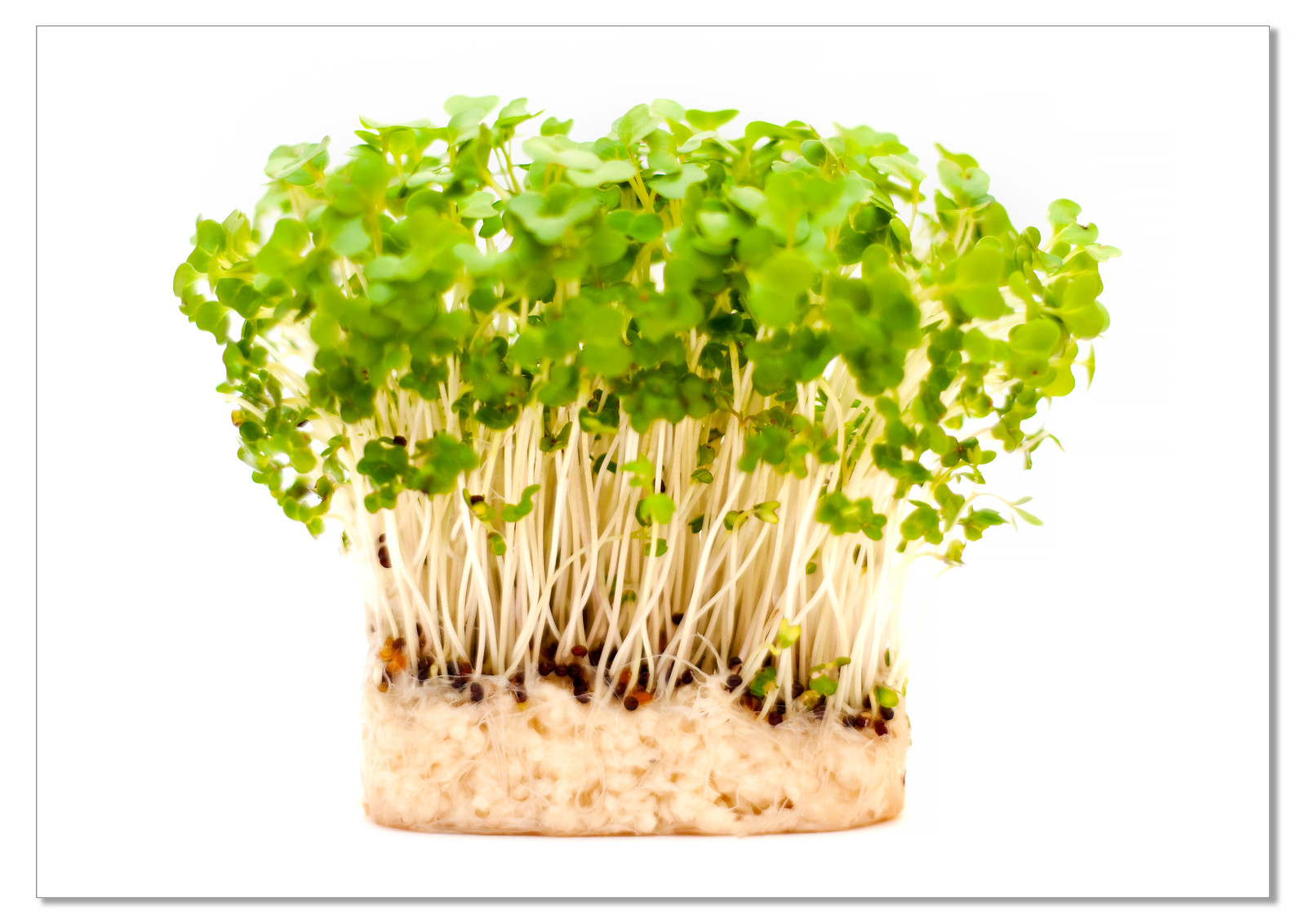
#2, I wanted to grow a single cress seed and place it on a pin head, get my 105mm with 3 extension tube and get in really close, but I bought a pot of cress and went with this idea.

Cheers.

Week 43 Grow 2 @2.8 by andysheader (Posiview), on Flickr

Week 43 Grow @1.8 by andysheader (Posiview), on Flickr
 
Hi Andy, both good ideas not sure which one I prefer, the cress I feel could do with more DoF for the root system which looks like it could be quite interesting,
2 good submissions both worthy of the theme (y)
 
Change - wonderful colours and sense of movement. I agree that the second edit is a big improvement.

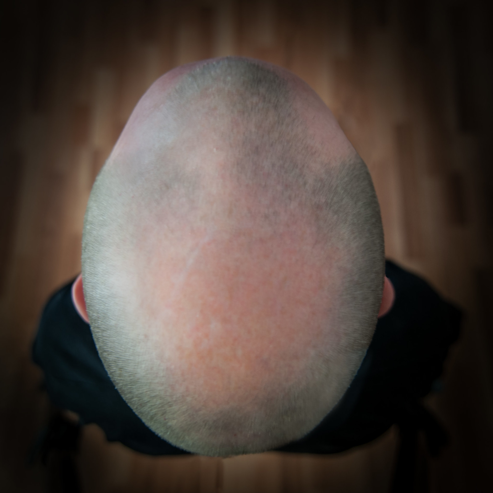
Grow - Baldy Man for me - a really original angle and nice background. It did briefly cross my mind to do something similar with OH as a model, but his bald patch is so big and shiny that I didn't think I could cope with the reflection off it :p
 
Hi Andy, both good ideas not sure which one I prefer, the cress I feel could do with more DoF for the root system which looks like it could be quite interesting,
2 good submissions both worthy of the theme (y)

Thanks, why didn't I think to focus on the roots :thinking: where the growth comes from :) I still have the cress so might give it another go.

Hahaaaaa like them Andy :D

Both got their good points for me, the head shot... just love that angle and the flooring below, as for the cress such an ubber low DoF adds a really interesting veiw

Both great submissions (y)

Cheers, it wasn't easy to do the baldy one but I had to do it :)

Change - wonderful colours and sense of movement. I agree that the second edit is a big improvement.

Grow - Baldy Man for me - a really original angle and nice background. It did briefly cross my mind to do something similar with OH as a model, but his bald patch is so big and shiny that I didn't think I could cope with the reflection off it :p

Yeah, I had an issue with reflections :)

Cheers.
 
Hi Andy
Balance - clever arrangement and good abstract feel. cutlery has lost some of its shine in the pp and cut out of spoon handle a bit jagged - full marks for thought tho

Change - excellent capture of the movement and the colours are super. prefer the edit but I did not think that the overblown look in #1 was that out of place.

Grow - #1 good pov and like the lighting and the vignette giving a halo effect around the head.
#2 - good lighting and pov bring out the vibrancy of the colour and the feeling of new life

Thanks, Alan.

I'm still enthused about the 52 :)
 
Hi Andy, had a closer look on flickr at both of them I think the second one the clarity of the stalks and the weirdness of the roots works for really well
:clap:
 
I like the reshoots of the watercress shoots ... great subject ... second one I think ... the seeds and stalks ... spot on

But I like the sharpness of the leaves in the original

... if you know what I mean.
 
Hi Andy

Change....another vote for the slightly toned version , love the motion in the leaves & the autumnal colors (y) I'd also have lost the blue bits as they seem to jar amongst the beautiful yellows , browns & green's...

Grow......can't have been easy setting up your selfie, well lit & like the plain floor (y)Not so sure about the focus...seems to be more on the sides of your head but that may have been intentional:thinking:

Of the Cress shots I think I prefer the original even though the focus isn't on the roots , though being awkward as I am I'd have preferred a deeper DOF to get both root & seed head in focus :exit:
 
Hi Andy

I'll be blunt... I'm less of a fan of the head, even though it is a very nice head :) Sorry, just not working for me.

But... the first cress shot is just a belter. Cannot improve - I LOVE your choice of super-narrow DOF and also the subject area you've focused on. The black backround works so well... it's just a top drawer photo. I'd put that in a frame and stick it in my kitchen (where I spend a lot of time!) - really super. :clap:
 
Hi Andy,

Cut: No 1 looks like a cracking picture without the cut 'technique' you've applied. between the two, I prefer number #2 I think the overall picture is less cluttered which works best. Definitely having the colour of the cutout mimic what the eye would expect too see works best too. Good original and creative work here.

Balance: An intriguing pic...like Lynne, I just can't see how this balancing act has been made possible :thinking:. I think you've done an admirable job on the cut out and background replacement, and does the trick for me unless I really wanted to over-analyse it. Obviously works well in mono (y)

Change: Think its all been covered technically. I do like how you've filled the frame with swaying leaves - gives this a touch of abstract. Im with Graham about cloning out the bits of blue sky.

Grow: Well done on your 200th post. That really is an achievement - and long may it continue :clap:. I like number one here. The stark overhead POV works well and the vignette mirroring the shape of the head is a nice touch. Also like the different tones in the floorboards and the scar on the head, which makes me wonder what happend here? I have to be honest about number 2 - I am not a fan of the cress pics, original or edited. Its not the techinicals its just the subject. For me really would need some macro take to bring this uninspiring subject to life - sorry Andy.
 
Of the grows it's the head shot, great POV, and I love the little tips of ear sticking out each side, as well as the fact you can see al the way down to the floor.

Of the cresses, I think its the original one on black for me, makes the green pop out wonderfully, the shallow DOF does leave the eye darting about a bit, but I think the black surround stops it from leaving completely....
 
I like the reshoots of the watercress shoots ... great subject ... second one I think ... the seeds and stalks ... spot on

But I like the sharpness of the leaves in the original

... if you know what I mean.

I know exactly what you mean...I haven't used my 50 1.8 and got carried away @1.8 :)

Hi Andy

Change....another vote for the slightly toned version , love the motion in the leaves & the autumnal colors (y) I'd also have lost the blue bits as they seem to jar amongst the beautiful yellows , browns & green's...

Grow......can't have been easy setting up your selfie, well lit & like the plain floor (y)Not so sure about the focus...seems to be more on the sides of your head but that may have been intentional:thinking:

Of the Cress shots I think I prefer the original even though the focus isn't on the roots , though being awkward as I am I'd have preferred a deeper DOF to get both root & seed head in focus :exit:

Yeah, I noticed I'd missed focus by an inch or so.

As above, got carried away with 1.8 :)

Cheers.

I'm preferring the original mate, with the foliage the centre of attention :)

Cheers, Dean, I have to say, I like the detail of the roots in the second, but I prefer the detail and etherialness (?) of the first.
 
Hi Andy

I'll be blunt... I'm less of a fan of the head, even though it is a very nice head :) Sorry, just not working for me.

But... the first cress shot is just a belter. Cannot improve - I LOVE your choice of super-narrow DOF and also the subject area you've focused on. The black backround works so well... it's just a top drawer photo. I'd put that in a frame and stick it in my kitchen (where I spend a lot of time!) - really super. :clap:

No worries on the head :)

Shallow DOF seems to have had mixed reviews :)

I enjoyed this one because I had some nice light and nice clean cress.

Hi Andy,

Cut: No 1 looks like a cracking picture without the cut 'technique' you've applied. between the two, I prefer number #2 I think the overall picture is less cluttered which works best. Definitely having the colour of the cutout mimic what the eye would expect too see works best too. Good original and creative work here.

Balance: An intriguing pic...like Lynne, I just can't see how this balancing act has been made possible :thinking:. I think you've done an admirable job on the cut out and background replacement, and does the trick for me unless I really wanted to over-analyse it. Obviously works well in mono (y)

Change: Think its all been covered technically. I do like how you've filled the frame with swaying leaves - gives this a touch of abstract. Im with Graham about cloning out the bits of blue sky.

Grow: Well done on your 200th post. That really is an achievement - and long may it continue :clap:. I like number one here. The stark overhead POV works well and the vignette mirroring the shape of the head is a nice touch. Also like the different tones in the floorboards and the scar on the head, which makes me wonder what happend here? I have to be honest about number 2 - I am not a fan of the cress pics, original or edited. Its not the techinicals its just the subject. For me really would need some macro take to bring this uninspiring subject to life - sorry Andy.

Cracking crit here (y)

Cut #2 of the second set is my favourite as well.

I got the 'how to' from Youtube and couldn't believe how he did it either, but after 2 tries I managed to balance it. Very strange to look at, though. The cut out was naff...:(

Yeah, I cloned out the blue bit and did prefer it. Originally I though the blue added a bit of colour contrast.

Grow, the scar, well there are two actually: one where I got whacked over the head with a metal bar and one where I scraped it after a few JDs while camping :)

No worries at all on the cress, it would be strange if everyone liked everything.

Appreciate the FB (y)

Of the grows it's the head shot, great POV, and I love the little tips of ear sticking out each side, as well as the fact you can see al the way down to the floor.

Of the cresses, I think its the original one on black for me, makes the green pop out wonderfully, the shallow DOF does leave the eye darting about a bit, but I think the black surround stops it from leaving completely....

I have to say, I do like the simplicity of the overhead of my head.

Cress, yeah, it was more of an excuse for getting my 1.8 out :)

Cheers all for the FB.
 
I can see why you needed a hat now at Brimham Rocks :naughty:

Two great ideas but definitely your head shot for me (y), must have took a fair bit of setting up and getting right, the position of both ears just sticking out is perfect :)
 
Hi Andy ....two great ideas there for Grow .... love the angle of the head shot.... a very original idea. First cress one for me .... I just think the black background gives it that extra bit of oooph against the white ones.

Cheers Susie, appreciate the visit and comments.
 
Back
Top