
You are using an out of date browser. It may not display this or other websites correctly.
You should upgrade or use an alternative browser.
You should upgrade or use an alternative browser.
weekly susiejb 52 /2014 Support
- Thread starter susiejb
- Start date
OP
- Messages
- 7,548
- Name
- susie
- Edit My Images
- Yes
Hi Susie. I had the very same idea, but couldn't find a decent web, the bright yellow bits distract a little but love the water droplets nice focus on them
great idea for the theme
Architecture - imaginative take on the theme. Well captured and I like the short DoF so that the web is clearly the subject of the photo.
Architecture, not an Ida I thought of.
Good detail and decent lighting. I'd prefer a cleaner BG but understand this is not always possible.
Cheers.
Love this Susie, I was also thinking of doing something like this, but like Allan, couldn't find a web or a decent web. Droplets work well. Background doesn't distract for me.
Absolutely perfect.
Lovely shot Susie, good detail in the dew/rain drops? Nice bokeh, possibly clone out that bit of blue on the left
Lovely take on the theme, great detail in the web with the dew/rain droplets, yellow in BG is a bit distracting but hay you have to go with what you've got sometimes.
Architecture - a stunning image love the water droplets on the web nothing at all to pick fault with, it's all spot on for me.
Susie... fantastic take on the theme backed up with a brilliantly executed shot. Super!
Exposure - good (could lighten if you wanted?)
Focus - absolutely perfect and DOF choice spot on
Composition - great... I like the fact it's taken in a garden and it's obvious it's a garden. Super.
You're a jolly good photographer!
Thanks so much everyone...I really appreciate the comments....once I started looking in the garden I found lots of webs and did lots of different angles, but I thought that one fitted the topic best. Yes I should have got rid of the blue spot Phil
They do work best with a piece of black card behind them but I usually manage to damage the web when I try that so I left it as it was.
OP
- Messages
- 7,548
- Name
- susie
- Edit My Images
- Yes
Hi Susie,
great shot, fits the theme well love the water droplets
Ooops you hopped in there Judi .... thank you for looking
- Messages
- 868
- Name
- Jason
- Edit My Images
- Yes
Hi Susie. Sorry I have not visted for so long
Skill: An amazing pic with instant appeal. Love the dark framing around the rich "mind blowing" tones of the flower. The yelow, reds and oranges are so vivid without being cheap or garish which is a skill in itself. My fav part though has to be the highlights from the water - looks so mystical. Well done Susie
Half: Another pleasing nature based submission. The opening of flower buds is a often overlooked little miracle of nature and I like that you've captured and preserved this moment in time. Im a fan of bokeh so Im always going to like this element, though this aside, I think you've done well on the rule of 3rds type composition and I especially like the little foliage section below the bulb and the fact thats theres just enough shaprness there to show off this interesting detail.
Architecture: hhmmm...this is always going to be a hard shot to pull off successfully. I've done this kind of pic before and they've always left me uninspired, especially when it appears to be a web floating in space with no sense of context. Unfortunately I feel the same about this shot....sorry Susie.
- Messages
- 1,412
- Name
- Elaine
- Edit My Images
- Yes
Another excellent nature shot Susie! I love the way you've used the diagonals, the water droplets are spot on and make the individual filaments really pop out and the oof yellow flowers behind the web help to give it a sense of place. Great job!
OP
- Messages
- 7,548
- Name
- susie
- Edit My Images
- Yes
Hi Susie. Sorry I have not visted for so long
Skill: An amazing pic with instant appeal. Love the dark framing around the rich "mind blowing" tones of the flower. The yelow, reds and oranges are so vivid without being cheap or garish which is a skill in itself. My fav part though has to be the highlights from the water - looks so mystical. Well done Susie
Half: Another pleasing nature based submission. The opening of flower buds is a often overlooked little miracle of nature and I like that you've captured and preserved this moment in time. Im a fan of bokeh so Im always going to like this element, though this aside, I think you've done well on the rule of 3rds type composition and I especially like the little foliage section below the bulb and the fact thats theres just enough shaprness there to show off this interesting detail.
Architecture: hhmmm...this is always going to be a hard shot to pull off successfully. I've done this kind of pic before and they've always left me uninspired, especially when it appears to be a web floating in space with no sense of context. Unfortunately I feel the same about this shot....sorry Susie.
Thanks for looking in Jason...much appreciate your comments and the time that you've taken to give them...thank you
OP
- Messages
- 7,548
- Name
- susie
- Edit My Images
- Yes
Another excellent nature shot Susie! I love the way you've used the diagonals, the water droplets are spot on and make the individual filaments really pop out and the oof yellow flowers behind the web help to give it a sense of place. Great job!
HI Susie - Half - a really nice image love the way you have captured it half way
Architecture - love it what a great idea no crit from me
Thanks Elaine and Craig...I'm glad you liked the shots...it's always hard to decide exactly which ones to put on here.
OP
- Messages
- 7,548
- Name
- susie
- Edit My Images
- Yes
I don't want to fall behind so I'm posting this for PROMISE. I glanced out of the window on Friday evening and the sky was very red, I have had one or two other ideas which haven't really worked, so will put his on, and move on to this weeks challenge.
Red Sky At Night ...the PROMISE of a lovely day .

Red Sky At Night ...the PROMISE of a lovely day .
Last edited:
- Messages
- 7,499
- Edit My Images
- Yes
You glanced out of the widow and you have a view of the sea! I could easily go off you, ya know
Good colours and great wispy cloud formation makes for a lovely image Susie I might have been tempted to crop a bit of the sky, how much is hard to say, its a toughie, but for me, certainly some  make it more a letter box crop? Could have done with the line/railing? cloning in the bottom left too
*whispers*- I noticed in the photos thread that you'd mentioned posting the image with a level horizon...................I think you posted the same image
Good colours and great wispy cloud formation makes for a lovely image Susie
I might have been tempted to crop a bit of the sky, how much is hard to say, its a toughie, but for me, certainly some make it more a letter box crop? Could have done with the line/railing? cloning in the bottom left too *whispers*- I noticed in the photos thread that you'd mentioned posting the image with a level horizon...................I think you posted the same image
Last edited:
OP
- Messages
- 7,548
- Name
- susie
- Edit My Images
- Yes
You glanced out of the widow and you have a view of the sea! I could easily go off you, ya know
Good colours and great wispy cloud formation makes for a lovely image Susie
*whispers*- I noticed in the photos thread that you'd mentioned posting the image with a level horizon...................I think you posted the same image
Lol....have I
I'm sitting down with my feet up so it will have to wait till tomorrow!I am so lucky with my sea view....I must admit the sunsets are fabulous. I know I should have cloned out the line, I made a very lame attempt at it, but gave up
Hopefully I shall be fully revitalised next week now all my visitors are gone.Thanks for looking Phil
- Messages
- 13,760
- Edit My Images
- Yes
Hi Susie
Really love the colours in your Half/Bud image... really nicely lit too, thinking there may be a slightest bit of movement caught, but the bokeh helps set it off nicely !!!
Architecture - Now that is a twist I had't thought of !!! - liking your idea here, lovely water droplets and again a great background - really good
Promise - Now that is wonderful, a cracking sunset, great wispy clouds, super colours, really like that
- Messages
- 1,412
- Name
- Elaine
- Edit My Images
- Yes
Lovely sunset colours Susie and a real dream-like quality to it. Is it St Michael's Mount?
- Messages
- 4,182
- Name
- Paul
- Edit My Images
- Yes
Spectacular colours Susie... very very punchy but good for it. The dark clouds towards the horizon really jump out because of the red behind them... very 3d.
I personally think it's a small crowbar but we've all been guilty of that before and since it's such a lovely picture...
I disagree with any cropping - I think the dark sea/land helps anchor it (so is necessary) and the various colours in the sky are lovely so it would be a crime to take anything away.
OP
- Messages
- 7,548
- Name
- susie
- Edit My Images
- Yes
Hi Susie, sea view I am another who could go off younice idea for the theme (it never once crossed my mind) and very well executed, I would maybe crop a little off the bottom as its very dark down there.
Hi Allan
I am lucky aren't I !I did already take a fair chunk off the bottom...it's knowing where to stop isn't it
I'm glad you liked it anyway.
OP
- Messages
- 7,548
- Name
- susie
- Edit My Images
- Yes
Lovely image great colours as said the line could go other than that for me no other cc. I use this saying all the time and it's about spot on in its forecast.
Thanks Carol...I really appreciate you taking a look.
OP
- Messages
- 7,548
- Name
- susie
- Edit My Images
- Yes
Hi Susie
Really love the colours in your Half/Bud image... really nicely lit too, thinking there may be a slightest bit of movement caught, but the bokeh helps set it off nicely !!!
Architecture - Now that is a twist I had't thought of !!! - liking your idea here, lovely water droplets and again a great background - really good
Promise - Now that is wonderful, a cracking sunset, great wispy clouds, super colours, really like that
Hi DK...thank for stopping by
Thank you for the encouraging feedback...I'm still loving the challenge.
OP
- Messages
- 7,548
- Name
- susie
- Edit My Images
- Yes
Lovely sunset colours Susie and a real dream-like quality to it. Is it St Michael's Mount?
Thanks for looking Elaine...no, we are much further up the coast than that...between Newquay and Watergate Bay.
OP
- Messages
- 7,548
- Name
- susie
- Edit My Images
- Yes
Spectacular colours Susie... very very punchy but good for it. The dark clouds towards the horizon really jump out because of the red behind them... very 3d.
I personally think it's a small crowbar but we've all been guilty of that before and since it's such a lovely picture...
I disagree with any cropping - I think the dark sea/land helps anchor it (so is necessary) and the various colours in the sky are lovely so it would be a crime to take anything away.
Hi Paul...thank you for taking the time to look, and for your lovely comments....nature composed the picture, I just took advantage of it
OP
- Messages
- 7,548
- Name
- susie
- Edit My Images
- Yes
- Messages
- 4,836
- Name
- Alan
- Edit My Images
- Yes
Hi Susie
Half - good idea and well handled with the subdued colours. Good comp and dof and detail. Minor point re stalk above has been mentioned
Architectural - like the idea - fits the theme. Good angle and focus - just those bright bits at back a little distracting.
Promise - an idea that would not have occurred to me. Like the restricted palette of colours and an excellent capture of the clouds. Agree with allan @alsjazzera re a bit more off the bottom.
OP
- Messages
- 7,548
- Name
- susie
- Edit My Images
- Yes
Hi Susie. As I've said to others first off apologies for not commenting all the time. Can't add anything extra to what's already been said above my post. Keep up the good work
Hi Susie
Half - good idea and well handled with the subdued colours. Good comp and dof and detail. Minor point re stalk above has been mentioned
Architectural - like the idea - fits the theme. Good angle and focus - just those bright bits at back a little distracting.
Promise - an idea that would not have occurred to me. Like the restricted palette of colours and an excellent capture of the clouds. Agree with allan @alsjazzera re a bit more off the bottom.
The sky is amazing!
I can see a little detail in the FG and maybe would like a little more.
It's on theme, just
Cheers.
Thanks very much for taking a look folks...as usual I take it all in and store your comments away for the future.
OP
- Messages
- 7,548
- Name
- susie
- Edit My Images
- Yes
I've done three very straight shots for the last few weeks so I really wanted to have a go at being a bit more creative this week as that's what I enjoy the most.....I'm sure there are lots of rules for taking glass, but as I don't know them I've just produced three different images that I like personally They are all just a broken shard from a clear wine glass that I've edited.
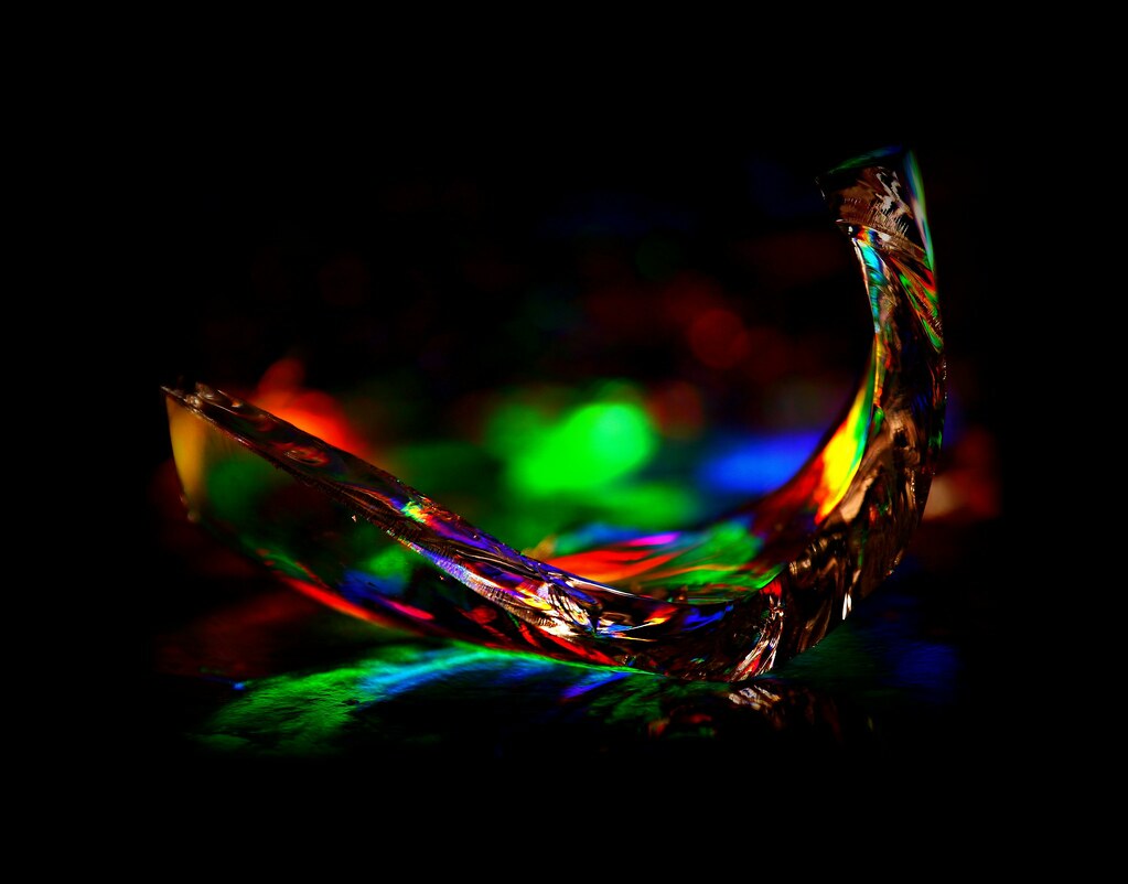
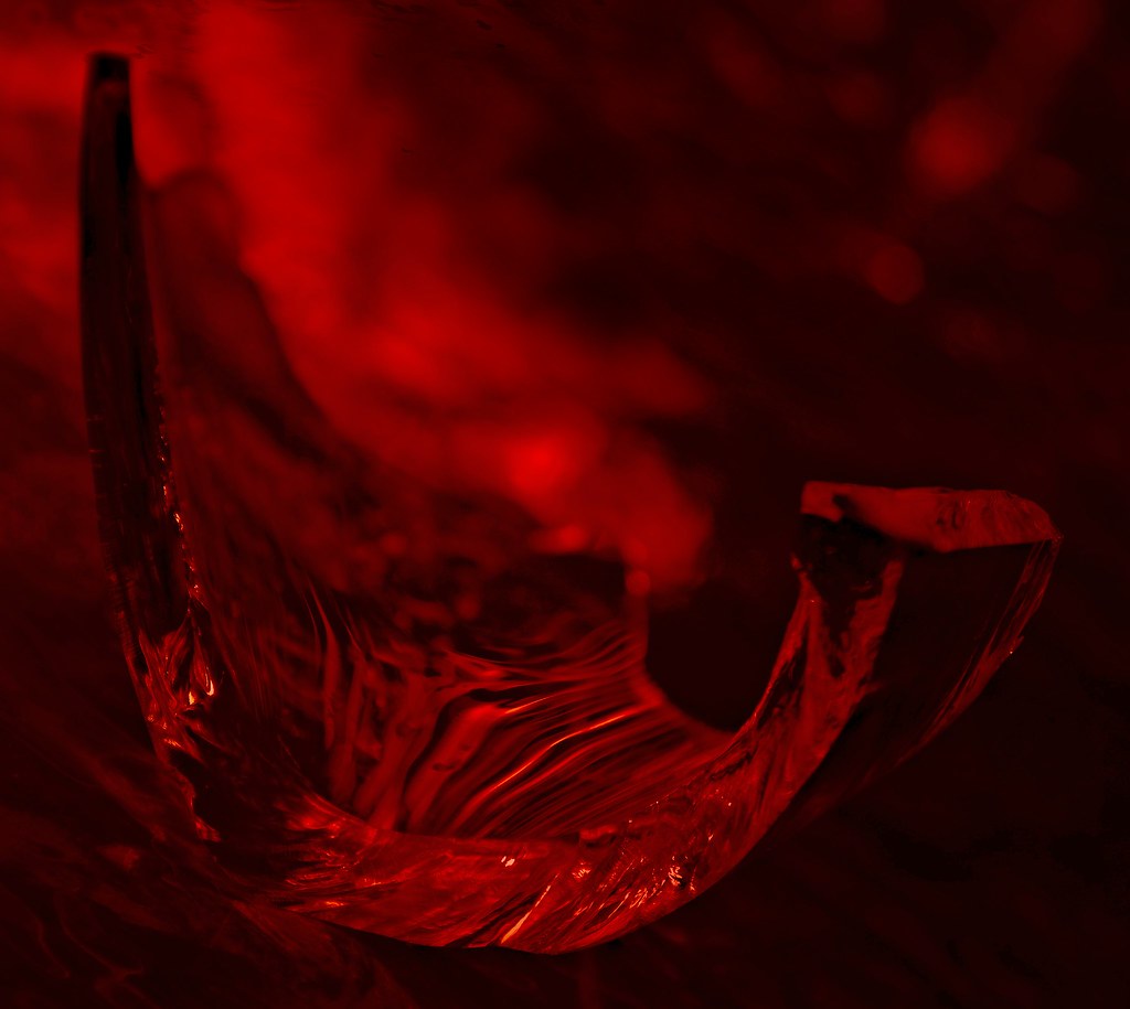

They are all just a broken shard from a clear wine glass that I've edited.
Last edited:
- Messages
- 7,499
- Edit My Images
- Yes
Excellent idea Susie these are great, all three are different and all three are very good
love the colours in the 1st, the pattern in/through the glass in the 2nd and the low key lighting through the glass in the 3rd
All look good for focus and detail............ I really can make mi mind up on a favourite
these are great, all three are different and all three are very good love the colours in the 1st, the pattern in/through the glass in the 2nd and the low key lighting through the glass in the 3rd
All look good for focus and detail
............ I really can make mi mind up on a favourite - Messages
- 4,182
- Name
- Paul
- Edit My Images
- Yes
Wow Susie, they're lovely images. My thoughts (which are not particular crit or anything, just thoughts as they come to me):
1. "On theme" for me as it's obvious we're looking at a piece of glass, although with the wonderful lighting my first assumption was it was a glass sculpture! The colours are stunning - focus must have been tough in the low light. Not sure whether slightly more DOF would have helped but it's a super image regardless. Composition looks good - difficult to know how else it could have been placed? A slightly higher POV shot might be interesting as well, giving a little more separation between the lights behind and the glass itself - could have given you more compositional options perhaps?
2. The most "on theme" for me, perhaps it's the red light which makes the glass look more dangerous and obviously broken? As an image, though, it has far less interest for me than #1 - I actually don't think the monochrome helps here TBH. The tight crop leaves little room for imagination wandering, either?
3. I love this one, but I wouldn't be able to tell it's a piece of glass without the explanation. I think this is a super image, although I would remain uncertain what I'm looking at! But I don't mind that - the light is fabulous (although is there a slight blowout middle left?) and for me, it's just absorbing. Almost the complete opposite of #2, where the mind is left with so many questions. Top notch! (but not on theme for me)
As a picture to hang on my wall and just stare at, it's #3 all the way. For a picture I really like still but think fits the theme perfectly, it's #1. Brilliant shots!
1. "On theme" for me as it's obvious we're looking at a piece of glass, although with the wonderful lighting my first assumption was it was a glass sculpture! The colours are stunning - focus must have been tough in the low light. Not sure whether slightly more DOF would have helped but it's a super image regardless. Composition looks good - difficult to know how else it could have been placed? A slightly higher POV shot might be interesting as well, giving a little more separation between the lights behind and the glass itself - could have given you more compositional options perhaps?
2. The most "on theme" for me, perhaps it's the red light which makes the glass look more dangerous and obviously broken? As an image, though, it has far less interest for me than #1 - I actually don't think the monochrome helps here TBH. The tight crop leaves little room for imagination wandering, either?
3. I love this one, but I wouldn't be able to tell it's a piece of glass without the explanation. I think this is a super image, although I would remain uncertain what I'm looking at! But I don't mind that - the light is fabulous (although is there a slight blowout middle left?) and for me, it's just absorbing. Almost the complete opposite of #2, where the mind is left with so many questions. Top notch! (but not on theme for me
)As a picture to hang on my wall and just stare at, it's #3 all the way. For a picture I really like still but think fits the theme perfectly, it's #1.
Brilliant shots!
OP
- Messages
- 7,548
- Name
- susie
- Edit My Images
- Yes
Excellent idea Susie
love the colours in the 1st, the pattern in/through the glass in the 2nd and the low key lighting through the glass in the 3rd
All look good for focus and detail
Thanks Phil...it 's been so nice this week to actually really enjoy doing my contribution. Glad you like them
OP
- Messages
- 7,548
- Name
- susie
- Edit My Images
- Yes
Wow Susie, they're lovely images. My thoughts (which are not particular crit or anything, just thoughts as they come to me):
1. "On theme" for me as it's obvious we're looking at a piece of glass, although with the wonderful lighting my first assumption was it was a glass sculpture! The colours are stunning - focus must have been tough in the low light. Not sure whether slightly more DOF would have helped but it's a super image regardless. Composition looks good - difficult to know how else it could have been placed? A slightly higher POV shot might be interesting as well, giving a little more separation between the lights behind and the glass itself - could have given you more compositional options perhaps?
2. The most "on theme" for me, perhaps it's the red light which makes the glass look more dangerous and obviously broken? As an image, though, it has far less interest for me than #1 - I actually don't think the monochrome helps here TBH. The tight crop leaves little room for imagination wandering, either?
3. I love this one, but I wouldn't be able to tell it's a piece of glass without the explanation. I think this is a super image, although I would remain uncertain what I'm looking at! But I don't mind that - the light is fabulous (although is there a slight blowout middle left?) and for me, it's just absorbing. Almost the complete opposite of #2, where the mind is left with so many questions. Top notch! (but not on theme for me
As a picture to hang on my wall and just stare at, it's #3 all the way. For a picture I really like still but think fits the theme perfectly, it's #1.
Thanks for looking Paul...I use my bathroom as a dark room
fortunately we have a long worktop in there which is very handy. I used just one small spotlight which I move around until I like what I see. I used my Raynox 150 macro lens.Number one is taken on a piece of iridescent card and I find that just by moving the camera around it creates lots of different colours through the glass...I did do lots of shots ...about 100
but that was the one in the end that I settled on.Number two did look similar to number one ...I took that on the card too but converted it to mono...I didn't like it much, so I then added the colour back in !!
Number three was a mono shot and I added a daguerreotype 'shiro' effect which I liked so I stuck with it. I suppose I could have cloned out the flare on the stem but maybe it would look too dull ....not sure on that. I think that's my favourite too.
Last edited:
- Messages
- 11,087
- Name
- Allan
- Edit My Images
- No
Hi Susie, three very good images, not sure which one either love the colours in the first and the third is very intriguing, I think the second is my least favourite but still very good.
Its nice to enjoy something rather than just produce something that fits a theme.
I still can't decide between 1 and 3
Its nice to enjoy something rather than just produce something that fits a theme.
I still can't decide between 1 and 3
- Messages
- 8,398
- Name
- Lynne
- Edit My Images
- Yes
Hi Susie
apologies for my late visit
Sharp...3 lovely abstract images......love the colors , & placement plus the light reflecting through on to the material in #1 ...I thought it was an ornament of some kind at 1st , lovely image but not obviously sharp to me at 1st glance though after reading your words I can see it is sharp
The red doesn't work for me ,mainly I think for the one color but again I can't see the sharpness
Te sepia toned one I really like for the subtle lighting , the tones & frame
Promise....superb Sky & very on theme.....how lucky are you living on the coast I've always believed that saying as well . Cloning the rail thing has been mentioned so no other crit from me
HAlf...like it , great use of DOF , lovely greeny browny tones, lovely detail in the seed head
Forgot the Spiders web...perfect for the theme , love the droplets...really well caught
apologies for my late visit
Sharp...3 lovely abstract images......love the colors , & placement plus the light reflecting through on to the material in #1 ...I thought it was an ornament of some kind at 1st , lovely image but not obviously sharp to me at 1st glance though after reading your words I can see it is sharp
The red doesn't work for me ,mainly I think for the one color but again I can't see the sharpness
Te sepia toned one I really like for the subtle lighting , the tones & frame
Promise....superb Sky & very on theme.....how lucky are you living on the coast
I've always believed that saying as well . Cloning the rail thing has been mentioned so no other crit from me HAlf...like it , great use of DOF , lovely greeny browny tones, lovely detail in the seed head
Forgot the Spiders web...perfect for the theme , love the droplets...really well caught
Last edited:
OP
- Messages
- 7,548
- Name
- susie
- Edit My Images
- Yes
Hi Susie, three very good images, not sure which one either love the colours in the first and the third is very intriguing, I think the second is my least favourite but still very good.
Its nice to enjoy something rather than just produce something that fits a theme.
I still can't decide between 1 and 3
Thanks Allan ...I'm pleased that you liked them, I do feel that buying my camera last year has opened up a wonderful new dimension in my life....not many days go by when I'm not taking a photo of something
OP
- Messages
- 7,548
- Name
- susie
- Edit My Images
- Yes
Hi Susie
apologies for my late visit
Sharp...3 lovely abstract images......love the colors , & placement plus the light reflecting through on to the material in #1 ...I thought it was an ornament of some kind at 1st , lovely image but not obviously sharp to me at 1st glance though after reading your words I can see it is sharp
The red doesn't work for me ,mainly I think for the one color but again I can't see the sharpness
Te sepia toned one I really like for the subtle lighting , the tones & frame
Promise....superb Sky & very on theme.....how lucky are you living on the coast
HAlf...like it , great use of DOF , lovely greeny browny tones, lovely detail in the seed head
Forgot the Spiders web...perfect for the theme , love the droplets...really well caught
Thanks for taking the time to look and comment on each one Lynne...very much appreciated
OP
- Messages
- 7,548
- Name
- susie
- Edit My Images
- Yes
Great stuff susie. I thought about doing broken glass ... dropping a wine bottle on the patio, but decided against it. Best leave that sort of thing to you.
#1 is a gloriously serious chunk of nasty beautiful sharpness.
Thanks d00d .... not the safest thing to be messing around with I must admit.
I love the last line of your comment
Last edited:
- Messages
- 1,412
- Name
- Elaine
- Edit My Images
- Yes
Three beautiful shots Susie! Love the fantastic colours you've caught in #1 and the ultra sharpness of the shard in #3. I think #2 is a great image in its own right, but somehow doesn't get the idea of sharp across to me as well as the others. The red colour and swirly shapes somehow put me in mind of magma flowing from a volcano.