You are using an out of date browser. It may not display this or other websites correctly.
You should upgrade or use an alternative browser.
You should upgrade or use an alternative browser.
9th visit to the 52's! COMPLETED!!
- Thread starter michael23
- Start date
- Messages
- 14,766
- Name
- Michael
- Edit My Images
- No
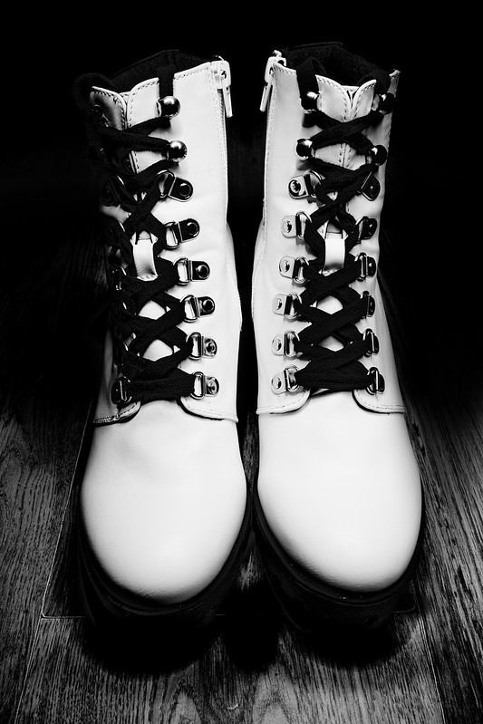
So to kick off 2019 here is my photograph for new.
3.2 second exposure and lit the the led torch on my phone, and opted on a black and white conversion. There are a few others if you click through to flickr but I keep coming back to this edit.
New Shoes
 IMG_3714 edit by Michael Johnson, on Flickr
3.2 second exposure and lit the the led torch on my phone, and opted on a black and white conversion. There are a few others if you click through to flickr but I keep coming back to this edit.
New Shoes
 IMG_3714 edit by Michael Johnson, on Flickr
- Messages
- 1,645
- Name
- Steve
- Edit My Images
- Yes
Hi. 9th 52, that's amazing!
Like your choice for this and looking through the others I agree it's the strongest. I like the contrast in the shot and the symmetry. It was also a good choice in my opinion to darken the right hand side in the edit.
The only tiny niggle is the corner of the darker piece of wood on the floor showing from under the left hand side shoe as we look.
Strong start to this year's 52. Good luck with the rest of the year.
- Messages
- 996
- Name
- peter
- Edit My Images
- Yes
I do like the contrast between the boots and the wood and I like the fade away to the background from the floor.
- Messages
- 199
- Name
- Walter
- Edit My Images
- Yes
Nice image Michael, thanks for details of lighting the subject good result.
Walter
Walter
- Messages
- 14,766
- Name
- Michael
- Edit My Images
- No
As soon as I looked in Flickr I thought!! They are not your boots. Like the high key type of shot with the little shadow at the front, plus the tones and texture in the wooden flooring.
Thanks for looking in Dave and the comments, appreciated as always.
Hi. 9th 52, that's amazing!
Like your choice for this and looking through the others I agree it's the strongest. I like the contrast in the shot and the symmetry. It was also a good choice in my opinion to darken the right hand side in the edit.
The only tiny niggle is the corner of the darker piece of wood on the floor showing from under the left hand side shoe as we look.
Strong start to this year's 52. Good luck with the rest of the year.
Hi Steve, 9th, its a challenege which helps keeps me going, I'm always drawn to returning! Thanks for looking in and commenting. Niggles noted
Like the lighting on this shot, how the wooden floor 'disappears' .... Good job!
Thank you Bob
I do like the contrast between the boots and the wood and I like the fade away to the background from the floor.
Thank you Peter.
Nice composition and the lighting is great. B&W works really well.
Thanks Clive, I was pleased with the black and white here.
Very nice, punchy image!
Like the symmetry and the contrasty look, and the wood grain really works.

Thanks Gareth,
Like the subject, like the black and white and like all the detail all around the image. I wasn't so sure about the shadow at the bottom but that's only a personal thing
On the board and looking good Michael
Thank you Ian.
Nice image Michael, thanks for details of lighting the subject good result.
Walter
Thanks Walter, the phone led does work quite well, I usually use my Olight torch with a diffuser on it, but I couldn't find it last night.
D
Deleted member 59779
Guest
Wow love this image it certainly draws your attention. Lighting is spot on to my eyes. Like the black background. Only niggle I have has been mentioned and I see you have taken note of it. Just the join in the wood . Look forward to seeing more of your images.
- Messages
- 14,766
- Name
- Michael
- Edit My Images
- No
Wow love this image it certainly draws your attention. Lighting is spot on to my eyes. Like the black background. Only niggle I have has been mentioned and I see you have taken note of it. Just the join in the wood . Look forward to seeing more of your images.
Thank you Mandy, pleased you like the image.
The look remarkably like my daughters new Ice Skating boots, they even appear to be off the floor in a similar way that they would be.
The Mono processing and high contrast approach works really well.
Thanks Tim, high contrast was certainly the way to go for this one.
Great shot, stands out so well looks great.
Thank you Jonathon.
I like the mono and the strong contrast. Looking at Flickr I too like this one most.
Thank you.
New
That works very well. There's no mistaking what the subject is. I like the black and white conversion, I don't think it would have quite the impact in colour.
Thanks Dominic, the colour version didn't really look right at all.
Super sharp shot Michael, I like the almost extreme b&w it works really well.
Thank you Susie, going as extreme as possible was the idea, thank you for looking in and commenting!
- Messages
- 14,766
- Name
- Michael
- Edit My Images
- No
I like a good black and white that has strong contrast like this. Good start to the year
Thank you Carl.
- Messages
- 14,766
- Name
- Michael
- Edit My Images
- No
Hi Michael, welcome back you 52 veteran! I do like this image; the high contrast, the symmetry and the tight crop combine to make it jump off the page. Good choice on all counts
Many thanks Andrea, pleased you like it! Very pleased with the start of this years challenge!
- Messages
- 14,766
- Name
- Michael
- Edit My Images
- No
Hi Michael, I think everyone has said it all really. Very nicely done. Like Tim, my first impression was of ice skates but I see from the others on Flickr that they have a deep sole. I think you picked the right one too
Thank you Georgina, yep they do a look like ice skates!
- Messages
- 616
- Name
- Ross
- Edit My Images
- Yes
Hi,
Nice shot to start off your (9th?! You must be a glutton for punishment) 52. Cool mono conversion and nice processing.
Nice shot to start off your (9th?! You must be a glutton for punishment) 52. Cool mono conversion and nice processing.
- Messages
- 14,766
- Name
- Michael
- Edit My Images
- No
Right, hoping this works. As I have no laptop charger, the replacement seems to be in a parrllel universe! With no thanks to royal mail or pc worlds know how service!
Anyway, to keep up to date I have transferred these via my Canon M50 witless function to my phone and then edited in snapseed and I have just discovered I can get the bb code off flickr via the phone browser.
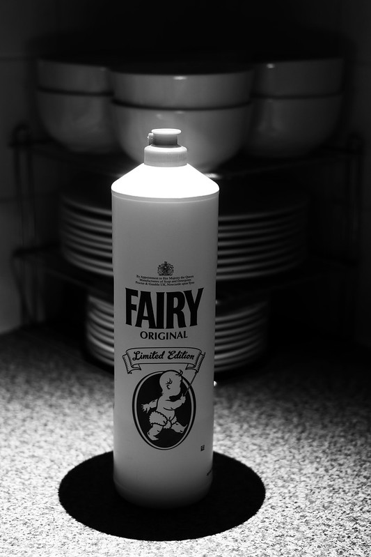
Clean, There is a highlight to the right of the bottle, I couldn't get the healing brush of snapseed to get rid. The top of the bottle is a little bright, but I kind of like it myself.
 20190123185343_IMG_3939-01 by Michael Johnson, on Flickr
And open
 20190123191716_IMG_3945-02 by Michael Johnson, on Flickr
Hopefully the images look OK having been edited on my phone.
Anyway, to keep up to date I have transferred these via my Canon M50 witless function to my phone and then edited in snapseed and I have just discovered I can get the bb code off flickr via the phone browser.
Clean, There is a highlight to the right of the bottle, I couldn't get the healing brush of snapseed to get rid. The top of the bottle is a little bright, but I kind of like it myself.
 20190123185343_IMG_3939-01 by Michael Johnson, on Flickr
And open
 20190123191716_IMG_3945-02 by Michael Johnson, on Flickr
Hopefully the images look OK having been edited on my phone.
Fuji Dave
I'm in Clover
- Messages
- 22,088
- Name
- Dave
- Edit My Images
- No
Hope you get the charger sorted soon.
Two very nice taken and edited images Michael, clean is a cool shot and like how it looks as though the fairy bottle has just come up out of the black circle.
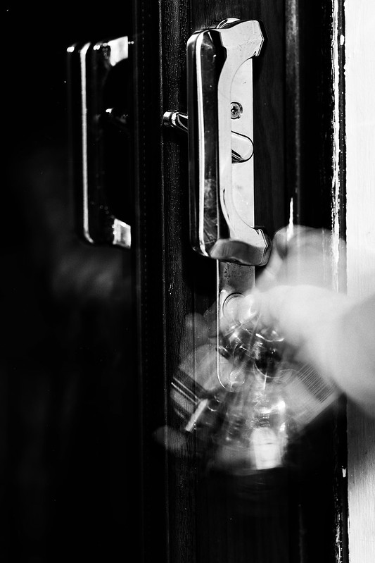
Open is a cracker as love the hand and key blur as imo it really adds more to the story. Both edits look very good and are fine for me
Two very nice taken and edited images Michael, clean is a cool shot and like how it looks as though the fairy bottle has just come up out of the black circle.
Open is a cracker as love the hand and key blur as imo it really adds more to the story. Both edits look very good and are fine for me
LC2
Negan
- Messages
- 10,454
- Name
- Tim
- Edit My Images
- Yes
Well done for battling the odds to get the images posted. Not sure I would have gone to that effort.
I find the fairy bottle itself a little underexposed, but given the tools at your disposal...
Open is much more to my liking exposure wise and nice n contrasty in B&W.

I find the fairy bottle itself a little underexposed, but given the tools at your disposal...
Open is much more to my liking exposure wise and nice n contrasty in B&W.
- Messages
- 996
- Name
- peter
- Edit My Images
- Yes
yes Its worked and 2 very good images I like the lighting on the fairy bottle.
- Messages
- 9,095
- Name
- Mandy
- Edit My Images
- Yes
9th 52 challenge on the trot wow thats impressive, good luck with the rest of the challenge.
New - love the boots, image is bang on for the theme.
Clean - good take on the theme love the composition i do find brightness on the top of the fairy bottle a bit to bright.
Open - bang on for the theme, like the fact you have managed to capture the movement when opening the lock.
New - love the boots, image is bang on for the theme.
Clean - good take on the theme love the composition i do find brightness on the top of the fairy bottle a bit to bright.
Open - bang on for the theme, like the fact you have managed to capture the movement when opening the lock.
- Messages
- 3,817
- Name
- Carl
- Edit My Images
- Yes
The fairy bottle is a good take on the theme, and I like that it's placed in front of a stack of dishes. I think the highlights are a tad hot on top of the bottle, but it's still great.
I like the movement in the open image, and it fits the theme perfectly.
I am really enjoying your use of strong contrast in your images, and I'm looking forward to seeing your image for week 4
I like the movement in the open image, and it fits the theme perfectly.
I am really enjoying your use of strong contrast in your images, and I'm looking forward to seeing your image for week 4
- Messages
- 4,659
- Name
- Pete
- Edit My Images
- Yes
Hi Michael
Finally got round to your thread.
New, pair of boots, first look they seemed a bit over exposed, but looking closer there is lots of details in the white area and detail can be seen in the black laces so well done on that.
Clean, The processing seems good given the problems you are having. What is the black circle around the bottle, too dark to be a shadow?
Open, nice image with movement which works well for the theme.
Pete
- Messages
- 1,645
- Name
- Steve
- Edit My Images
- Yes
Clean - I don't find the top to bright at all but do find the black circle underneath distracting, not sure what it is. I like the placement with the dishes in the background just being visible.
Open - Great shot, love the movement in the keys/hand and really tells a story.
Open - Great shot, love the movement in the keys/hand and really tells a story.
GarethB
Likes to peek
- Messages
- 2,291
- Name
- I don't even know anymore!
- Edit My Images
- Yes
Two jolly decent images there Michael.
Considering your pp limitations, the tones and contrasts turned out very nicely.
CLEAN is terrific! I love the lighting....the bright top contrasts very well with the dark shadow at the base.
Great mono processing, and the central composition works well.
OPEN is again very good! The motion blur is what really makes this image stand out - expertly captured!
Again, it's great in mono - nice contrast too.
Hope you get your laptop working again soon, though you've certainly produced the goods with 'less capable' equipment, that's for sure!
D
Deleted member 59779
Guest
Clean: Old fairy liquid style bottle. Lovely image. For me the highlighted top of the bottle leads you to the stack of dishes behind. I’m in two minds about the black circle at the base of the bottle in one way it helps the fairy bottle stand out more and in another way it looks like the bottle is disappearing into a black hole. Still really like this photo.
Open: Lovely low key image, emphasised by the movement in turning the key.
Open: Lovely low key image, emphasised by the movement in turning the key.
- Messages
- 14,766
- Name
- Michael
- Edit My Images
- No
Thank you everyone for those comments, I am very pleased the images have worked and how well they have been received. The "black hole" under the fairy liquid bottle is indeed a shadow,, I used the led torch on my phone for lighting again with the kitchen light turned off, I positioned the phone immediately above the bottle to get the effect.

