weekly BobBCN 52 (Wk 52 - BUSY added)

Hi Bob


Friendship...great film ,colors look good , only little niggle is the shadow on her face ( can't reall her name :bonk: ) Different take on the theme , works well (y)
 
Thanks for all the comments recently.

After a hectic week I have finally come up with something for change!! I haven't had time to comment on others as yet but I have browsed through to avoid doing the same.

Anyway, initially my idea was just a photo of my 1100D!! :LOL:

But whilst travelling to work I realised that everyday I have to change trains so why not something along those lines? (oops!) So here's part of the labyrinth of tunnels that I go through each day to get from one train to the next.


change by BobBCN, on Flickr​

It's SOOC apart from resize/contrast tweek. I thought the angled viewpoint was better than other straight ones I took.

And sorry for the lengthy explanation, but without it people may think that 'change' refers just to the yucky colour scheme!!
 
Who's Bib? :LOL:

Other than that I agree with DK. For me it's the jaunty angle that makes it. I don't even mind the blown light at the top. It all adds up to make a great shot.
 
have to agree the angle makes the picture and it feels quite art deco
 
Can't think of anything for natural. Well, I can but the woods are far away!

Anyway, maybe later ........

For now though, I have a new change shot.

Here in Catalonia there's definitely a desire for change as most Catalans hope for independence from Spain. The flag which depicts this desire is known as the ESTELADA or starred flag. There are thousands still hanging from balconies at the moment - I say still because usually they go up on the 11th September which is the Catalan National Day. Well, to cut a long story short ..... my original idea for change was one such flag but in the end I went for the 'changing-trains-underground-tunnel' shot.

However, this morning I spotted this one and the visual pun jumped out at me. The flag is there demanding independence/separation, in a street called Union!

No offence intended to any Catalan people of course, just a curious juxtaposition . . . . .


changes by BobBCN, on Flickr​
 
Good spot. Like that. Helps that the flag is folded rather than hanging free. Maybe abit too tight at the top for my taste.

Cheers Alan, good point about the top being too tight. Thanks.


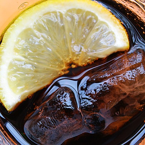
And exactly a week late, here's my Natural. It dawned on me this morning whilst staring into my glass of Coca-Cola. I was probably thinking how much in the glass was actually natural ... and bingo ... out came the Canon.


Ice and Lemon by BobBCN, on Flickr​


Suffice to say, it tasted great!
 
Hi Bob

I like your subject choice for Change & the description of "why " its for the theme.....but the angle is killing my OCD for straightness . Apart from that I like it , nice n sharp , well exposed considering the bright lights :)

Your flag shot for change , great colors in the flag ,almost looks like it's been sc'd...bit tight at the top as mentioned previously

Natural , great diea...it' natural to have coke ,lemon n ice together(unless you're me & don't have lemon or ice :LOL: ) Coke nicely in focus with the cubes, I'd have liked the lemon slice in focus as well as thats the natural bit ?
 
natural - good idea and on theme, I would like to see what a wider crop would look like, as Lynne says the pov and focus seems to be more on the ice cubes, although they are natural too :LOL:
 
I didn't immediately get the natural theme but as a photograph it works compositionally and appears well lit although a larger DoF would have helped in this case.
 
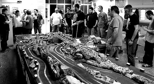
Been struggling all week to think of something for AGE and now along comes SPREAD!! Really digging deep with this one .....

They were taken at the slotcar club I go to, proving that you're never too old to start playing with toy cars ....... it fits the theme but that's about it I'm afraid, blown areas, chopped bodies in the b/w etc etc I prefer the colour shot personally.

Oh well, at least SPREAD can't be worse ......


AGE by BobBCN, on Flickr


AGE2 by BobBCN, on Flickr​
 
A very good idea for natural. Spread, prefer number 2, and my that would be fun! Very fitting fir the theme.


Yes! Well spotted Michael! I thought about the tracks while I was looking for something for SPREAD. But I hadn't done AGE and then I thought that they worked for that because of the 'second childhood' idea.

Looks like you spotted SPREAD before AGE! (y)
 
Once again, thanks for the comments!

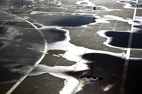
Well, just in time, here's the real SPREAD. The sun came out after a shower leaving this puddle pattern on the outdoor basketball court, but the sky was turning dark again in anticipation of another downpour.

SPREAD


puddles2 by BobBCN, on Flickr​
 
Hi Bob,

Hope you're keeping well and well done for hanging in there.

Natural - nice crisp sharp shot, lemon looks very refreshing.
Spread - Intriguing water pattern bang on theme for spread, may look better in black and white but not sure - like it !
 
Hi Bob

neat thinking for Age...you're never too old for toys :LOL: #2 for me...cleaner shot of the track , like the group of lads at the back & great colors ...always difficult to get shots at events like these I suspect so you've done well (y)

Spread....hmmmm...think I agree with Nick...B&W might just work better , nice abstract image though :)
 
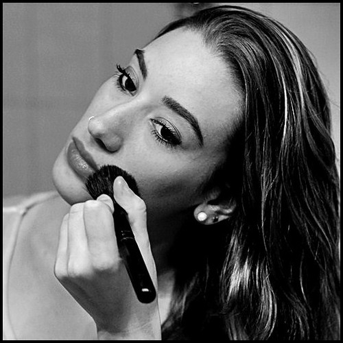
The TOGETHER theme struck me as a bit similar to DUO as straight away I thought of things that go together, as a pair etc. Anyway, decided against that idea only to fall back on it after coming up with nothing!

So, to cut a long story short ...... here are two things which are seldom apart .... my daughter and her make-up stuff! :LOL:


Together by BobBCN, on Flickr​
 
Cheers, Michael! (y)

Yes, I thought about that, too. It's actually a mirror reflection and so in some of the shots I would have needed to clone part of me out of it. What you can see is actually part of the shower (and the tiles) and I had to crop right in to reduce the distraction.
 
ah your daughter is beautiful, and she lets you take her picture - so lucky :) only crit I have is the white mark near her nostril. Is it a nose stud? You can only just see it but I would clone it out :clap:
 
Thanks for the compliment Summer! I'll tell her: she'll be chuffed!!

Yes, the nose thing - it's a ring I believe, but sometimes it's a stud. I can never keep up with all the variations. Didn't think of cloning but I get your point.
 
Together - nice portrait which i think works really well in monochrome. I wouldn't have got the connection without your explanation but women and makeup do go together. Nice work.
 
Hi Bob, I like your use of black and white it helps you to focus on the model and not the background. The tilt of your models head and her expression are great as well! What beautiful eyes your daughter has!!:)
 
Back
Top