weekly ChickenDipa's 52 week 2012 Colour + Shadow added

hi Alex,

On theme for Vice, #2 & #3 prob the better out of the 3....I would go for #3 as my favourite..
 
Yeap, im leaning towards number 3 too, has more going on and you can see they are betting slips! :D
I thought the first one was just a gathering on blokes, until you said what it was... :D
 
Magical - First one is the better one, love the idea but as said it's a shame the ears have been lopped off.

Vice, for me the 3rd one is best as it feels seedy and desperate

Magical - I like #1. As has been said it's a pity about the ears but the image made me smile.

Vice - Nice set with #3 being my favourite for the theme.

Going to re-take the bunny one this weekend. Has got a good reaction so worth it I think.

Thanks for the vice comments, its my favourite too.

Hi Alex


#3 for me....looks a bit more in keeping with the theme , nice capture from your night out (y)

Glad to get a shot whilst out, just wish it had dawned on me earlier :wacky:

Hi Alex, I'm tied between #1 and #3. The pillar is a little distracting but it might look odd without it! #3 is prob a better one to show the theme but I prefer the atmospere of #1!!:)

The pillar one was odd, didnt notice it when I took it. Will post it up without and see.

Thanks all for popping by!

Without pillar


Vice 1a by ChickenDipa, on Flickr
 
Last edited:
hi Alex,

On theme for Vice, #2 & #3 prob the better out of the 3....I would go for #3 as my favourite..

Yeap, im leaning towards number 3 too, has more going on and you can see they are betting slips! :D
I thought the first one was just a gathering on blokes, until you said what it was... :D

#1 is not as obvious I guess unless its somewhere you frequent alot!

Thanks for the comments both.
 
Oooohh...yum yum yum...Thorntons are to die for & very much a vice of mine so have to love your shots (y)

#2 for me.....though maybe tempted to crop just below the foil wrapped one ?

You seem to be having fun with the new camera :clap:
 
Number 3 for me, deffo! I like the angle and the fact that there are so many slips its obviously someone's vice!
 
Hi Alex

Magical - #1 is imaginative take. Cute bunny and cute man and spot on theme for me. Agree with others about ears and chair - but you are rigth - it is OK(y)

Vice - I think #3 is the best shot for the theme and is well taken for focus and dof. The chaotic nature of the slips adds to the theme as well.

#1 is a good effort. I find it hard to incorporate people into the themes and it is refreshing to see it because generally we cannot pose them as we weould an inanimate object.
 
Oooohh...yum yum yum...Thorntons are to die for & very much a vice of mine so have to love your shots (y)

#2 for me.....though maybe tempted to crop just below the foil wrapped one ?

You seem to be having fun with the new camera :clap:

Its a good box selection this one, on offer at the moment too. The things we do for photography :whistle:

Thanks for the comment and yes enjoying having my own camera :D

Number 3 for me, deffo! I like the angle and the fact that there are so many slips its obviously someone's vice!

Hi Alex

Magical - Love the first one (wont mention the ears)... lovely looking bunny, and a nice touch with the Lego man and hat

Vice - No:3 for me, looks more of an addiction in that shot, nicely done

Vice
another one for number 3 from you original shots, and number 1 from the new shots.
Like the DoF.

Hi Alex

Magical - #1 is imaginative take. Cute bunny and cute man and spot on theme for me. Agree with others about ears and chair - but you are rigth - it is OK(y)

Vice - I think #3 is the best shot for the theme and is well taken for focus and dof. The chaotic nature of the slips adds to the theme as well.

#1 is a good effort. I find it hard to incorporate people into the themes and it is refreshing to see it because generally we cannot pose them as we weould an inanimate object.

Hi Alex, numbers 2 and 3 for me, leaning more towards 3, but I do like the black and white used in 2. I would be tempted to do a tighter crop of the chocolates in number 1.

#3 has turned out to be alot more powerful than first imagined. Thanks for the positive comments and visiting.

Thanks Alan for the comments on #1 I thought the people shot would be a bit different and have not really come close to getting a real person into my shots so far, wish I had taken a few more but there was betting to be done and the queue for the Tote was massive.

Did not manage to reshoot my bunny shot today but I am aiming too. She wants more carrots as payment though or something...
 
Hi Alex. I can't chose between your magical shots! I like the bunny with the magician for humour value (the chair is a little distracting though) and I like the DOF in number two!
I look forward to the reshoot.

I was then undecided about which vice shot I preferred when you posted some choccies, yum! The sad thing is I guessed they were Thorntons before I saw the writing on the gold wrapper! I
Prefer number two but think the blurry choc at the front could be cropped out!

Chocolate is always a winner in my book(y)

Thanks Marsha for the comments. The reshoot is still on the list of things to do, will do it soon!

I've gone for #3 of the first bunch as my Vice representation. Though the chocolates did tempt me....just decided to eat them! Thought of you yesterday - York Chocolate Festival :D

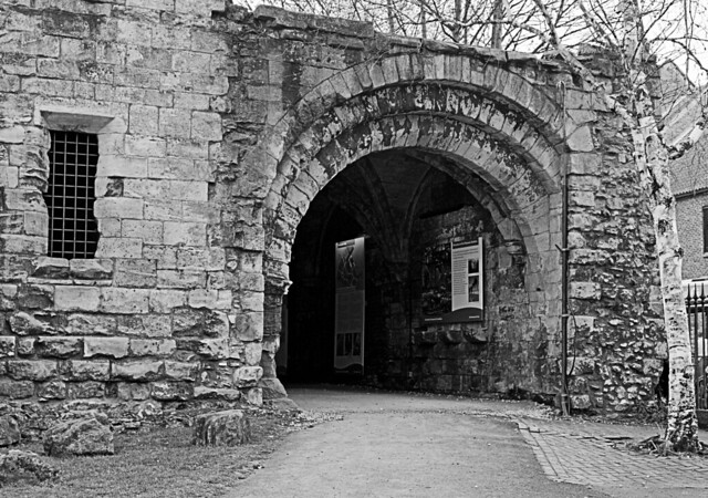
Seem to have had a busy week, had a couple of ideas for Entrance but did not manage to get them. Went to York yesterday and a few opportunities presented themselves. So heres my 'entrance'.

Taken in the Museum Gardens, I liked this particular entrance and the path leading up towards it. Did get a couple of others but decided on this one.


Entrance_HP by ChickenDipa, on Flickr
 
Hi, Alex, OK....what do we have...:D

Magic...took me a second but made me laugh....:LOL: First thing I noticed was the cropped bunny ears. I suspect there isn't a lot of colour in there so B&W is a good choice. Chair is an issue and I'd have removed the table cover (and Jon's biscuit crumbs :D). Perhaps the hat in front of the bunny.

Magic #2 is OK, but compared to #1 lacks. Looks nice and sharp. Also table and cover.

Vice #1 for me...but you should have got much closer...:D. Crop in closer, for me to exclude the LH post and some of the floor. B&W maybe? 1/30th hand held..not bad but maybe a bit faster?

Entrance. B&W again is nice. Not an easy one to compose...step right and pan left slightly to exclude the tree, maybe. Can't tell if you're knelt down but looks like it. D90 as well....:clap:

Good show...how is the D90 going by the way?

Cheers.
 
Thought of you yesterday - York Chocolate Festival :D
There's a festival? Why have I not heard of this? Maybe I'll put that in my diary for next year;)

Entrance - The mono works for me too. I like the tree, I think it frames the entrance quite nicely. I would maybe crop the right side close to the base of the tree to cut out some of the building on the right. I would also consider cropping the bottom slightly to lose the rock lower left and frame up the the roots of the tree:thinking:
 
Hi, Alex, OK....what do we have...:D

Magic...took me a second but made me laugh....:LOL: First thing I noticed was the cropped bunny ears. I suspect there isn't a lot of colour in there so B&W is a good choice. Chair is an issue and I'd have removed the table cover (and Jon's biscuit crumbs :D). Perhaps the hat in front of the bunny.

Magic #2 is OK, but compared to #1 lacks. Looks nice and sharp. Also table and cover.

Vice #1 for me...but you should have got much closer...:D. Crop in closer, for me to exclude the LH post and some of the floor. B&W maybe? 1/30th hand held..not bad but maybe a bit faster?

Entrance. B&W again is nice. Not an easy one to compose...step right and pan left slightly to exclude the tree, maybe. Can't tell if you're knelt down but looks like it. D90 as well....:clap:

Good show...how is the D90 going by the way?

Cheers.

Thanks for stopping by and the comments Andy. My bunny wasnt really in the mood to be photographed. I definitely want to redo it as I like the idea.

The vice ones at the track were taken by little Nikon so not too much control over the settings.

Not knelt down but down a slope, I wanted to spend a bit more time on this one but it nearly turned into a spot the togger shot. Central York with many many tourists walking around :-( The tree seemed like a good idea at the time, may recrop it.

Loving the D90 and having my own camera. Using the oldie lens that came with it and a 35mm one (Jon got a 50mm). Looking forward to some more shots on Monday :)

There's a festival? Why have I not heard of this? Maybe I'll put that in my diary for next year;)

Entrance - The mono works for me too. I like the tree, I think it frames the entrance quite nicely. I would maybe crop the right side close to the base of the tree to cut out some of the building on the right. I would also consider cropping the bottom slightly to lose the rock lower left and frame up the the roots of the tree:thinking:

I did not know until last Sunday, worth going. Found somewhere that sells the best hot choc. Yummy.

Thanks for the comments.

Black & white suits this. Good picture.

Thanks very much!

Now on to soft...
 
Soft - I have an idea I am yet to execute. Forgot to get the props so will have to wait until next week.

In lieu of that shot here are a couple of others I have taken this week that I think say soft

Another one taken in York whilst on the Chocolate and Sweet Tour

Soft 1 by ChickenDipa, on Flickr

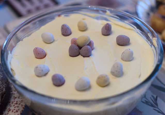
Was not intended to be a submission for this weeks theme, just a record of my trifle creation which I made for Easter lunch at my mums. I like how the colours have come out and it was pretty soft and yummy :)

Soft 2 by ChickenDipa, on Flickr

All a bit foody, and my idea still to shoot has a sweet theme!
 
Hi Alex

Entrance - good composition except for the right hand edge. Many talk of cropping but posiview suggests a different viewpoint - both have merit. I think that the tree is ok ,adding to the curve of the entrance and pointing in that direction but the more modern building on the rigght seems out of place both in the photo and the theme.

Soft
#1 - On theme and rather gloopy:D. Top of circular machine is cropped off and i don't know whether that was intended or overlooked

#2 - surroundings are a bit mixed and distracting. I would have preferred to have seen the front eggs in focus as well. Good idea but lacks a bit of punch ( or did you put sherry in the bottom?;))

But in any event I see that you are gong with another idea as well. Look forward to seeing it.
 
Good morning Alex

Entrance the B and w works for me think i may have tried to crop out the fence on the RHS but thats me.

Soft 1 yes you've chopped the top of the machine (was this at Terry's) and i think if it was me i woud have concentrated on the chocolate falling in to the bowl and got rid of all the stainless.

Soft 2 its already been said that the background is a bit distracting
 
I have to admit that neither of the soft shots are doing anything really for me, though I do like the mini eggs on the trifle, great idea :)

Technically wise, number one's crop as has been mentioned, detracts from the shot as does the expanse of the stainless.

number two has a cool colour cast I think and is quite closely cropped.

Looking forward to your planned shot though.
 
Entrance, yes I agree it needs a slight crop on the right, but other than that think it's a great shot.

Soft, definately number 2 for me. The background is a little busy perhaps, but your DoF has dealt with that reasonably well. Love it!
 
Thanks for the comments all. As mentioned, my soft shots are shots that became soft after taking them really, not planned theme shots but just shots! Got my props to try a couple of other ideas tomorrow whilst I try and think about 'Pride'.....

Cropped Entrance

Entrance crop_1 by ChickenDipa, on Flickr

And #1 of soft. Messed with the colour a little, not sure if I am keen.

Soft crop by ChickenDipa, on Flickr

Soft, definately number 2 for me. The background is a little busy perhaps, but your DoF has dealt with that reasonably well. Love it!

Soft #2 is pretty much how I wanted to turn out, wanted to focus in on the middle eggs, get a close crop and get the DOF.

Soft 1 yes you've chopped the top of the machine (was this at Terry's) and i think if it was me i woud have concentrated on the chocolate falling in to the bowl and got rid of all the stainless.

Not at Terrys, at a small Chocolate shop in the centre. Tempering chocolate out in the open of the shop. Very tempted to just stick my finger in.
 
Prefer the entrance crop, was thinking more along these lines for the shot on the chocolate, i'll take it down if you want me to, just to focus on how soft it looks when it falls


alex soft by jalizcazan, on Flickr
 
Entrance - Nice shot. Agree with a crop on the RHS so your editted version is a winner for me

Soft - Yummy looking chocolate. I must say I prefer the trifle shot and like the colouring although maybe the DoF is a bit too shallow to get all the eggs in focus.
 
Thanks Liz, no need to take down. Thanks for the crop and your take on it. I do prefer the wider shot of the chocolate just because it has more chocolate in it!

Entrance - Nice shot. Agree with a crop on the RHS so your editted version is a winner for me

Soft - Yummy looking chocolate. I must say I prefer the trifle shot and like the colouring although maybe the DoF is a bit too shallow to get all the eggs in focus.

Pleased that I did the edit of entrance, it has worked out well.

Thanks for the soft comments, I have work to do on that theme still!
 
Soft not working for me, (well except making me want to eat chocolate!), look forward to seeing your update.
 
Here are 3 more for soft, completely different takes on the theme

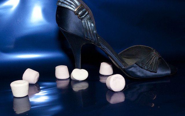
This idea was better in my head than it was in practise. The shoe kept tilting and not sitting right. I kept eating the marshmellows whilst 'thinking' about the composition :)

Soft Shoe 1 by ChickenDipa, on Flickr


Soft Bottle 2 by ChickenDipa, on Flickr

Soft poochie, he had a shower so was lovely and soft. Also I think it captures his soft mouth.

Soft Terry by ChickenDipa, on Flickr

My last bunch for soft promise! I think I am leaning towards #2 for my submission this week just because its a bit of a different shot.
 
Last edited:
I'm quite liking the runny melted choccie! Not a fan of the marshmallow shot, the shoe puts me off really and it just seems a little random! I would have tried to stick with just the mallows.

Nice idea with the fabric conditioner, I love the colours.

Number three wins it for me, what a lovely looking dog, I love their soft mouths!
 
Hi Alex


little catch up from me...'pologies for not getting here sooner :crying:


Entrance.....quite liked your original shot....but your cropped verison works much bette & has more punch...nice edit girlie :clap:

Soft...ye gods...so many choices :LOL: Has to be the 1st version of the chocolate mixing /pouring device....hits the theme , colors look good & focus look good ....added to which it's chocolate :D

That said I do rather like your doggie shot (y)

The fabric conditioner image...like the colors & the reflection & again on theme but hmmm :thinking:

You seem to be having fun with the new camera (y)
 
I think my fave soft is poochie :) all dogs are softies :LOL:
 
Thanks for the comments guys. I am having fun with the camera which is why I was so cheesed off at myself for not making last Monday Lynne!

I am not overly happy with any of the pictures this week which is why there is so many! For the theme though I think the fabric softener or doggy will make the grade.

I am working on pride but been unable to find the props I need. 1 more trip out today and hopefully I'll be sorted.
 
I think I still prefer the trifle one. The shoe is a great idea, but I think the lighting is too harsh to make it the best.

So, yes, twifle gets my vote :)
 
Last edited:
Soft-I like your dog image looks a real cutie the only thing is his paws arecut off I think this is the best image out of the three. Nice work Nick
 
He had mucky paws :)

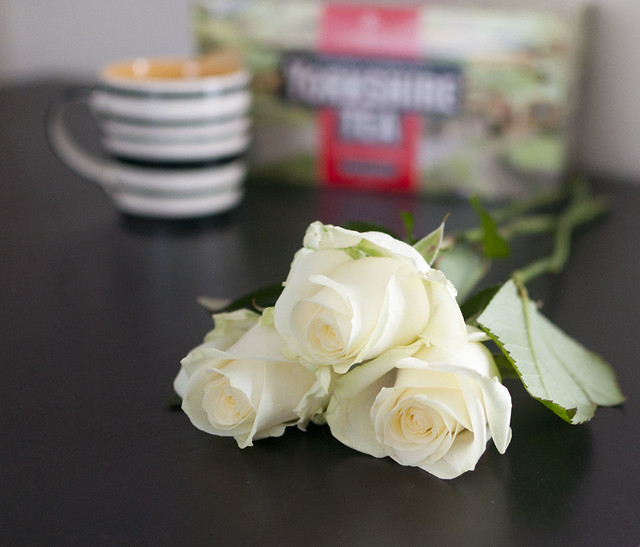
So after having this idea in my head all week I finally found the right props today. Here is my take on Yorkshire Pride and I am proud of being from Yorkshire. I took a few shots but I think this one says what I had in my head the best. If I had hung on until tomorrow there may have been a Yorkshire pudding in there too but decided this was enough :D


Yorkshire Pride by ChickenDipa, on Flickr
 
Nice one. I have to say I prefer York 4, because the box isn't cropped.

Nice depth to retain detail in the box, nice low angle, nice tea.

I'd just prefer the RH leaf wasn't there. I also suspect having a nice clean BG would improve.

Oh, did I say...nice tea!!

Cheers.
 
Back
Top