
You are using an out of date browser. It may not display this or other websites correctly.
You should upgrade or use an alternative browser.
You should upgrade or use an alternative browser.
weekly d00d's 52 in 2014 ... Week 51 : Extravagant
- Thread starter d00d
- Start date
OP
- Messages
- 9,081
- Name
- David
- Edit My Images
- Yes
Hi guys ... thanks for the feedback ... I like (slightly, intimately) backlit objects but have been told before about them looking flat, so must bear that in mind.
This was taken at home ... plastic cup on a box on top of a table, same height as the mantelpiece where there's glittering christmassy things inc. a string of tiny white lights, and a big mirror above.
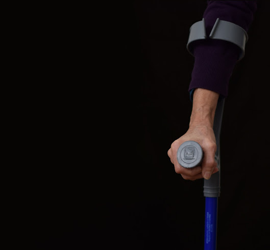
The marigold inflated and sealed with freezer bag clip. What fun.
This was taken at home ... plastic cup on a box on top of a table, same height as the mantelpiece where there's glittering christmassy things inc. a string of tiny white lights, and a big mirror above.
The marigold inflated and sealed with freezer bag clip. What fun.
- Messages
- 13,760
- Edit My Images
- Yes
Hi David ")
Nonsense - LOL that is a real odd idea indeed, very bizzar, good DoF, nonsense indeed
Nonsense - LOL that is a real odd idea indeed, very bizzar, good DoF, nonsense indeed

OP
- Messages
- 9,081
- Name
- David
- Edit My Images
- Yes
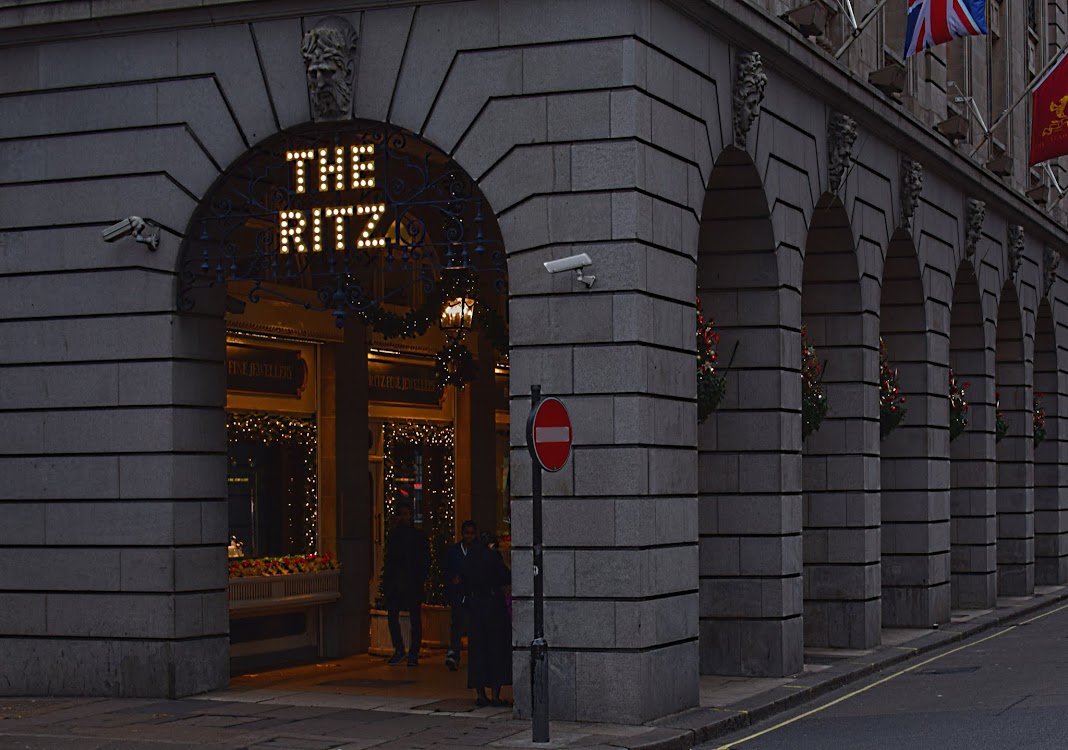
With 5 stars in mind for Extravagant, I took a trip up the West End mid/late afternoon yesterday ... Claridges & The Dorchester were both disappointingly difficult due to obstructions and not having a wide enough angled lens. So this, I think unusual, shot of The Ritz it is!
Week 51 : Extravagant
Week 51 : Extravagant
OP
- Messages
- 9,081
- Name
- David
- Edit My Images
- Yes
Thanks Alan. I arrived at the scene a little early, it was just dark enough for the sign to be lit but my aim was to shoot at dusk or dark. In PP I used Curves which made it look darker whilst increasing the artificial light contrast.
Last edited:
- Messages
- 13,760
- Edit My Images
- Yes
Hi David
Liking your thought with this one, and your aim to get there in low light, good that it is not busy, there are a few distracting elements but not really anything you could do with them (No entry sign dead centre Etc) liking the arches leading away to the right and the illuminated sign, you did well with the minimal light
Liking your thought with this one, and your aim to get there in low light, good that it is not busy, there are a few distracting elements but not really anything you could do with them (No entry sign dead centre Etc) liking the arches leading away to the right and the illuminated sign, you did well with the minimal light
- Messages
- 4,088
- Name
- Graham
- Edit My Images
- Yes
the arch to the left is good, and as DK says the receding line to the right works really well, like teh people to give a sense of scale.
I also though a touch dark, but if that was your intention, then cool.
great job getting all the verticals so. That would have been a problem had they not been .
I also though a touch dark, but if that was your intention, then cool.
great job getting all the verticals so. That would have been a problem had they not been .
- Messages
- 8,398
- Name
- Lynne
- Edit My Images
- Yes
Hi David
like your nonsense shot......fun & well focused
Extravagant .....can't really add to what othets have already said....bit of a cop out I know but really can't add anything useful so just from me
like your nonsense shot......fun & well focused
Extravagant .....can't really add to what othets have already said....bit of a cop out I know but really can't add anything useful so just
from me- Messages
- 4,834
- Name
- Alan
- Edit My Images
- Yes
Hi David
nonsense - creative idea and like the comp. Like the backlighting and the glittery bits at the bottom - less do the thingy in the b/g behind the glove. Clever stuff
Extravagant - good positioning for the shot with the receding arches to the right. A bit underexposed i feel
nonsense - creative idea and like the comp. Like the backlighting and the glittery bits at the bottom - less do the thingy in the b/g behind the glove. Clever stuff
Extravagant - good positioning for the shot with the receding arches to the right. A bit underexposed i feel
- Messages
- 1,411
- Name
- Elaine
- Edit My Images
- Yes
A very extravagant idea  The level of light looks just right to me and I love the perspective of the colonnades
The level of light looks just right to me and I love the perspective of the colonnades - Messages
- 9,095
- Name
- Mandy
- Edit My Images
- Yes


- Messages
- 4,182
- Name
- Paul
- Edit My Images
- Yes
Hiya David
Extravagence: well that's definitely on theme. The dining room even more so, TBH, but I'm not sure what they're like about you stepping in just to take photos. A little birdie also tells me their suites are fairly opulent too As far as the image goes, the composition is very nice for me: don't mind about the road sign and the only other option I would have seen would have been to use an even wider angle and get closer to that near arch and "The Ritz" sign but still keep the right side arches in as a leading line (and perhaps capture more of them with a UWA). But it's great as is, compositionally. For me it could do with perhaps a stop more exposure, but that may well have been the real conditions: gloomy and perhaps about to rain? Good image.
Only one to go!
Extravagence: well that's definitely on theme. The dining room even more so, TBH, but I'm not sure what they're like about you stepping in just to take photos. A little birdie also tells me their suites are fairly opulent too
As far as the image goes, the composition is very nice for me: don't mind about the road sign and the only other option I would have seen would have been to use an even wider angle and get closer to that near arch and "The Ritz" sign but still keep the right side arches in as a leading line (and perhaps capture more of them with a UWA). But it's great as is, compositionally. For me it could do with perhaps a stop more exposure, but that may well have been the real conditions: gloomy and perhaps about to rain? Good image.Only one to go!
- Messages
- 6,502
- Name
- Peter
- Edit My Images
- Yes
Nonsense - An amusing take on the theme. I think the central positioning works on this as does the bright background which almost gives it a sense of a realistic setting
Extravagant - A bit too under exposed for me I'm afraid although I see what you were trying to achieve for the theme.
Extravagant - A bit too under exposed for me I'm afraid although I see what you were trying to achieve for the theme.
- Messages
- 1,411
- Name
- Elaine
- Edit My Images
- Yes
Works well! A very effective shot and a great end to the year
- Messages
- 13,760
- Edit My Images
- Yes
How did I miss your last shot, for me it doesn't need anything on the LHG side, I like the negative space, a great finish


