weekly David Tennant's TP52 2015 Week 11 Crowd Reshoot and Week 13 Machine Added

Not sure whether it is because I am on kindle or not but couldn't access your linky kept getting a blank page. Hopefully someone can confirm one way or the other for you. (It's the only one I've had oroblems with).
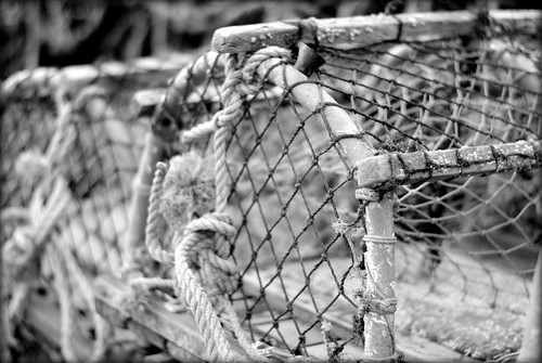
Plenty of pattern in the shot. Would be good to see the colour version.
 
Nice opening image and as Mandy says your link in the photo thread is blank and is not redirecting to your thread?
Good Luck for your 2015 52 challenge.
 
Hi David,

Welcome aboard. It's good to have you here and I hope you're going to enjoy the next 52 weeks.
I've just popped into the 'photos only' thread and fixed the link for you, so all should be good to go now :)

Nice start to the project too.
Good tones and contrast which make for a strong B&W conversion, effective DoF and nice clean crisp image.
The patterns are there, but I wonder if you could have made a bit more of them - maybe by getting a bit closer up to the mesh to focus in on that or maybe if there was a big pile of pots stacked there, taking a wider view and showing the repeating patterns of the curves and shapes.
Thanks for the comments.

What did I do wrong with the link so I know for next time?
 
Hiya David, that's a great shot of the lobster pots. I agree with Sarah that it would be even more "patterny" if you were able to capture more, but as an image it works very well as is. I like your choice of contrast and DOF and the composition is elegant.

All in all, a very good first submission... keep it up :)
 
Really like this shot, saw it on Flickr earlier, stood out, lovely and clear too!
 
welcome David

I like lobster pots, but .... TBH the image is a bit small, too tightly cropped and grey.
 
That's a great start David. The mono conversion suits the subject well and the DoF has been controlled well and for me is sharp where it need to be.
 
Thanks for the comments. If anything I would have like a slightly larger DoF.

Struggling a little with Bliss but took a couple of shots yesterday which might be suitable, will have a look at them tonight and upload one. Did also take some nice ones of my son yesterday which would fit the bill but I don't post any of him online so can't really use them.
 
Off to a great start, I'd say ! Fantastic image ! the shallow dof looks good to me. (y)
I like a nice pot shot ! but then, I like all things nautical.
All the best with the challenge, looking forward to viewing more from your 52. :)
 
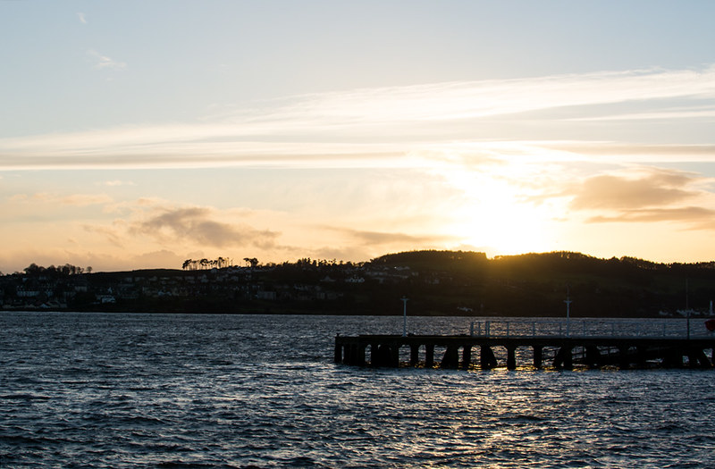
I'm afraid the actual submission doesn't quite work for me.
I can see how it fits the theme, but there is no real focal point just almost two straight lines,
with the jetty and the hills. The processing I feel is also a bit flat.
Sorry about that ;)


But actually your lad with the camera works well,
I love the artistic, slightly leaning way that he's standing too.

Watch out dad he's gonna cost you a fortune in a few years :D
 
Hi David... first Bliss shot for me isn't my favourite I'm afraid. I like the idea of shooting into the sun, but too often I find it ends up weakening the image way beyond what I had in my mind. I'm about to "invest" in some ND grads to have a play a bit more with these sorts of high contrast scenes.

The second one is a cracker - we have the same camera for our 3yo son and he loves it too. I like the angle (not being level works better for me with this sort of shot) and it's great you have him taught to use the viewfinder rather than the LCD ;) Nice lighting on his hair and a good bit of bokeh in the background above his head. All in all, it's a cracker (the picture and the son :))
 
@Cobra @pjm1 @Happysnapper79

Thanks very much for your comments.

I completely agree with all your comments above. I was going to submit the photo of our son originally but we don't normally put photos of him online but changed my mind with this one.

He always uses the viewfinder, don't know if it's because he always sees me doing that and doesn't really see anyone use a LCD to take phones with the exception of mobile phones. The difficult bit just now is getting him to keep it up to his eye until the photo has been taken. We'll get there though.
 
HI David & a belated welcome from me :wave:

Patterns....like that , simple , well focused & a great conversion (y)

Bliss...agree with other comments , #2 is way better , though as I'm not one for kiddies I can't offer any crit........so I'll agree with PJM's comments :D
 
Hi, Bliss, indeed. Some photographs just work and no crit is needed. This, IMO, is one of them. Although I would like to see it in colour.

Good luck with his photography and get some photographs posted :)

Cheers.
 
Nice one. I like them both but looking at them prefer the B&W as the colour is, errr, too colourful :) so good call with the B&W.

Cheers.
 
Hi, the picture of your son in B+W works really well by the looks of it he might be starting his own 52 soon
good idea on the first bliss idea but shooting into the sun is a very difficult thing to do and I don't think it quite works here
 
Hi,

Bliss - Agree with other comments, second picture is definitely the best IMO, really like the colour one too, but maybe to much colour in the background distracting me away from the focus point.

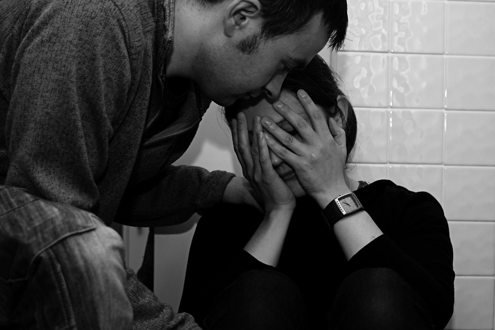
Fragile - Like the idea, composition works well.
 
Hi,

Off to a strong start. Like the one of your son in B&W, the colour one brings too much of the background into the play.

I think with a bit more trying the landscape bliss one could work. Maybe a different angle, or something else in play. But onwards on and upwards!

Good fragile shot too, B&W works well. A colour one wouldnt have worked in this situation. Maybe a colour one for the next one!!!
 
Excellent interpretation, David.
And as Andy said, B&W was the way to go (y)
 
Back
Top