Finally getting around to catching up with others
Horizontal, loads of them going on, really like the panoramic of it, kept all the shadows in, nice image
Vast, I think I prefer the St Peters one, it certainly looks vast, and the way you have centred it helps the effect
Rough, make me feel a bit dizzy
")
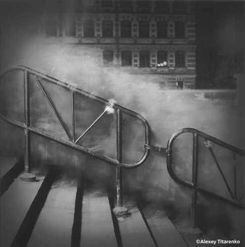
, I keep wondering what it would look like in B&W? It is one cool staircase!
Covered, in many ways
Liking the patterns of the tattoo's
Colourful, nice depth of field and certainly colourful!
Entrance, I think I like the first one, nice textures and the open door makes a difference!
Size, like others have said, I think the second is the better image


")

 JI3A4396
 JI3A4437
 Wk 21 - Size
 Wk 21 - Size 2
 Week 22 - Forgotten

